How to Use Visual Elements in Landing Page

80% of the ocean in the world is still unexplored and unmapped, much like the aspects of email marketing,
where we discover something new every day.

One such lesser explored aspect is the treasure trove called ‘Landing Pages’. Sadly,
according to Nifty Marketing, 77% of landing pages are home pages.

Dedicated Landing Pages can increase your conversion rate, and visuals can play a vital role here. According to a
Venngage study, people remember 80% of what they see, 20% of what they read, and 10% of what they hear.

Let’s solve the mystery of visuals in landing pages and dive into the realm of attracting the right traffic to your
website.

Take the plunge...

5 Thrilling Reasons To Get Into
The Landing page Waters

  • You want to amp your SEO ranking

    By creating a landing page optimized for search engines, you can appeal to the algorithms and get the
    right traffic to your landing page. By not optimizing, you could be missing out on search traffic.

  • You need conversions

    Landing pages are a great way to not just capture leads, but with an effective approach, they can
    increase sales and ROI.

  • You are launching a product or promoting a service

    Informing your audience and directing them towards a product or an offer is a smooth sail with landing pages.

  • You are running an ad campaign

    A landing page is a must if you are running an Ad campaign but it should fit in perfectly, just like the
    breathing mask for a diver.

  • You want accountable visits and want to track the customer journey

    Landing pages can help to track the performance of your marketing effort. Monitoring the analytics will
    tell you a whole lot about the unknown.

Primary dimension of a landing page in Google analytics.

Explore the 'Visual' World Beneath
The Landing page Waves

Attractive Images

Images have the ability to connect with people. 80% of viewers have proved to be more attentive to the content of the copy if it was supported by images. If you are using a portrait or real image of a face, you can manipulate the visual cues by changing the look room of the model.

Just like Star Dogs Grooming Salon, you can place the CTA accordingly by using the image as a directional cue, and easily expect higher conversion rates. Images also bring credibility and make it easy to exhibit a product.

You can also use images as a carousel-like how Cotton On did to exhibit a range of products. It can also be used to show pictures of the guests for an event or conference.

#Pro Tip

If you can show, don’t tell. If you can convey a message through an image, do not talk about it further in your landing page design. It will make your content look repetitive and boring.

GIF Currents

80% of people seem to remember seeing a video, whereas only 20% remember something they read on a page. In that case, GIFs meet us halfway, helping us create a video-like experience. A smart marketer would use high definition videos and visual elements, but a genius would do just what is needed and use GIFs. Giphy has revealed that more than 500 million active users spend almost 11 million hours viewing GIFs on their platform; it only shows the popularity of GIFs.

From using animated arrows and directional cues towards a CTA to showcasing a product in a 360 degree range, GIFs are your landing page lifeguards.

This Landing page for a game, Kamui, gives an extensive graphical landing page experience. They have animated GIFs that deliver a highly interactive interface, reflecting the standard and design interface of the game itself.

You can also use a GIF as a background like how Giphy does on their sign up page by exhibiting artworks and engaging the audience.

#Pro Tip

It is better to keep the size of the GIF under 1MB. There are chances it might take way too long to load, especially if you are using more than one GIF in the same landing page.

Video Wave

Using videos in landing pages have proved to increase conversion by 86%. But this can be achieved only by using the relevant video which reflects the brand and conveys the required message. While strategizing your landing page design, follow the inverted pyramid technique to drive better conversion. 90% consumers prefer video content; smart marketers are thus using videos in their landing pages more often more often.

Traffic
Type of KPIs
  • Website visitors
engagement
  • High-value actions
  • Video views
conversion
  • Purchases
  • Installs
  • Sign-ups

You can use videos in the background just like how Riu Bambu has done to give the viewer a tour of their hotel premises.

Videos can also be used as a testimonial from a client or a user. 88% of consumers have faith in testimonials and customer reviews, and it impacts their buying decisions. Testimonial videos like how Dribbble has used them in their landing page, not just contribute to their credibility but also let their audience know their standard of delivery.

#Pro Tip

It is a good practice to test elements of your landing page, in this case, test all your visual elements and how they complement the CTA.

Illustrious Illustrations

In responses to a recent survey, 95% of B2B buyers said that they wanted shorter and highly visual content.

Abstract art has become a trend in marketing campaigns where an idea is symbolically represented through graphics and modern designs. This is a great way to customize and design an artwork, as it is easier than setting up a photo-shoot or video campaign.

This illustration was used by Slack on their landing page! It maintains equilibrium between the bright colors, heavy text, and white space.

#Pro Tip

Avoid using images or illustrations straight from the stock. Use credible images and designs to establish credibility.

Edifying Graphs

Landing pages can be a great place to explain complicated statistics or data through simpler graphical representation.

This landing page by Survey Monkey has used a graph to visually represent the data provided in the testimonial, beside the sign-up form. Even before you go on to read the testimonial, just by looking at the graph you know that there has been a 60% increase in sales.

#Pro Tip

For large amount of data, use scatter plots and treemaps. Line charts, bar graphs can be used to represent information over a period of time. Use pyramids and pie charts to show the proportion of elements.

Sinking Into The Cues On
Landing Pages

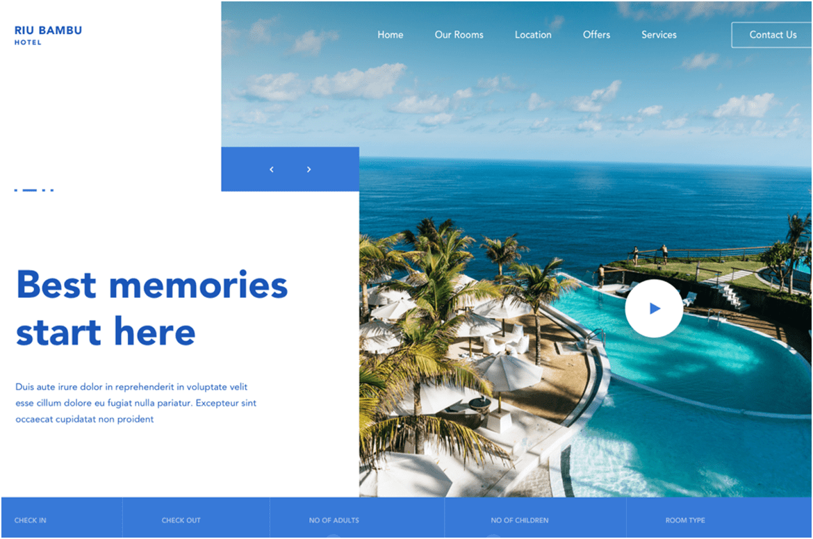
What’s the first thing your scuba-diving instructor trains you for? Understanding the visual cues because they work the best. Likewise, using apt visual cues that back the message in a landing page will ensure better communication and greatly boost engagement.

Human beings are creatures with less than 8 seconds of attention span. Visuals have the upper hand in such situations.

To put in simple words, instead of holding a board with the text that says ‘End the dive’ a scuba diver simply does thumbs up and the same message is communicated 60,000 times faster than processing

Catching the Color Cues

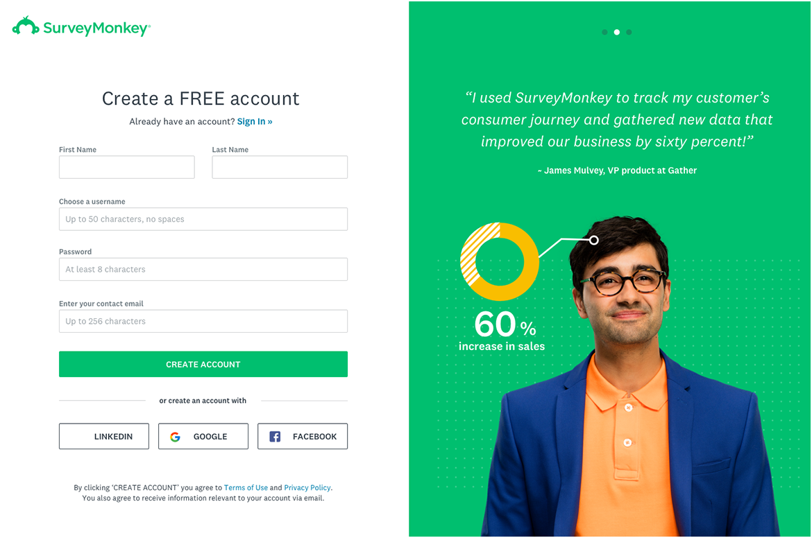
Visuals are not about replacing text but strengthening it. And colors play a major role in doing so.

Colors have the ability to make the design presentable.

Colors can determine the action or behavior of the viewer.

Here's a list of colors and the emotions associated with each. Using the appropriate color as per your brand message or your landing page goal, will help you connect efficiently with your target audience.

  • Represents Minimalism, Purity, Sterility. Used for Non-profits, hospitals and some minimalist clothing brands.
  • This is one of the most noticeable colors as it has the longest wavelength in the spectrum. It indicates, power, passion, love, heat, intensity. When mixed with white, it produces pink which is a much calmer and weak color. Used for FMCG brands and media outlets.
  • It’s a bright, cheerful, and light color. This is the happiest color of the spectrum used for quirky brands, who want to communicate with clarity.
  • Communicates peace, calmness, and truth. Used for legal and other such services.
  • Communicates health, good luck, and tranquility. Used for brands that contribute to growth.

Furthermore, when crafting a CTA, one should design it in such a way that it attracts maximum attention and contributes to conversions. Use colors for your CTA wisely because they will help to make buying decisions much faster.

#Pro Tip

To highlight your CTA, use a contrasting color from the background. For
reference, try using the color that is completely opposite in the color wheel. For a
much-varied color reference, you can manipulate the tints and shades accordingly.

In this landing page, Ford Family Law has used ‘blue’ in the background and 'yellow', the opposite color in the wheel, for the CTA. This ensures that the CTA stands out in the design.

Straight From the Divemasters
of Landing Pages

Wrap Up

Just as every scuba dive takes us on a whole new underwater experience,
every landing page campaign teaches us something new. We hope this
infographic has been an eye-opening guide offering an ocean of opportunities
when it comes to using visuals in landing pages.

Embed this infographic