


The effectiveness and high ROI of email marketing have been a long established fact. However, designing emails that can deliver on these yardsticks entails getting every element of your composition right. When on average readers spend 2 seconds looking at your email, the visual appeal plays an important role in determining whether or not they will engage with your campaign.
As far as visual appearances go, monochrome designs are emerging as a hot favorite among email marketers. That’s because colors have the ability to influence a person psychologically. The use of monochrome hues can create a sense of harmony and work as a great unifying element. Besides, sticking to a uniform color palette throughout your email body promotes ease of reading and creates a restful environment in which a reader can engage with the content more comfortably.
10 Brands That Nailed Their Monochrome Email Design
If you think that a single color scheme would make your emails look dull or boring, take a look at these 10 brands that nailed the monochrome email design and reevaluate your take:
1. Creating Depth

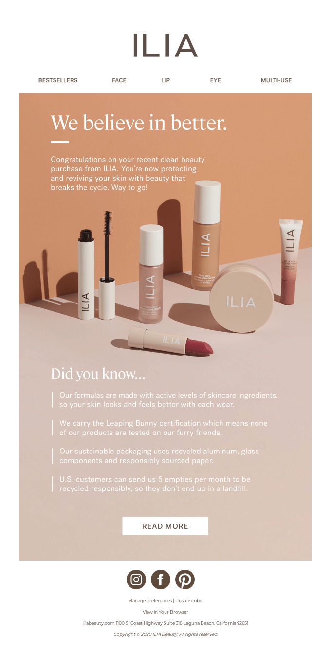
Cosmetics brand Ilia has used monochrome hues with the peach color palette to create an element of depth in the mission-driven email. The blend of different shades makes the products stand out as the central focus of the email. Besides, the bold white font on soft, earthy hues promotes ease of reading and lends the email a restful vibe. Even if a reader were to engage with email only for a couple of seconds, they would still get the message loud and clear.
2. Clean and Simple

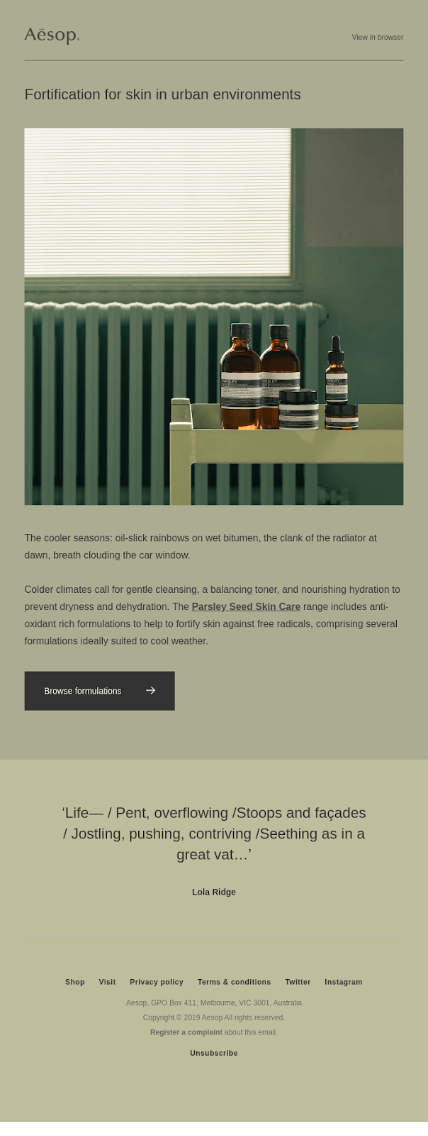
Beauty and personal care brand Aesop has done a brilliant job of using monochrome green hues in this email that promotes skincare products specifically designed for the urban environment. The choice of greens in the backdrop creates a close-to-nature vibe, which is perfectly in line with the message they’re trying to get across.
3. Guiding Focus

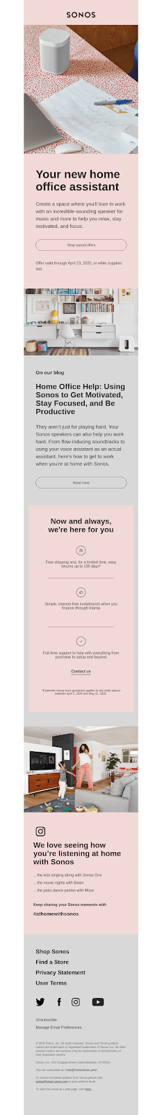
In this email, wireless music equipment brand Sonos is pitching its new home office assistant, coupled with a special promotional offer. The prominently placed image of the product, on a soft pink monochrome background, is telling the reader exactly where their focus should be. The email is not crowded with different elements or product images. This adds a premium appeal to the product, making it seem aspirational.


4. Stoking Desire


Look at how brilliantly Tinker Watches has played with monochrome hues to offer its readers a sneak peek into an upcoming product launch. The celestial effect in the backdrop enhances the appeal of the product. This black on black design with just the right amount of white space works wonderfully to create an element of depth and make the product appear visually more appealing. The design complements the ‘very limited edition’ announcement with its luxury feel.
5. Uniform yet eclectic

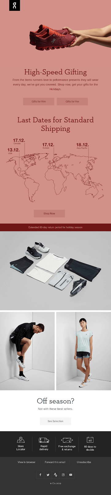
This email from activewear brand On is the perfect example of the fact that monochrome needn’t be boring. The use of different shades of red ties the entire design together seamlessly yet makes the key element – the image of a pair of red sneakers – stand out. With just one look, you know what’s the hero of the message here because it is being uplifted and celebrated.
6. Decluttered and Direct


The monochrome design is your best bet at capturing and retaining your readers’ attention long enough to get them to read a block of text without getting distracted. This email from home decor and furniture brand Minna is a textbook example of it. The use of soft, neutral hues which the central image blends in with creates a calming effect on the readers’ eyes, allowing them to focus on the message.
7. A Touch of Animation

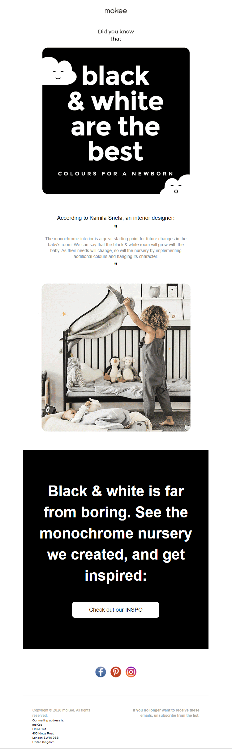


When it comes to designing email campaigns, everything gets better with a touch of animation. This promotion run by Mokee is proof. Pegging an offbeat idea of monochrome nurseries for newborns over the popular choices of pink, blue and yellow, they have added two cutesy cloud faces that move back and forth to draw the reader’s attention to the message. This has been followed up by an image slider with a mix of attractive nursery photos that are bound to make any expecting or new parent explore this unusual idea by clicking on the CTA.
8. Keep ‘em Hooked

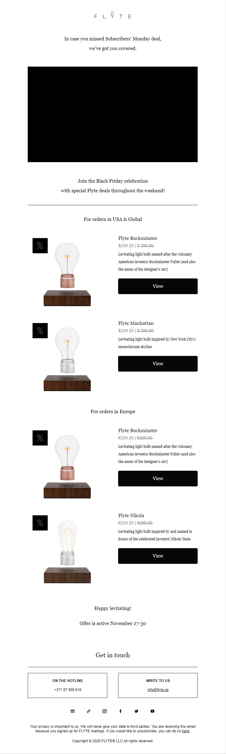
Speaking of the impact of using animation in a monochrome design, this email from Flyte checks all the right boxes. The central visual element – a rotating bulb animation that swings from darkness to light – is bound to have a reader intrigued and hooked. With lucrative offers pegged right underneath, they’ve optimized the probability of anyone looking for similar products clicking on the CTA.
9. A Uniform Appeal

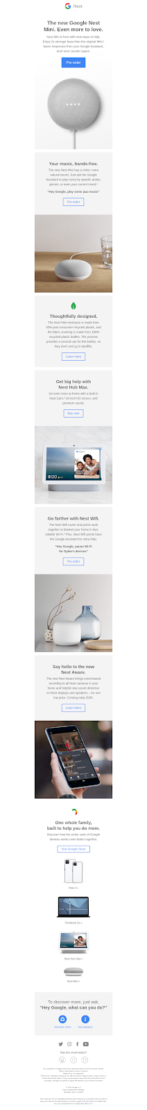
Monochrome colors are your best bet for creating emails with a uniform, cohesive appeal. This works best in cases where you want to drive home a singular message and create an impression that will stay with the reader long after they have exited the email. Take, for instance, this Nest series introductory email from Google where they have pegged a new offering in monochrome theme. Juxtaposed with neutral white and off-white backgrounds, the devices truly stand out and seem lustrously appealing to the eye.
10. Play with Neutral Hues

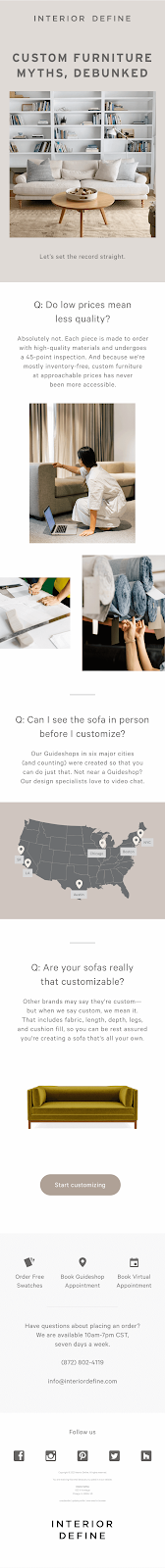
Just because you’re working with a neutral color palette doesn’t mean there is no scope to play around with different shades and patterns. This email from Interior Define shows just how you can nail it. They have tapped into the universal and evergreen appeal of soft earth hues to promote their range of furniture pieces, making them desirable to a potential buyer.
The Takeaway
You can see now why monochrome colors are such a hot favorite with a cross-section of digital marketers. By using these colors in clever combinations, playing with different shades, and adding versatility through elements such as animation, you can create stellar email campaigns that are far from mundane!