


So, you know the importance of a landing page? That standalone site designed for a specific goal and linked to one or the other marketing asset is meant to engage and convert users with a specific offer or message. Its creation starts from identifying your campaign objective, the target audience, and the promotion channel. The achievement of its marketing purpose concludes (goes on?) with constant testing, tweaking, and tracking.
In between the proverbial cup and the lip, though, there are several elements you have to work out and integrate to maximize your metric of success—whether it’s conversion, lead generation, transaction, user re-engagement, or any other. Primarily, the design and copy must be clear, clutter-free, and crisp to really reel in your followers/browsers/subscribers.
Let’s look at 5 different types of landing pages used widely by ecommerce brands and a few tips and tricks to enhance their design and copy. With these examples being based on email marketing campaigns, we will also look at some best practices to get more users to land on your standalone pages and click on that CTA (and not bounce off!).
1. Landing Page For Enrollment
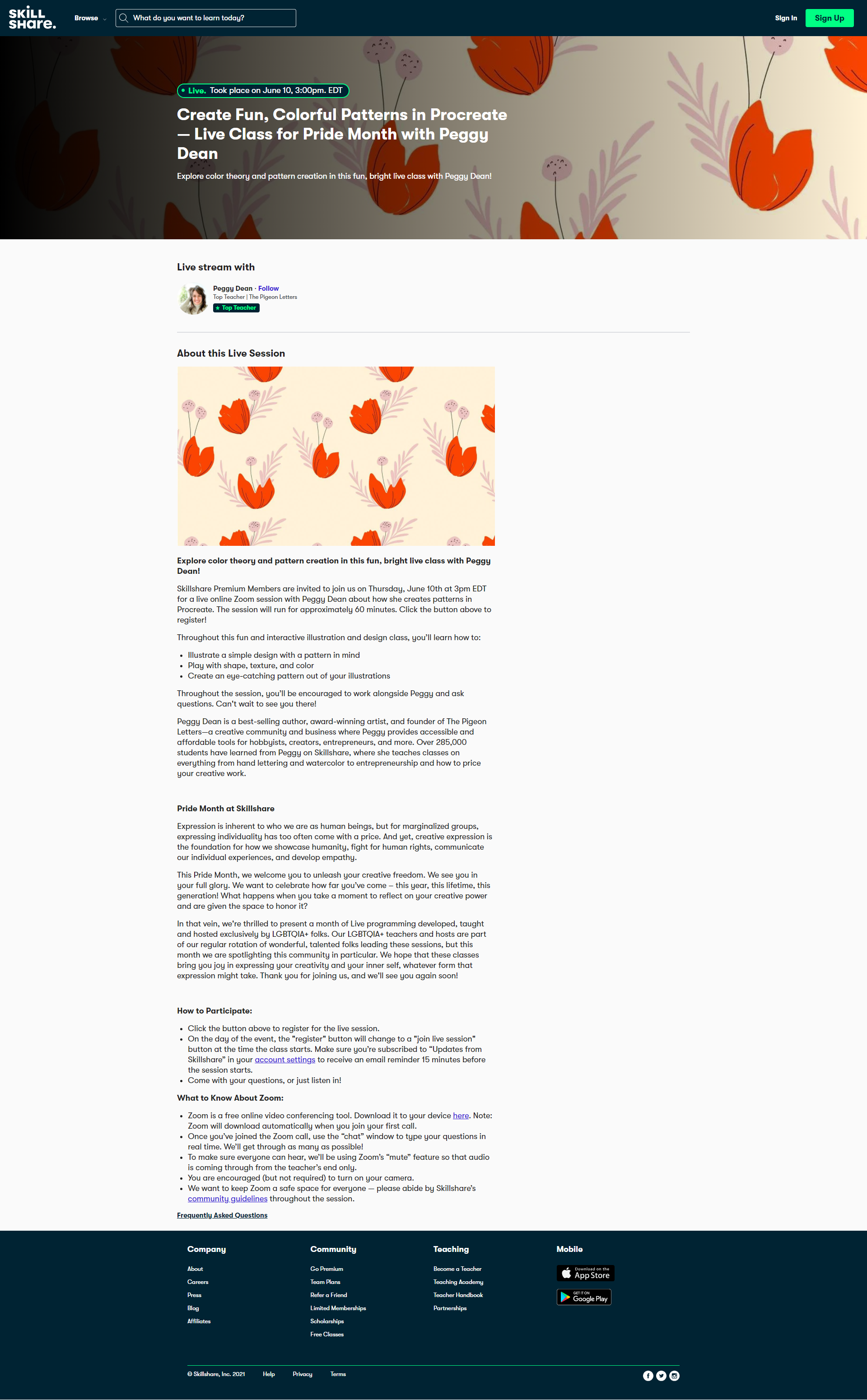
We love that Skillshare has kept it straight and simple here with the design in this class sign-up template for its online learning community platform. The hero image in vignette blends well. The text legibility is impressive, as is the spacing. The copy is informative. Post-dated, the page helpfully indicates the class has concluded.
What would we have excluded? The offer link placed in an additional bar on top, and the site links in the footer. It would have been better to stick to one clear sign-up CTA to reduce the visual noise and exit links.
Here are a few best practices to amp up conversions post-click on your class/course sign-up landing page:
- Identify your target audience and have your copy address them. Don’t assume a big and bold CTA will get them to click through. Instead, inspire them; tell them why they should sign up.
- Showcase your educational offerings / brand strengths with a nifty infographic.
- Embed a testimonial or two. Video over text, but see what works.
- Try to include all relevant stats of the course / your brand above the fold.
- Don’t cram too much into your design or copy. But do include clear instructions on how to sign up/apply/enroll.
- Include a connected image or a few. A photo slide would be great.
- If you have to include a navigation bar on top, let it just be related to your classes/courses.
2. Landing Page For Downloadable Content
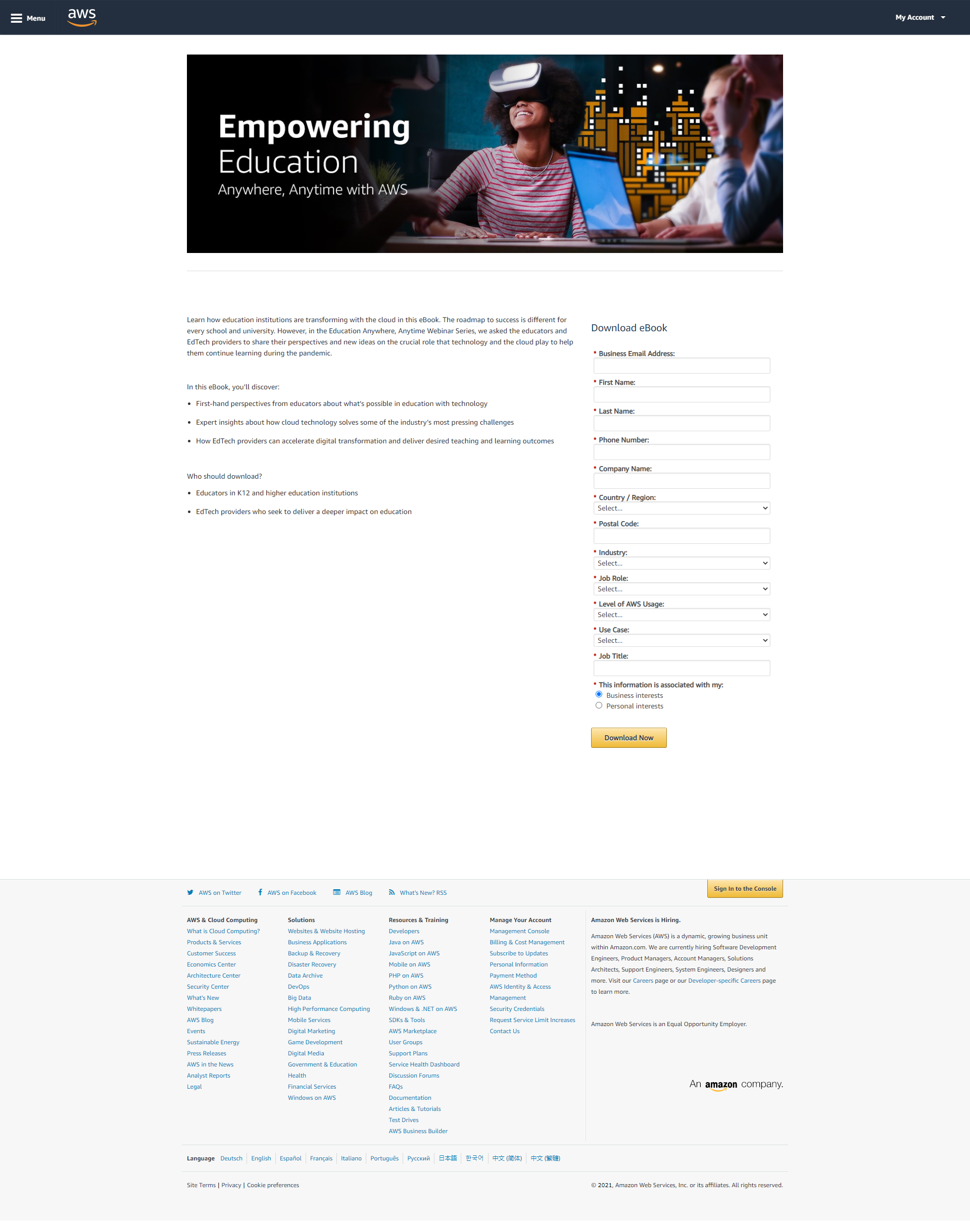
Less is more, always, when you’re trying to get users to buy into something that is not a product or service offering. Amazon Web Services has read into this and simplified the design for this landing book for an ebook download. The banner image is crisply rendered and quite aligned with the ebook’s topic focus. The cloud tech platform’s messaging also delivers with informative bullet points.
A few things could be improved with this design. For starters, it would have been good to mention “ebook” somewhere with the first scroll. Also, the form could be a little shorter, and the site navigation links aren’t necessary again. Finally, it wouldn’t have hurt to plug in the parent brand’s logo, too, perhaps as a clickable element.
Keep these pointers top of mind while designing your ecommerce landing page for content downloads:
- Don’t just plug in the content; market it, too. Outline the benefits clearly.
- Set out all the details of the content offering: target audience, what it contains, use cases, file formats available.
- Develop trust and deliver on expectations by offering templates that work for your TA.
- Make the distinction when it’s free content. If it’s priced, integrate sales newsletter-like elements, such as a sneak peek and FAQs.
- Keep the lead generation form simple and minimalist. Restrict to one or two fields, as far as possible.
- Have a secondary CTA, such as account sign-up, newsletter subscription, catalog browsing, etc.
- Link to the brand website below the fold to address the bottom half of the sales funnel and prevent distraction and high bounce rates.

3. Landing Page For Subscription Offer
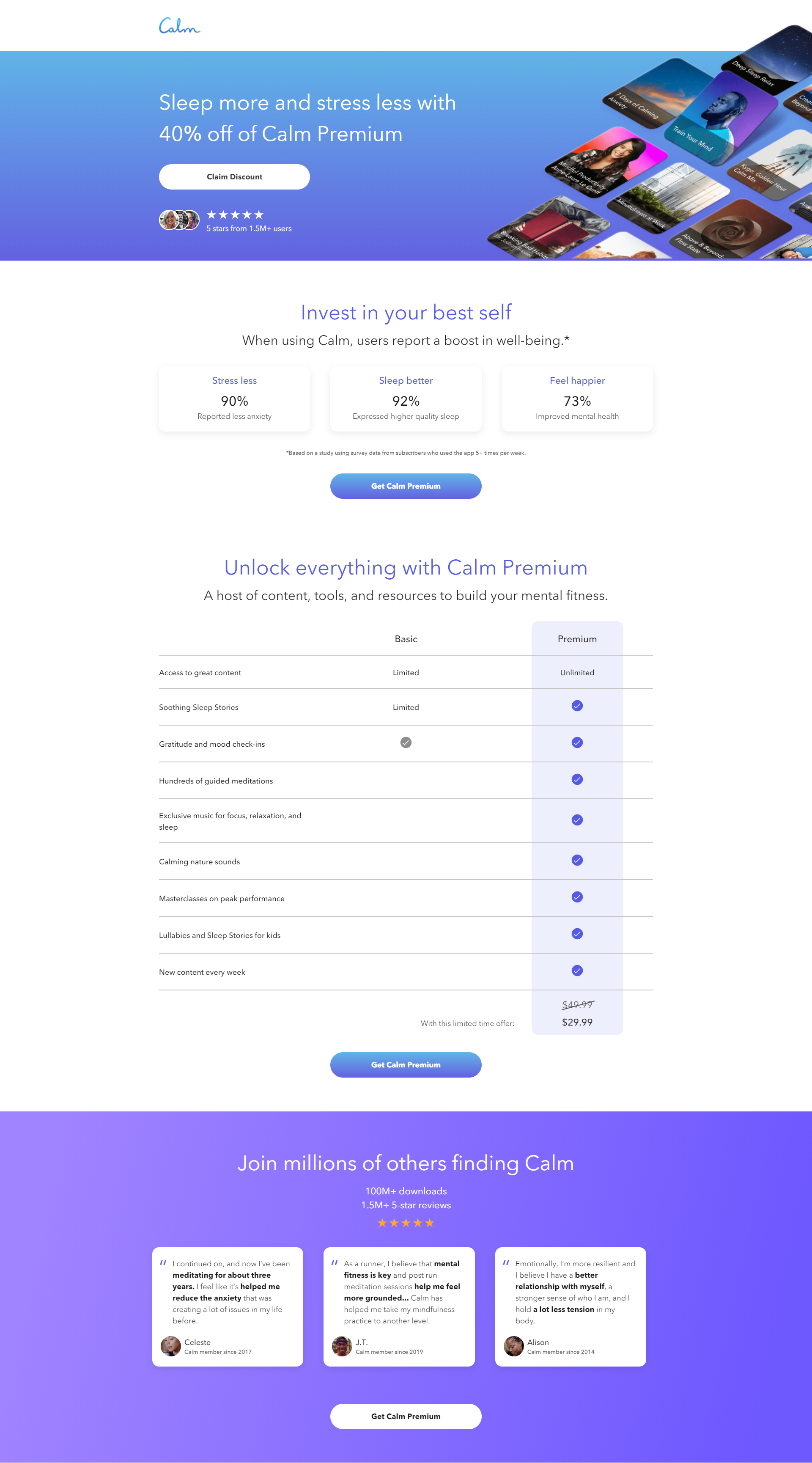
What’s not to love about this landing page done up by SF-based meditation product company Calm? It’s a perfect example of how simple can be striking and functional, all at the same time. The design in the bold and bright brand color is set off well with the crystal-clear text. The message is short and to the point, with all the relevant details included.
The segments above and below the fold are well thought-out and designed. The social proof above the fold and the expert voice as you scroll down are smartly integrated. We mostly love how the entire template is clutter-free and striking. The repeated CTA buttons are also a wise call.
Here are a few things to keep in mind to get higher conversions on your ecommerce subscription landing page:
- Remember, your primary and only objective is to get an additional subscriber. So, keep your copy and design just about that. No sitemap, no content marketing.
- Make the offer details clear. If there is a particular discount, highlight that.
- You can try a “View Rewards” or “Get Coupon Code” route, too, just to make your payment encouragement look more personalized.
- You can also speak to the specific user through the copy by including apt words and phrases, such as “exclusive” or “just for you.”
- Remember to stress urgency with “limited time offers.”
- Last but not least, streamline the conversion route. Let your landing page lead straight to the checkout/order processing/payment page.
4. Landing Page For Event Registration
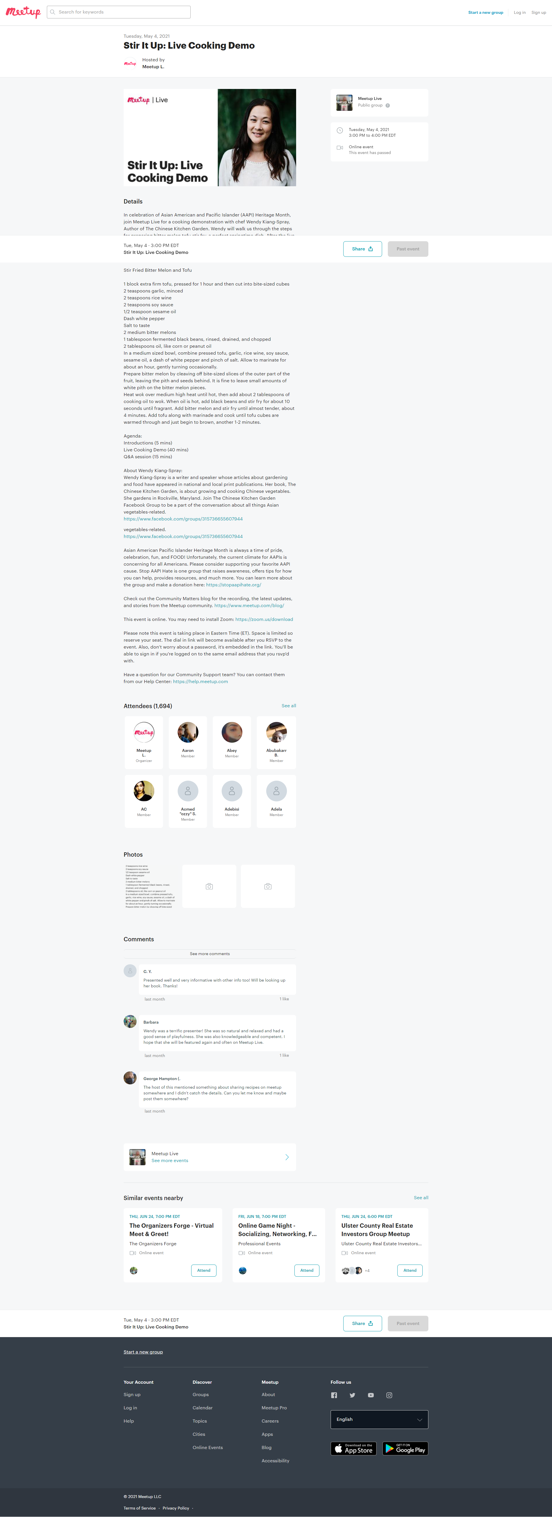
Meetup, most often, goes for a no-frills template to drum up upcoming events and rake in registrations. This landing page clearly focuses on the event in question, from the headline to the last detail. We like that they have updated the page after the event to drive engagement and retargeting for users who get here through other routes.
They have also neatly doubled it as a bit of content marketing, pre-event, by including the recipe. The outbound links are primarily centered on the event itself, which works. The bottom fold has integrated a comments section, which speaks to the user-centricity detailing. Only, we would have gone for a more striking hero image up front and center—in this case, perhaps something related to food, of course.
Here are a few tips to get the word out on your upcoming event through appealing landing pages:
- Focus on the single conversion goal of registration. Ensure your elements—from the headline to the CTA—are framed and designed around that.
- Integrate social proofing where applicable. Also, consider adding social media buttons for shareability.
- Set clear expectations for the event. Reflect the theme and tone of the event in your design and copy.
- Outline the value proposition precisely. If the star attraction of your event is the host/speaker/panelist, then introduce them properly. Include their title, images, expertise, etc.
- Dial up the FOMO tone with copy elements such as “Don’t miss” or “Sign up now.” Offer an incentive, if you can (early-bird discount, for example).
- If you’re trying to generate leads, keep the linked CTA simple. Ask only the information you need; an email ID should suffice.
5. Landing Page For Product Trial

Coursera’s free trial landing page for its paid “Plus” version has an impactful design overall. The color contrast is very effective, and the blue palette is soothing and engaging. The image is well-positioned, as are the logos of the partner institutes that work as trust symbols.
Though the copy covers several points, the minimalist framing, along with the iconography, makes it highly scannable. The testimonials that appear as you scroll down add to the credibility factor, and the FAQs should prove helpful.
Things we would change: pushing the testimonial bar to the second scroll and bringing down the course offerings slider. Also, the template can do without the site and social media links to prevent visitors from leaving the page.
- Eliminate any header, footer links. Anything that tempts users to “browse” or “see more” is only going to reduce conversions on your post-click landing page.
- Augment the credibility factor further with relevant stats about your product, trial subscriptions / downloads, any certifications or industry accolades, etc.
- Provide any additional details of the product or service in collapsible tabs or lightboxes to not overwhelm the design.
- Conflicting CTAs are an easy trap with a product trial page. Make sure there’s no “Buy now” CTA. Any relevant banners should be taken out, too.
- Frame any sign-up or lead generation form to be friction-free.
- Build on the trust with assurances such as “No credit card required” and “No auto-renewal without approval.” You can also include your privacy policy as an unobtrusive link below the CTA.
Wrapping Up
So, those were our top tips for a range of eCommerce landing page needs. To get the best out of your email marketing-landing page conversions, implement these tried-and-tested practices:
- Place as much copy as you can in your email newsletter. Let your landing page be light on text.
- Ensure your design is mimicked and standardized across your email and the landing page (and any other promotion channels used for that particular campaign).
- Make your CTAs connected, not conflicting.
- Include pertinent images of a common template in your drip campaign and the landing page. Make sure they speak to the audience and echo the overarching message.
- Where possible, include videos to back up your messaging—short and easily clickable.
- Last but not least, optimize email and landing pages for mobile.
Want help with creating flawless, optimized landing pages? Reach out to us.