


Are you a marketer at an institution or company that’s riding the wave of webinars? If you’re in the tech or educational fields, particularly, chances are you have been promoting more internet-based events to convert leads and drive sales by presenting speakers on a niche topic or fronting an in-house team presentation.
From the promotion to post-event curation, there are a series of steps involved in hosting and marketing a webinar. Perhaps, you have cracked the email marketing game, and you’re recording a great email open rate for your webinar registration invites. What about the next step—designing an attractive and functional webinar landing page that invites your subscribers to sign up? How can you get that right?
In this blog, we have selected 9 winning examples of webinar landing pages to inspire you and summarize the dos and don’ts. We’ll look at the hits and misses of each page in terms of design and copy.
1. AWS Aces It

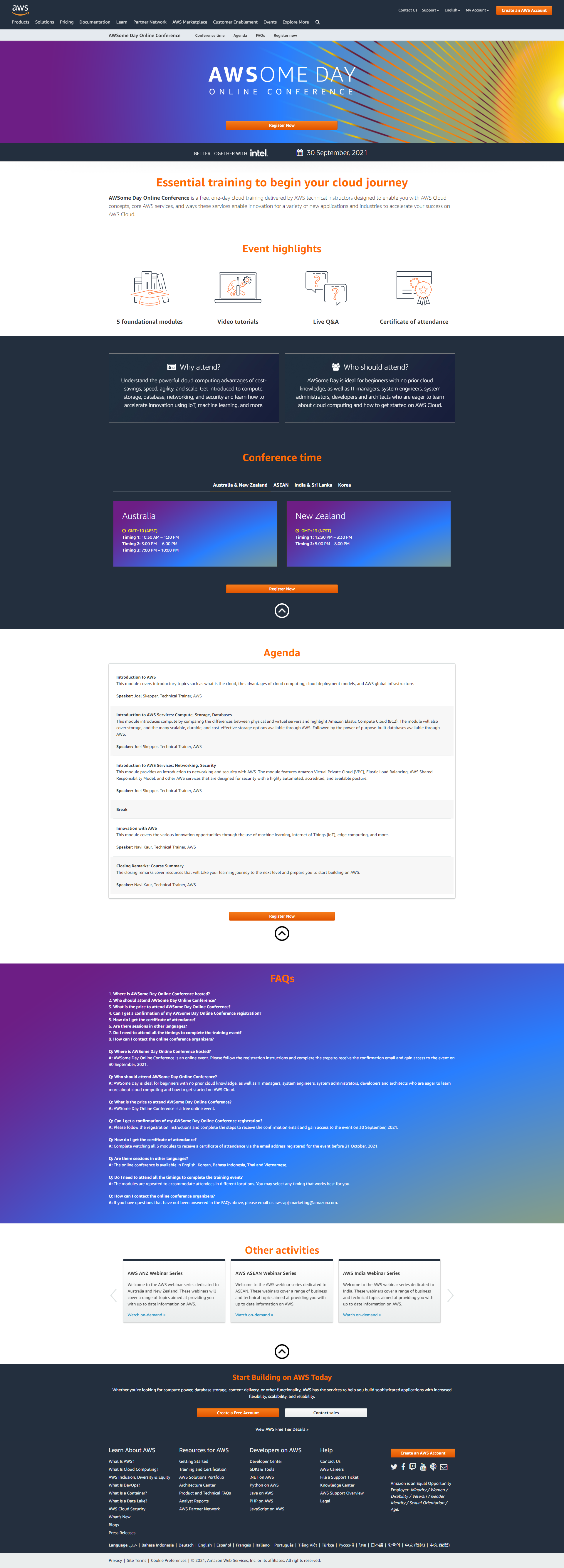
Obviously, this Amazon subsidiary knows how to maximize web presence. On this page, we love the use of the brand colors and the clean layout. Also, the copy is to-the-point and sets out every little detail.
The use of simple GIF iconography and the inclusion of detailed FAQs are the other standouts. We also appreciate how the CTA has been repeated throughout the copy.
Things We Would Change
- The navigation menus can be removed.
- The registration form opening from the CTA is detailed and could have done with a couple of fewer fields.
- We’d be nit-picking here, but the CTA button could have been more dynamically designed with differently framed words than just ‘Register now.’
2. A Strong Case For A Segmented Design

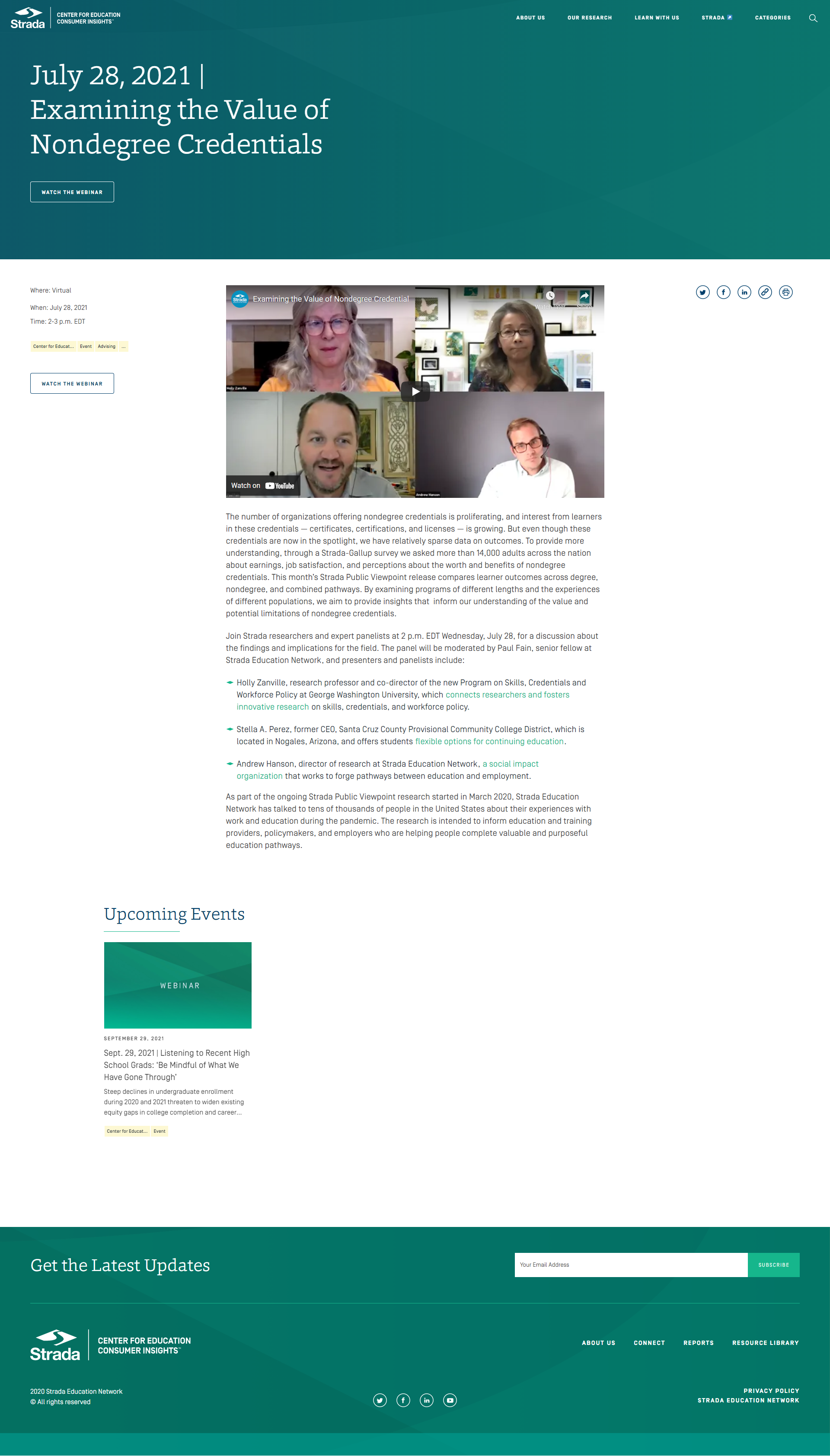
The Strada Education Network has used a simple, segmented layout here. As this is a post-dated landing page we have reviewed, we will comment on the fact that they have considerately plugged in the webinar video.
(You can also consider leveraging content marketing with relevant videos and case studies once the event is over. According to reports, 91% of professionals who view webinars say they then visit a website to get more information on the topic. If they’re already on your content-populated site, you’re enhancing the probability of conversion.)
The headline is set apart in attractive, bold letters. The color palette is soothing, and the design elements are synced up with the copy purposes. We, especially, love the bulleted design.
Things We Would Change
- The copy could have been shorter; it can be a lot to take in, especially if you’re skimming.
- While the use of white space is excellent, we thought the alignment should have been better. All the supporting design elements being left-aligned throws off the overall balance.

3. Emma Eggs You On With Restraint

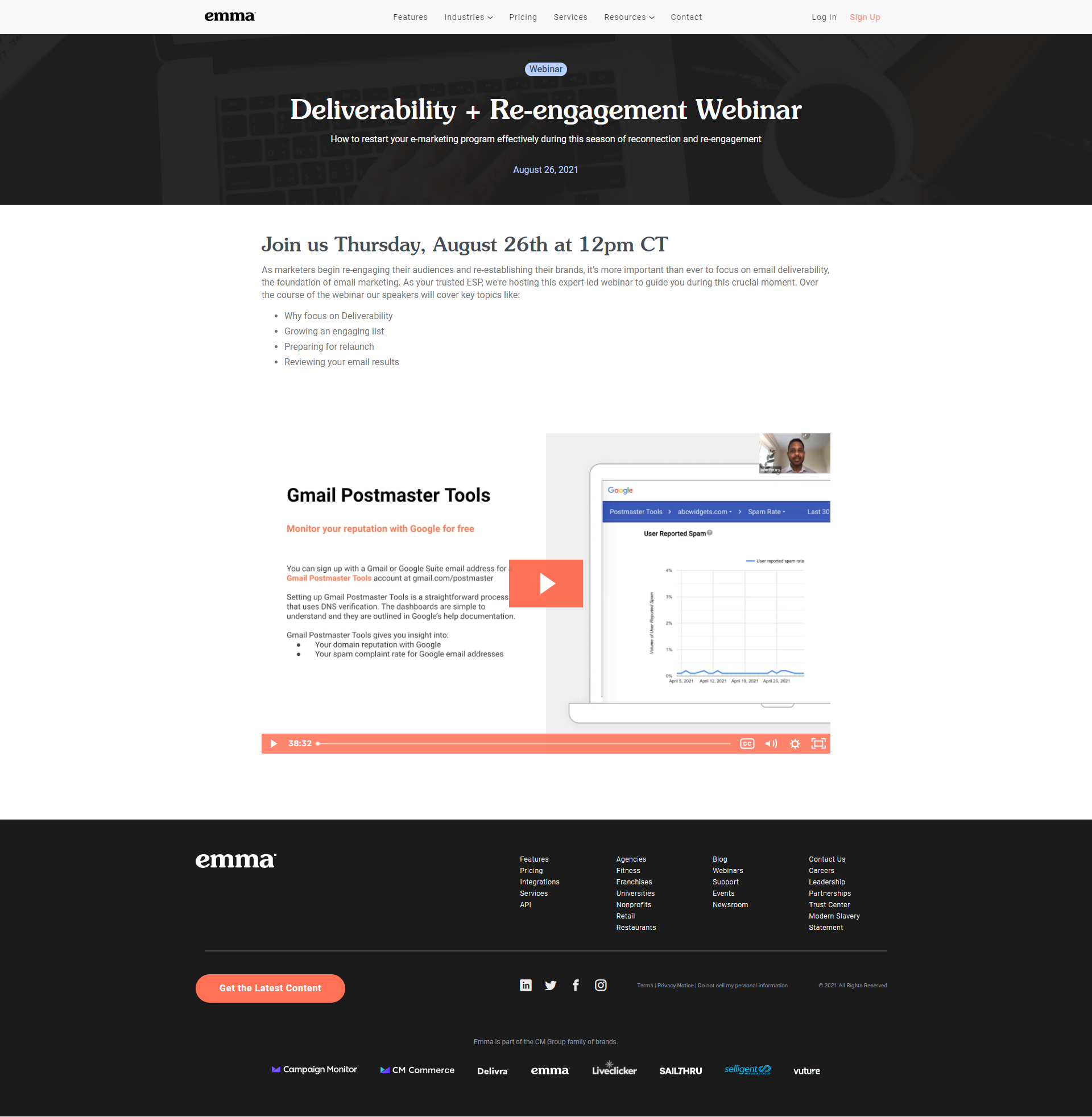
The email marketing brand has pared down the aesthetics and makes a good case for simplicity with this landing page’s design. The form is simple and invites conversions. The copy is straightforward. Post-dated, the blog has neatly plugged in the webinar video.
Things We Would Change
- The font spacing catches your eye, particularly in the title. It’s best to try and fit in a simple, inviting, and direct title in the available space than settle for awkwardly broken-up words.
- The use of white space is slightly off.
- The social media buttons are not placed appropriately. They could have alternatively/additionally been added higher up in the copy segment.
- The navigation segment in black at the bottom is chunky.
4. Learning Lab’s Light Hand With Listing

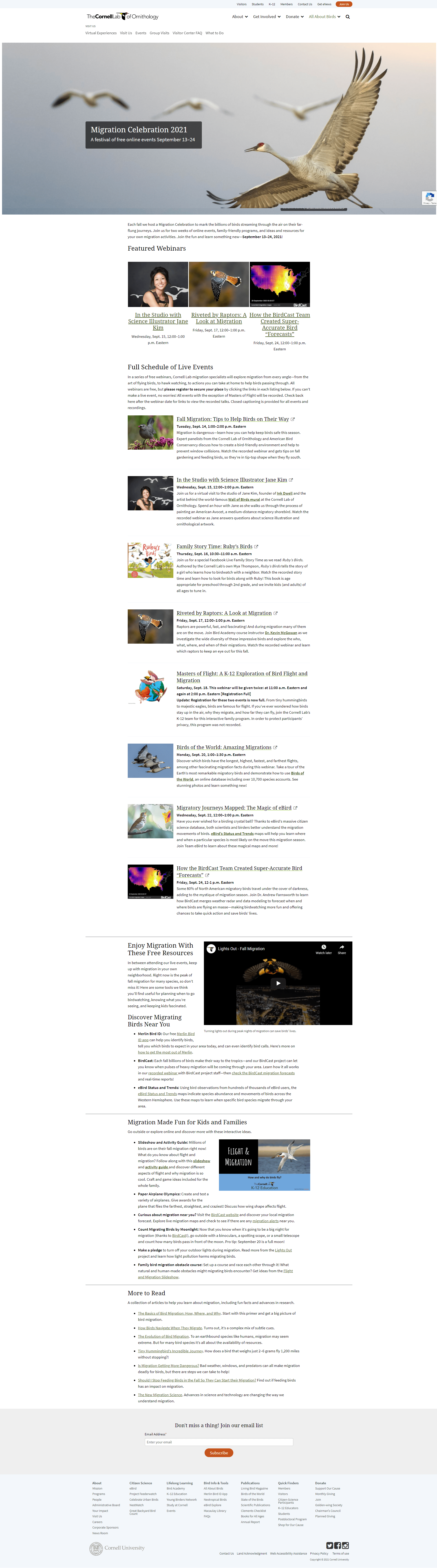
The Cornell Lab of Ornithology gets almost everything right with this landing page. There’s a lot to put out there for a webinar series, and the objective is accomplished with A-plus aesthetics. The listed layout appears entirely in sync with the event communication objectives.
The copy is neatly broken up and revolves around the relevant details, and the follow-up pages and sign-up forms are straightforward. The use of images also works. The hero image, in particular, is striking and seamlessly integrated into the overall styling, with a good font-contrast set-off.
Things We Would Change
- The double navigation bar on top is distracting.
- It’s obvious the Lab is looking to loop in a bit of content curation on the page. This could have been done a little differently, as currently, there are too many scrolls. A side panel, either in the form of a static, set-off segment, or a subtle pop-out feature, would have been a better bet.
- There could have been one prominent CTA up top. Also, hyperlinking the registration pages doesn’t quite work; it all ends up looking a little cluttered.
5. Use of Simple Symbols

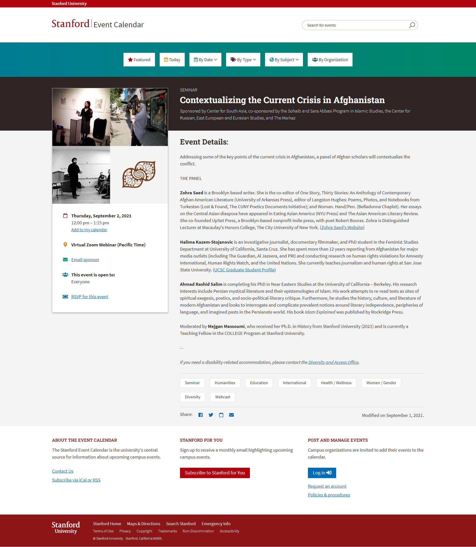
Stanford University appears to be in total touch with what works for a webinar landing page. This simple and effective layout says everything that it needs to.
The use of small, subtle, and supportive symbols stands out. The ‘Add to my calendar’ and ‘RSVP to this event,’ in particular, should invite plenty of conversions. Also helpful is the direct communication on disability-related accommodation further down.
The segments are optimally spaced. The social sharing buttons are small but perfectly placed and set off with a good amount of white space. We also tip our hats to the linking to the speakers’ sites; this is well-rounded communication.
Things We Would Change
- We couldn’t ignore the use of ‘seminar’ up top. While a minor detail, the need for consistency across the copy cannot be stressed enough.
- The hero image could have been more crisply rendered. The white bordering on the grid design underlines the smudgy visuals in this critical first scroll view.
- The CTA could have been a bit more prominent or repeated below the fold.
6. Digital News Platform’s Downsized Display

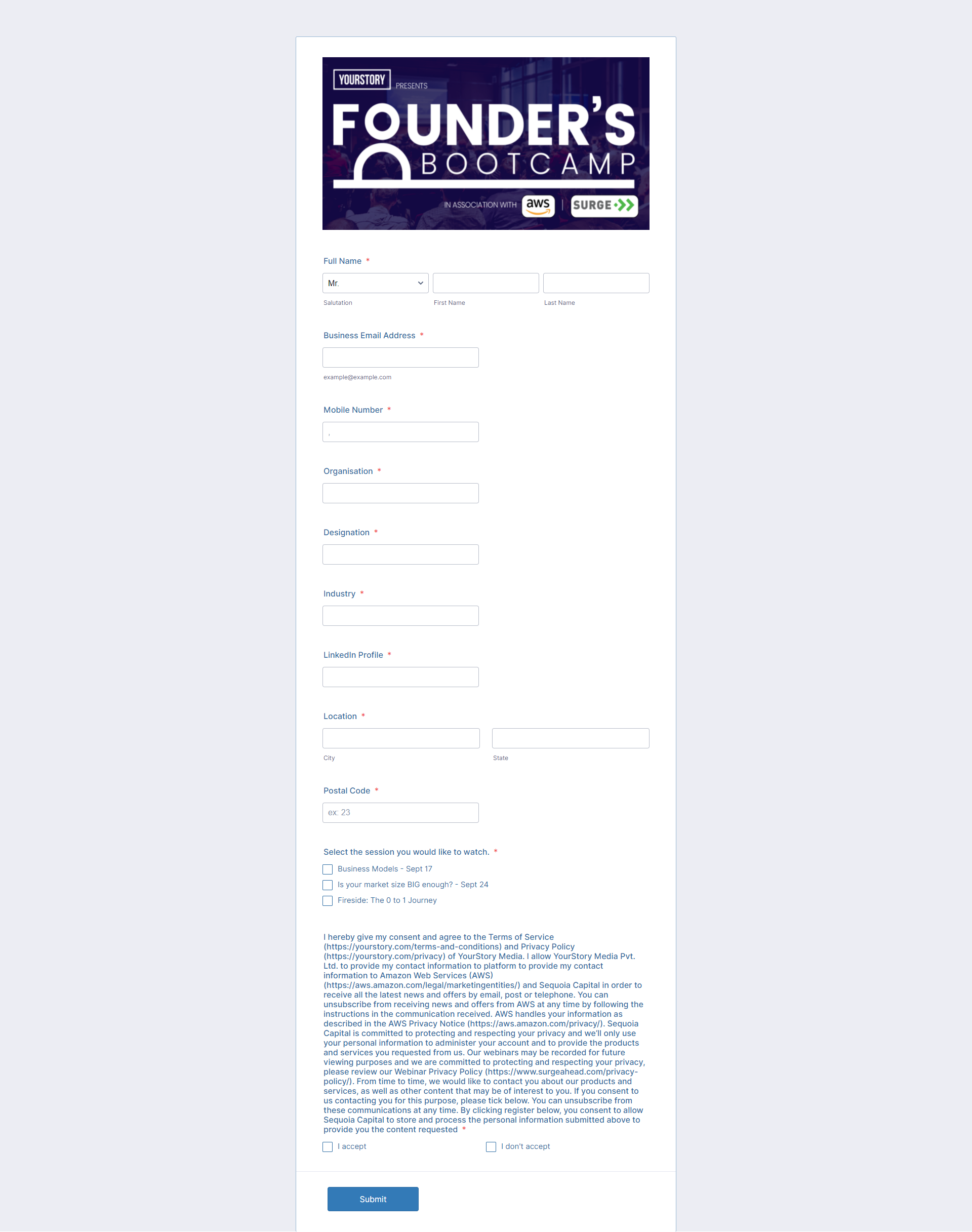
YourStory has taken the highly pared-down route with this landing page. A design focussing on the extremely essential elements is one option for webinar event organizers. Put together one vital visual followed by a streamlined sign-up form, and you’re good to go.
YourStory’s page has a prominent branding element, and its design is well-balanced, clear, and summarizing. The plain white design with neat borders eliminates distraction completely.
Things We Would Change
- The sign-up form is a little too detailed. The location field, for instance, can be done away with; the data can be mined from IPs, instead.
- Following from the previous point, it’s always better to seem less intrusive and leave out a ‘phone number’ field. Instead, if there’s a transaction focus, you can experiment with a poll pop-up or similar after the registration is complete with an opt-in for a follow-up call. A more creative way to record contact details, these days, would be offering a calendar reminder via text or a messaging platform.
- The T&C text is way too long and presented as one block. Any disclaimers should definitely be simplified.
7. Email Marketing Brand Invites With Elegant Design

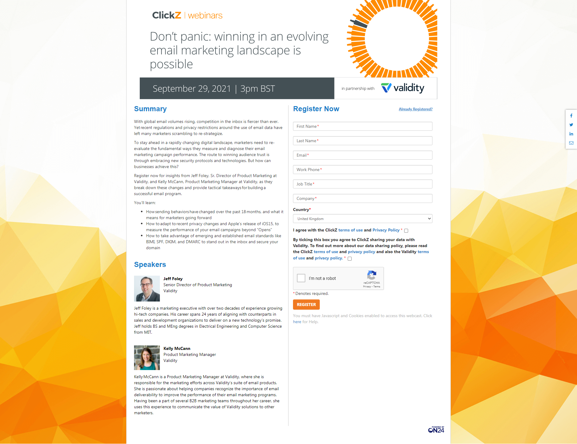
This marketing curation platform has done up this page for an email marketing webinar nicely. A vertical segmentation often makes scanning easier, and ClickZ has nailed this, with the right panel completely taken over by the brand’s visual identity.
The webinar details are neatly captured up top in a short summary. It’s always good to add the speaker details, if possible with their images, as this brand has done here. It serves to bring out an ‘event’ tone in the template.
Things We Would Change
- While the image is in sync with the overall design and in the brand color, we are not sure what it’s trying to convey. Ensure your image is serving a purpose, and then let the visuals do the talking where possible.
- Most importantly, the page hasn’t been optimized for mobile view. Considering about 40% of emails are opened on a mobile device and about 25% of webinar attendees sign in on a mobile device, it’s crucial your online event promotion is mobile-friendly on every front.
8. Paris Business School’s Case Study in Clear Design

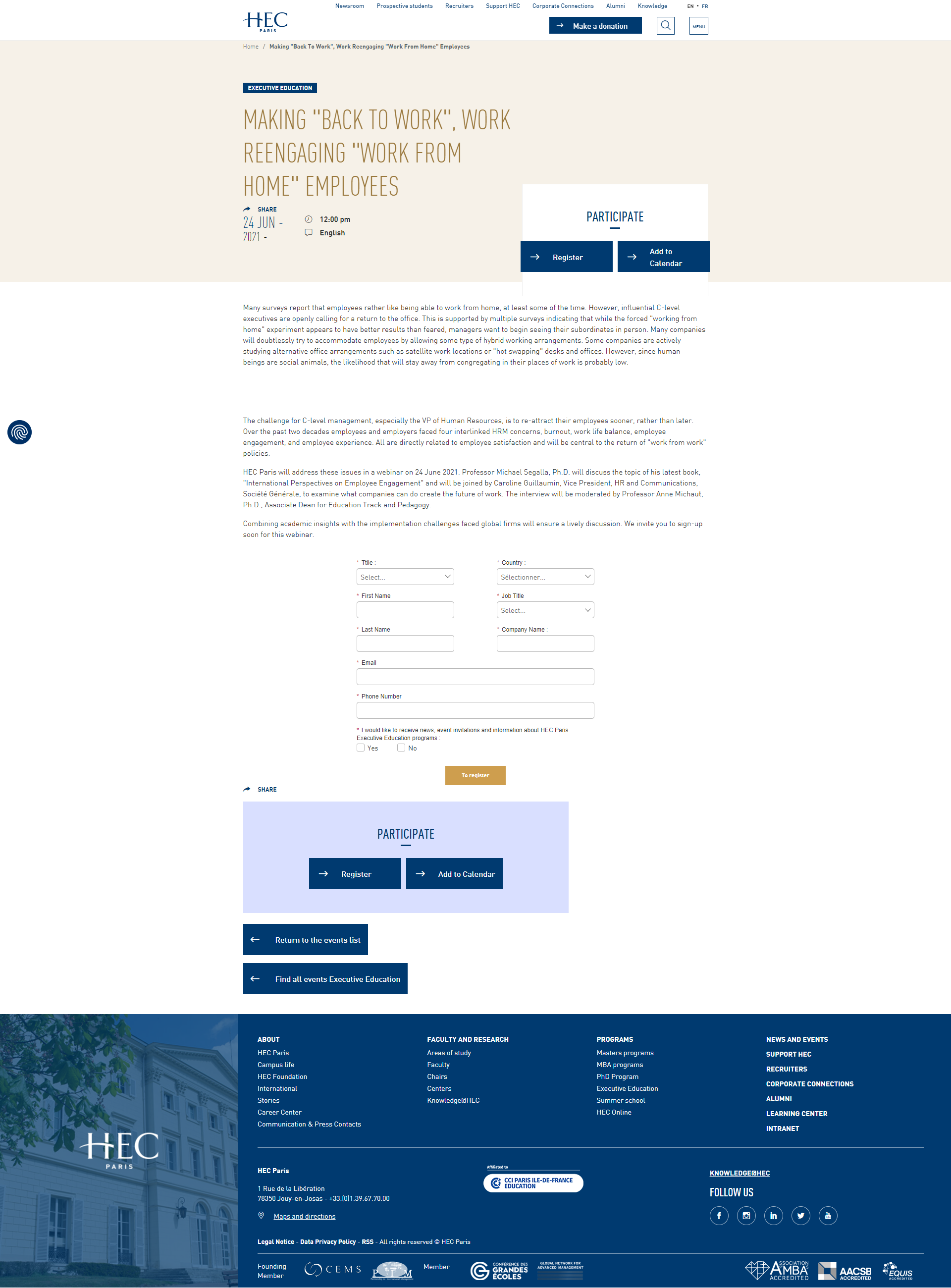
HEC Paris’ webinar invite is based on a clean and clear template with a pleasing color palette. The page view starts with helpful iconography, and this continues throughout the folds. We loved the striking simplicity of the title panel and the navigation buttons. The share button couldn’t have been better captured, and the navigation panel at the bottom is non-intrusive.
Things We Would Change
- Some of the design elements seem a little fiddly and even glitchy. For one, the language opt-in on the right-top didn’t function when we reviewed the page in mobile view.
- The design is slightly off-balance in terms of uniform spacing, particularly in mobile view.
- Considering we reviewed the page design over two months after the event, it should have some post-dated elements integrated. With research showing nearly all webinar attendees prefer access to on-demand video recordings, you can garner more leads by updating the landing page and plugging in the webinar video after the live event.

9. Education Event Page Epitomizes Elegance

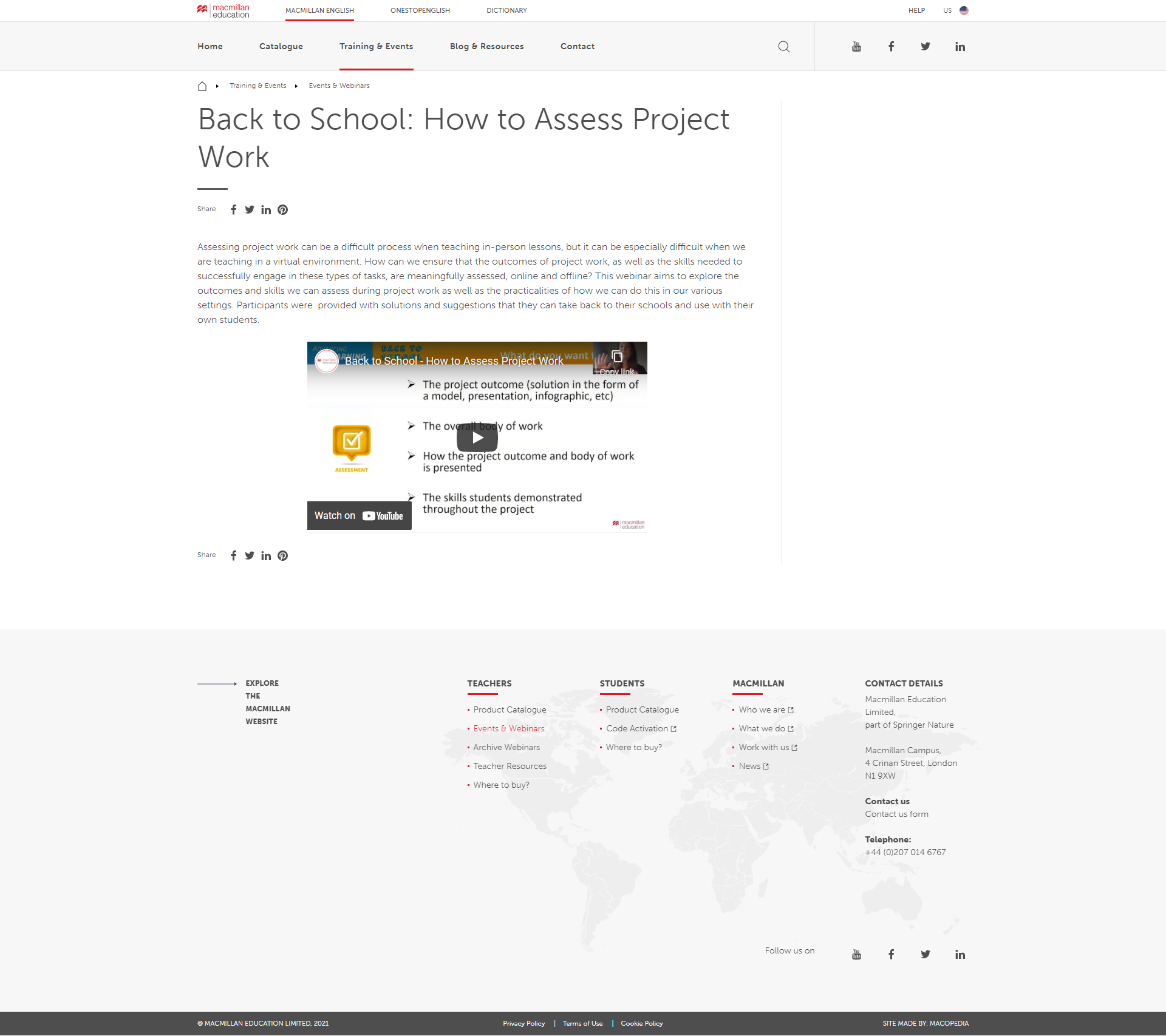
Macmillan English’s page design was one of our top favorites. It’s a clean design that includes every webinar essential. The page clarity is of a high level, particularly with the font type. The title panel, in particular, stands out effortlessly.
The social sharing buttons have been unobtrusively integrated and also repeated a few scrolls down. We also liked the slightly dynamic CTA buttons. Their two-shade design serves to grab eyeballs.
Things We Would Change
- We aren’t quite sure why the form wasn’t integrated into the primary landing page itself, with the corresponding branding you can see on the hyperlinked sign-up page. It could have been placed below the fold or on the currently blank right panel.
- There’s a grey navigation bar at the bottom in the mobile view that could have been done away with.
- Once again, the sign-up form could have been a bit shorter. It’s otherwise eye-pleasingly neat.
- Also, we would always avoid any pop-ups.
Wrapping Up
So there you have them—9 inspiring webinar landing pages that have got most things right to rake in registrations. To summarize, these 3 golden rules should guide you to design your webinar landing page:
- Keep the sign-up form short and simple.
- Make sure you’re communicating all relevant event details with a crisp, user-focused copy.
- Bring it all together with a unique design that reflects your brand identity and integrates visuals, including CTAs, a hero image, speakers’ pictures, and necessary icons.
Looking for expertly designed, responsive landing pages that record the highest conversions?
Access our exclusive services.