


Last week, Andrew King from Lyris arranged an online webinar on email marketing and we at Uplers could not hold our breath to participate in the same. Being the game changers of the email world, Uplers really relished the webinar.
It really amazed us and we thought to share the key takeaways with the rest of our disciples. Uplers at the workplace are sure that these key takeaways will help you structure a perfect email in an immaculate way.
Firstly as we all know, the Smartpshone users globally have sky rocketed. That said, the chances of your emails getting opened in different viewing environments fourfold. According to one recent survey by Litmus, Outlook still dominates the email client open rate with 18%.
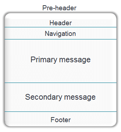
The pre – header is the first line of text and your peer header needs to be the marketing message that is designed to attract the subscriber’s eyeballs. It should be distinct and creative. The header on the other side should contain your brand elements, logo and be simplified for mobile users.
The primary message of an email should be precise so that subscribers just skim through the same and get a hinge of calls to action and other important elements of the main message of an email. The secondary message on the other side should give your subscribers additional options for clicking through. The secondary message should also consist of one paragraph and one call to action.
Ideally, the calls to action should be clear and enticing. It should be coded keeping in mind the finger targets for the mobile users. The footer of an email should be optimized with a clear unsubscribe link, website address and contact information. In case if your emails use images, ensure that they are placed properly with the correct ALT text and the text to image ratio is balanced equally or optimally.
Moreover, over and above these tips always try and see in each section individually to ensure the best results. Analyze the click and heat maps to see where your customers are presently clicking. Find out what email clients your subscribers are using – Optimize with the top email clients in mind. Actually, try using your email on a mobile device – How easy is it to navigate, read and click? Test Test and Test! A/B split test your improvements before rolling out to the entire database.
Summing up, these best practices will drive you towards designing a heavenly email that will attract a lot of opens and click throughs.
The Webinar was organized by Andrew King (@akingkiwi) of www.lyris.com
To view the webcast, please click here: https://bit.ly/17kRaTr