


No matter how limited and curated your internet surfing is, chances are that you have definitely come across a banner ad- that’s just how ubiquitous they are. What are banner ads, you ask? Well, they are pretty much billboards, except they exclusively occupy the digital realm. They can be found placed on the top, bottom, or sides of a website- essentially high-traffic locations where the visitor’s eyes are most likely to dart to- , and their primary objective is to drive greater traffic to the advertiser’s page. Using them, businesses can fetch new leads, generate click-throughs, and build brand awareness.
Are they effective? Incredibly! So much so, that ad spending in the banner advertising segment is projected to reach US $155bn this year. Banner ads can be seen literally everywhere on the internet, and this very fact itself works against them at times. For instance, as many as 33% of users find banner ads intolerable. This sort of criticism can mostly be attributed to the fact that although everyone employs banner ads, the majority of them have undercooked notions regarding their craft. If, in the past, you, too, have struggled to pocket the glowing rewards of banner ads, this article will help you identify where you’ve been going wrong. Here, we highlight 5 critical banner ad errors that you must steer clear of while you sit down to design them. Curious to find out what they are? Read on!
1. You Are Not Paying Attention To The Banner Size
Many businesses fail to obtain the desired results from their banner ads simply because they are careless while specifying their dimensions. While they must be large enough to effectively court the visitor’s eyeballs, they shouldn’t be over-the-top either. At the same time, you also have to take into consideration the platform on which you are putting out your ads. Different platforms demand different ad sizes.
Below, we have listed the most common banner sizes for Google, Instagram and Facebook Ads.
Google Ads
- Full Banner: 468 x 60
- Medium Banner: 300 x 250
- Half-Banner: 234 x 60
- Vertical Banner: 120 x 240
- Leaderboard: 728 x 90
- Large Leaderboard: 970 x 90
- Skyscraper: 120 x 600
- Large rectangle: 336 x 280
- Wide Skyscraper: 160 x 600
- Billboard: 970 x 250
The website on which you’re planning to display your Google Ads will also come into the picture while finalizing the ad size.
Instagram Ads
On Instagram, you have 3 avenues to display your ads- posts, stories, and reels. Given below are the banner size you can use for each
- Posts: 600 x 600 (holds for both single and carousel posts)
- Stories: 1080 x 1920
- Reels: 1080 x 1920
Facebook Ads
You can display your ads on Facebook as a single post, carousel, story, or collection. Take a look at the appropriate banner sizes for each.
- Single post: 1200 x 628
- Carousel: 1080 x 1080
- Stories: 1080 x 1920
- Collection: 600 x 600
2. You Are Not Placing Your Ads Right
How many leads and clicks your banner ad will generate depends a lot on its placement. As mentioned earlier, banner ads are typically put in the most high-traffic zones of a website. So, ideally, you’d want to position your ads:
- Above the fold– This is a tactic that is embraced by a large number of businesses, and for very obvious reasons. Who wouldn’t want their banner ad to be the first thing greeting a visitor as they arrive on a website? Besides, our attention spans are dwindling with every passing day, meaning the number of visitors who will scroll right to the very bottom of your page is going to get less and less with time. So, placing your ad above the fold gives it a tremendous shot at earning some visibility. Now, in the above-the-fold zone itself, you have a lot of prospective areas for placing your ad. And while all of them are equally effective, we still suggest putting your ad in the top-left or top-right corners. This has two advantages:
1. A visitor’s eye always goes first to these two positions, either to locate the site’s home button or the hamburger button.
2. Your ad will appear above the content of the page.
- In close proximity to the content– Place your ad in the region where most of the site’s content is concentrated. The underlying rationale behind this is pretty simple- the content portions of a page register the highest activity (heatmaps help quantify this phenomenon), and hence if you position your ads in that vicinity, they stand to receive maximum exposure.
- Left or right sidebars– There are broadly two ways in which human beings read sentences: from left to right or right to left. So, depending on members of which reading culture make up the majority of the website you are targeting, you can position your ad on the left or right sidebars of the page.


3. Your Banner Ad Is Text-heavy
When you hear the word “banner”, what comes to your mind? Rectangular or square-shaped papers embellished with vibrant colors and stylish visuals, right? Well, your banner ads, too, should look to mimic this aesthetic. Sure, your banner ad has to have a message, but remember, if it’s not visually enticing to begin with, its entire purpose will be defeated.
Here are some pointers you can abide by while framing your banner ad copy.
- Keep it crisp and to the point.
- Keep the sentences short and simple. Long and winding sentences are hard to follow, affecting the overall readability of your ad. Additionally, they make your ad visually cluttered.
- Write in the second person, as much as possible. This will help you establish a personal connect with the readers, nudging them to take action.
- Do not use jargon.
Now that you know how to go about the text in your banner ad, let us look at what all you can do to make it visually appealing.
- If you are using images, make sure they are of high quality. Using low-resolution images will not only impede the success rate of your ad but also dampen your business’ credibility.
- Want to go all-text and still garner attention? Implement bold typography. An evergreen design trend, it works wonders when it comes to grabbing eyeballs.
- Don’t shy away from using animation. Even a simple, minimalistic animation will surpass static visuals when it comes to engagement.
- Different colors have different kinds of impacts on us, which is why color psychology is a core aspect of visual advertising. Ensure the color you choose agrees with the tone of your message and the general mood of your ad. If you are unsure, it’s best to stick to your brand colors.
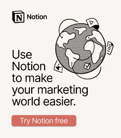
Notion’s banner ad aptly encapsulates the points we have made above. Take a look.

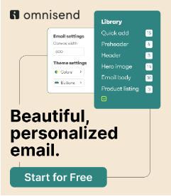
Sendinblue’s ad also makes for a brilliant example.


4. You Are Not Using The Right Keywords
Even if your copy is delightfully riotous, your ads will continue to come second to those of your competitors if they are not peppered with the right keywords. Putting keywords in your ad copy is vital as it helps it climb higher in search engine appearances.
Keywords also serve the additional purpose of infusing clarity into your messaging. Suppose, you are a seller of electrical appliances. Now, put yourself in the customer’s shoes. Say, you want to buy a refrigerator. Wouldn’t “energy-efficient” and “long-lasting” feature at the top of your search phrases? Imagine spotting the very same phrases in a business’ banner ad. Wouldn’t you be tempted to check it out, at the very least? This is how keywords increase the probability of visitors engaging with your ads.
This banner ad by Keysight drives home our point perfectly.


5. Your CTA Isn’t Impactful
Your CTA (call-to-action) is, essentially, the visitor’s incentive to interact with your banner ad. Goes without saying, if your CTA isn’t compelling enough…you probably have an idea of how that sentence is going to end.
So, onto the main question now: “How do I design a lively CTA?” We share some tips below, which you might find useful.
- Make sure your CTA button is discernible. It should be big enough, placed appropriately, and contrast sharply against the background.
- Write a brief CTA phrase. And while you’re at it, try to make use of action verbs instead of the run-of-the-mill “Click Here”, “Free Demo”, and the like.
- Word your CTA so that the visitor has an idea of where they will be led upon clicking on it. For instance, if the objective of your banner ad is to get people to check out your pricing plans, let your CTA be “Check Out Plans” and not “Find Out More”. The more transparent and clear you are with your CTA, the better the chances of visitors taking action will be.
Here are a few examples to help you better understand what we are talking about here.


Wrapping It Up
We hope the insights shared above have helped you identify the different potholes you should look to avoid while creating banner ads. Take inspiration from the examples cited above and craft an ad that will bring your business under the spotlight!