


The Internet is flush with banner ads. Thousands of brands, both old and new, invest in banner ads to reach their target audience. One can’t look at the screen without coming across at least two banner ads at the same time. This means your audience is increasingly made aware of your competitors, and is possibly moving down the sales funnel to the point of actually converting.
That’s how effective banner ads can be. They’re everywhere and they’re unmissable. And when they have been designed well and rigorously A/B-tested, they can strike oil.
Now that you have a basic idea of how banner advertising can funnelize, so to speak, a target market, it’s time you familiarize yourself with banner ad design best practices— if you want to tell people about your brand and generate leads.
Let’s roll!
1. Stick To Image Guidelines
The image is the focal point of your banner ad. In fact, the image is the ad. So, make sure you are conversant with the image guidelines. Note that the guidelines may vary depending on the display network you choose.
The guidelines will also vary depending on the type of banner ad. For instance, in the case of static banners, Google’s recommended size for landscape, portrait, and square images is 1200 X 628, 1200 X 1200, and 900 X 1600, respectively.
In the case of responsive banner ads, the size of the images you want to upload must not exceed 5120 KB.
2. Use High-Quality Images
Make the banner images immediately accessible. Don’t create hindrances in user experience. Choose high-quality images both to stand out and to streamline the viewing experience. So, avoid blurry, over-filtered images.
The following banner ad from the Global Wellness Institute uses a high-quality image.


Here’s another banner ad, from the Consumer Technology Association, that uses a high-quality image.


Often, designers are tempted to invert colors in a bid to fancify the ads. Fancier need not mean better. You want your audience to be informed of something urgent, not just enthralled by too many things at once. Ultimately, you want the viewer to act.
Remember: the banner is a means, and not the end.
So, anything that distracts the viewer from the focus of the ad is to be avoided.
3. Avoid Overlaid Logos
Because you want the image of your ad to be the sole focus, avoid overlapping it with the logo of your brand. It defeats the purpose of using a high-quality image, doesn’t it?
The banner ad is not really the place for reinforcing your brand identity so conspicuously. You have a whole website dedicated to do just that. Instead, consider suffusing the ad with your brand colors and place the logo on the upper-left corner of the banner, following the natural reading pattern— just like Zoho Creator has done it.

Don’t worry about your logo being invisible. It’s not necessarily a part of banner ad best practices. If the banner is expandable, the viewer will not miss anything.
4. Say No To Overlaid Text
Unless text is naturally embedded within the image, you want to avoid overlapping the image with additional text. A particularly risky situation is when both the banner heading and the text over your image are repetitive. That would be a big turnoff.
See how Email Broadcast has kept text and image separate.

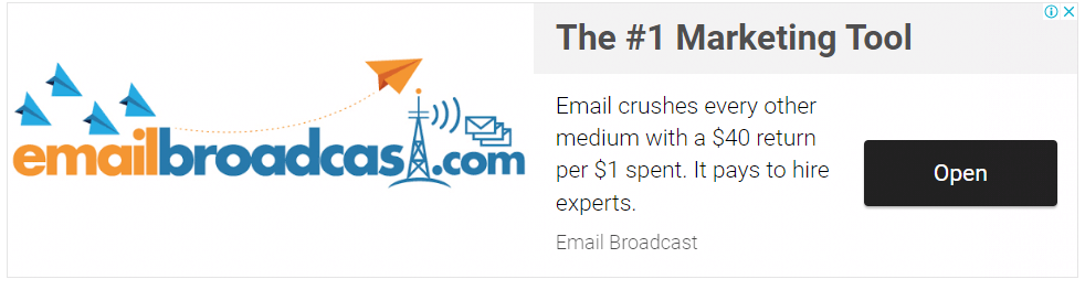
Note also that images with overlaid text will look cluttered up on smaller banner sizes.
Again, if your banner ad is cluttered up, it is not optimized for easy mobile viewing. When all the elements of the banner are huddled close together, the mobile user will not be able to tap on the CTA button with ease, if only to quit the adscape and learn about your brand on its website.


5. Take Your Time With CTA Buttons
The CTA button is the most important element of your banner ad. Successful banner ads use CTAs that are prominent, direct, and enticing.
The color of the button should be directly opposed to the background color. Make the button large enough so that mobile users can easily tap on it.
The CTA text should be concise, aligned with the nature of your message, and urgent. Drop hackneyed phrases like Click Here, Go To Website, Buy Now, etc. Instead, try using first-person phrases such as I Am Ready, I Want To Save, I’m Interested, and so on.
Sometimes, you might get copy ideas from the heading of your banner. So, if first-person CTAs are not viable for your ad, you can tailor the CTA copy to the main text of your ad. For instance, in the following Hewlett Packard banner, the CTA matches the information-dangling tone of the heading.


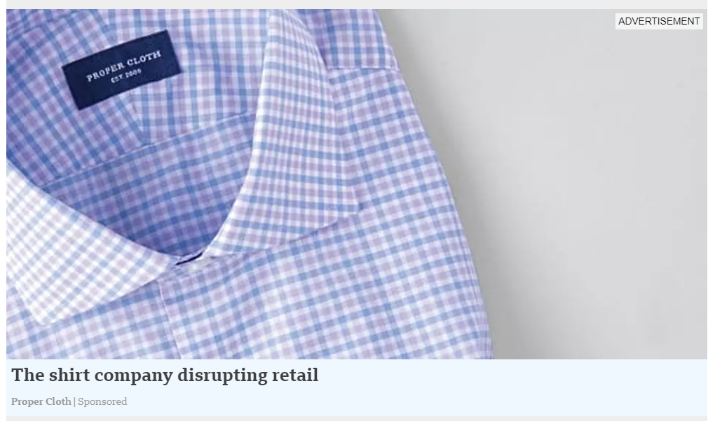
6. Turn The Spotlight On Your Product
Create banner ads that display a great product image. You only need to keep it as the focus of your ad while using minimum copy around it. Take a look at this Proper Cloth ad.

Again, Bulgari here below slays it with an excellent product image.
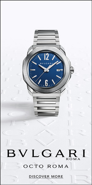
As you can see, product images are a great way to make your banner ad clean and soothing to look at. It does away with the more complex side of design and copy, while also scoring high on authenticity and reliability.
Interestingly, if your product is nicely photographed and made the center of your ad, you may use a traditional CTA text to drive more traffic. This is because the product will be the real inspiration to act, not the CTA.
7. Use One Product Image Per Ad
Google recommends using one image per ad, instead of collages. This is not often stressed in most banner ad best practices.
As mentioned before, a banner ad is the means, not the end. It acts as a portal to something larger and beyond. You only want the visitor to take notice of your business, and be acquainted with it more thoroughly and deeply on the website.
8. Avoid Compositing
Digital compositing is the technique of digitally combining multiple images into a single final image. As far as creative banner ads are concerned, Google does not recommend digital compositing.

Use organic colors and surroundings for your banner images, like this JW Marriott banner. Let the ad look natural.
In the hands of a mediocre artist, compositing, which is a highly technical process though among the most ambitious banner design ideas, may look contrived and artificial.
9. Include Special Offers And Deals
Effective banner ads include special offers, discounts, promo codes, coupons, etc. to inspire urgency. It’s one of the most popular tactics with eCommerce brands. So, if you have something special to offer, shout it out, make it known.
G.J. Gardner’s animated banner hits the right note.

Incidentally, it’s often easier to write the CTA copy around such ads. This is because the banner image, which proclaims the offer, acts like a shadow call-to-action.
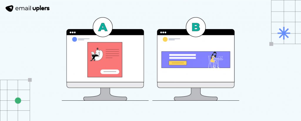
10. Test Your Ads
Just knowing how to make banner ads is not enough. Your job is not done until you have split-tested your banner ad. While it’s true that every element of your ad is optimized for higher user engagement and conversion, you cannot be dead cert about its effectiveness in the real world without first having it strained through a constructive A/B test.
Toward that end, here are some of the best practices for A/B-testing your banner ad:
- Choose only one variable at a time.
- Have a clearly defined goal of testing the variable.
- Choose a sample size that is large enough to return actionable statistics.
- Test both versions of your variable at the same time.
- Run the A/B test for a sufficient amount of time for it to yield actionable data.
Wrapping Up!
So, those were some of the best practices for banner ads.
Contrary to certain preconceived notions, banner ads are not legacy media. The fact that they are omnipresent gives a direct lie to such ideas. The banner ad is still one of the most efficient tools for building brand awareness and connecting brands with their target demographic. It’s literally the door to your business. Designed properly, you are sure to hear the knocks.