


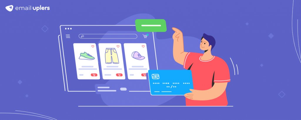
Growing up, our science classes taught us that friction is a “necessary evil”; that, although the phenomenon’s inherent nature of presenting resistance might come across as a nuisance, it is the very thing responsible for facilitating a wide variety of our actions such as walking, writing, gripping objects, and generating heat among many others. Now, those of us who graduated out of those science classes and embraced marketing might have an incredibly tough time wrapping our heads around the “necessary” part of it. As far as we are concerned, friction is the devil himself.
It is the singular greatest obstacle between our customers and them receiving the experience we desperately want them to. Naturally, a great chunk of our professional careers is focused on eliminating friction. And that brings us to this blog, which is, well, yet another step in that direction. What are we talking about in this blog? A variety of methods that will help you optimize your landing page checkout experiences and skyrocket your conversions (by as much as 35%). Excited already? Well, what’s stopping you? Read away!
Don’t Make It Mandatory For Visitors To Create An Account
Personally, I’ve found myself bouncing from a fair number of pages solely because of this reason. And I’m quite sure that I’m not the only one. For a minute, put yourself in a new visitor’s shoes- you come across a particular brand, say, via a targeted social media ad. You check out their handle and find it rather interesting. You decide to check out their website. Your decision is handsomely rewarded, for this page contains a whole lot of products that you’ve always wanted. You merrily surf through the page, filling your cart, one item at a time. Satisfied with your picks, you proceed to checkout. However, instead of the payment portal, a pop-up window appears on your screen. It asks for you to log in or signup to complete your purchase. A buzzer goes off in your head, you roll your eyes, heave a sigh of utter disappointment, and abandon, both the cart as well as the brand for all of time to come.
Don’t want this narrative to play out for your visitors too? Well, you already know what to do. Of course, brands that make account creation a compulsory part of the checkout process don’t do it with the intention of turning away visitors. They do so with the aim of generating leads. But, you see, there are plenty of other avenues to achieve that. For starters, you can always implement a time-delayed or scroll-delayed pop-up form. Feel they are too intrusive? Try out inline forms.
Look, I completely understand if none of these alternatives work for you, and you want to stick to your original idea of including account creation in your checkout experience. But, we already discussed the demerit of that approach. So, to avoid that, the least you can do is give your visitors a guest checkout option. This will allow them to complete their purchase first and create an account later.
This is exactly what Warby Parker does.

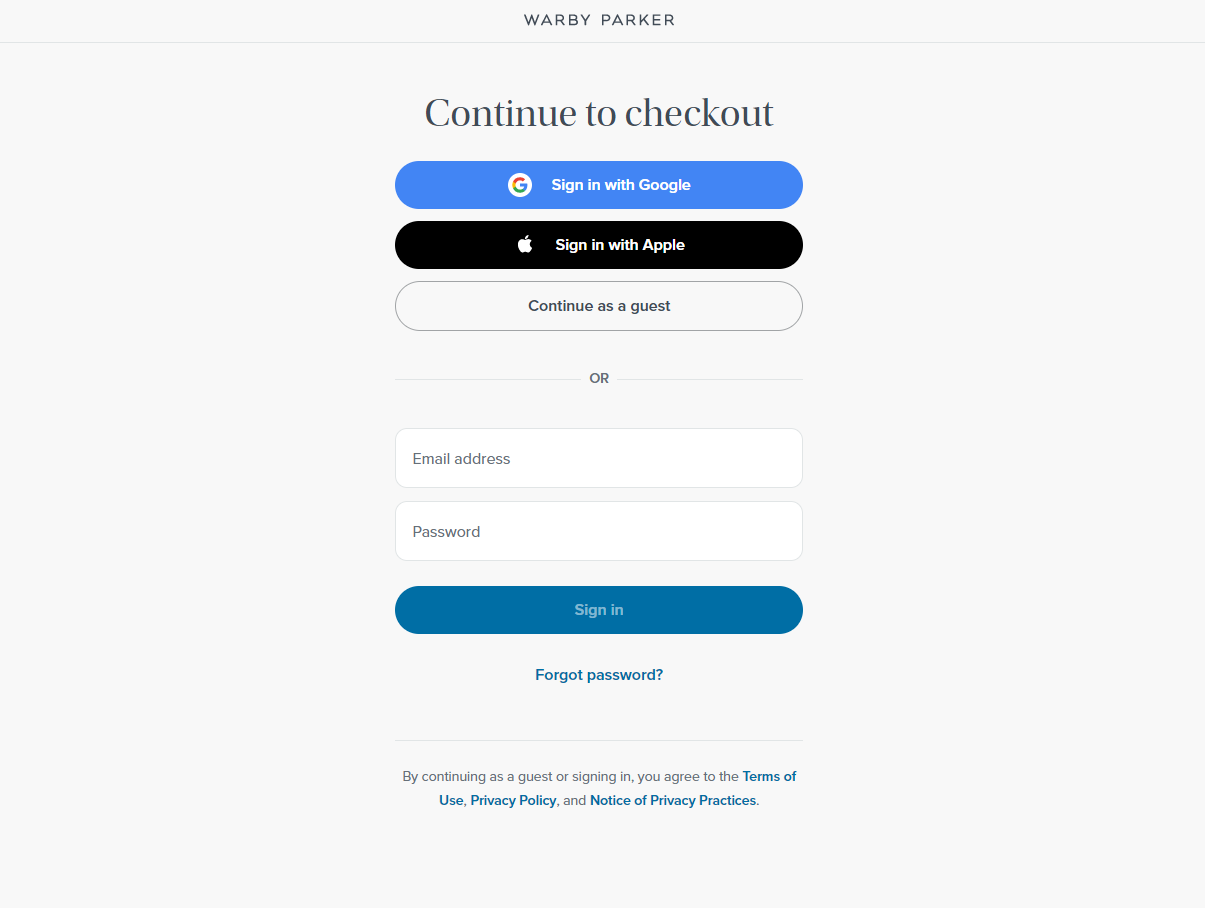
A lot of brands these days are also providing their visitors with the option of signing in with an existing Google or Facebook account (essentially, a social log-in option). This helps them obtain all the customer details they need and minimizes the number of clicks for the user, an absolute win-win scenario.
Pay Attention To The UX Design Of Your Checkout Page
Trust me, this plays a significant role in enhancing your checkout experience. After all, how will you convert visitors into customers if you can’t engage them effectively, to begin with? Nothing makes visitors abandon the checkout process faster than a flow which is incoherent.
Take a look at some factors that one ought to keep in mind while designing the checkout page.
- Loading time: Checkout pages that take forever to load are something that all of us are a little too familiar with, completely against our will, of course. Hence, one of your top priorities must be to optimize the loading time of your checkout page.
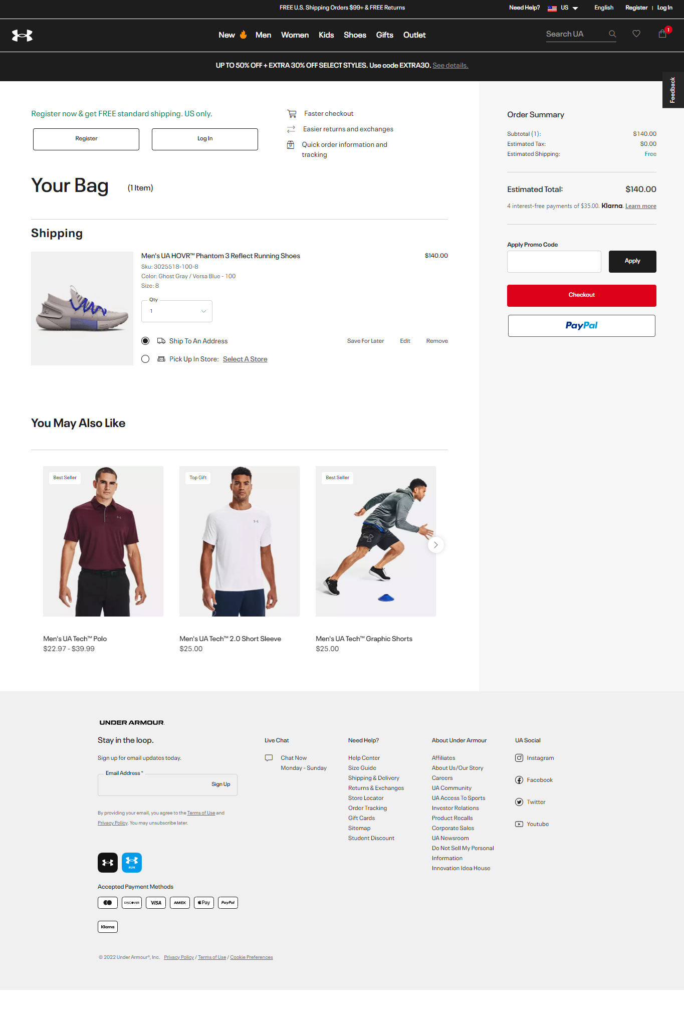
- Type of checkout page: Here, you have two options to contend with- one-page checkout pages, and multi-page checkout pages. Both, as you’d have already assumed, have their own share of pros and cons. One-page checkouts emphasize simplicity and convenience and are well rewarded for the same, registering a 21.8% higher conversion rate than multi-page checkouts. However, because they keep all the information on a single page, they tend to overwhelm visitors on occasion. For the same reason, their loading times tend to lean towards the higher side.
Under Armor delivers an ideal illustration of a one-page checkout page.

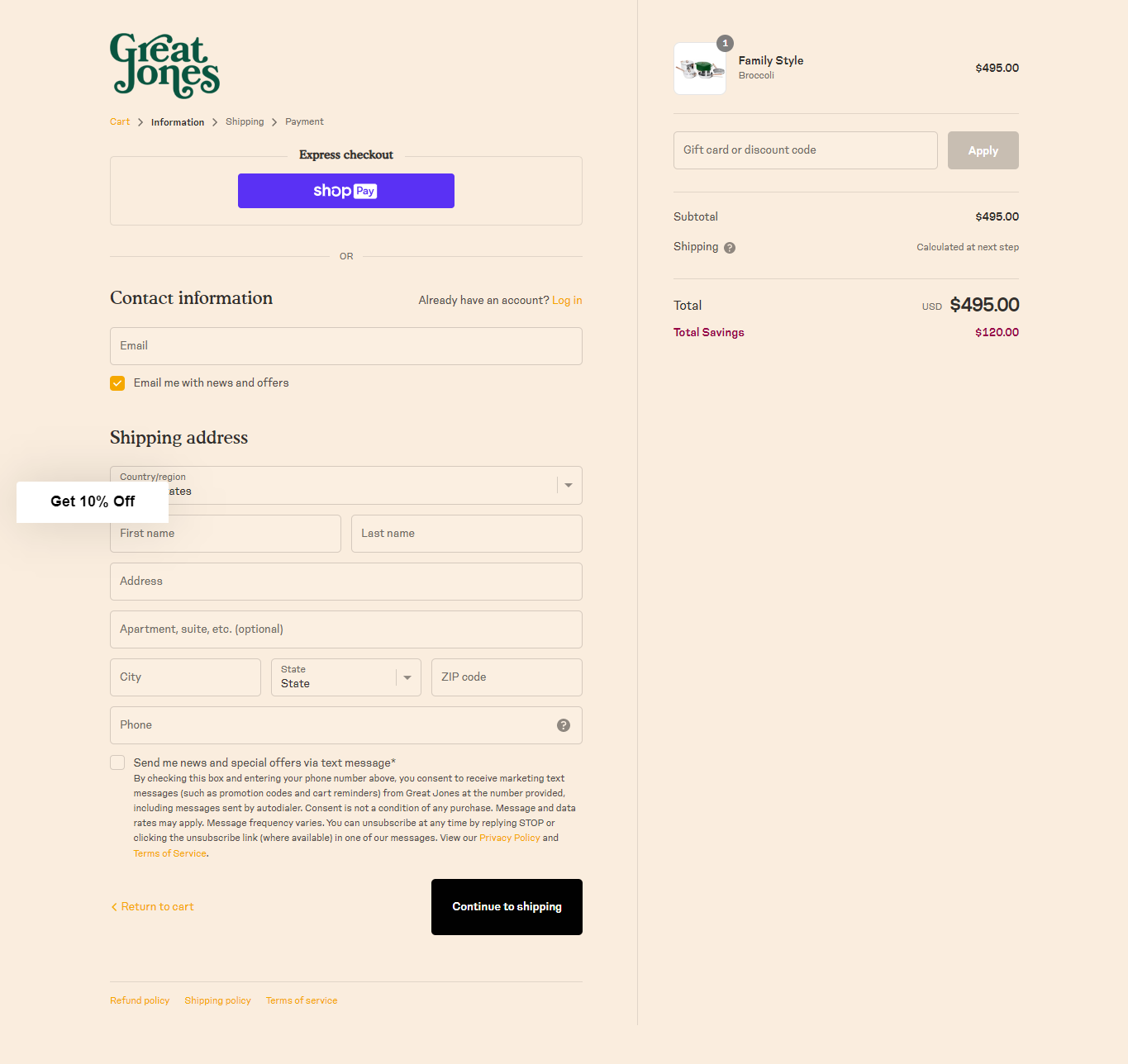
Multi-page checkouts, on the other hand, phase out the checking out process across multiple pages, making the data collection process smoother for you. Their greatest foe is, unfortunately, their very design. The more the number of steps in the checkout process, the lesser the chances of conversions.
A good example of a multi-page checkout page is that of Great Jones. Take a look.

- Number of information fields: Only focus on keeping fields that ask for essential information from the user. In most cases, this is covered by name, contact number, and address.
- Variety of payment options: One of the best ways to increase the convenience of your checkout process is by offering several payment methods to your visitors- debit card, credit card, PayPal, Apple Pay, interest-free credit lending, everything.

Make Sure There Are No Hidden Fees
How many times have you abandoned a cart simply because the price of your item jumped from $200, suppose, to $240 as you moved from the product page to the checkout page? As a matter of fact, hidden fees are responsible for a good 49% of shoppers ditching their carts. The ideal course of action, thus, is to be absolutely upfront regarding shipping costs, convenience fees, taxes, and any other additional sum that might come into the picture. If possible, try to give this clarity to your customer even before they start populating your cart. For instance, most brands these days allow buyers to hover over the displayed products; this lets them view the products from multiple angles. In one of these frames, you can consider disclosing the product’s shipping and packaging fees. This way, the buyer knows exactly the amount they have to pay at the final step.
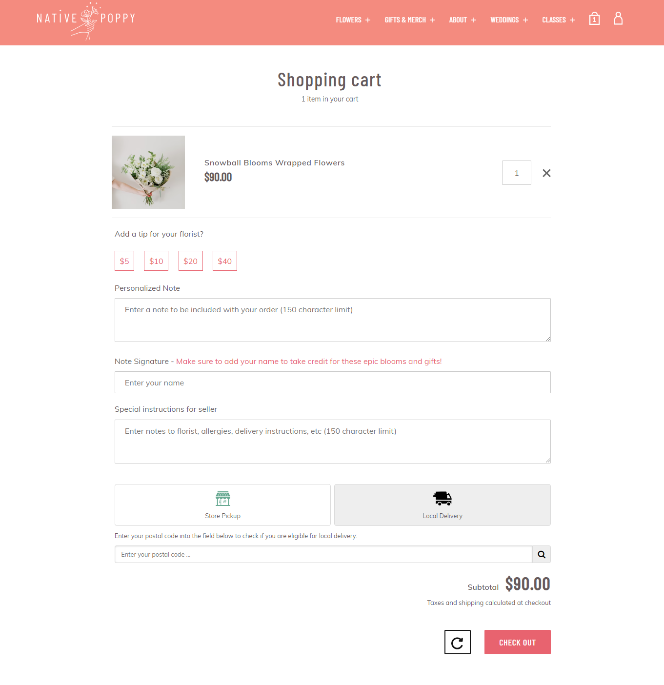
That said, it is only sometimes possible to state the shipping fees at the outset. This is because a lot of the time, it depends on the customer’s location, a detail you won’t be able to gather before the checkout process. So, do we wait till the checkout window to spring this cost at the buyer? No, there’s a simple workaround. Just inform them that the shipping cost will be calculated at checkout.
Native Poppy have taken this route with their checkout page.

Want to make things more transparent? To this statement, hyperlink a shipping rate table which contains prices corresponding to each region you deliver. Now, coming to taxes. It is best to work them into your product pricing than adding them as an auxiliary fee later on.
Prioritize Responsivity And Accessibility
92.1%– that’s the percentage of users who make use of a mobile phone to access the internet. That’s a sweeping majority, you’d agree, no matter how your scale is calibrated. This makes it imperative for you to make your checkout page mobile-friendly (and while we are on the topic, a gentle reminder to make your landing pages responsive as well). Once your design is sealed, check that it renders well across both desktop and mobile devices. Overlooking this will have you dealing with an unhealthy number of abandoned carts.
Some fundamental things to take into account to ensure your checkout page is responsive:
- Use a single-column layout. This not only makes for convenient scrolling but also allows you to steer clear of issues that a multi-column layout invites, such as overlapping columns, overflowing text, and misplaced images.
- Make sure the buttons are not too small. Your website is likely to have several buttons corresponding to different actions so size them as per their priority (the greater the priority, the bigger the button size). All in all, it’s a good practice to keep your buttons in the range of 42-72 pixels. On top of that, look to it that there’s ample spacing between two successive buttons.
- Optimize images, if any, on your checkout page. Otherwise, it will end up affecting the loading time of your page’s mobile version.
- Try to enable predictive text for the forms on your checkout page.
Other than making your page mobile-friendly, you must make it accessible as well. At present, nearly 1 million people in the world have some form of disability. The importance of adhering to accessibility best practices, therefore, can’t be overstated. Listed below are a few for your consideration.
- Add HTML labels to form fields. This will help screen reader users understand which label corresponds to which form field.
- If your page has a set of related form fields, group them together.
- Maintain ample contrast between your background and foreground elements.
- Check if your page can be navigated, and all its features, accessed, without a mouse.
Wrapping It Up
A sub-par checkout experience can ruin the hard work put into your landing page and get in the way of you driving higher conversions. We hope the insights above will help you take the necessary measures to deliver an unparalleled checkout experience to your buyers.