


Sometimes prayers work real fast. On 14th September 2016, Uplers had released an article on various HTML email hacks while coding for Gmail and we were hopeful for a miracle. As a recent update, Developer page of Google came out with news that sent shockwaves around the email marketing world.
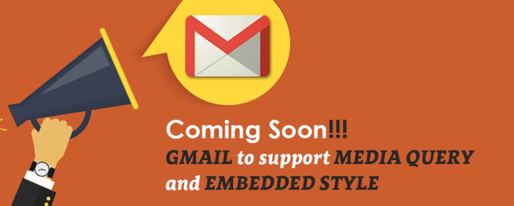
Google Announced Embedded Styles and Media Query Support …
What does this mean for your subscribers?
This bold move from Google is all set to translate into a very well-developed end-user experience. With media queries being supported, Gmail (mobile and desktop) and even inbox can easily display responsive emails. So, no more squinty eyes and constant zooming in and out (who has that patience!!!) to read the miniature text incase the desktop layout of your email is displayed in their mobile or Gmail automatically bumping up the font by up to 50%, thereby destroying your email design and many such catastrophes.
What difference it would make in the way emails are built in future?
Even though Google has been playing cat-and-mouse assuring that Gmail supporting media queries is a priority since 2 years, the announcement on their app developer blog is a sign of Google actually implementing media query support and adopting of embedded CSS styles in Gmail is an added bonus.
No more Hybrid emails
Nothing is written in stone but the code written for any responsive email shall work in Gmail too. To emulate responsiveness in Gmail, email developers code first without media queries and then enhance it using media queries to get set in hybrid layout. This will no more be required as simply using media queries would now support responsive emails.
No more mobile-first
Thumb rule for developing any email was to be mobile-first approach, keeping in mind that Gmail often renders the desktop layout in mobile. That’s how the design was restricted to either single or max two columns.
No more Outlook DPI v/s Gmail conflict
In large displays (23” and above), Outlook often wreaks havoc to email layouts. In such cases, the emails are coded using fix widths on all elements. On other hand for Gmail app, without media query, it was mandatory to let elements in percent to allow them to float and stack in mobile or smaller screens. So DPI for outlook can never be mixed with Responsive in Gmail app.
Stylesheet support
Gmail earlier stripped away classes and IDs and this meant individually providing inlining for every line of code that we wish to style. With Gmail supporting embedded styles, any change in the stylesheet in the <head> shall be reflected in the body of the email. Thereby reducing the overall coding and in turn reducing the file size of email significantly.
Changing content on Gmail app on mobile layout
Now the prospect of a separate mobile layout of the same email wherein different elements to be shown on mobile would be possible, to make it more appealing or clickable. For example, showcasing CTA on top in mobile which might be at bottom in desktop can now be achieved using different content on mobile and desktop.
Background position Support
Uplers had also pointed out the lack of support for background-position. Even though not supported by Outlook, but it shall be good to experiment with responsive background with support on Gmail desktop and Gmail app.
Some expectations from Gmail new update apart from above:
- Support of Radio buttons, checkbox and interactive elements since new Gmail version promises media query support and <style>.
- Support of iOS Gmail app not increasing the font size automatically; this would help render a good responsive email in iOS gmail app as its suppose to.
- Support of Fonts, Google fonts, Websafe fonts using Fontfact or import allowing fonts to get inline and thus render on gmail app.
- Unlike Yahoo, it won’t restrict CSS or media queries selectors to be defined separately.
- Hoping to remove the 102kb limit of emails. Emails are getting converted to “mailable websites” and the chances of code being heavy are higher, so to avoid any clipping, the limitation on 102kb needs to be increased and thus entire email can be viewed irrespective of it’s height.
- Non-Gmail id configured on gmail app would now start supporting background images
- Patching up one issue should not give birth to a new issue. i.e. Hoping developers don’t need to find out hacks to the new bugs that may arise with new updates on Gmail and Gmail app
Wrapping Up
We Uplers dream of a time when all email clients shall offer WYSIWYG (What you see is what you get). No email should be unsubscribed due to poor layout rendering. Spare your thoughts on how excited you are on Google’s newest advancements.