


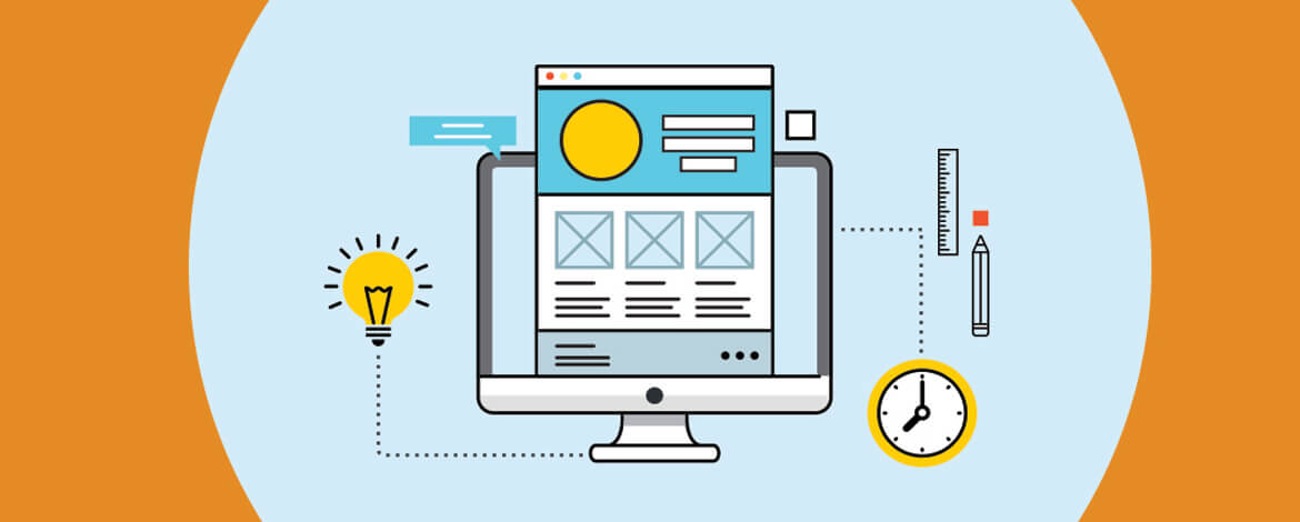
Best things in life always come in pairs – Mac and Cheese for dinner, Red wine and candlelit dinner for a romantic evening or Starsky and Hutch for a great detective action. Similar is the partnership between an email campaign and its associated landing page. One is incomplete without another.
While we have been talking about the leaps and bounds that email design trends have achieved in the past year, it is equally important to learn about how different brands have been revolutionizing the Landing page design trends frontier.
Current trends in Landing page design
#1 Two tone gradient backgrounds


Click on the image to check out the page
By creating contrasting backgrounds, designers enhance the focus on the object in the foreground. By adding a two-tone gradient as the background color, the focus is not diverted from the foreground, yet the visual appeal of the background stands out. Additionally, Whimsical added plain geometric shapes to add extra visual appeal.

#2 Ample use of white space


Click on the image to check out the page
Whitespace is a designer’s best friend as it speaks volumes with nothing. In the above landing page by Logomaster.ai, the first fold is a distraction free user interface. Moreover, the headline straightforwardly answers the question the visitor has, and it easily converts the visitor by prompting them to try their services with a single field form.
#3 Illustrations

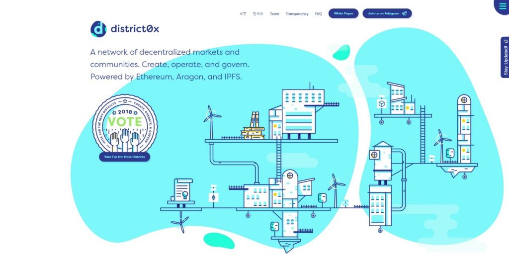
Click on the image to check out the page
Websites tend to use stock photographs for showing their products and services, but these photographs get handicapped when representing certain abstract and conceptual ideas. In such situations, illustrations are the super heroes through which the visitor can better visualize your concepts. This landing page by district0x, has used a background with geometric shapes (trend #1) spaced evenly with ample white space (trend #2) to highlight their illustration.
#4 Zig-Zag layout

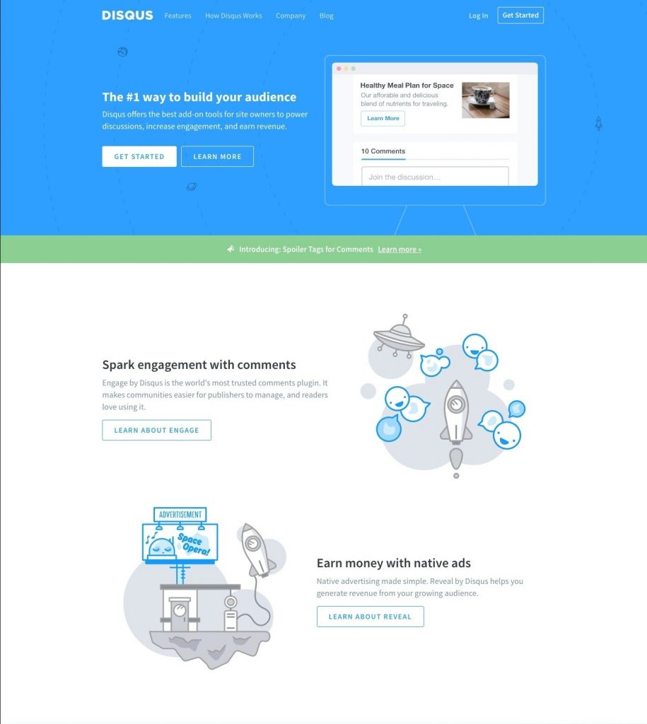
Click on the image to check out the page
Visitors tend to scan through your page content in the hope to find keywords that answer their concerns. Based on several tests performed, it was determined that people generally tend to follow a ‘F-shaped’ pattern. So, by placing your content in a zig-zag layout, your visitors will have an easy eye-scan path, thereby facilitating their search. Disqus’s Landing page has a background with geometric shapes (trend #1) spaced evenly with ample white space (trend #2) to highlight their illustration (trend #3) with a zig-zag layout for easy reading.

#5 Headlines That Answer “I want …” or “I want to…”

Most of the visitors will reach your page in the quest of finding an answer that starts with “I want…” or a variation of it. By molding your headline to answer such queries, you significantly reduce the bounce rate and in turn improve conversion rates. This landing page by Uplers has a bold headline that connects with the prospects as soon as they visit the page.
#6 Subtle opt-in request forms
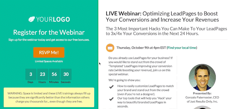
Subtle two step opt-in forms are the best way to get refined leads. Brands are becoming conscious about the way they are requesting email addresses. With a two-step sign up trend, brands use a button or link on the landing page, clicking which the visitors encounter a new opt-in form. The visitor may also be redirected to a new landing page with a detailed form. This landing page from Leadpages pops-up the form when the visitor clicks the RSVP CTA button. This way only those who are genuinely inclined on attending the webinar will register.

#7 Parallax Scrolling – Curiosity, Surprises & Fun

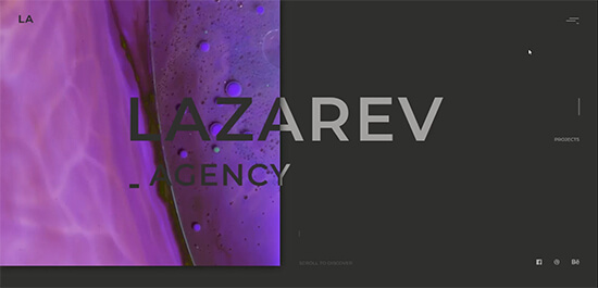
Click on the image to check out the page
Apple introduced parallax scrolling wallpapers in their iOS 7. To the uninitiated, parallax effect means that when a user moves their device, a quasi-3D effect adds depth by moving the background wallpaper and icons in the direction of movement. Parallax effect in websites generally moves the elements in sync with the visitors’ scrolling behavior. With Parallax scrolling, you have multiple advantages right from the product presentation, fun background movements, interactive design to drive engagement with action triggers and much more.
With the 3D depth illusion, advanced story-telling, floating images and improved UX, Parallax is most certainly making the websites more vivacious and turning out as a robust fad followed by developers this year. In above example by Lazarev Agency, the elements move symmetrical to the mouse movement and creates an optical wonderland.
What are the best practices
- The headline of your landing page needs to match the requirement that brought visitors in the first place.
- Use directional cues to direct attention to your CTA (arrows or photos/videos of people looking or pointing at your button).
- A landing page should only have a single purpose and hence a single focused message.
- Show your product/service being used in context.
- Use video. It is better to have an explainer video than a paragraph of text.
- Use real testimonials for authenticity.
- Show social proof via indicators of your social status.
- Always A/B test. Preferences and liking don’t stay the same for long. Let your customers decide which message works best for them.
- Try-before-you-buy is a standard and expected feature.
- Provide a guarantee and trust seals to build trust.
- Simplify your copy using bullets.
- A preview of your deliverables is a great way to increase trust.
- Segment your traffic source.
- Never send your traffic to your homepage. Always use a landing page!
Key factors while designing
- Use a clear and concise value statement so visitors understand the purpose of the page immediately
- Use conversion design rules to make your CTA stand out (whitespace, color, contrast, directional cues)
- When using a form to collect data, balance the amount of information requested with the perceived value of the item being given in return (report, eBook etc.)
- Have terms & conditions, privacy policy, at the footer itself.
Wrapping Up
Trends are like the sand dunes, ever changing with the incoming winds of time. Yet, it is a good idea to have a pulse of ongoing trends to help you design better converting landing pages. If time is a constraint, keeping you away from innovation, give Uplers a try. Our able and efficient team can design and code your landing pages as per your requirements and that too in short TAT.