


As humans, we love getting options along with the power to choose. With time, emails too are changing as their technology is innovating. Thus, marketers are making optimum use of both these factors and are creating emails that are more interactive.
A lot of brands have incorporated these changes to boost their ROI, and why not? Email statistics claim that over one-third of the worldwide population will soon be using email by the end of 2019.
With studies showing the attention span shrinking, standing out has become a ‘necessity’ today. Grabbing the attention of the subscribers and keeping them engaged has become a challenge. Also, it’s important to try to squeeze in maximum information (brand, offer, deal, etc.) and exhibit it in a short span of time.
That’s the reason why ‘SLIDERS IN EMAILS’ were introduced. Sliders come with no limitations except for the compatibility. Thankfully, all major email clients such as Apple and Thunderbird support sliders, making it a popular element for an interactive email.


Burberry Revolutionizes Interactivity in Emails with Its Slider
Burberry, a luxury fashion brand has been experimenting with sliders in their emails. The Uplers take this opportunity to understand the design and effect of ‘sliders in emails’.
But first, let’s take a closer look at Burberry’s emails of 2017 and the transformations their emails underwent while going the interactivity way. Here’s an email by Burberry that hasn’t integrated any interactive elements at all.


Fig. Burberry email without any interactivity
This Burberry email has a clean and simple design. But the absence of a CTA in the first fold can affect conversions. The email, overall, looks pretty plain and directs to the CTAs. The problem is that the CTAs aren’t highlighted separately and sort of just merge in with the text.
Now let’s take a look at an email that’s integrated with a GIF.


Fig. Burberry email with GIF embedded
Given above is an example of an interactive email with a GIF, by Burberry. The email depicts the unveiling of their February Collection on the runway. The email displays the products in glimpses through the GIF. No major details of the products are provided. There are two CTAs at the bottom, one that directs the recipient to ‘shop the looks’ and the other to ‘watch the show’.
Now, let’s check out the below example of Burberry’s email with an embedded interactive slider.
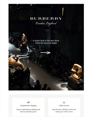

Fig. Burberry email with interactive slider embedded (Click on the email to experience the interactivity)
As observed above, Burberry has a simple and clean email with a clearly visible single CTA above the fold. As the recipients scroll further they come across the slider. This slider helps compile and display a wide range of the products. In case the recipient is looking for more detailed information, they have provided a ‘Watch the Video’ link at the footer of the email.
GIF VS Sliders – In Emails
In general, GIF animation and Slider both are completely different. But when it comes to displaying multiple images, they do the same job.
For Links: If you create an image slider with GIF, then only one link can be placed on all the images used in the GIF. Whereas in a CSS slider, individual links can be placed on all the images used in the slider thus giving a broader canvas to showcase.
For Rotation: If the slider is created using GIF then the images will change as per a regular interval set while creating the animation. On the other hand, the CSS Slider in the images can be changed as per our free will by clicking on the CTA/page.
File Size: Adding more images to the GIF slider will make the GIF animation heavy and thus lead to more load time. Whereas in CSS slider, adding more images will not make much difference in loading.

Quick Recap – Benefits of ‘Slider in Email’
- By including a ‘slider in email’, Burberry could showcase more in less space along with attractive details. The subscriber can directly click on the product (on a slide) they like or want and can be directed to the relevant page. This serves the purpose of multiple CTAs without being too pushy on the recipient.
- A slider helps major industries to easily showcase products, offers, and features in one go without occupying a lot of space.
- The brand can entice the recipient with attractive images.
- It’s great to generate curiosity and give a snapshot of the new products or offers. This results in better conversions and lead generation.
- Adding more images in sliders will not make any difference in the page load time.
- CSS Slider in the images can be changed as per our choice by just clicking on the CTA/page – thus increasing interactivity.
Have you tried sending Sliders in Email, proving less is more?
If not, then grab the opportunity now!