


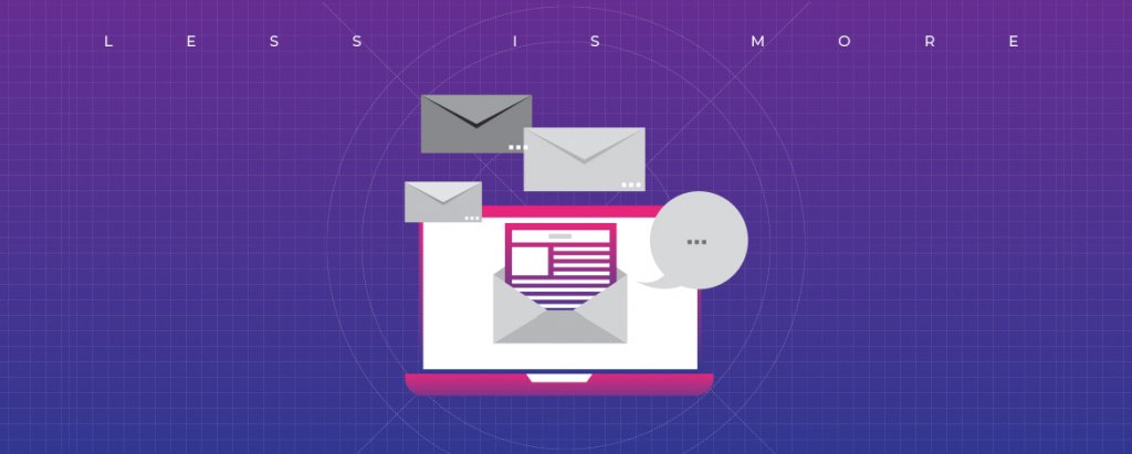
The niche and size of your operations, notwithstanding, if you run a business, you have to connect with your audience and create a buzz around what you’ve got to offer. And email marketing remains one of the most effective channels for establishing direct, one-on-one communication with your customers. To make the most of this marketing channel, you need to ensure that your email stands out. That requires more than a crisp copy and great content – you need to create a great template design! The design plays a crucial role in making your email engaging, eye-catching, and hard-hitting. And minimalist email designs stand out in this regard.
In this blog, we explore why minimalist email design is an evergreen trend and why exactly ‘less is more’ when it comes to designing emails.

Why Minimalistic Email Design is Timeless
With a smartphone in almost every hand and high-speed digitization all around us, we live in an era of information deluge. As information brims over and attention spans reduce, keeping the email design minimalistic has emerged as a sure-fire way to grab eyeballs and get your target audience to engage with your content.
A study indicates that nearly 54% of emails are now accessed on smartphones. When most users view your emails on-the-go, fast-loading, and well-rendered designs with the ease of navigation are the needs of the hour. Imagine a user scrolling through your email while traveling to work or catching a coffee break. Will they have the patience to wait for the message to load and then scroll through lengthy text embedded in a complex design? No, in all probability.
To prevent your communication from being consigned to the trash bin before the message has registered with the recipient, leaning in favor of minimalism is your best bet. Emails with clean and edgy designs have a calming effect on the reader, allowing them to engage more proactively.
You can embrace the less is more approach by doing away with the clutter and focusing only on the crucial aspects. This practice can effectively steer your recipients toward the essential part of any emailer – the CTA.
Beautiful yet simple styling combined with brilliant typography and a visual hierarchy is the core ingredient for delivering on compelling user experience.
5 Best Practices for Creating Minimalistic Emails
Marketing professionals swear by minimalistic email designs because they deliver your message in a simple yet beautiful and enticing manner. Your target audience not only comprehends the message quickly but also feels motivated to take the desired action. To create such clean yet impactful emails, here are a few best practices to bear in mind:
1. Smart Use of Negative Space
Negative space, or white space, provides visual relief and promotes ease of reading. Minimalist email design is one that uses this negative space smartly to balance out the design elements and negate a sense of clutter.
2. Clean Typography
Using a mix of fonts in varying sizes may sound good in theory, but it often proves counter-productive. Clean typography with a limited variety of fonts is the hallmark of a clean and clear design. Choose a font that aligns with your brand image and place your text such that it renders well on different devices.
3. Colour it Wisely
Monochromatic color schemes are a classy choice that blends well with the whole minimalistic approach. However, this does not mean that you absolutely cannot use bright, funky colors in your emails. If that’s something that resonates with your brand image, by all means, use it. But don’t go overboard. The smart approach is to use colors to draw attention to the most important elements of your message.
4. Don’t Make it Text Heavy
The whole concept of minimalism rests on less is more. This also applies to the text you incorporate in your email design. Try to keep the copy crisp and concise. You can use infographics and icons to include additional information. These are eye-catching, convenient to read, and used to guide your recipients toward the CTA.
5. Create a Visual Hierarchy
The effectiveness of an email rests mainly on its structure. When taking the minimalistic approach, pick a few elements, and arrange them such that your subscribers’ attention is instinctively drawn to the most important part of your email.
5 Inspiring Designs that Can Turn Around Your Email Campaigns
Now, that you have a fair idea about what it takes to create minimalist emails, let’s turn to the pros, who have been nailing this approach steadily, for some inspiration:
1. Keep It Simple

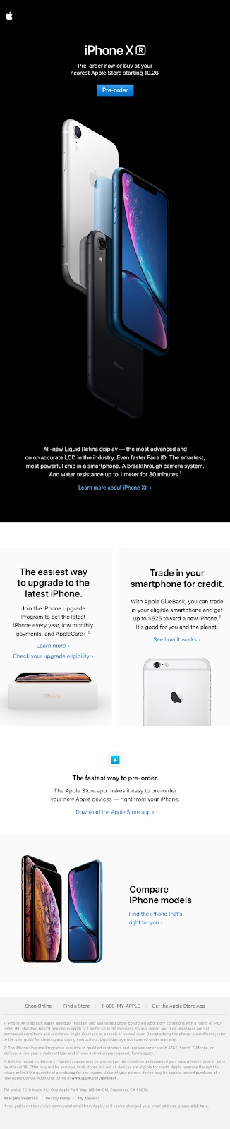
Apple has been nailing the minimalistic emails consistently. All the brand’s communication rides on simple fonts, eye-capturing images, and clean design. This email is no exception. You see how the image of the iPhone X stands out to make the product seem aspirational. The negative space underneath has been used smartly to create a contrast and pack in the message. The choice of fonts and visuals and their placement create a clear visual hierarchy, telling users exactly where they need to focus.
2. Leverage Visuals


This email campaign by Film Supply is proof that you can load up on visual elements and create a minimalistic design. The CTA is prominently displayed, and the featured image complements the messaging of the email perfectly. This is the kind of email design that is sure to tempt the readers to give it a second look because it appeals to an inherent instinct of associating joy with travel. The fonts are bold, but the use of white is a smart choice as this makes it easy on the eye.
The images and text have been arranged in a fashion that creates a clear visual hierarchy.

3. Monochromatic Colour Schemes

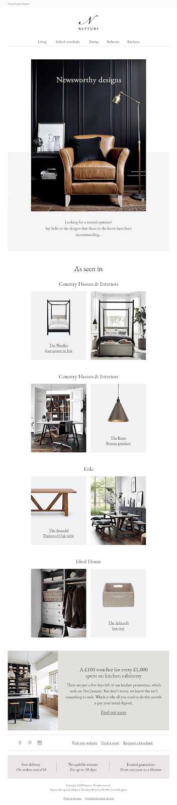
Monochromatic colors – whites, blacks, and greys – are your best friends in creating a minimalistic design with an uber-chic appeal. Look at this newsletter from Neptune. The cool greys interspersed with the generous use of whites give it a modern look that would appeal to the aesthetic sensibilities of the target audience. There is no heavy text or overpowering color blocks here. The tan-brown chair, the highlight of the email, stands out as the color creates visual contrast with the monochromatic background, instantly capturing the readers’ attention.
4. Add a Fun Twist with Animations

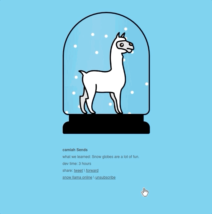
Animations can be a fun and quirky way of capturing your audience’s attention and impacting their memory. This minimalistic email design by Camiah delivers a simple and clear message using a creative animation that is endearing and memorable. The objective here is to get the target users to engage with the brand through social media shares, which they’re likely to act upon organically. The clear, uncluttered background in a bright color ensures that the readers’ attention is focused where it matters most – on the animation.
5. Smart Use of Color Blocking


What if your email has more than one principal component? Color blocking can be an effective way to separate the messaging in a single email without making it look too cluttered or confusing. Besides, it can augment the visual appeal of your design. For instance, this email newsletter from Flock used a mix of bright colored blocks, juxtaposed with the right amount of negative space, to convey a mixed bag of messaging and CTAs. From website clicks to retweets and brand messaging, everything is packed into a single email without making it look jarring or off-putting.

To Wrap it Up
Email marketing is continually evolving to cater to changing customer behavior. By embracing minimalism as an ideology, you can assume a position of dominance in your email marketing efforts. It places you in a position to control the readers’ eye movement and decide which aspects they pause and stare at. Besides, fewer elements and clean design will save you the trouble of overhauling your email marketing strategy every time a current trend goes out of style.
At Uplers, we understand the nuances of navigating through the challenge of creating engaging email campaigns. As a leading email marketing agency, we help you create impeccable and minimalistic email designs with editable modules perfect for automation.
Learn more about how we can help you join the ranks of power email marketers with the help of automation.