


For every campaign that email marketers roll out, a considerable time is spent selecting and finalizing the design for the same. And that’s perfectly warranted. After all, design, in many ways, is pretty much the life of your campaigns. You could fill up your emails with all the elusive information and products or services you like but it won’t attract any attention unless its design is upto the mark. In this blog, we talk about one design trend which is well-adored by marketers and audiences alike- monochrome. In monochromatic design, designers use a color scheme that revolves around different tones and shades of one base color.
With the rise of minimalism, more and more brands seem to be turning to monochrome design palettes while developing their assets. It helps them achieve an unfussy and sophisticated look, while simultaneously inviting greater engagement from their readers. Thinking of incorporating monochrome design into your own emails but don’t know how to go about it? Well, we’ve got you covered. In today’s blog, we share with you a bevy of stunning monochrome email inspirations that will surely fill you with more than enough ideas for your future campaigns! Make sure you have your email scrapbook handy because you’re surely going to want to pin these.
Fenty Beauty
Subject line: NEW Fat Water Milky Toner Essence quenches thirsty a** skin

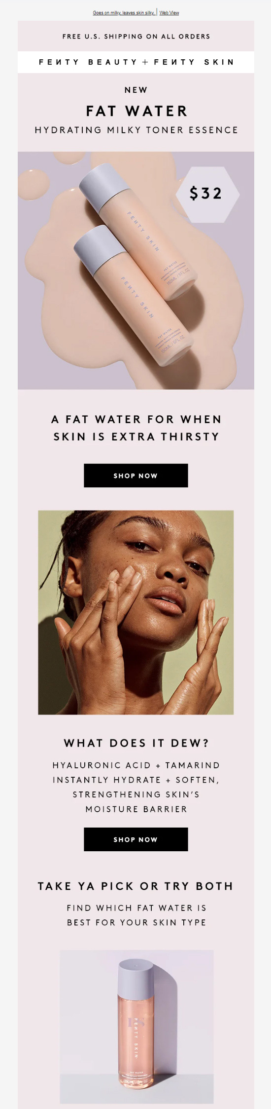


Lining your email’s color palette with that of your products is a great tactical move and that’s precisely what Fenty Beauty have done over here. As soon as the reader opens the email, the hero section shows them the product. Here, one gains familiarity with various aspects of its appearance- shape, size, and most importantly, color. Now, by using a similar shade for the email’s color palette what Fenty Beauty essentially does is keep this familiarity intact for the readers. This, in turn, goes a long way towards keeping the recipients’ attention in place, ultimately nudging them towards taking an action.
Another aspect that we’d also like to discuss here is the presentation of text in this email. Though scarce, they’ve been set up in all caps to ensure that whatever information they’re trying to convey gets across to the reader loud, and clear.
Hoefler and Co.
Subject line: Fonts for Tight Tracking

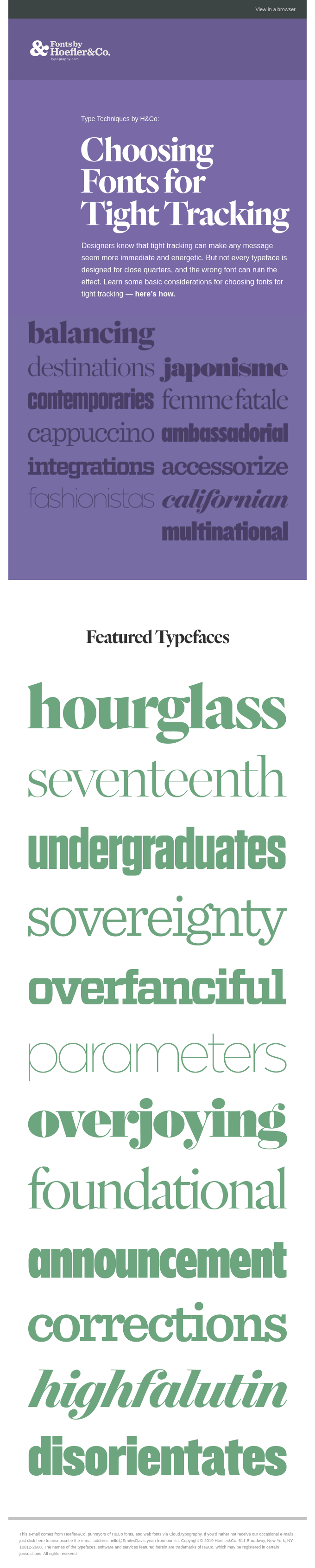
A single glance at Hoefler and Co.’s email over here is enough to tell you that they are absolutely on top of their email design game. I mean, you wouldn’t expect anything less from a font design studio, wouldn’t you? Here, they are talking about “Choosing Fonts for Tight Tracking” and so captivating is the design that the reader will find it incredibly tough to bounce from the email before having scrolled down right to the very end.
The hallmark of this design is, of course, the purple-shaded monochrome. Denoting royalty and sophistication, the use of purple here helps the brand establish itself as a figure of authority. Taking into account the fact that the presence of darker shade could potentially be stress-inducing, Hoefler and Co. have left the bottom half of this email completely white to balance things out. Clever email design at its peak, really.
The Sill
Subject line: Meet our NEW fiberglass planter

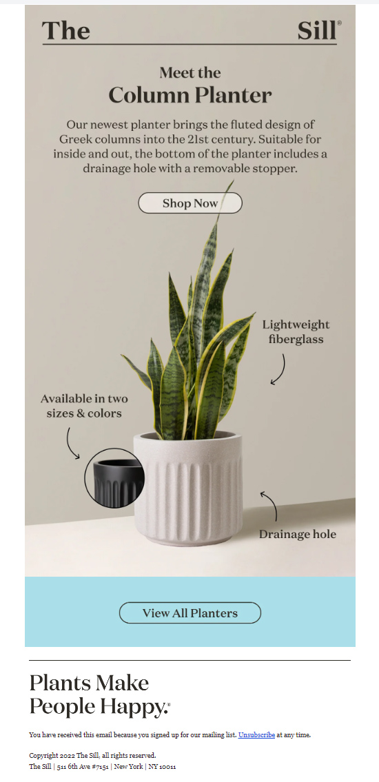
One of the best things about using monochrome design is that it allows your email’s hero to shine ceaselessly. For instance, take a look at this email by The Sill. The hero in question here is their new Column Planter. By placing it against a monochromatic background, The Sill ensures that the subscribers’ eyes remain rooted (that was very much intended, yes) to the product, thanks to lack of interruptions in the backdrop.
To facilitate greater readability, they have chosen black as the font color. Also notice how the CTA button has been, on design, allocated a color which is similar to the backdrop yet visibly distinct. This has been done to make sure that readers are able to spot it with ease. A pretty smart move, if you ask me.
Cocojune
Subject line: Ready to set sale with us?

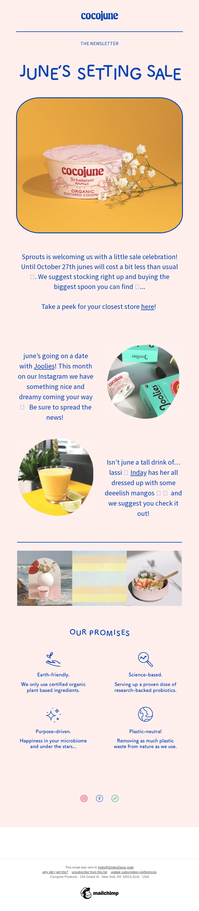
This email from Cocojune is a visual delight to behold. The monochromatic pink background exudes a languid charm and is ably complemented by the playful blue font that occupies the foreground. What we particularly like in this example is the manner in which the products have been displayed- they’ve been fitted into circular and rectangular-like frames such that they can easily attract the reader’s eyeballs whilst not blocking the delightful backdrop simultaneously.
Boxed
Subject line: Save $15 when you join our special perks program!

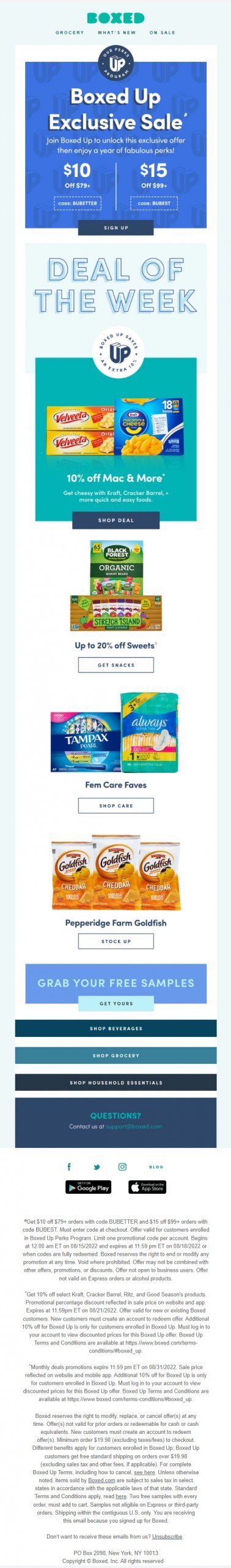
Now, many email marketers out there are a tad skeptical when it comes to embracing a monochrome design for they think it renders the emails rather monotonous. To them, I present this delightful example by Boxed. To prevent your monochrome designs from appearing wearisome, you can do what Boxed has done over here- implement varying shades of a monochrome color palette in your email. And, lo and behold, your outcome becomes visually refreshing! To get the best of this arrangement, I suggest that you assign a different messaging to each shade in your email. This way you’ll be able to offer a lot of clarity to your readers, and goes without saying that always causes them to warm up to your brand.
A24
Subject line: What’s up, Doc? 🕯️

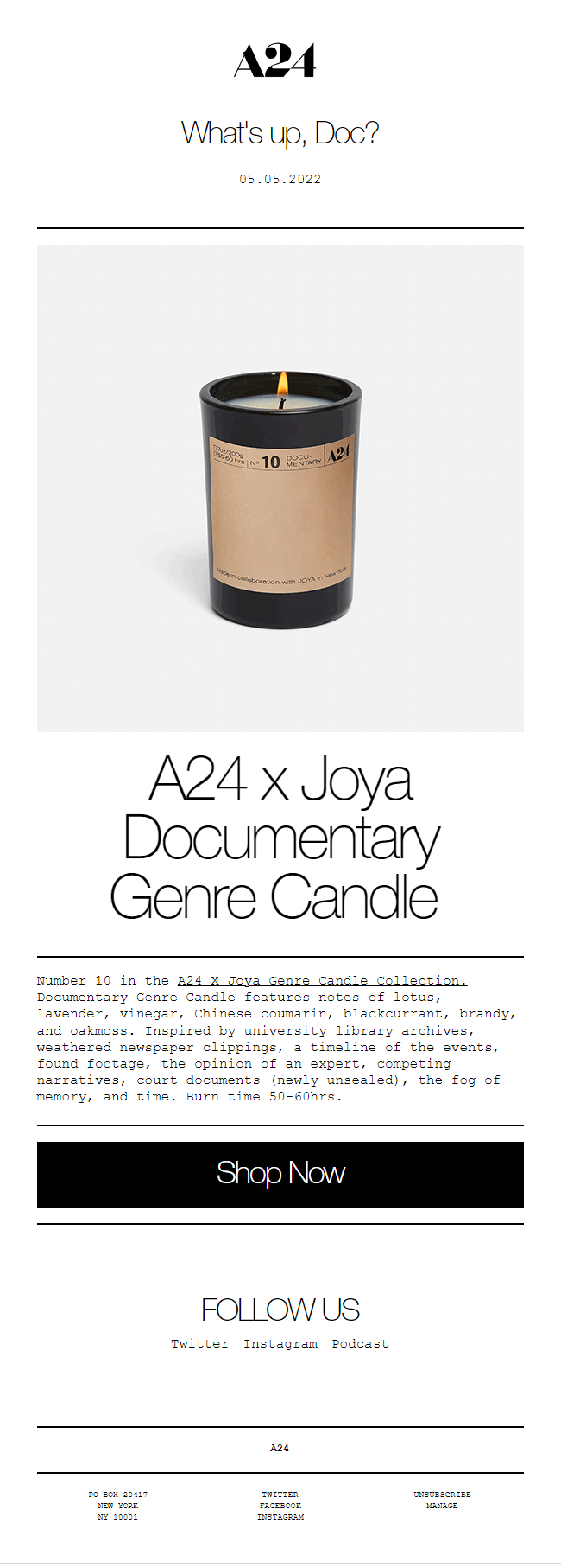
Another great way of electrifying your monochromatic layouts is by punctuating them with a dynamic element. Don’t get what I’m talking about? Take a look at this A24 email. The animated GIF in the hero section greatly enhances its appeal, wouldn’t you agree?
If in the past you have had no success in making people take note of your movie recommendations, maybe it’s about time you took a leaf from A24’s gorgeous monochromatic book.
Comme Si
Subject line: Style Inspiration: Dress socks

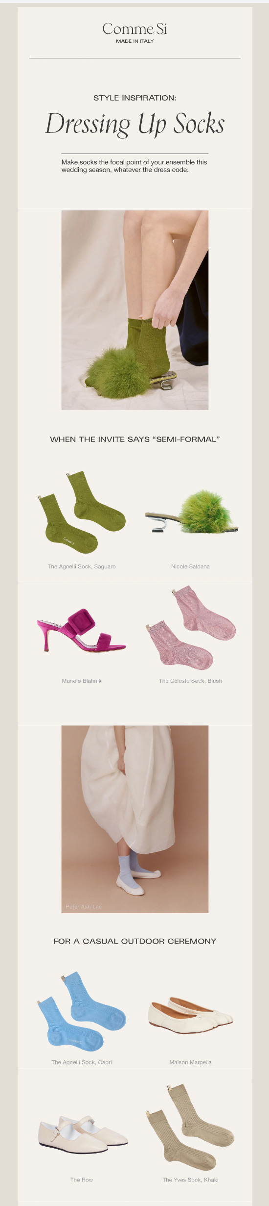

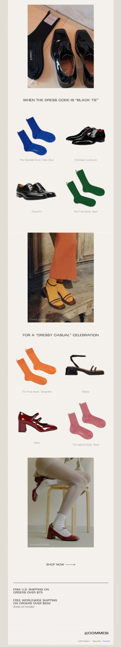
Every now and then you’ll find yourself drafting an email which will be a little lengthier than the rest. And then, this question will rent your mind- “Will I be able to hold my audience’s attention?”
I’ll be honest- it’s tricky. Even when your content is completely fluff-free. But, your job becomes much easier when your email design is monochromatic. This email from Comme Si is a glowing testimony to that. Though it is rather lengthy, you find yourself scrolling, rather effortlessly, through its entirety, don’t you? The credit for that, in large, goes to the monochromatic backdrop which is essentially the spine of this email. One more thing we really appreciate about this display is its product display frames.
Notice how the backdrops in these frames have been sensibly chosen to complement the monochrome palette which defines the email. Might seem like a small detail but ends up making a whole world of difference to the eventual output.

Eight Sleep
Subject line: Announcing NEW Smart Temp 2.0

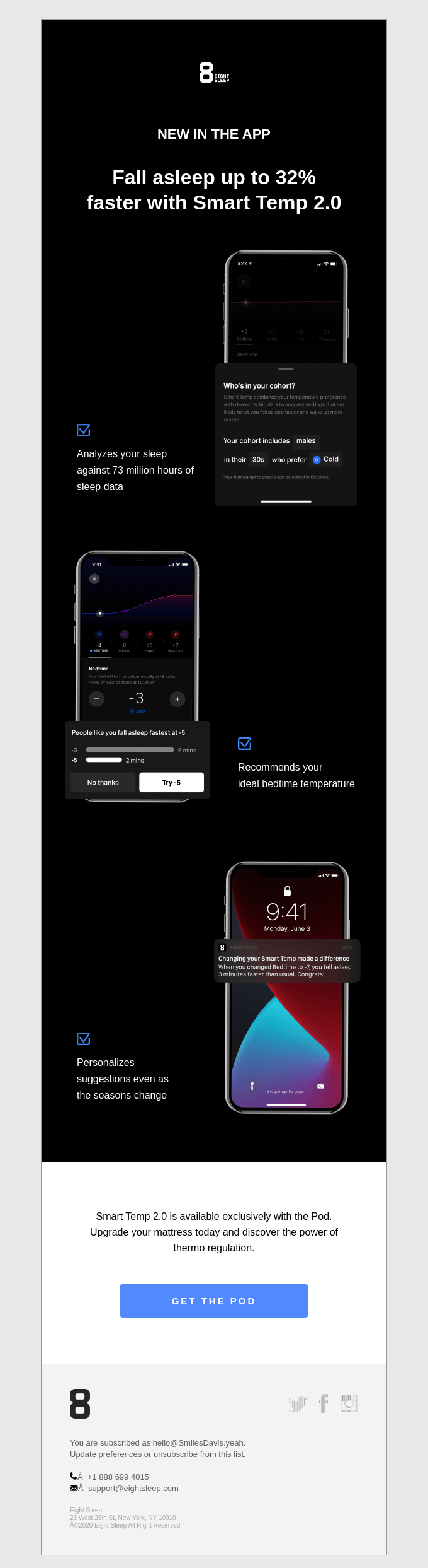
If your wardrobe is stacked with garments of every shade black (just like mine), this email from Eight Sleep might just incentivize you to stack it further in the same direction. If you’re having a hard time getting over that sleek and suave black monochromatic background, trust me, you’re not all alone. What really lets the monochromatic design shine here, though, is Eight Sleep’s minimalistic approach to things. Had they not been economical with their copy and prioritized white space, you and I wouldn’t have had the same amount of appreciation for this email.
Food 52
Subject line: A must-have for ice-cold ice cream on the go.

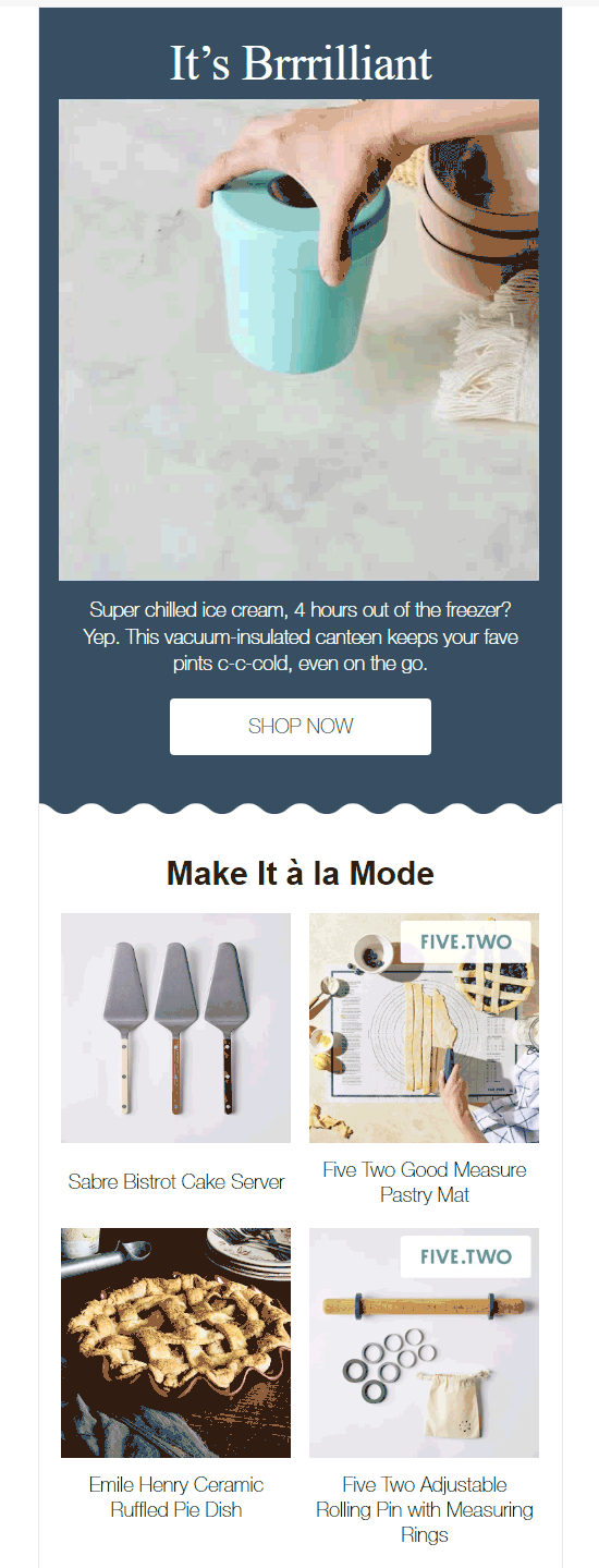

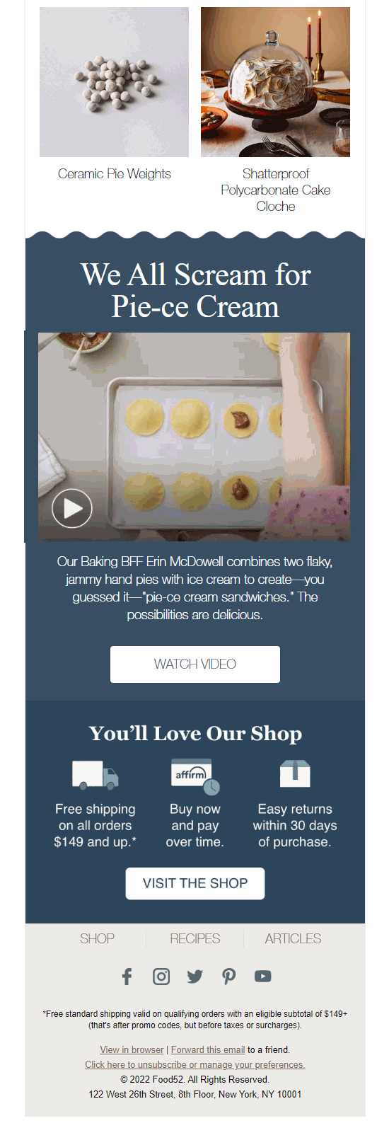
Before I delve deep into this example, let me ask you a question. In this email, had Food 52 used a warmer shade- say yellow, red, or orange- compared to the blue they have, would this email have had the same effect on you? Yes, it might have still looked pretty, but would it have left the same impact? Perhaps not, right? This is exactly the point I aim to discuss with this example. With monochromatic designs, you need to be absolutely sure that your color is in sync with the overall “mood” of your message. Unlike polychromatic palettes, you don’t have the liberty to hop from one color to another. Here, whichever color you finalize will be responsible for binding all the elements in the email. Hence, the decision becomes that much more critical.
Finn
Subject line: Save 20% on a Healthier Tummy 🐕

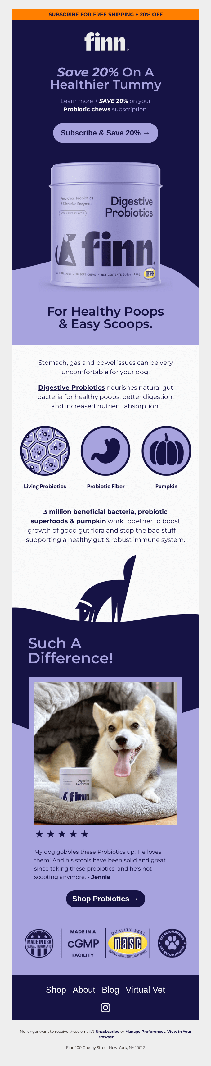
Finn’s email over here ranks easily among the best monochromatic email inspirations out there. However, there are two things that I’d like to particularly highlight. The first thing are the icons. See how they belong to the same palette as the one making up the monochromatic background? This is a golden rule to keep in mind while designing icons, for it helps render a great deal of visual consistency to the email. The second thing is the color of the CTA button. I love the fact that it’s the same shade as that of the product displayed- an excellent instance of subliminal messaging.
Wrapping It Up
I hope that the examples shared above have provided you with enough fodder to give shape to your own monochromatic designs. Don’t worry if it takes a few tries to wrap your head around the nuances of it; it’s completely normal. But once you get going, trust me, there’s no looking back!