


With an increase in the global smartphone usage, marketers have marked their 2013 calendars for the mobile-optimized email as a priority! 75% of the companies presently do not optimize their emails for mobile while the statistics show that the email opens on smartphone has surpassed PC in 2013! This is high time there is a need to act SMART.
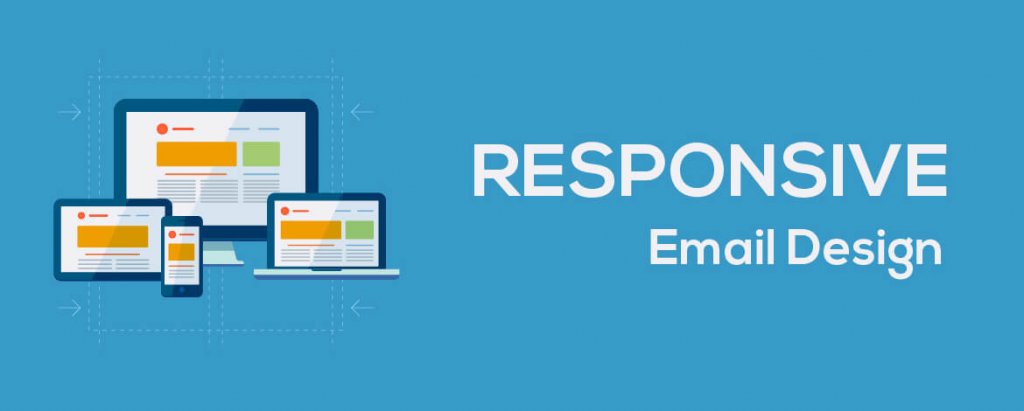
Mobile-optimized emails are pivotal now due to the increase in the smartphone user base globally. Mobile emails also attract more Opens and Click through. Utilizing technology optimally is a must and thus with the help of CSS3 media queries, more marketers tend to develop responsive mobile email version that is responsive to different screen sizes, rendering well cross-platform.
43% of the emails are opened via a mobile device and if you do not optimize email for mobile, you might be losing over half of your subscribers. This is insanely poignant.
There are professional companies like Email Uplers who can help you design and code responsive email design to an amazing Responsive layout that adjusts to the viewing environment whether it’s mobile, desktop and/or tablet.
Email Uplers bring you an opportunity to get benefited from the go-mobile behavior of your audience by creating a responsive email layout. Use the following coupon code at the time of placing your order RESPONSIVE10.
Now you can order a Responsive layout for your Email Design at 60% Discount (Available for the month of April). Package starts at $55/Email.