


The year is 2000. A loved one of yours, residing in a different city, thinks of you and decides to reach out. You are in your living room, and get notified of their intentions by a peppy tune emanating from the desk adjacent to you. The table, however, is not the source of this noise. A small cuboid placed atop it, is. The said cuboid is now urgently gleaming a flash of yellow light which upon closer inspection reveals the name of the person who wants to talk with you. You press a button on the cuboid, hold it against your ears, and in an instant, the distance between two cities seems to get bridged by a considerable extent.
Cut to three decades later, and this small cuboid is at once both a subject and witness to one of the most inspiring evolution stories of our times. Now, connecting two people living in different corners of the world isn’t this device’s most sensational feature, bringing the whole wide world to your fingertips, is. At present, people’s reliance on their cellphones (smartphones, more like) is at astronomical heights. As an email marketer, this holds immense significance for you. Why? Because it directly dictates the manner in which you ought to go about developing and designing your campaigns. You see, more than 50% of people use their phones to access their emails. So, if you are not making your emails mobile-friendly, you risk miffing as many as half of your subscribers, and that’s something that, let alone you, no business operating on the face of this earth can afford.
Herein arises the million-dollar question: How can I make my emails mobile-friendly? Well, the answer to that is what comprises the blog we’re sharing with you today. In a few minutes from now, you’ll find yourself coming across a host of tips and tricks that will allow you to wrap your head around mobile email design with ease and grace. Can’t wait to find out about them? Well, dive right in!
Make Single-column Layouts Your Default Choice
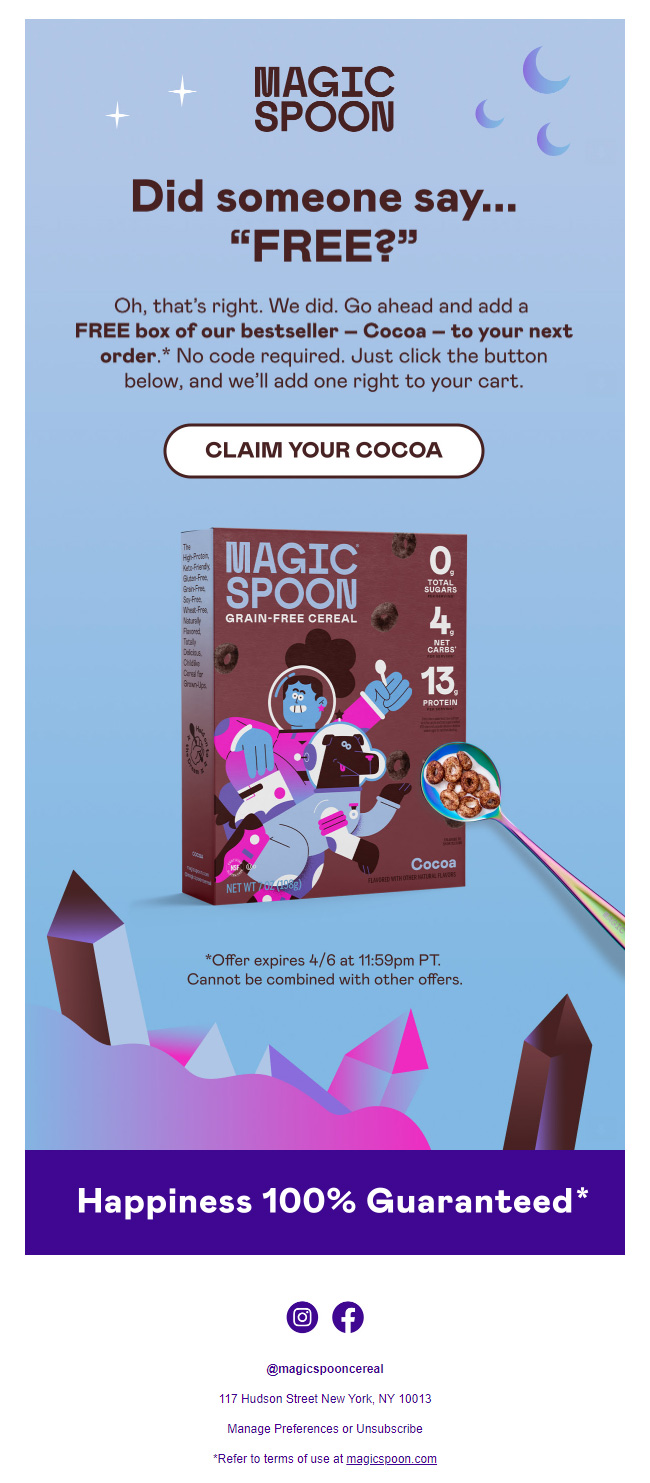
Embracing a mobile-first philosophy starts by making single-column layouts the go-to option while designing your email templates. Single-column layouts pack a lot of merits, which is why you can find them featuring across most mobile friendly design tips. At the outset, they help you avoid instances of overlapping columns, shifting images, and overflowing text, issues which are inherent to multi-column layouts. Since single-column layouts require you to place your content blocks one above the other, it lets you specify a very clear hierarchy of information. Subsequently, it becomes incredibly convenient for subscribers to navigate your emails, elevating their user experience in the process. That, in turn, helps you drive increased levels of interaction and engagement, and ultimately, higher conversions. Additionally, single-column layouts give you the scope of lending more volume to your headings and fonts, enabling you to amplify your readability by leaps and bounds. Not tough to imagine which these layouts form the crux of mobile email design now, is it?
All these points are brilliantly epitomized in this email by Magic Spoon, which serves as a brilliant mobile email design inspiration.

Most importantly, single-column layouts help make your emails accessible. The vast majority of HTML templates in circulation today are coded using tables. Here, one needs to be extremely careful with the content order. If the specified sequences disagrees with the left to right and top to bottom reading order, the email will become inaccessible to subscribers using assistive technologies like screen readers. By using a single-column layout, you establish a logical reading order, thereby eliminating the possibility of random content being read out.
While we are on the subject of accessibility, here are a few other measures you can enforce to make sure your mobile-friendly emails register the same user experience across all your subscribers.
- Use semantic HTML markup. This will allow you to assign meaning to every single element in your email. As you might have already guessed, doing so makes it possible for browsers and screen readers to identify them sans any ambiguity whatsoever. Because semantic markup offers additional context to screen readers, they are able to interact with and navigate through the email that much more efficiently. A very common use case of semantic HTML markup can be seen in the form of paragraph and header tags. Developers define these tags to prevent the screen reader from treating all the content in the email at the same grade. Essentially, they help inform the screen reader of the distinction that exists between title and body, playing a crucial role in improving your content’s structure.
- Write descriptive alt texts. Keep in mind that screen readers rely on them to interpret the images in your emails to subscribers. Therefore, the more evocative and detailed your alt texts are, the more accurate the picture screen readers will be able to paint for their users.
- Add ARIA (Accessible Rich Internet Application) attributes. They help provide context to certain HTML elements. With them, you’ll be able to tell the screen reader the precise function of a particular button and help them interpret tables legibly. The purpose of ARIA, thus, is to enrich the user experience.
Be Judicious With Images
A large number of mobile email clients do not display images by default, so you need to be rather mindful while adding them to your emails. Images lend vitality to your emails, no doubt, but this limitation means that you are better off not conveying your most crucial bits of information using them. The wise course of action, hence, is to treat images as auxiliary elements, a piece of advice you are guaranteed to get from most agencies dabbling in email template design services. Wrest the gravity of your messaging with the email copy. This way, even in the absence of images, whatever you are trying to communicate doesn’t get compromised. While sitting down to brainstorm your campaigns, account for the worst, and visualize your emails without images, to begin with. Whatever insights you derive from this experience, will help you craft mobile optimized emails effectively.
Curate Subject Lines and Preheaders Carefully
The quality of your subject lines and pre-headers goes a long way toward determining the kind of engagement your campaigns will receive. If they are unable to generate interest and curiosity in your subscribers’ minds, you will never be able to nudge them to open your emails. But even after making certain that your subject lines and preheaders are as tantalizing and impactful as possible, there’s still one more factor you need to regard seriously- their length. Doing so will allow you to design ideal mobile optimized emails.
41-50 characters and 40-130 characters- these are considered to be the ideal subject line and preheader text lengths respectively. Still, to be on the safer side, we’d advise you to treat 30 characters as your upper limit. The last thing you’d want for your subject lines and pre-headers is to get clipped on mobile devices, isn’t that right?
Because we are talking about designing mobile-friendly emails in this email, we’d like to lay extra emphasis on preheaders. Why? Because marketers that have grown designing desktop-only emails, tend to overlook them. One can argue that while preheaders are important, they don’t really call a lot of attention to them, visually speaking, when emails are viewed on a desktop device. On a mobile device, however, the scenario changes drastically; they become quite conspicuous and should you fail to curate them mindfully, you risk hampering your interaction levels.

Keep Ample White Space Around Links And Buttons
All mobile friendly design tips unanimously stress on keeping emails click-friendly. You don’t want your subscribers trying to tap on a button or link in your email, and ending up accidentally clicking on something else altogether. It will spoil their user experience to no end and might deter them from engaging with your emails in the future. To avoid this and to make your mobile responsive email templates stand out, infuse white space generously around each button and link in your email. If your email has multiple CTAs or links, make it a point to not keep them close to one another.
Take a look at this segment of an email (mobile view) sent by The Edinburg Natural Skin Care Company.


See how cleverly they have spaced their CTAs? Also notice how there’s plenty of space between the links present in the email signature (as well as between the social buttons).
Pay Attention To Your Font Size
What is the font size you’re sealing for your desktop emails? 14px? 16px? Whatever be its value, make the font of your mobile emails at least 2-3 points larger than that. The largest complaint people usually have with most (the ill-designed ones, of course) mobile emails and websites is that they force them to squint hard to even have a remote shot at going through the content they hold.
We’d recommend you sticking to 14-16px for your body copy and 22-26px for your headlines. Goes without saying, don’t end up enlarging your fonts unnaturally either. Besides not helping your cause of readability, extra large fonts will invite the suspicion of spam filters. Of course, if there’s any one particular detail which you wish to highlight, you are free to dial up its size sufficiently, so long you are not going overboard.
Wrapping It Up
Designing a mobile-friendly email can be a little tricky, but stick to the basics and the best practices and you are sure to come out on the right side. We hope the tips shared above will help you shape stunning mobile-conducive campaigns!