


It’s almost back-to-school season. As this time consistently drives the second-highest sales activity, niche and non-niche brands will be up and running in your lane.
Back-to-school spending was projected to hit $41.5 billion in 2023. This year, it’s expected to cross $81 billion. This is a great opportunity for retailers like you, and if email is part of your marketing mix, you may expect to top your sales figures from last year. Usually, the shopping frenzy doesn’t kick in until July. But you must start early to warm up your audience through storytelling, product drips, educational content, etc.
To give you a head start over your competition, we’re listing the top 9 back-to-school email examples. Take a cue from these brands that are acing it.
1. Care of Chan

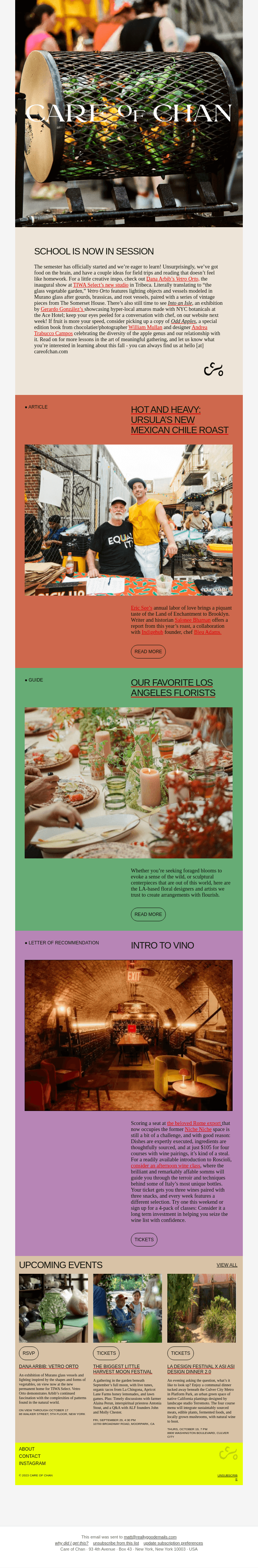
Care of Chan is a non-niche brand known for organizing parties and get-togethers.
Typically, you wouldn’t associate them with the back-to-school season. But their email establishes a link by promoting ideas for “field trips and reading” in the first block.
In fact, the block sets the context for the entire email, the focus word being “learn.”
Each block is differently colored to visually segregate the content type in each. It not just maintains interest, but helps the viewer understand the content.
Pro Tips:
- If you are a non-niche brand, do not appear to be forcing a connection with back-to-school themes. Be spontaneous, and don’t insist on the connection
- Segregate content blocks by using separate color schemes for each content type
Read more: The Ultimate Guide to Email Template Design
2. Atoms
Subject line: Going back to school, or know someone who is?

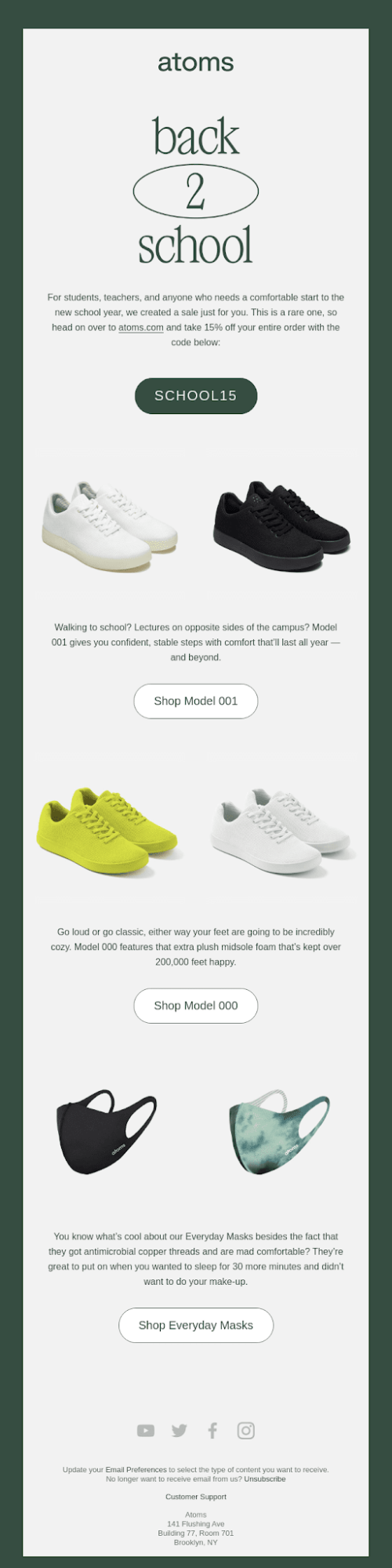
Atoms’ back-to-school email uses prominent CTA buttons to highlight the discount code and shopping models
The product images are wonderfully shot. Each email section uses the inverted pyramid, leading the viewer’s eye from the image to the corresponding CTA button.
Significantly, each pyramid’s image and text occupy equal space, ensuring a steady visual rhythm.
Pro Tips:
- Make maximum use of white space to draw attention to critical information
- For long emails, apply multiple inverted pyramids to assist content viewing

3. Munk Pack
Subject line: $50 toward your favorite snacks

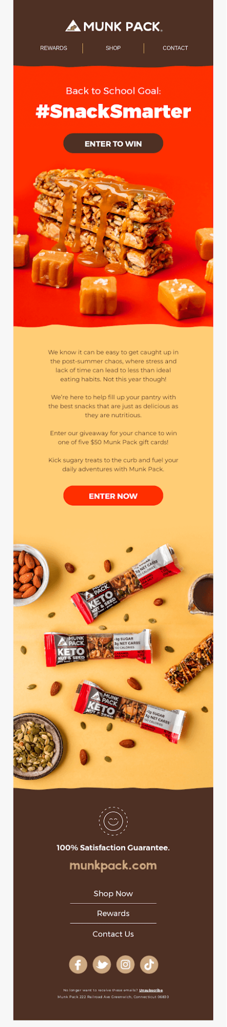
Munk Pack’s back-to-school campaign features a giveaway contest—a cool idea to start off the season. It not only makes for a memorable email experience but also fits the brand’s goal of cutting sugar consumption.
Rich with ultra-detailed product photography and deep-tone background colors, the email immediately engages all your senses. Munk Pack experiments with non-linear dividers to separate the content blocks. The CTA button shapes are consistent.
Speaking of CTAs, in case the viewer should ignore the buttons above the fold, they can see other relevant site-wide CTAs (e.g. Shop Now, Rewards, Contact Us, etc.) in the recovery module just before the footer.
Pro tips:
- If possible, avoid using a landscape arrangement for your text. Prolonged horizontal viewing tends to be more strenuous than vertical viewing
- If you are a food brand, use dark colors in your back-to-school emails to reflect the sensual nature of food
4. Moment
Subject line: Back To School: Latest Gear for Home Office and School


If you plan to use long templates for back-to-school email marketing, you want to be level-headed in your approach to design.
A long email is information-rich, so you need to make it simple, elegant, and easy for the reader. Moment’s email balances text and images in each block. To keep up visual engagement, the surround-less product images are arranged in a Z-pattern layout.
Fittingly, the color scheme also alternates between the content blocks.
Responsive design is particularly critical for long emails. Ensure to implement media queries, include the viewport meta tag in the HTML document’s <head> section, and utilize percentage-based widths along with the CSS property “max-width: 100%;” for images.
Pro Tips:
- Include ‘View Online’ or ‘View in Browser’ and ‘Unsubscribe’ links in the header and footer, respectively. The recipient might not read the entire email, but spam filters will scan it in toto for potential misdemeanors
- Place the most important, action-oriented content above the fold; Moment’s Documentary Photography tutorial is placed in the penultimate block since it is less important than the sales-tuned products above the fold
5. Mojo
Subject line: Back-to-school burnout is no match for Mojo!

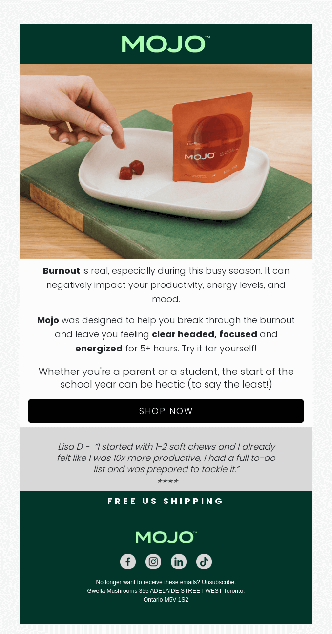
Most back-to-school email subject lines are either named after the campaign or intimate a product showcase in the email. Nothing wrong with that!
But Mojo’s subject line highlights a problem: burnout. This is more attention-grabbing as it is not just relevant but useful as well. In fact, 60% of high school students across 10 schools in the U.S. report burnout at some point in their school career.
The template is short. It includes a one-line customer testimonial. Now, if you are an ecommerce brand, consider ditching stock photos for the hero banner and use your own product images instead. Just like Mojo.
Pro Tips:
- If you’re featuring a customer testimonial, distinguish it from the rest of the content by keeping it in quotes and changing the font style
- Consider placing “Free Shipping” both at the top and bottom of your email
6. Vitruvi
Subject line: Back-to-school essentials

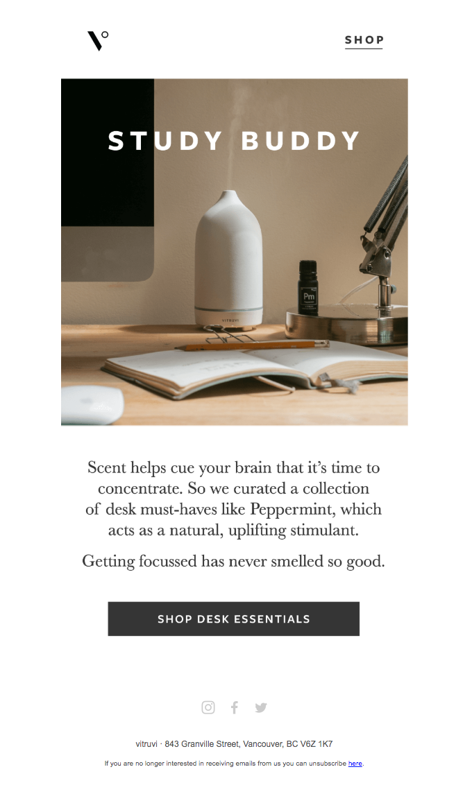
Vitruvi, a brand specializing in air care and home scenting products, has masterfully adapted its selling point to the back-to-school context.
The design may seem straightforward as if not much is happening, but this isn’t just another “simplicity” hack. Sometimes, brands send short and simple emails when they’re close to the event date or as part of a drip campaign. This approach makes it easy and quick for the recipient to engage. It’s a smart alternative to using urgency tactics like “Hurry!!!”, “Order Now!!!,” etc., to bait subscribers.
Pro Tips:
- Avoid “prettifying” short emails to justify hard work. Design according to the dictates of the content and your back-to-school campaign objectives
- If you need textual content for your email to make sense to the subscriber, use email-friendly fonts
Read more: How to Create a Powerful Email Design System
7. Epic!
Subject line: Get 40% off Epic Unlimited for [name]—just in time for Back to School

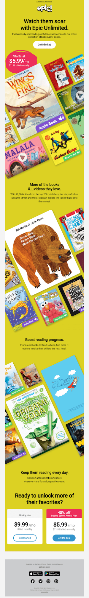
Epic’s back-to-school email uses an angular layout to showcase books. Most of Epic’s emails follow a consistent layout, likely utilizing custom templates. Drag-and-drop builders typically don’t support such unique designs. “It’s often difficult,” says Dmytro Kudrenko, founder of Stripo, “to create brand-consistent emails because of custom fonts and design styles. In such cases, marketers have to ask developers or coders for help.”
Notably, the books are arranged to prominently display the more sales-worthy titles, with the rest partially cut off.
Since images dominate the space in this email, brief strips of textual content between the images help maintain the design’s flow.
Pro Tips:
- Be strategic in your approach to content placement when using non-traditional layouts. So, set the right visibility criteria to maneuver the viewer’s focus
- Include appropriate breaks between multiple content forms. Place discount offers at the top. If you want fewer CTA buttons, ensure the space between the CTAs is engaging and scroll-worthy; this is because you need to keep the viewer engaged when they aren’t being prompted to take action

8. Bose
Subject line: Save big on headphones and speakers for back to school season

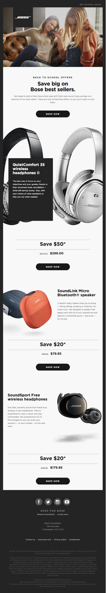
The full-bleed product image is the standout element of Bose’s back-to-school email. The photography is ultra-detailed, allowing the viewer to dwell on the features.
Now, whether you should go for full-bleed images depends on your brand. Bose is a titan and Bose aficionados love exploring product features in detail. But you can still experiment with full-bleed product images and see the response for yourself.
Note how the textual overlay partially obscures the first product image. If you want to use such overlays, balance how much you wish to reveal and how much to hide. But avoid using too many of those.
The email goes on to use a brief Z-pattern layout for its next two products. Notably, the template is punctuated with discount offer reminders.
Pro Tips:
- Hire a professional photographer to snap all your products, especially if you are a tech brand
- Don’t forget to add social buttons (either text-only or widget–only) and proof of consent in the footer; use well-padded CTAs for mobile users
9. Kipling
Subject line: Bello? Klaar om weer naar school te gaan? (Hello? Ready to go back to school?)

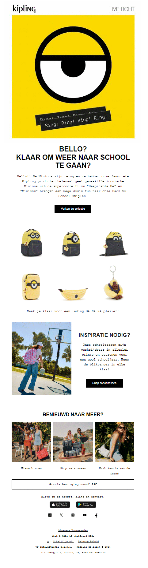
Our final back-to-school email example is from Kipling. This is the only themed email on our list. Featuring a fun GIF in the hero banner followed by a traditional grid of themed products, Kipling’s email is a sober mix of image, text, and animation.
Minimal textual content and standard-res images, combined with good use of white space, create a balanced design that is crucial for optimizing email loading time.
Pro Tips:
- If you want to use GIFs, ensure the file size does not exceed 5 MB. Ideally, aim for a file size of 1 MB or lower to prevent slow loading
(Importantly, consider using the first frame of the GIF as a standalone image for those rare instances when even small files have trouble loading) - For themed emails, determine whether keeping your email fully- or partially-themed is better. Supplement your theme with a story/narrative
Ace Back-to-School Email Marketing with Us!
Our email design and development team is a template production powerhouse, delivering over 3,000 email templates monthly for brands across various industries and countries. From modular to custom to interactive templates, our expertise spans a wide range of brand objectives, needs, and pain points.
Share your back-to-school vision with us, and we’ll help make it one of your most successful campaigns of the year.