Let’s Make Emails Accessible
This infographic has been designed to help you create, design and develop email campaigns that are accessible to all. We’ve provided you with a key to indicate which techniques help you to address the different needs people have.
-

Eye
-

-

-

Neurological
Content Creation
Copy
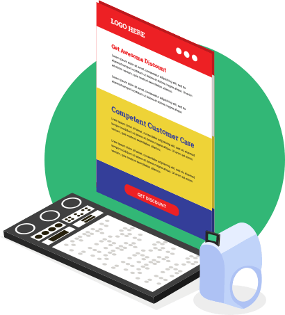
Break down your copy into sections, and give each of your sections a heading, so, at a glance, or by listening to a screen reader, your subscribers can quickly understand the message, or messages, you’re conveying through your email. Then, break down your sections further into small, digestible paragraphs.


Imagery
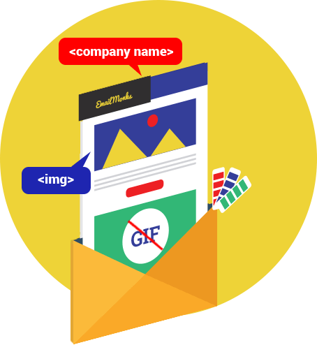
Imagery should be just that – imagery. If your email does feature images that contain text, the text should be illustrative, and not key to the message of the email.
Avoid creating animated GIFs that flash repeatedly, as they may trigger photo-sensitive seizures in some people.
Add an alt attribute inside each <img> tag, and carefully consider the alternative text you insert into it.
- If your image is a logo, insert the name of the organisation.
- If your image is a photograph, and that photograph is key to understanding the message of your email, insert text that clearly describes it.
- If your image is a graphic, and that graphic is purely functional, such as a button arrow, insert an alt attribute, but leave it empty.


Pro-Tip
Add a full stop after the alternative text within each alt attribute, as it will cause some screen readers to helpfully pause before proceeding on through the email.
Buttons
Buttons should be bullet-proof, and selectable across their entire area using a finger or thumb. If your email features more than one button, consider writing a different call to action for each one.


Pro-Tip
Build your buttons to a minimum height of 44px.

Links
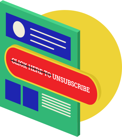
Link your calls to action, rather than text that instructs subscribers how to respond to your calls to action (e.g. update your preferences rather than click here to update your preferences). Build links so their underline doesn’t interfere with the link text.



Content Styling
White space
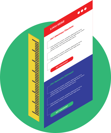
Let your email content breathe, increasing its readability by using white space. Surround your email with typographic margins and group related content together, separating each group with white space. Insert paragraph spacing to help distinguish one paragraph from another.


Fonts
Headline
For your headline, choose from decorative, serif or sans-serif typefaces. Be mindful that it needs to remain easy to read.
Headings
For headings, choose from serif or sans-serif typefaces. Serif typefaces, such as Georgia and Droid Serif may help to distinguish your headings from your body copy.
Body copy
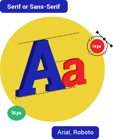
For body copy, choose a sans-serif typeface, such as Arial or Roboto, but avoid using thin or light weights, such as Roboto Thin or Roboto Light.
Font-size
Define a minimum, readable size for your body copy. If your body copy’s font-family has a large x-height, apply a minimum font-size of 14px. If your body copy’s font-family has a standard x-height, such as Arial, apply a minimum font-size of 16px.
Line-height
As a guide, style your line-height at 1.5x the font-size – font-size:16px; line-height:24px; or font-size:16px; line-height:150%; for example.




Colour
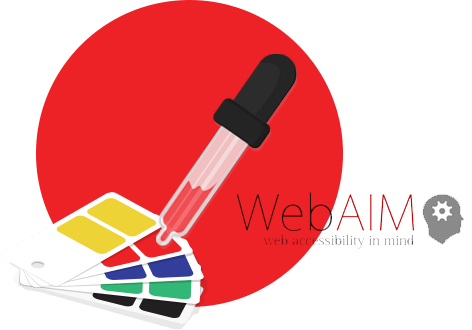
Check the colour contrast between the colour of your text and the colour of the background it sits upon, using the WebAim Color Contrast Checker:


Alignment
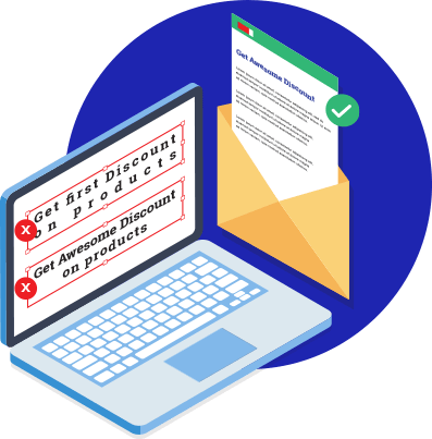
Retain the default (left) alignment of your email, avoiding centred or justified text.

Content Structure
Flow
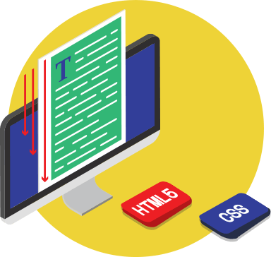
Build your email so it makes sense when read from top to bottom, without repositioning its content with CSS.


Line length
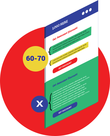
Manage your columns, so each line of text is no longer than 60-70 characters.
Hierarchy
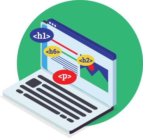
Use semantic tags to markup each piece of content. Headlines should be wrapped within pairs of <h1> tags, headings within pairs of <h2> to <h6> tags, and paragraphs within pairs of <p> tags.


Pro-Tip
Add style="margin:0;" inside your opening tags, to prevent email and webmail clients adding excessive line space.
Tables
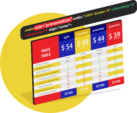
On your structural tables, add role="presentation" inside each opening <table> tag, to prevent screen readers ‘reading’ each cell within your email.



Tools for Testing an Accessible Email
Before hitting the send button, test your emails for accessibility using the tools below
Experience your email using the following accessibility features built into these popular operating systems

- VoiceOver on macOS
- VoiceOver on iOS
- Narrator on Windows
- TalkBack on Android

-

-
Email, Newsletter & Landing Page Design and Coding Company.
-
Beyond the EnvelopeTM
-
An email designer and developer with a fondness for HTML typography in Email.

