


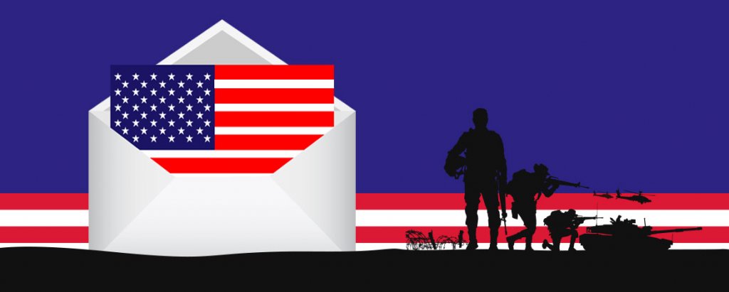
The month of May brings with it a day that’s special for the U.S. – a day that honors the brave men and women who have died while serving in the military. Yes! Memorial Day is around the corner and as we remember and pay tribute to all our war veterans, this holiday is inevitably a great time to reach out to your customers, communicate, engage, and push sales.
Travel and gatherings are one of the few highlights of this summer holiday but with the ongoing crisis, when neither of the two is advisable, you can always focus all your marketing efforts on the popularity of shopping when it comes to Memorial Day, which falls on May 25 this year. Offers during this long weekend have proven to boost sales consistently every year. This is mostly because the prospect of offers and discounts draws in a large number of consumers.


What better way to promote sales during this special holiday than through emails! As now is the right time, to begin with planning your Memorial Day email campaign, without further ado, let’s jump in to see some of the brands that have played well with their emails on this occasion via stunning email design, copy, and concept.

RAW Generation

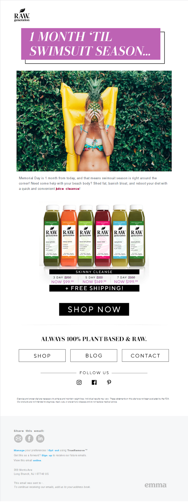
This email by RAW Generation, a company that produces preservative-free natural products for a healthier lifestyle, was sent a month before the holiday. The subject line is to the point – “Memorial Day is 1 Month Away!” The header of the email however reads- “1 Month ’til swimsuit season” which is a subtle reminder for the readers to get their beach bodies ready.
The design is simple and the copy is short and to the point. The product is placed just below the primary copy followed by the rate card and CTA. The footer has a short description of the brand, few more actions, and the buttons to their social media, which allows the user to choose a different medium to connect with the brand. This email is simple, clear, and delivers the message avoiding all forms of obscurity.
Any promo

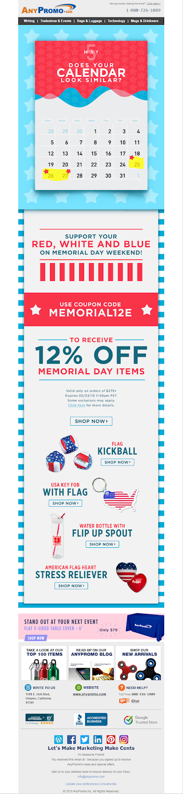
This email by AnyPromo has used a bright color palette with all the elements in the American flag- The stars, the stripes, and the colors. The calendar in the design simply marks the Memorial Day weekend and reminds the customers of the holiday. There is barely any copy and the offer is the main highlighted text here, followed by the products which are also complementing the theme of the holiday.
The design is brilliantly conceptualized as without much copy to explain, one can still understand the message of celebrating the spirit of the American holiday.
Subject line: Get ready to chill & grill! MEMORIAL DAY Presale is here…
ZOX

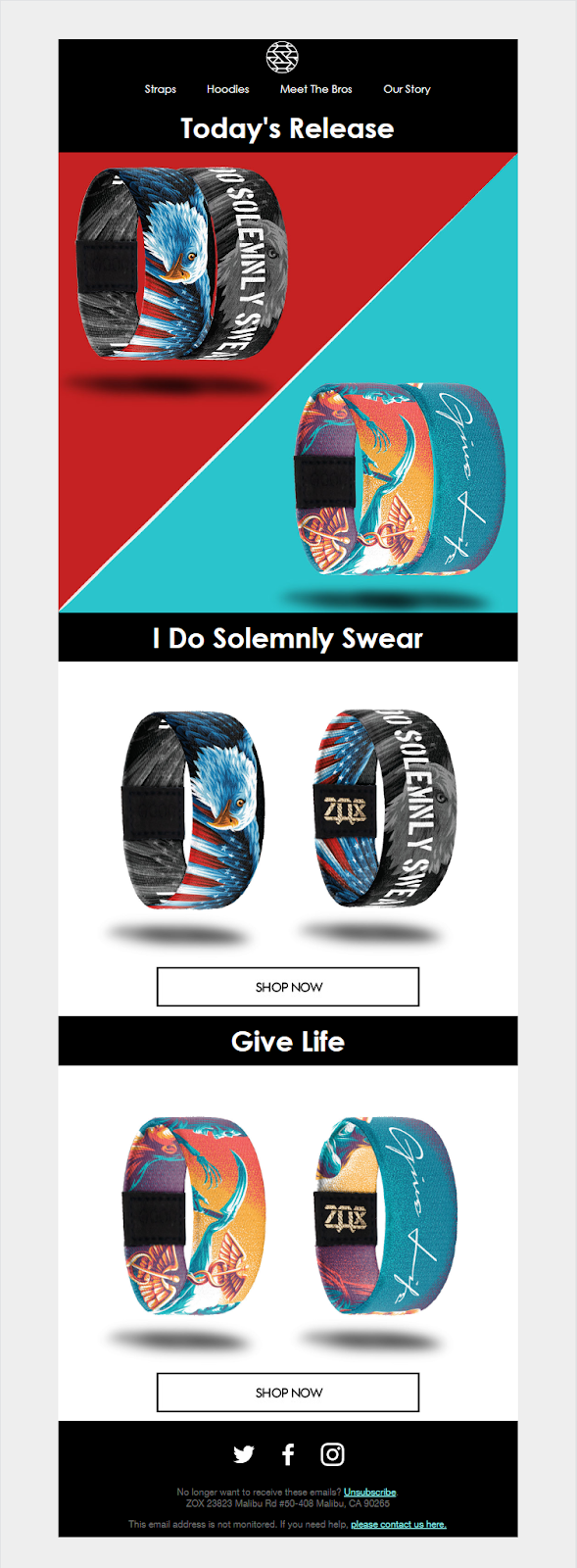
This email by Zox is brilliant because it has almost no copy! Any message that had to be conveyed is communicated only in the subject line- A Special ZOX Drop Ahead of Memorial Day. That is it.
If you take a look at the email design, the two dominating colors are from the national flag, again representing the holiday and the hero image in the first fold has the two products which are being released. The second fold has the name of the product, the display, and the CTA respectively. This brand has made sure there is no beating around the bush and makes the most out of an open email. Bravo, ZOX!
Iron & Resin

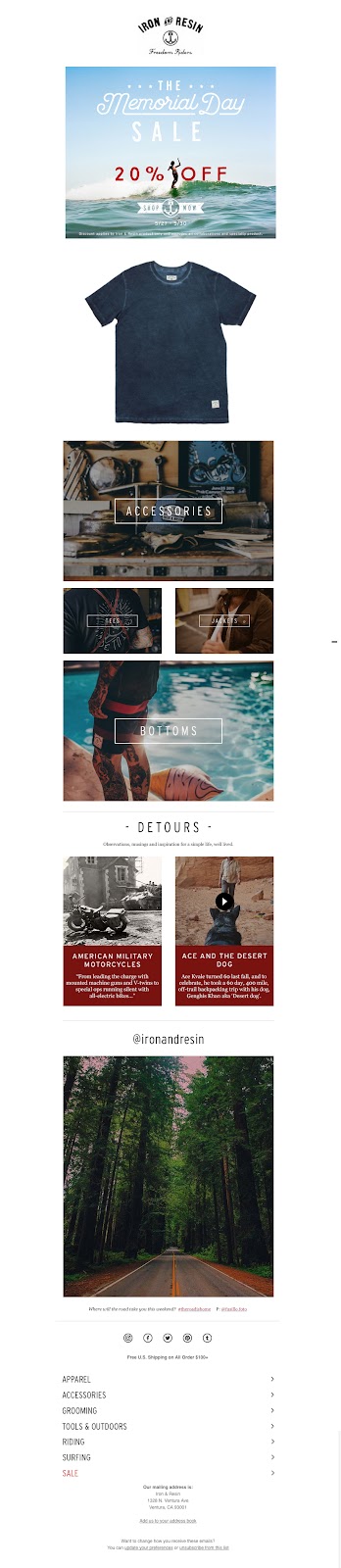
Iron & Resin sent out this email to promote their Memorial Day sale. The offer is highlighted and kept in focus and the various sections of the brand where the offer implies, is laid out further down in the email. Followed by elements for engagement, they have not made any further hullabaloo over their offer. The visualization in the email beautifully represents the tone of the brand.
LOFT

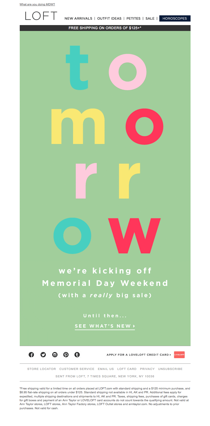
Loft has done a great job of sending out a zero-image email for a promotion. This tease email is a reminder of the sale that is yet to go live, but the hype created will definitely register the message as the whole email is technically a single word- ‘Tomorrow.’ The color-changing GIF format acts as the cherry on top. A single CTA leading to the browse page might help to convert even before the holiday!
Twice

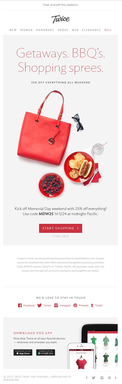
Twice uses the inverted pyramid structure with an enticing headline, a hero image displaying a few of their products, a short copy that describes the sale, followed by a CTA. The brand color is maintained throughout the email and the CTA is difficult to go unnoticed. Twice has made sure not to complicate the design by keeping the elements to bare minimal, yet conveying the message clearly. An adequate amount of white space balances with the other elements effortlessly.
Care/Of

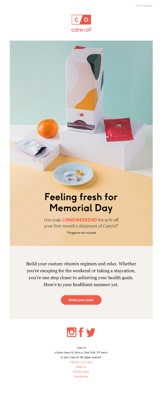
Care/Of has not made any deliberate inclination concept-wise. They have used their products as an exhibit in the hero image and have kept the color palette subtle as usual, showing the consistency in design. The headline ‘Feeling Fresh for Memorial Day’ is the only hint in the whole email that this is an occasional email. The copy is personal and gives the description of the incentive the brand is providing. A single CTA dominates as the center of attraction and delivers its cause. The design is not loud and yet rings a bell with the viewer. Neat job, isn’t it?
JANE


This email was sent out as a final call for the sale and the brand has made it clear with the high-resolution image that they have used. The image is heavy and therefore they have used a lighter copy.
The colors are bright and reflect the concept of a sunny summer holiday. The copy is minimal and is a direct reminder to shop before the sale ends along with the weekend. The copy – ‘These deals are almost done’ creates urgency and leads straight to the CTA. A simple copy and a heavy design, well balanced and crafted into a beautiful Memorial Day email!
J.CREW

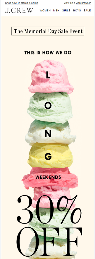
This email is again a great example of “perfect balance” (Pun intended). J Crew has often flaunted this design of multiple scoops on various occasions, but we feel this concept of aligning the text ‘Long Weekend’ on the scoops of gelato has perfectly fit with the theme of Memorial Day.
The headline is short and crisp. The intention of the email is definitely the offer, which they have made sure strikes out all other elements. One might say that the impersonal copy is a little icy cold, but well, it seems to have worked for them!
The Reserve

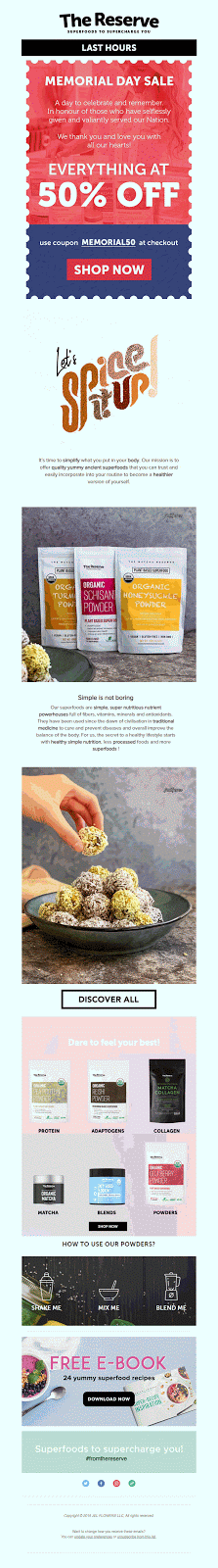
This email by The Reserve is also a final call before the end of Memorial Day sale. The design is brilliant for the single reason that they have used multiple elements and no single element overpowers or suppresses any other elements.
The Subject line says: ‘Hurry! 50% OFF Sale Ends Tonight’ thus creating the much-needed urgency. They have used a coupon like a template, in the holiday’s representative colors, with a customer browsing through their products as the hero image. The fact that they have a memorial day coupon becomes evident with just a simple design. They have used a GIF to highlight the offer followed by the CTA.
Further in the email, they have used yet another GIF with a fun copy that gives a brief about who they are, what they have to offer, and how to use their products. The email ends with a ‘Free Ebook’ supported by an animated CTA. The reserve has definitely put in a lot of thought into the design and visual aesthetics. Well done!
Wrap Up
This holiday might be a little different from all the other years, but it’s never a bad practice to take an opportunity to communicate and interact with your customers. With the right message at the right time, a good email will never go unappreciated. These Memorial day emails are definitely muse-worthy designs to experiment within your long weekend Memorial Day holiday email campaign!