


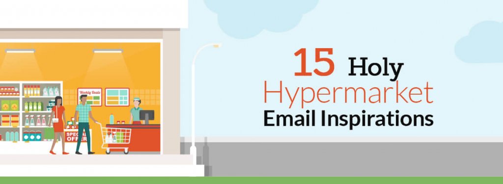
As per the latest figures shared by Kantar Worldpanel, the grocery market has witnessed a rise of 1.1%, fastest since June 2014. With intent to capitalize on this upbeat trend in the grocery market, retailers will push hard to attain the maximum market share this holiday season. And, what could be a better way to achieve this than email inspirations. Email design inspirations can surely be your golden key to email marketing success.


So, how to send amazing emails and stand out in the inbox?
Well, Uplers bring to you some heavenly hypermarket email inspirations that could help you send better emails this holiday season.
1) Aldi


Aldi has smartly designed their email by placing the inspiration banner at the top which grabs quick attention. The CTA is crisp & self-explanatory.
2) Costco Wholesale


A chic design by Costco is backed with a cool theme based image. The price of each product is bold and grabs the eyeballs instantly.
3) Walmart


Email by Walmart is designed to perfection with the use of lively colors. The text in the Johnson box as well as the hero image is written well which surely would increase the conversion rate.

4) Food Lion


The email design by Food Lion looks beautiful with vibrant colored images. A well-written copy, backed with a strong CTA
5) Giant Eagle


The hero image in the email by Giant Eagle has been designed to perfection. The use of white space to display different products has been done nicely.

6) Marks & Spencer


Marks & Spencer has made a good use of vibrant colors in their Christmas email. The email looks elegant and well-structured with the right use of white spaces between columns.
7) Ralphs


Ralphs has used the white background effectively to highlight the offers on different products. A livelier hero image could have been more impressive.

8) Target


A neat email design by Target with the use of white background and just the brand asset colors. The CTAs are positioned above the fold which makes it hard to miss.
9) K-Mart


K-Mart sticks to the Christmas theme by using wonderful images in their email. A well written text in the Johnson box surely would increase the open rate.
10) ACME


The contrasting colors by ACME has been used cleverly making the text look rich and legible. The copy is well written and sends across the right message.
11) Safeway


A chic design by Safeway with a good use of animation in the email. The copy is loud & clear backed with a self-explanatory CTA which adds to the possibility of higher subscriber engagement.
12) Kroger


A simple email design by Kroger with subtle colors. CTAs are placed at right places supported with a worthy copy.
13) Sainsbury’s


Use of striking colors in the email banner by Sainsbury’s grabs readers immediately. Good placement of multiple CTAs is surely an add-on.
14) Tesco


Vibrant images backed with attractive offers makes this email appealing. The copy is written well making it look pleasing.
15) Waitrose


The bold & loud copy in the email by Waitrose is attention grabbing. Highlighting the important points with Waitrose color scheme looks exceptional and is difficult to miss.
Is designing and coding of emails giving you sleepless nights? Try using Uplers ‘ quick and trustworthy services.