


Ask any email developer worth his salt about his Achilles Heel, and they are most likely to point out the elusiveness of crafting an HTML email that renders uniformly across email clients and devices. While we are all familiar with the issues MSO (Microsoft Outlook) poses in crafting that “universal renderable HTML template,” in the text that follows, we will attempt to find a solution to this white whale of every developer.
The Issue At Hand
Before we get to the solution, let’s understand the complexities of the issue at hand. Since its 2007 version, Outlook started employing the services of the Word processor in order to render its emails, which in turn comes with its own challenges, such as its limits on renderable CSS styles, certain HTML tags, and their parameters.
Even though Outlook has the provision of deploying VML (Vector Markup Language) in rendering email templates, it works only on Outlook 2007-2013 version; therefore, developers have to use CSS styles or HTML code differently compared to other email clients that may use Webkit, for instance.
The Solution In Sight
When the need arises to code separately for MSO and other email clients, conditional code steps in to save the day. Also known as MSO conditional statements or conditional comments, it has the potential to iron out many difficulties that email developers face on a daily basis. Let’s see how that works out.
What is the Meaning of Conditional Code?
Simply said, much like its name, conditional code deploys “if-then” statements to specify actions to be carried out when a particular statement is true. For instance, “If X is true, then execute Y.” In this particular piece of code, X will be executed only when condition Y is met.
One might say that complex conditional code can only be deployed by programming languages like PHP, Python, JavaScript, C#, etc.; however, markup languages like HTML presented by style sheets like CSS (Cascade Styling Sheets) can handle a limited set of conditional statements. This can help developers to present platform-specific content through a range of different clients and devices. Conditional comments can help you target a plethora of versions of MSO and render emails seamlessly across a range of devices using Conditional CSS via media queries or employ fallback classes within your <style> tags in your email <head>. You could finally deploy those stellar email newsletter templates that you envisioned for your brand!
Conditional Comments with MSO
Microsoft developed MSO tags (<!– and →) so that they could be recognized, and their content will be displayed specifically by Outlook. These comments allow developers to add a specific piece of code or a styled element that might have been ignored in their HTML documents. Incidentally, as you might be aware, HTML comments are mostly ignored by email clients and browsers.
However, T-online is one email client that will render all comments effectively. Therefore if your emails are directed to t-online.de domains, you must hide comments from that client.
<!--[if mso]>
<table><tr><td>
<p>Content type here // It will display only in outlook.</p>
</td></tr></table>
<![endif]-->
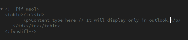
In the above example, only Outlook will be able to process and deploy the table and its contents whilst other email clients won’t be able to read the comments and use the styles.
Let’s have a look at some of the codes you can use as per your bespoke need:
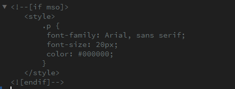
- Using MSO conditional comments for incorporating CSS styles in the <head> targeting specifically Outlook.
<!--[if mso]>
<style>
  .P {
   font-family: Arial, sans serif;
   font-size: 20px;
   color: #000000;
   }
</style>
<![endif]-->
- If you’d like to target clients outside Outlook, here’s what you can do,
<!--[if !mso]><!-->
<p>This message for who doesn't use Outlook!</p>
<!--<![endif]-->
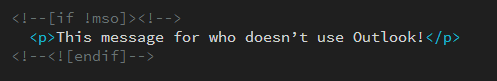
“if !mso” is declaring, “if the client is not Microsoft Outlook”. You’ll also need to append your initial <!–[if !mso]> tag with <!–> and preface your closing <![endif]–> tag with <!– in order for Outlook to acknowledge this code.
- One can even target specific Outlook versions by specifying the version number after “if mso”. For example,
| Outlook version(s) | Code |
| All Windows OutlookMost common | <!–[if mso]> your code <![endif]–> |
| Outlook 2000 | <!–[if mso 9]> your code <![endif]–> |
| Outlook 2002 | <!–[if mso 10]> your code <![endif]–> |
| Outlook 2003 | <!–[if mso 11]> your code <![endif]–> |
| Outlook 2007 | <!–[if mso 12]> your code <![endif]–> |
| Outlook 2010 | <!–[if mso 14]> your code <![endif]–> |
| Outlook 2013 | <!–[if mso 15]> your code <![endif]–> |
| Outlook 2016 | <!–[if mso 16]> your code <![endif]–> |
Use cases of conditional code in developing emails
If your latest email campaign is curated to be sent to multiple email clients, you will need to incorporate certain elements of conditional code to ensure that your emails render well across platforms and email clients.
Interestingly, conditional code allows one to create more engaging content for supportive email clients. It allows you to deploy the eyeball-grabbing power of animated gifs, HTML5 videos, and cool web fonts whilst offering backup design and content for clients that are unsupportive of these features in creating responsive email templates.
Let’s check out some use cases;
1. Deploying different styles and designs depending on the email client or viewport size
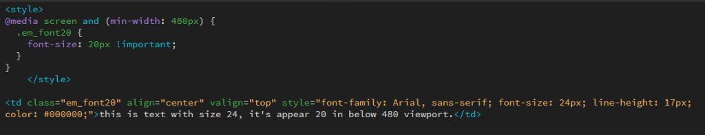
Emails can render differently when viewed on different devices. For instance, a <h1> heading at 24px on a mobile email client will look completely fine, but when viewed on a desktop, the title may seem small in comparison with the body copy. The @media rule can be used to set styles according to the viewport’s dimensions or other specifications of the subscriber’s device.
<style>
@media screen and (min-width: 480px) {
  .em_font20 {
    font-size: 20px !important;
  }
}

</style>
<td class="em_font20" align="center" valign="top" style="font-family: Arial, sans-serif; font-size: 24px; line-height: 17px;
color: #000000;">this is text with size 24, it's appear 20 in below 480 viewport.</td>
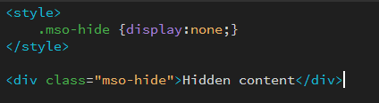
2. Hide specific email elements
As we are aware, there are certain HTML and CSS components are not supported by all email clients. In order to prevent an awkward display of such elements one can use conditional CSS to hide them. Here are some ways you can use to hide particular email elements;
- Deploy inline CSS:
If you wish to hide an element, you must set the display property to none. For instance,
<div style=”display:none;”>Hidden content</div>
- Make use of the mso-hide property:
In particular versions of Microsoft Outlook, you can use mso-hidden attributes in a style tag to hide an element. For example;
<style>
.mso-hide {display:none;}
</style>
<div class="mso-hide">Hidden content</div>
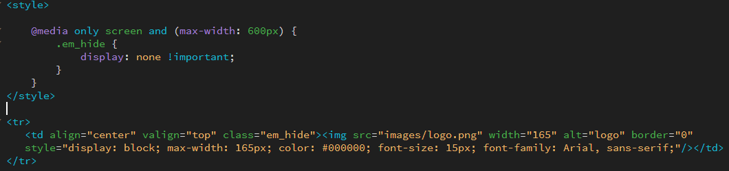
- Employ display:none in a media query in order to hide an element on specific devices by setting the display property to none. Here we hide the image in 600px and less viewport.
<style>
@media only screen and (max-width: 600px) { .em_hide {
}
</style> |
<tr>
}
display: none !important;
<td align="center" valign="top" class="em_hide"><img src="images/logo.png" width="165" alt="logo" border="0" style="display: block; max-width: 165px; color: #000000; font-size: 15px; font-family: Arial, sans-serif;"/></td> </tr>
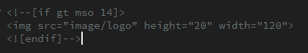
Make use of MSO conditional comment to hide an element on the basis of a certain condition. In the following instance, you can choose to hide an element if the Outlook version is older than 2010.
<!--[if gt mso 14]>
<img src="image/logo" height="20" width="120">
<![endif]-->|
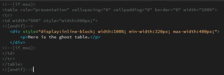
3. Employ Ghost Tables:
Ghost tables come in handy when you don’t wish Outlook to break things simply because it doesn’t recognize the max-width, min-width, and inline-block properties. There are a couple of ways to create ghost tables, let’s check them out;
<!--[if mso]>
<table role="presentation" cellspacing="0" cellpadding="0" border="0" width="100%"> <tr>
<td width="600" style="width: 600px;">
<![endif]-->
<div style="display:inline-block; width:100%; min-width: 320px; max-width:480px;">
  <p>Here is the ghost table.</p>
</div>
<!--[if mso]>
</td>
</tr>
</table>
<![endif]-->|
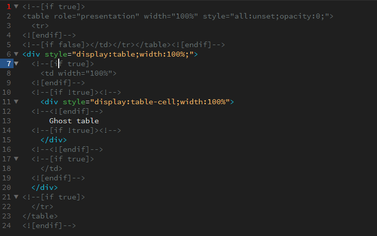
Or,
<!--[if true]>
<table <tr>
role="presentation" width="100%" style="all:unset;opacity:0;">
<![endif]-->
<!--[if false]></td></tr></table><![endif]-->
<div style="display:table;width:100%;">
<!--[if true]>
<td width="100%">
<![endif]-->
<!--[if !true]><!-->
<div style="display:table-cell;width:100%">
<!--<![endif]-->
Ghost table
<!--[if !true]><!-->
</div>
<!--<![endif]-->
<!--[if true]>
</td>
<![endif]-->
</div>
<!--[if true]>
</tr>
</table>
<![endif]-->


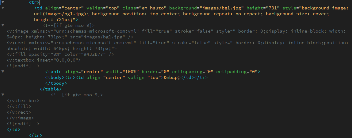
4. Bulletproof backgrounds and bullets:
Bulletproof email design elements are HTML/CSS elements that use traditional background images combined with Vector Markup Language (VML) to display properties irrespective of your subscriber’s email client. The following is an example of a bulletproof background.
<tr>
<td align="center" valign="top" class="em_hauto" background="images/bg1.jpg" height="731" style="background-image: url(images/bg1.jpg); background-position: top center; background-repeat: no-repeat; background-size: cover; height: 731px;">
<!--[if gte mso 9]>
<v:image xmlns:v="urn:schemas-microsoft-com:vml" fill="true" stroke="false" style=" border: 0;display: inline-block; width: 640px; height: 731px;" src="images/bg1.jpg" />
<v:rect xmlns: v="urn:schemas-microsoft-com: vml" fill="true" stroke="false" style="border: 0;display: inline-block;position: absolute; width: 640px; height: 731px;">
<v: fill opacity="0%" color="#432B77" />
<v:textbox inset="0,0,0,0">
<![endif]-->
<table align="center" width="100%" border="0" cellspacing="0" cellpadding="0"> <tbody><tr><td align="center" valign="top"> </td></tr> </tbody>
</table>
<!--[if gte mso 9]>
</v:textbox>
</v:fill>
</v:rect>
</v:image>
<![endif]-->
</td>
</tr>
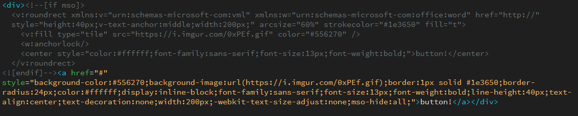
Across email clients, the shape of a button may be affected, however, their functioning is unaffected. Here is an instance of a bulletproof button,
<div><!--[if mso]>
<v: roundrect xmlns:v="urn:schemas-microsoft-com: vml" xmlns:w="urn:schemas-microsoft-com:office:word" href="http://" style="height:40px;v-text-anchor:middle;width:200px;" arcsize="60%" strokecolor="#1e3650" fill="t">
<v: fill type="tile" src="https://i.imgur.com/0xPEf.gif" color="#556270" />
<w: anchor lock/>
<center style="color:#ffffff;font-family: sans-serif; font-size: 13px; font-weight:bold;">button!</center> </v: roundrect>
<![endif]--><a href="#"
style="background-color:#556270;background-image:url(https://i.imgur.com/0xPEf.gif);border:1px solid #1e3650;border- radius:24px;color:#ffffff;display:inline-block; font-family: sans-serif; font-size: 13px; font-weight:bold;line-height:40px;text- align:center;text-decoration:none;width:200px; -webkit-text-size-adjust:none; mso-hide:all;">button!</a></div>
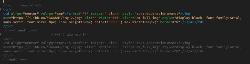
5. Replace Gifs with static images:
Outlook for Windows still does not support gifs. Across Outlook versions, the handing of gifs varies. To convey your visual message in an effective manner one can use conditional comments to display a static image.
<!--[if !mso]><!-->
<tr>
<td align="center" valign="top"><a href="#" target="_blank" style="text-decoration:none;"><img src="https://i.ibb.co/Y366BHT/img-2.jpg" alt="" width="600" class="em_full_img" style="display:block; font-family: Arial, sans-serif; font-size:18px; line-height:50px; color:#000000; max-width: 600px;" border="0" /></a></td> </tr>
<!--<![endif]-->
<tr>
<!--[if gte mso 9]>
<td align="center" valign="top"> <a href="#" target="_blank" style="text-decoration:none;"><img src="https://i.ibb.co/Y366BHT/img-2.jpg" alt="" width="600" class="em_full_img" style="display:block; font-family:Arial, sans-serif; font-size: 18px; line-height:50px; color:#000000; max-width: 600px;" border="0" /></a></td>
</tr> <![endif]-->
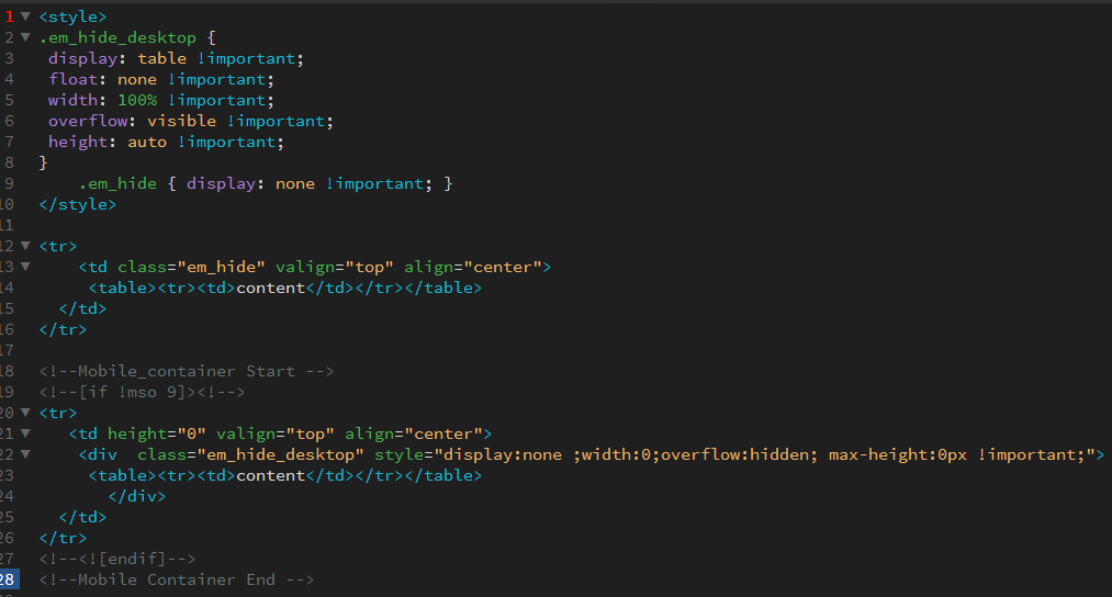
6. Hide & Show Method:
If you want to hide and show elements in mobile and desktop you can use this method.
<style>
  .em_hide_desktop {
    display: table !important;
    overflow: visible !important;
    float: none !important;
    width: 100% !important;
   height: auto !important;
 }
  .em_hide { display: none !important; }
</style>
<tr>
  <td class="em_hide" valign="top" align="center">
    <table><tr><td>content</td></tr></table>
  </td>
</tr>
<!--Mobile_container Start -->
<!--[if !mso 9]><!-->
<tr>
  <td height="0" valign="top" align="center">
    <div class="em_hide_desktop" style="display:none;width:0;overflow:hidden; max-height:0px !important;">
       <table><tr><td>content</td></tr></table>
    </div>
  </td>
</tr>
<!--<![endif]-->
<!--Mobile Container End -->
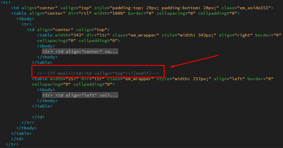
7. Stack Tables:
One can stack tables in Outlook mobile using mso conditions. For this, one has to code the main table and, after that code two tables in the main table. You may then code MSO code for the middle of both tables.
For instance,
<tr>
<td align="center" valign="top" style="padding-top: 29px; padding-bottom: 28px;" class="em_aside151"> <table align="center" dir="rtl" width="100%" border="0" cellspacing="0" cellpadding="0">
<tbody>
<tr>
<td align="center" valign="top">
<table width="343" dir="ltr" class="em_wrapper" style="width: 343px;" align="right" border="0" cellspacing="0" cellpadding="0">
<tbody>
<tr> <td align="center" va...
</tbody>
</table>
<!--[if mso]></td><td valign="top"><![endif]-->
<table width="257" dir="ltr" class="em_wrapper" style="width: 257px;" align="left" border="0" cellspacing="0" cellpadding="0">
<tbody>
<tr> <td align="left" vali...
</tbody>
</table>
</td>
</tr>
</tbody>
</table>
</td>
</tr>
Summary
In conclusion, one can say that one can deploy different techniques that can be used to achieve consistency across clients, servers, and devices. Are you looking for the perfectly coded, universally rendering email campaigns? Email Uplers is just a couple of clicks away!