


Responsive is quite in the vogue. With most subscribers reading emails on the go, it is quintessential to send out emails using media queries that render well across the devices irrespective of the screen sizes.
For most marketers that has a user base viewing emails in native apps on Android and iOS, responsive fetches amazing results. However, media queries are a problem when your user base is viewing emails using third party applications. As they have no or minimal support, these emails don’t render well on these email clients or third party app.


If your user base is relying more on the third party apps, there is a workaround to using media queries which is now known as hybrid coding technique or spongy technique of coding. With this approach, the email renders just like the responsive version in the third-party apps as well however, this method does have some limitations and it would not be as good a responsive email as developed using media queries.
So, what is the great fix?
The logical solution to fix the rendering issue is to use min-width and max-width to enable movement. However, this workaround will not work in Outlook, but luckily there are few solutions that can help you in fixing this problem as well.
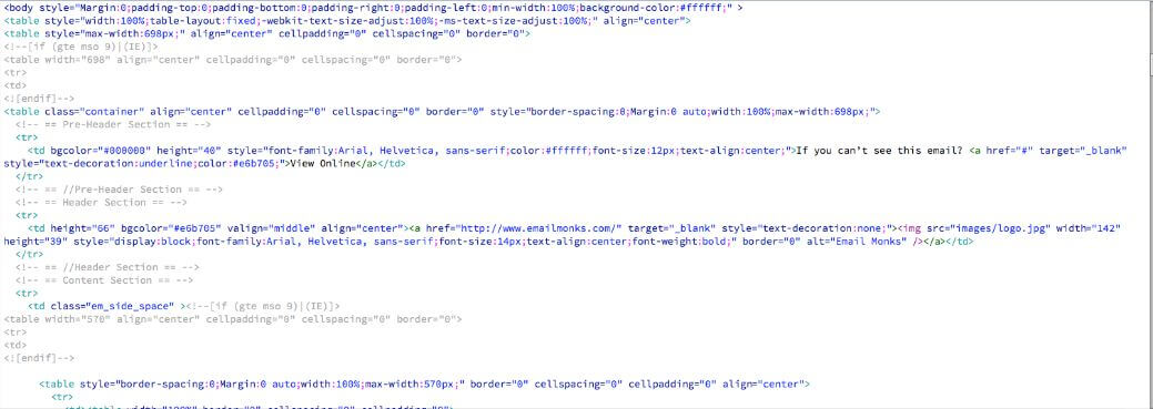
You need to create a table that is 100% wide with a max-width of your desired size on Desktop.
@media screen and (min-width: 601px) {
.container {
width: 600px!important;
}
}
Apple Mail, which doesn’t respect max-width, create a media query to limit that table’s size on desktop
<!–[if (gtemso 9)|(IE)]><![endif]–>
This is used for conditional CSS for Outlook to force it to collapse borders on all tables and prevent unwanted gaps
In Body Margin: 0; padding: 0;min-width: 100%;
We also have Margin: 0 auto;set here to center our table in Yahoo in Chrome. Though this use of margin is for Yahoo typically, we always capitalize Margin so that Outlook.com won’t strip it out.
Under the body, first we have a <table>tag, to center its contents.
<!–[if (gtemso 9)|(IE)]>
<table width=”600″ align=”center” cellpadding=”0″ cellspacing=”0″
border=”0″ >
<tr>
<td>
<![endif]–>
<table class=”container” align=”center” cellpadding=”0″ cellspacing=”0″ border=”0″ style=”border-spacing:0;Margin:0 auto;width:100%;max-width:600px;”>
<tr>
<td>
[content goes here]
</td>
</tr>
</table>
<!–[if (gtemso 9)|(IE)]>
</td>
</tr>
</table>
<![endif]–>
A conditional table for Outlook that is hidden to all other clients. We need these because we’re using the max-width property which Outlook doesn’t support. Therefore we need to create special Outlook-only tables with explicit pixel widths to contain everything in Outlook.

Single Column Layout:
For full-width banner you just need to give class in td of image & define class in style, Change the max-width according to your email size.

Two Column Layout:

<tdstyle=”text-align:center;font-size:0;”>
<!–[if (gtemso 9)|(IE)]>
<table width=”100%”>
<tr>
<td width=”50%” valign=”top”>
<![endif]–>
[column to go here]
<!–[if (gtemso 9)|(IE)]>
</td><td width=”50%” valign=”top”>
<![endif]–>
[column to go here]
<!–[if (gtemso 9)|(IE)]>
</td>
</tr>
</table>
<![endif]–>
</td>
</tr>
These conditional columns are important, because without them Outlook will not let our two floating tables sit neatly side-by-side. As Outlook doesn’t support max-width either, these columns help restrict each column to the correct size.
- Font-size: 0to get rid of any gaps between our columns inside this cell.
- Text-align: center stack in the column center on mobile
- We’re using a width of 100% up to a max-width of 300px so that this particular column will be 100% wide on viewports that are smaller than 300px wide.
- We are going to get two columns to float side by side on desktop, but stack in the center on mobile, is by using a combination of text-align: center and display: inline block. You can choose from left, center or right text alignment, and your inline-block divs will obey.
–> Set vertical-align to whatever you like, it will acts like valign=”top”

Three Column Section
<tr>
<td
style=”text-align:center;font-size:0;”>
<!–[if (gtemso 9)|(IE)]>
<table width=”100%”>
<tr>
<td width=”200″ valign=”top”>
<![endif]–>
[column to go here]
<!–[if (gtemso 9)|(IE)]>
</td><td width=”200″ valign=”top”>
<![endif]–>
[column to go here]
<!–[if (gtemso 9)|(IE)]>
</td><td width=”200″ valign=”top”>
<![endif]–>
[column to go here]
<!–[if (gtemso 9)|(IE)]>
</td>
</tr>
</table>
<![endif]–>
</td>
</tr>
–>Now add the following CSS to give some additional padding to this row, as well as set up all the properties we used in the two-column layout to make our columns behave how we want them to. It will also set up our styles for the div columns that we are about to add, which will be 200px wide in this case.
Two Column (Inverse)

<table width=”100%”
dir=”rtl”>
<tr>
<td width=”500″>
<![endif]–>
<table style=”width:100%;display:inline-block;vertical-align:middle;max-
width:500px;”
dir=”ltr”
>
[Content Goes Here]
</table>
<!–[if (gtemso 9)|(IE)]>
</td><td width=”100″>
<![endif]–>
<table style=”width:100%;display:inline-block;vertical-align:middle;max-
width:100px;”
dir=”ltr”
>
[Content Goes Here]
</table>
<!–[if (gtemso 9)|(IE)]>
</td>
</tr>
</table>
<![endif]–>