


Internet and emails is the lifeline that connects us to every happening in the world, while on the move. So when you open an email, what is the first thing you observe in the content? Headlines? Images with attached captions? Ads?
Ever considered what all have in common? Fonts and colors!
While Colors in emails evoke different emotions and speaks about a brand’s value proposition, personality and presentation; Fonts communicate your brand to your subscribers and customers, but a font’s true purpose is to be read. (Even here your attention was quickly caught by the bold typeface)


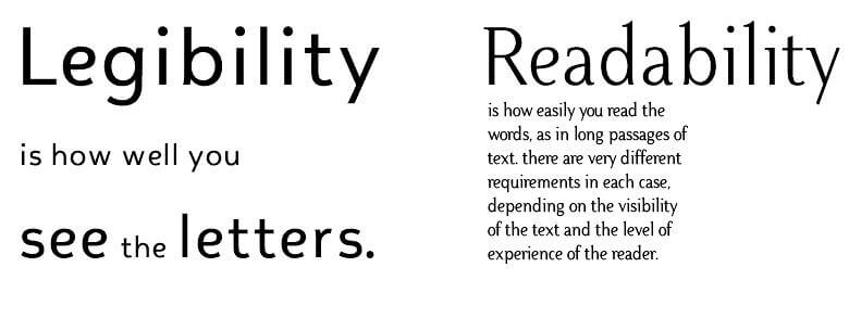
Just like there is no single “Perfect” color for every brand, there is no single “Approved” font. Fonts are intrinsic to the typography of digital content and a really exemplary typography has one prime purpose – Utmost Readability. Most people assume Legibility and Readability in emails to be same. However, there is a vast difference between them.

Scanned or Skimmed: Understand how you ‘see’ words.
Read the following two paragraphs and time yourself each time:
- The quick brown fox jumps over the lazy dog. The quick brown fox jumps over the lazy dog. The quick brown fox jmups over the lazy dog. The quick brown fox jumps over the lazy dog.
- Welcome to Reading 101. Sit down. Pick up a book. Focus on the first word, follow with second word. On reaching end of the line shift the to word on the next line.
Even if you couldn’t time yourself, you should have noticed that reading first paragraph was quicker since it had the same sentence repeated. Such kind of reading is called Skimming, i.e. Neglecting words and focusing on keywords.
Now once again read both paragraphs and find the error in both lines. Got it? Excellent! This time you went through each word, and this is called Scanning. Independent on how you read your emails, a proper font makes a difference in your cognitive thinking abilities and also willingness to read the email.

Using Simple Fonts vs. Fancy Fonts in Emails
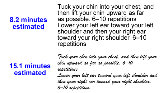
Studies indicate that readers tend to take more time (around 86% longer) reading fancy fonts like Brush script than simple fonts (Arial) as it was hard to read. Also, the willingness to read the exercise dropped in case of fancy fonts compared to simple fonts.

So have you picked your pitchforks to banish the fancy fonts? Hold on!
A survey conducted with fonts in a restaurant menu revealed that people perceive the chef in restaurants whose menu is written with fancy fonts to be more skilled. Similarly, in emails to gain class and sophistication make use of Fancy fonts, but Beware!, you also stand a chance to scare them away before they even read the first line if your entire email body contains same font.
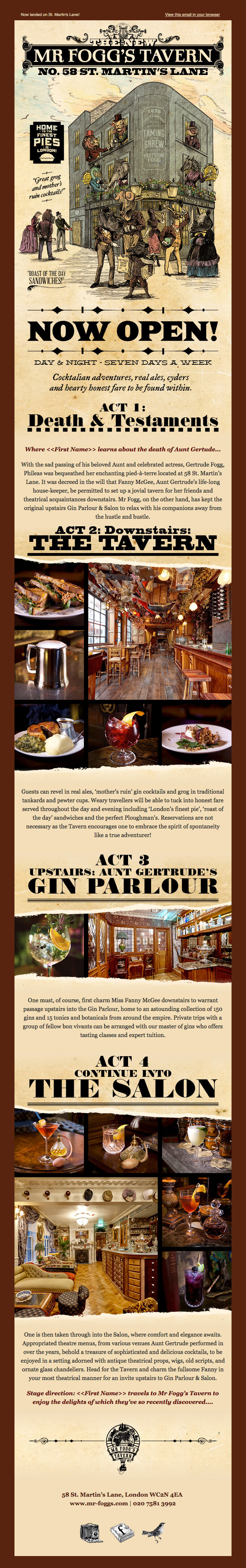

Fig: An Email Newsletter with 3 different set of Fonts associated with Midwest Saloon theme.
Best practice is to reserve Fancy fonts for Headlines in order to catch attention and then follow through with Simple fonts.

Home Furnishing Company Domino makes use of 2 contrasting Fonts to separate Headline & Body in each sections.
Fonts and Email Clients
Amongst the plethora of the available fonts, email clients shall only display fonts that are already installed on your recipients’ devices. So depending on the different email clients you have to provide fallback font options.
- System-Wide Font
Fonts that are already available as Windows, Apple or Android system font; such as Arial, Helvetica, Verdana or Trebuchet is most fail safe options.
![]()
![]()


- Web Font
Font family from various web based sources such as Google Web fonts or Fontdeck can be included into your coding, since they provide various Font Family support.
![]()
![]()


In case of Outlook, a fallback bug causes content to be displayed in Times New Roman, instead of fallback font, when the primary font isn’t available. This can be avoided by specifying CSS class in your email code.
- Setting as Image
If the font you wish to include is not available in above category, it is advisable to include in form of an image.
![]()
![]()
Finding the sweet spot. Get your email typography correct.
- Select a proper font combination
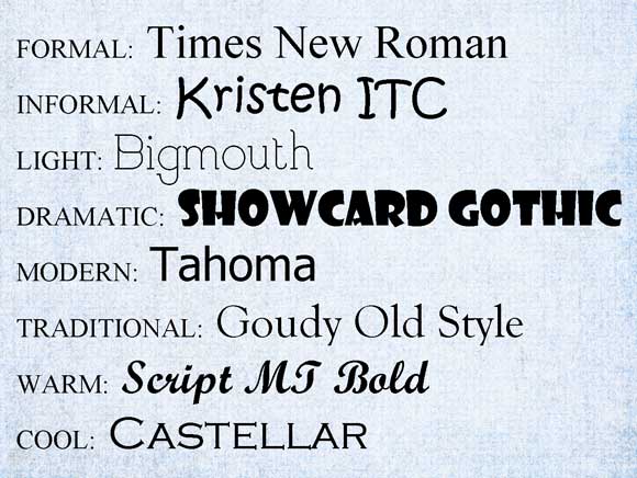
- Determine your tone:

AN ALL CAPS TYPEFACE GIVES AN IMPRESSION OF A LOUD, SHOUTED EXPRESSION, so should be avoided altogether.
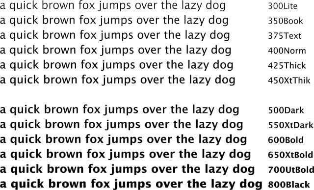
- Choose an anchor font: The base font upon which you can experiment with light, bold, semi-bold and black options.Select a proper font combination.

-
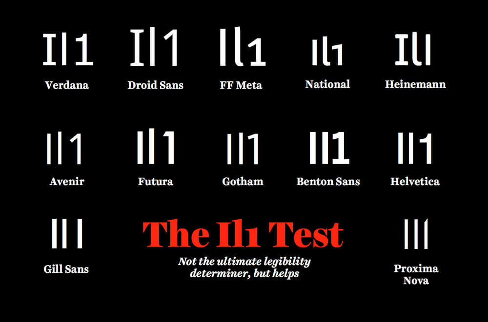
- Conduct Il1 test: To check whether your font renders each character properly, it is suggested to check whether the letters ‘I’, ‘l’ and ‘1’ are differentiable. Here is an interesting presentation by Jessica Hische to test each font.

- Choose a font size more than 12pts for easy readability. It was found that letter size of 12pt is ideal for print, but with the onset of digital screens and prolong viewing; it is advisable to set font at least 14 -16pts.
- Provide proper line spacing. Font size and Line spacing should be linear. Line spacing should be around 1 1/2 size of font size, i.e. for a 14pts font size the line spacing should be approx 23pts.
- Set a line length between 50-75 chars for easy scan path deviations.
Takeaways
- A really exemplary typography should provide Utmost Readability.
- A bad Typography reduces cognitive thinking ability.
- The space between any characters in the same font is called Kerning.
- Reserve a Fancy font for Headlines in order to catch attention and then follow through with Simple fonts in body.
- Set a line length between 50-75 chars for easy scan path
- In case of choice always go for a medium width font with line spacing of about 1 1/2 font size.