


How do I create my next email template in Salesforce Marketing Cloud?
It’s pretty straightforward: collect email addresses, segment your subscriber list, create personalized content, set up testing and post-campaign analytics, and let ‘em rip!
Right?
Not exactly!
All these steps are undoubtedly important. But it’s also critical to pay attention to another essential part of the process: email template design.
With a host of intuitive creation tools, built-in Salesforce email templates, intelligent predictive AI (Einstein), plus numerous powerful capabilities – Salesforce Marketing Cloud (SFMC) makes it easy to create memorable, 1-to-1 emails. In this guide, we will focus on the design aspects of SFMC email marketing, and show you how you can enhance your email’s designs. So whether you are a Salesforce Marketing Cloud consultant, email marketing specialist or a newbie designer, get ready to explore these tips. Your next email adventure awaits!
The Critical Elements of a Great Email Design
Why is email design important?
No matter how great your content or how timely your campaign, if your design is not impressive, your entire campaign can fail. Your recipients are busy, impatient and distracted, so if your email’s design doesn’t impress them, they may simply ignore or delete your message.
To capture the attention of your audience, your email design must be engagement-worthy. This means it must be:
- Visually appealing
- Contain easy-to-read copy, thoughtful images, and an intuitive layout
- Consistent with the brand’s aesthetics and values
- Easy to navigate, read, and understand
- Perfectly synced with other email elements (e.g. content)
5 Best Practices to Make Your SFMC Email Campaigns Shine
So how can you create kick-ass email designs that deliver value to your subscribers and ensure rich rewards for you?
Here are 5 of our favorite best practices – all tried-and-tested and verified by the email experts at Uplers!!
1. Choose your colors wisely
Email marketing offers some amazing opportunities to go wild with colors. But don’t go too wild – your email’s legibility depends on it! Choose complementary colors, preferably those that match your overall brand’s colors (website, logo, marketing collaterals, etc.). Also make sure that your text and colors don’t clash. Avoid “vibrating” colors or colors with low visibility that hurt your readers’ eyes and stop them from opening your emails.

Your audience may consist of several color-blind subscribers, or subscribers with some other visual challenges. So always choose colors that don’t reduce their visibility.
Other color tips:
- Choose complementary and contrasting colors for text and background
- Use dark-colored text against a white (or other light) background for the email body
- Use white (or other light) text on a darker color for a CTA button

- Test that your email colors are visible to all people with a free tool like Are My Colours Accessible?
- Test drive differently-colored emails with A/B testing
2. Don’t over-experiment with fonts
It’s also important to choose the right fonts for two reasons: to ensure that text renders correctly on your reader’s device, and to ensure that they can actually read it!
As far as possible, choose “web-safe” fonts like Arial, Tahoma, Helvetica or Times New Roman because they usually render correctly across the web and all kinds of devices. If you have an established email marketing design team, or are working with an expert Salesforce Marketing Cloud consultant or experienced email marketing expert, you can experiment with other fonts. But you should still avoid using cursive, curly-q fonts. Legibility is the key.

3. Add ALT text to images and buttons
When working on email design, it’s easy to forget about ALT text. But if you do, some of your readers will simply see a blank space where a button or image is supposed to be. Adding ALT text will enable your subscribers to understand what they’re reading, even if the HTML doesn’t render properly or if their email client blocks images by default. ALT text will also guide them towards a particular action, e.g. “Read More”, “Click here” or “Buy Now”.
Add ALT text to every image, link and button in every email. If you have created landing pages, hyperlink this text to these pages.
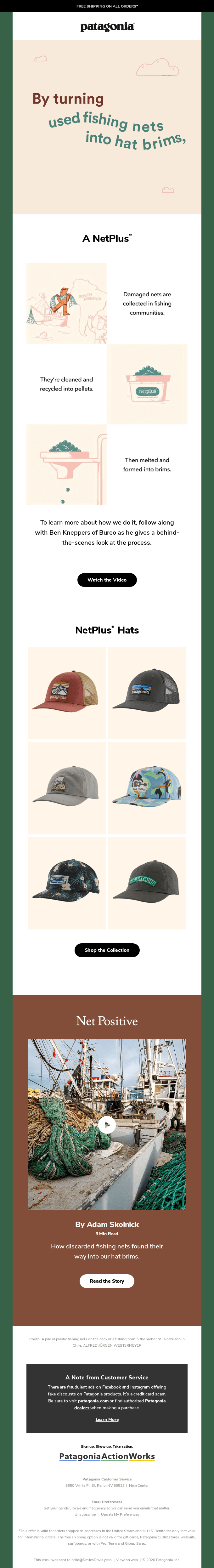
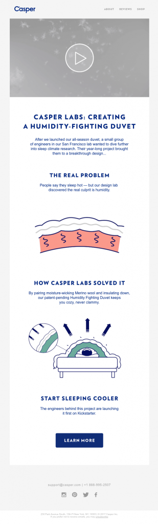
4. Plan your template’s layout and pick the right elements (engaging GIFs, fun illustrations, etc.)
Consider using a modular framework for each type of email message. Determine if one Salesforce email template with different modules will fit all your needs, or if you need different templates for different emails.
In addition to bright, cheerful colors (that match your brand), graphics, photos and other visuals can make your email engaging. For example, GIFs can be a fun way to catch the eye of your audience. Combine a GIF with useful, relevant content to give users a compelling reason to click on a button. You can also create a GIF of your website or a product demo to create curiosity or intrigue.

Use interactive elements in your email to raise the “oomph” factor, such as:
- Countdown timers
- Video

- Accordion menus
- Image carousels
- Maps
- Quizzes
- Live polls
- Image/button rollovers


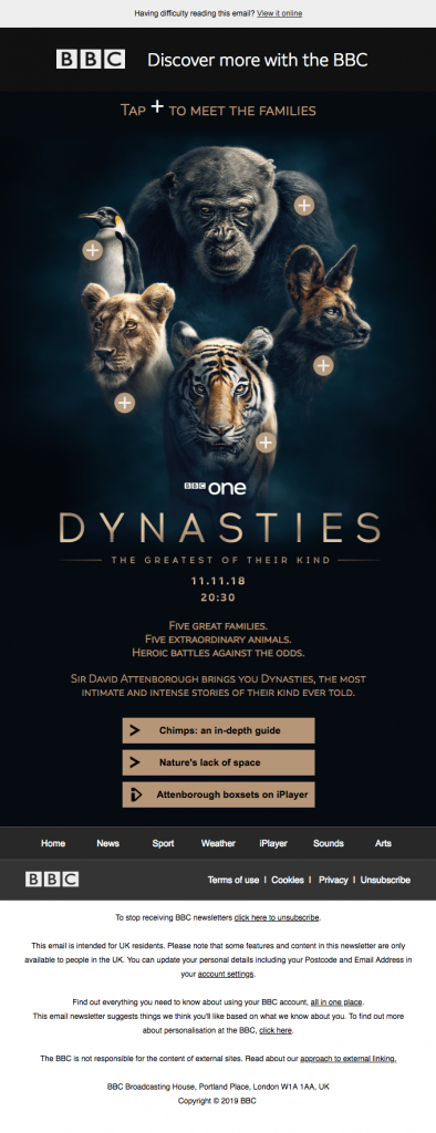
Illustrations are also a good way to maintain your reader’s attention all the way to the bottom of the email. Add an illustration next to each content section to break up the monotony and enhance the email’s look-and-feel. You can also incorporate branded images to give your brand more of a personality, and to generate greater brand recognition and recall.
Organize your layout with user experience (UX) in mind:
- Check if the layout looks cluttered, especially on mobile
- Strategically organize all written and visual content so the email is easy to navigate and consume
- Leave empty/white space throughout the email


- Check that no sections of the copy are cut off
Whatever graphical elements you use, make sure they have a “purpose”. Your template should not contain too many animated GIFs or interactive elements. It should also not contain any auto-play audio elements. Add context and interest through photographs. But avoid stock photography that doesn’t align with your message, brand or subscriber. Appeal to subscribers’ emotions and communicate functionality.
5. Polish your CTA
Distinguish your call to action through colors, text choice and correct placement. It should clearly stand out from the rest of the copy. It should also be clear and unambiguous so the reader quickly understands what action you need them to take:
- Buy a product
- Sign up for a service or subscription
- Take advantage of a sale, special offer or limited-time discount
- Download a resource
- Recommend the brand to a friend
Don’t be afraid to use multiple CTAs throughout your email, especially if the different prompted actions are all closely related, and meet the email’s main goal. You can also include the same CTA more than once.
Other CTA best practices:
- Position one clear CTA at the top of the email, with additional CTAs in the remainder of the body.

- Add a CTA above the fold for maximum eyeballs and engagement.
- Make sure that the contrast between the CTA text and background color is high enough to be easily legible.
Some more “big picture” ideas
We hope these five ideas inspire you to develop and design beautiful emails that your subscribers love. To wrap up this guide, here are some more design best practices to build a successful email campaign:
- Incorporate vivid visuals that connect with your brand’s persona
- Test all colors, fonts, images and CTA buttons/links to make sure the email renders correctly across platforms and devices
- Also test it without images to see what your email looks like with a weak connection
- Don’t overcomplicate the design
- Create mobile-optimized emails so they look great on any device and for every email client

(iPhone X)
- Maintain consistent look and feel so it’s easy to identify any email as your brand’s content
- Add a clearly visible unsubscribe button or link
Finally, a great email design always focuses on readability. To make sure that your email is readable:
- Divide it into bulleted text and sections
- Each section should follow a logical flow
- Include spacing between text and white spacing between text and graphical elements
- Keep sentences short
- Place your most important content at the top
To know more about perfectly-designed Salesforce email templates and how they can take your brand’s value into the stratosphere, talk to us!