


On 14th September, developers at Google turned every email developers’ world a tad brighter by announcing that soon their email clients shall support media queries from the next update. At the time of writing this article, Google stuck true to their words and responsive emails have started to grace inboxes of innumerable Gmail users.


Why the news was welcomed by all?
Earlier, Gmail didn’t support media queries out-of-box. This meant the responsive email templates opened in Gmail would have a broken layout compared to native email clients.


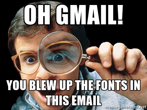
As you can see, in the email being viewed on a mobile device, Gmail automatically bumps the font size to make it readable. But this in turn can ruin the overall layout and disrupt the overall user experience.

A workaround solution was to code the email in a spongy layout and then adding media queries for the other email clients and such kind of layout was called Hybrid email.


But hybrid coding was too complex and was a waste of time.

Other alternative
In such cases, the email needs to be forced to render the desktop view of the email by adding a separate div consisting of some amount of ‘ ’ after the footer.


It’s 2017, Gmail is now responsive…
…. but do we still need to enforce desktop view in mobile devices??? The answer is yes as well as no. For those mobile devices with unusual display density or low display resolution, it is necessary to enforce desktop view.


Other scenarios wherein you need to selectively force desktop view
Subscriber’s Gmail is not updated due to improper iOS version: Certain Apple devices, owing to hardware restrictions get stuck at a specific iOS version and hence cannot update their Gmail. This means, if they wish to enjoy the responsive email, templates need the desktop layout coded.

Low storage spaces cause Gmail to not update: Majorly observed in Android devices, due to low internal storage, Gmail cannot be updated similar to previous case.
But this doesn’t mean that we enforce desktop view in all devices. Since the div is nested in media query, the desktop view is only triggered when not forced always.
<div class="em_div" style="white-space:nowrap; font:20px courier; color:#ffffff; background-color:#ffffff;"> </div>
Parting Thoughts:
Noticed any new bug after Gmail’s responsiveness update? Share your experience in the comments below.