


Crafting engaging content is key to getting maximum open rates and click-through rates for your email campaigns. True. However, positioning and organization of the content plays an equally vital role in drawing the subscriber’s attention. Cutting the long story short, your email layout is as important as your email copy.
While you use HTML to code both websites and emails, it does not work on the same principles.Here’s how it’s different:
- When it comes to emails, you have to accommodate everything in a layout of 600px fixed-width.
- Emails are coded with table tags, so if font sizes scale up or down, it leads to breaking the layout.
That said, let’s discuss how you can ensure that there is no discrepancy in your font sizes and the email renders well on all devices and browsers.


Rendering of EM and PX in the Popular Email Clients
When you test a 1em and 16px baseline, which is the default in browsers like Opera, Internet Explorer, Firefox, and Safari Desktop, it looks something like this:

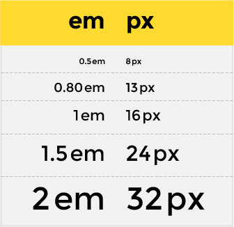
Like you can see in the image, em and px are consistent enough with the font sizes they display. The challenge actually lies in translating these figures into HTML email. Every email client uses different baselines and that’s the reason why it becomes difficult to create pixel-perfect emails using em. The pixel is an absolute unit while em is a relative unit that varies across different email clients.
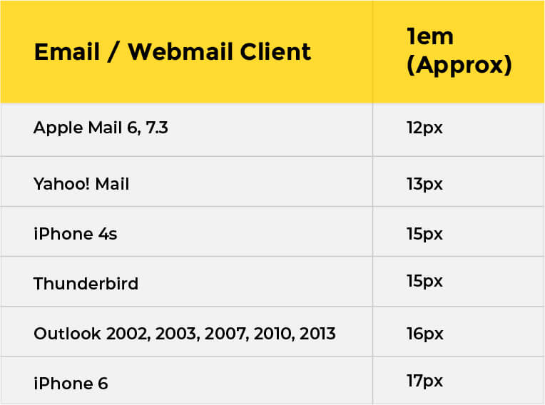
Lotus Notes and Outlook email clients work on the 1em/16px baseline. On the other hand, if we talk about the webmail set, stylesheets within Gmail, Hotmail, and MobileMe, these clients scale down em sizes from the 16px baseline irrespective of the test in the browser. WebKit email clients like Apple Mail, iPad, and iPhone work like their webmail counterparts with the baseline as 1em=12px for Apple Mail and 1em=13px for iOS.


It is intriguing to know that font sizes specified with px reflect the same height and width across all the major email clients, unless font substitution has been used.
In other words, 16px in Outlook works as 16px in both Gmail and iPad. As long as you are not using a fluid layout for your HTML email, it is advisable to use fixed font sizes as it ensures consistency as well as reliability.
How to Use EM Within Email?
If you want to use em within email, it will take you two steps as discussed below.
- In the first step, you define a “font-size” with a value and an absolute unit that the em can relate to. It should be specified and styled within an opening <td> tag, as below.
<td style=”font-size:13 px; line-height:1.5em;”>
- The next step is to use span tag to style the text inside the table cell with the em.
<span style=”font-size:1em;”>Uplers</span>
The text mentioned inside the span tags styled with the em will now be related to the font-size in the opening <td> tag. It will, thus, render the text at 13px.
In case you miss out on defining the absolute unit and the value for the em to relate to, your text will render according to the email and webmail clients.
In the table below, you can get a clear idea of how 1em will render in different email or webmail clients. It is quite evident that while em makes it easy to adjust the font-size of several pieces of text inside a table cell, it can break your email layout if you do not define the value and an absolute unit.

How to Use PX In Emails?
PX is the safest to use as it renders accurately across email clients. Just bear in mind that iOS Mail on the iPhone resizes text of 13px or below to 14px to make it more readable.
In order to override this behavior, you can use the CSS Property -webkit-text-size-adjust and designate a value of none. Just make sure that the text is legible and readable for your subscribers.

How to Enhance Readability While Using PX in Emails?
Often, it so happens that the text becomes difficult to read because of insufficient line spacing. You can overcome this issue by designating the font size plus around 6px and increasing it as the font size increases.
For example: If the font-size is 13px, the line-height should be 19px and for font-size of 14px, the line-height can be 21px.
However, the challenge with this technique is that it can get quite cumbersome to maintain this consistency over different font sizes.
Therefore, it is recommended that you use the percent unit for line-height instead of pixel. You can choose 130% to 150% according to the font-family.
The code would look something like this, and it will make leading proportionate to every font size in the email.
| <td style=”font-size:13px; line-height:150%;”> |
Wrapping Up
The bottom line – Use px in your email and save your subscribers the frustration of seeing a broken email. It will not only make your typography readable but also create an aesthetic visual appeal.