


Email is one of the most challenging digital media, but it has remained to be a valuable marketing channel in spite of its professed death. There are seemingly numerous hurdles between the modern marketer and a successful email campaign, such as permissions, unsubscribes, email design, and buggy email clients. An email audit helps you to overcome these hurdles by letting you know the shortcomings in your email campaigns and making the necessary modifications to bring better results.
We shall discuss the essentials of email design audit in this article.


How email design is a vital part of the campaign success
A well-designed email can be a boon for your email marketing strategy. It will convey the message more clearly and help you increase the subscriber engagement. If your emails are visually attractive, you will be able to capture the attention of the subscribers and entice them to purchase from you. Therefore, you should focus on email design as much as you do on the marketing best practices.
A broken email layout can turn off your subscribers and make them unsubscribe or report your emails as spam. To avoid losing subscribers like this, it is advisable to have flawless email design with double-checked HTML codes, which becomes possible with a regular email audit.
Why periodic email design audit is important
Many marketers end up using the same kind of email templates for all their campaigns. Be it a marketing email or a transactional email, your subscribers will not like to open your email if it has nothing new to offer to them. Keep an eye on the metrics such as open rate and click-through rate. In case you find that your emails are not performing quite well, it could be time for an email design audit.
It is important to get a periodic emai
l design audit because email design trends are constantly changing. An audit can determine whether your email designs are in line with the technological advancements and reinvent new opportunities for you.
How to conduct a design audit
A typical email consists of the following sections:
- Email header
- Hero image
- Email copy
- Email footer
First of all, review the entire look and feel of the email. There is a thin line between being creative and going over the top. Strive for a visually attractive email without making it too cluttered. It must follow all the branding guidelines – brand logo, type of font, and color scheme.

Next comes the email header. Make sure that it is interesting enough to grab the subscriber’s attention. The hero image should match the core message of the email, while reflecting your brand personality.
Email copy is the next thing you should check. Make sure it is engaging enough to keep the readers hooked and prompts them to take action. It should not be salesy and subtly convey the message with the customer at the cynosure.
You should choose visual imagery for the emails in such a way that it throws more light on the offer highlighted in the email. If your email is intended to introduce a product or service, you can consider adding custom illustrations in the email that would explain the reader more about it. Alternatively, you can also use rich media like GIF to demonstrate its usage.
Whenever you add images to your email, you should make sure to add alt-text to the images so that the subscriber can know what the image is about, even with images turned off.
Moreover, your text: image ratio should be maintained at 80: 20 so that it does not trigger any spam filters or hamper your deliverability.
Last but not the least comes the email footer.
It should include links to your social media profiles, an unsubscribe link, a View Online link, and your physical address.
Let’s consider an example to understand how to audit an email.
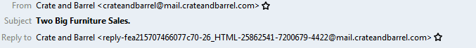
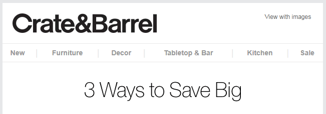
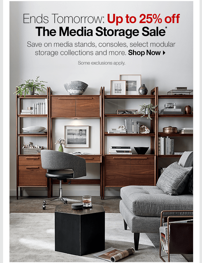
Take a look at the email by Crate & Barrel. We shall divide the email into different sections for better understanding.
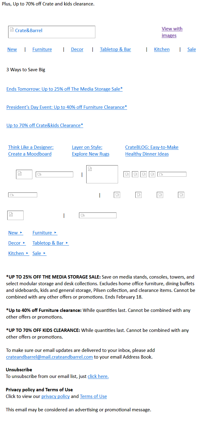
- The From line is enough to let the subscriber know who the email is from. “Two Big Furniture Sales” is an interesting subject line to garner higher open rates. They have a separate “Reply to” email address, which reflects that the brand is actually interested in hearing from the subscriber.

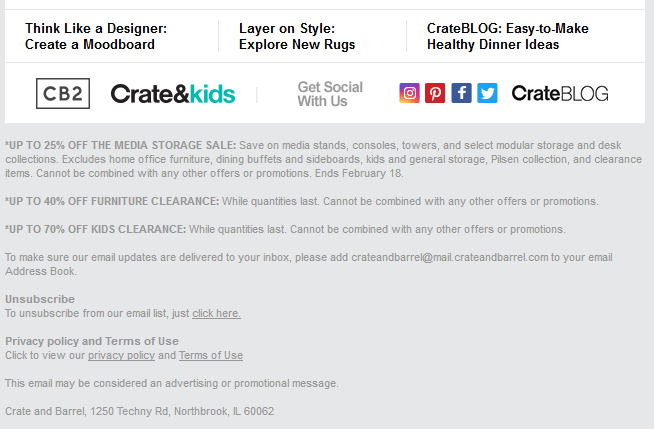
- It is a good idea to have the navigation bar at the top of the email followed by an intriguing headline “3 Ways to Save Big”.

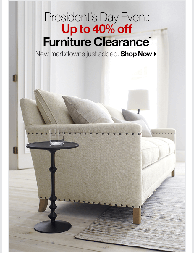
- The next section announces two of their sales with a visually pleasing image and relevant copy supporting it. Instead of making the entire image clickable, it would be a good practice to have a separate CTA button redirecting the subscriber to the respective landing page.


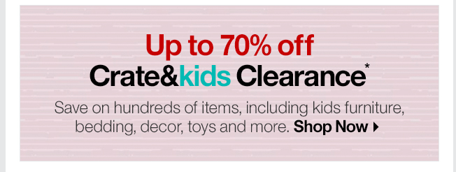
- They have taken the opportunity to promote the clearance sale for kids in this section with a CTA that redirects the subscriber to its landing page.

- The footer follows all the best practices like including the social media icons, unsubscribe link, privacy policy, and their physical address.

6. Here is the HTML version of the email with a preheader text that adds more information to the subject line. Also, notice the appropriately written alt-text for all the images.

How Uplers can Help
If you are still unsure about how an email design is audited, let us help you.
Here’s how an email audit report will look like:

Are you intrigued by the details highlighted in the report?
Get in touch with us now and we would love to share our insights with you.