


Designing responsive emails is not easy.
That’s because email rendering is complex. By the time an email reaches the intended inbox, it has gone through a number of rendering layers. In fact, Litmus states that there are potentially 300,000 renderings for every email.
But there’s no getting out of responsive emails, is there?
As a coder, you’re used to writing complex media queries to adjust the email layout for different devices. It takes time.
Not to mention the burden of code maintenance; as new devices and screen sizes emerge, you’d have to update your media queries to maintain responsiveness.
Slow coding, multiple iterations, delayed hand-offs, and all that jazz! We get you. We’re familiar with the back-and-forth, the ping-and-pong, of email development.
But you can saunter out of that routine, hands in pocket, by turning to MJML.
By the end of this post, you’ll know what MJML emails are and how you can leverage the MJML framework to code responsive emails faster. From the top!
- What Is MJML?
- How to Use MJML for Email?
- MJML vs. HTML: What’s The Difference?
- Limitations of MJML
- The Do’s & Don’ts of MJML


What Is MJML?
MJML, short for Mailjet Markup Language, is a framework designed to simplify coding responsive HTML emails. MJML builds responsiveness into the code, so you don’t have to write complex codes to achieve email client-agnostic rendering.
According to MJML’s documentation, MJML is a transpiler.
A transpiler is a program that converts the language of a code into another language. It acts as a translator, if you will, between programming languages.
MJML is also seen as an abstraction layer, which is a concept in computer science referring to something that hides system complexity from the user.
Here are a few advantages of MJML:
- The semantic syntax allows email developers to code easily and straightforwardly, boosting their productivity.
- Its extensive library of standard components lightens the email codebase and speeds up the development process.
- MJML’s open-source engine enables the creation of outstanding HTML emails.
- As an open-source framework, MJML benefits from a large community of contributors who continually improve the framework and provide support, documentation, and resources for developers.
- By using MJML, you can avoid the complex nesting of HTML tables and the need for email client-specific CSS.
- MJML handles many of the quirks and inconsistencies of different email clients, providing a more consistent rendering experience and reducing the need for client-specific CSS hacks.

How to Use MJML for Email?
Follow these steps to code an MJML email:
- You start with the
<mjml>tag. The<mjml>tag acts as the foundation of your MJML document. It includes all the content that will be used to build your email.
- Next, you add the
<mj-head>tag which, similar to the<head>tag in HTML, will contain all the information of the head section.
- Coming to the email body, the
<mj-section>tag breaks it down into sections containing columns (<mj-column>) and text (<mj-text>).
- Add relevant tags for buttons, images, and tables by using
<mj-button>, <mj-image>, and<mj-table>, respectively. - Go on adding the relevant MJML tags for your navigation bar, social media sharing, hero banners, accordions, carousels, etc. You can also build custom MJML components.
Here is an example of a simple welcome email designed using MJML.

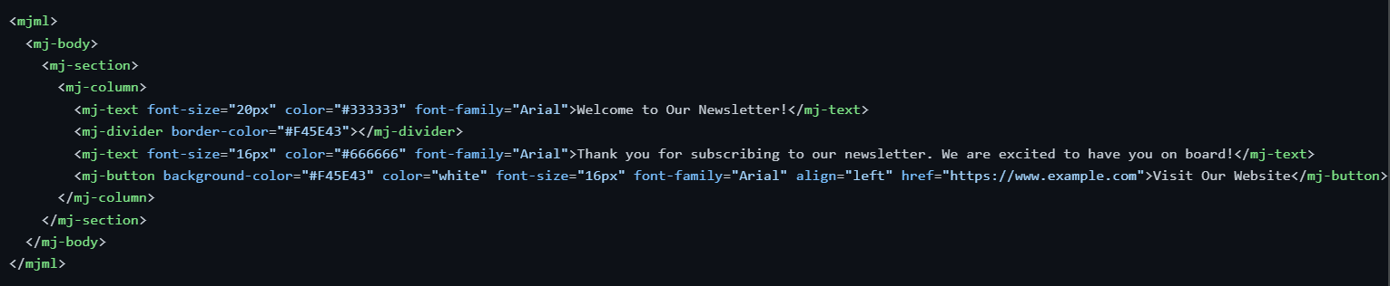
And here’s how the welcome email looks.


After completing the coding, navigate to the MJML online editor. Click the “Render” button at the bottom left, then click on the “HTML” option at the top left. Once the HTML is generated, you can send the email through your preferred ESP.
MJML vs. HTML: What’s The Difference?
Conceptually, the main difference between the two is that HTML is the standard markup language for structuring content on websites, mobile apps, and emails, whereas MJML is specifically built for creating responsive emails.
Unlike HTML, which is not essentially render-friendly, MJML simplifies coding and email rendering across major email clients.
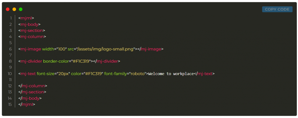
Let’s consider another simple welcome email. Below is a comparison of the email written using HTML and MJML. Notice the complexity and length in either case.
1. MJML Code

2. HTML Code
<!doctype html>
<html xmlns="http://www.w3.org/1999/xhtml" xmlns:v="urn:schemas-microsoft-com:vml" xmlns:o="urn:schemas-microsoft-com:office:office">

<head>
<title> </title>
<!--[if !mso]><!-- -->
<meta http-equiv="X-UA-Compatible" content="IE=edge">
<!--<![endif]-->
<meta http-equiv="Content-Type" content="text/html; charset=UTF-8">
<meta name="viewport" content="width=device-width, initial-scale=1">
<style type="text/css">
#outlook a {
padding: 0;
}

.ReadMsgBody {
width: 100%;
}

.ExternalClass {
width: 100%;
}

.ExternalClass * {
line-height: 100%;
}

body {
margin: 0;
padding: 0;
-webkit-text-size-adjust: 100%;
-ms-text-size-adjust: 100%;
}

table,
td {
border-collapse: collapse;
mso-table-lspace: 0pt;
mso-table-rspace: 0pt;
}

img {
border: 0;
height: auto;
line-height: 100%;
outline: none;
text-decoration: none;
-ms-interpolation-mode: bicubic;
}

p {
display: block;
margin: 13px 0;
}
</style>
<!--[if !mso]><!-->
<style type="text/css">
@media only screen and (max-width:480px) {
@-ms-viewport {
width: 320px;
}
@viewport {
width: 320px;
}
}
</style>
<!--<![endif]-->
<!--[if mso]>
<xml>
<o:OfficeDocumentSettings>
<o:AllowPNG/>
<o:PixelsPerInch>96</o:PixelsPerInch>
</o:OfficeDocumentSettings>
</xml>
<![endif]-->
<!--[if lte mso 11]>
<style type="text/css">
.outlook-group-fix { width:100% !important; }
</style>
<![endif]-->
<style type="text/css">
@media only screen and (min-width:480px) {
.mj-column-per-100 {
width: 100% !important;
max-width: 100%;
}
}
</style>
<style type="text/css">
@media only screen and (max-width:480px) {
table.full-width-mobile {
width: 100% !important;
}
td.full-width-mobile {
width: auto !important;
}
}
</style>
</head>

<body>
<div style="">
<!--[if mso | IE]>
<table
align="center" border="0" cellpadding="0" cellspacing="0" class="" style="width:600px;" width="600"
>
<tr>
<td style="line-height:0px;font-size:0px;mso-line-height-rule:exactly;">
<![endif]-->
<div style="Margin:0px auto;max-width:600px;">
<table align="center" border="0" cellpadding="0" cellspacing="0" role="presentation" style="width:100%;">
<tbody>
<tr>
<td style="direction:ltr;font-size:0px;padding:20px 0;text-align:center;vertical-align:top;">
<!--[if mso | IE]>
<table role="presentation" border="0" cellpadding="0" cellspacing="0">

<tr>

<td
class="" style="vertical-align:top;width:600px;"
>
<![endif]-->
<div class="mj-column-per-100 outlook-group-fix" style="font-size:13px;text-align:left;direction:ltr;display:inline-block;vertical-align:top;width:100%;">
<table border="0" cellpadding="0" cellspacing="0" role="presentation" style="vertical-align:top;" width="100%">
<tr>
<td align="center" style="font-size:0px;padding:10px 25px;word-break:break-word;">
<table align="center" border="0" cellpadding="0" cellspacing="0" role="presentation" style="border-collapse:collapse;border-spacing:0px;">
<tbody>
<tr>
<td style="width:100px;"> <img height="auto" src="/assets/img/logo-small.png" style="border:0;display:block;outline:none;text-decoration:none;height:auto;width:100%;" width="100" /> </td>
</tr>
</tbody>
</table>
</td>
</tr>
<tr>
<td style="font-size:0px;padding:10px 25px;word-break:break-word;">
<p style="border-top:solid 4px #F45E43;font-size:1;margin:0px auto;width:100%;"> </p>
<!--[if mso | IE]>
<table
align="center" border="0" cellpadding="0" cellspacing="0" style="border-top:solid 4px #F45E43;font-size:1;margin:0px auto;width:550px;" role="presentation" width="550px"
>
<tr>
<td style="height:0;line-height:0;">

</td>
</tr>
</table>
<![endif]-->
</td>
</tr>
<tr>
<td align="left" style="font-size:0px;padding:10px 25px;word-break:break-word;">
<div style="font-family:helvetica;font-size:20px;line-height:1;text-align:left;color:#F45E43;"> Hello World </div>
</td>
</tr>
</table>
</div>
<!--[if mso | IE]>
</td>

</tr>

</table>
<![endif]-->
</td>
</tr>
</tbody>
</table>
</div>
<!--[if mso | IE]>
</td>
</tr>
</table>
<![endif]-->
</div>
</body>

</html>
This is how the email will look like.


Limitations of MJML
You might face the following problems when using MJML for creating emails:
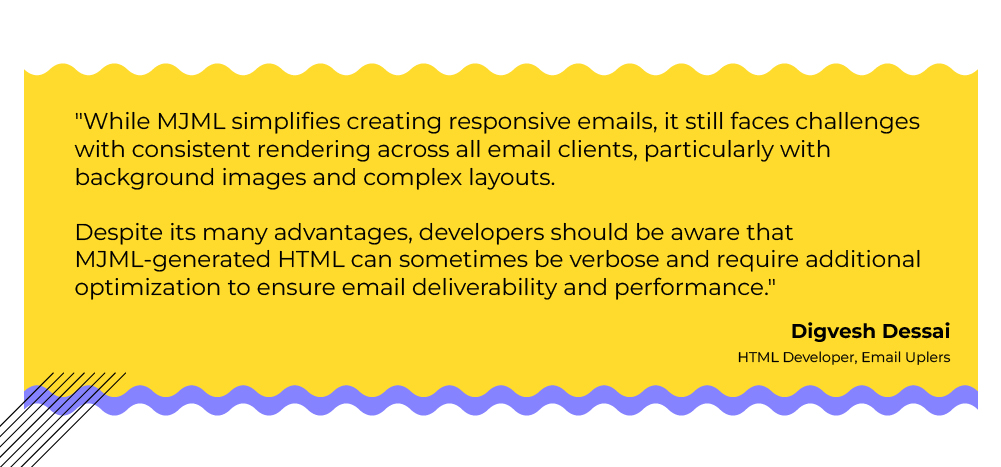
- Background images may not render properly on certain email clients.
- Outlook doesn’t always correctly interpret CSS classes, which MJML adds by default, leading to compromised mobile layouts.
- The converted HTML code may be complex and contain errors.
- The converted HTML code is typically long. So you’ll want to “minify” the code. The MJML online editor does feature the option to minify code.
- MJML’s automatic conversion might not always produce the desired results in less popular or older email clients, necessitating additional testing and tweaking to ensure compatibility across email clients.
- While MJML offers a variety of pre-built components, the framework can be less flexible for highly customized email designs, potentially requiring a fallback to traditional HTML and CSS thus limiting the customization options.
- The abstraction layer in MJML can sometimes lead to bloated HTML output, which can affect email load times and impact performance on slower connections or devices.
- MJML’s debugging tools are not as extensive as those available for pure HTML and CSS, which can make troubleshooting more challenging for complex email designs.

The Do’s & Don’ts of MJML
Let’s quickly consider the do’s and don’ts of leveraging MJML. First off, the do’s:
- Use the MJML Online Editor: Utilize the MJML online editor for quick testing and rendering of your MJML code. It provides a live preview and can help you spot issues early.
- Leverage Pre-built Components: Take advantage of MJML’s extensive library of pre-built components to speed up your development process and ensure consistency in your designs.
- Validate and Optimize Output: Always validate and optimize the HTML output generated by MJML. Use tools to minify and clean up the code to ensure better performance and deliverability.
- Regularly Update MJML: Keep your MJML framework up to date with the latest version to benefit from new features, improvements, and bug fixes.
- Test Across Multiple Clients: Even though MJML aims to provide cross-client compatibility, always test your emails in multiple email clients and devices to ensure they render as expected.
Finally, the don’ts:
- Don’t Rely Solely on MJML Defaults: While MJML provides good defaults, don’t rely solely on them. Customize your styles and layouts as needed to match your brand and design requirements.
- Avoid Overcomplicating Designs: Don’t overcomplicate your email designs with excessive nesting and complex layouts. Simpler designs are more likely to render consistently across different clients.
- Don’t Ignore Email Client Limitations: Be aware of the specific limitations and quirks of various email clients. For example, Outlook might not handle certain CSS properties well, even if MJML handles them in other clients.
- Don’t Skip Documentation: Avoid skipping the MJML documentation and resources. They provide valuable insights and best practices that can help you make the most out of the framework.
- Don’t Neglect Accessibility: Don’t overlook email accessibility. Ensure your MJML emails are accessible to users with disabilities by using semantic HTML tags and providing appropriate alt text for images.
Code Responsive, Responsibly!
MJML is one of the most popular, handy alternatives to complex coding.
That being said, there’s no final alternative to expertise. Email is complex and email clients unpredictable. While Gmail and other clients are beginning to support better renderability, email still lacks universally accepted coding standards due to its open platform nature. As a result, responsible email coding is as important as responsive coding.
Our post covered just the basics of MJML email. This should give you a head start. But if you want to explore further, head over to MJML’s documentation.