


The foundation of a successful email marketing campaign lies in building a solid subscriber base. To do that, you need to work towards building a high-quality email list. And, to do that, you have to familiarize yourself with the ins and outs of email signups.
Drawing people to your email list is no mean feat. But, when you have a neatly-crafted email signup form at your disposal, the job becomes exceptionally easier. Although creating the perfect form requires generous dollops of hard work, dedication, and tenacity, when done right, it can propel your brand to extraordinary heights of glory. In this article, you’ll be embarking on a comprehensive tour of the fascinating realm of email signups. Better bookmark this page at the earliest; this one’s sure to come in handy in the future!
Table of Contents:
- What is an Email Signup Form?
- Importance of Building an Email List
- Types of Signups or Opt-Ins You Can Employ on Your Website
- Things to Keep in Mind While Creating a Signup Form
- Email List Building Practices You Should Avoid Like the Plague
- How Can You Protect Your Site From Spam Signups?
- Wrapping It Up
What is an Email Signup Form?
As the name might already indicate, an email signup form is essentially a contact form or a tool that collects the email addresses of users visiting your website. Subsequently, it allows you to communicate with them. Usually, these forms are embedded on a web page. Visitors willing to subscribe to your emails and newsletters specify their addresses in these forms. Signup forms are also alternatively referred to as opt-in forms and webforms.
The most significant advantage of using signup forms is that they provide you with the explicit consent of your subscribers. This, in turn, plays a pivotal role in building an organic and high-quality email list. In this day and age, when even a misspelled address can earn you a place on a blacklist, email signups are rather invaluable for your business. Campaigns sent to contacts add via signups register improved opens and click-throughs. Since these individuals are already expecting to receive communication from you, you don’t run the risk of being flagged as spam. As a result, you are able to both enhance your email deliverability as well decrease your unsubscribe rate.
Often, the most common question that crosses marketers’ minds is this- What information should my email signup form request from the visitors? Well, judging by what the best in the business out there do, our advice would be to keep just two input fields- name and email address. At the end of the day, that’s all you need to add them to your list. However, if you plan on sending personalized communication right from the beginning, you may ask for additional, relevant information such as zip code, age, gender, and the like.
Importance of Building an Email List
The journey of fine-tuning your email signup game culminates in growing an extensive, and more importantly, organic email list. But why is list building so crucial to begin with? The following points illustrate why.
- First, let’s start with the obvious. Do you know even a single person around you who doesn’t use email? With a global user base of 4 billion, the majority of active internet users in the world have an email account. But it’s not this impressive market penetration alone that makes email a tempting channel; its performance is equally scintillating. At present, email offers a staggering ROI (return on investment) of 3800% (no, we did not mess up the number of zeroes)! As many as 306 billion emails are exchanged on a daily basis, and more and more are hopping on to this bandwagon as we speak. Marketers who have grayed their hair in their profession are unanimously of the opinion that email continues to outperform most of its fellow marketing channels.
- An email list can be continually monetized. Once you add a contact to your list, your relationship with them doesn’t just end post their first transaction. If you manage to keep them engaged, they will be more than willing to entertain all of your product pitches in the present and the future. Simply put, an email list is a permanent business asset. The e-commerce giants around you owe their grand statures to their email lists. What’s more, an email list comes in handy even if you don’t have anything to sell in the first place. How? Say you are a book reviewer. Every time you publish a new review on your blog, you can use email to alert your readers to the same. Securing repeat traffic suddenly seems a lot more feasible, doesn’t it?
- Typically, email enjoys a high engagement rate, making it the go-to channel for many businesses to keep their customers engaged. Apart from implementing personalization at scale, it also enables you to send the right message at the right time. Therefore, the more people there are on your email list, the greater will be the visibility of your campaigns and products. And greater visibility leads to…you all are a clever audience, we’ll let you connect the dots.
- With the continual rise of social media platforms, we don’t blame you if you feel tempted to shift all your marketing operations over there. But get this- as effective as the likes of Facebook, Instagram, and Twitter are at building an audience, they don’t allow you to exercise complete control over your contacts. These platforms keep all the critical data about your followers to themselves. On the contrary, with email, you get complete access to all vital data points like name, email address, and contact number. Additionally, social media platforms also force you to contend with multiple limitations when it comes to interacting with your clients. This is not the case with email, where you are free to communicate with your subscribers in whatever manner you deem fit. Besides, when an email lands in a subscriber’s inbox, they feel as if they are being addressed on a one-on-one basis. This positively endears them to your brand. And should your content be compelling enough, these same subscribers won’t be shy of spreading word of it with their near and dear ones. Last but not least, email is nearly 40 times more effective than Facebook or Twitter at acquiring new customers.
- Email is a great channel to drive traffic to your other platforms. This is why most brands prefer keeping email at the forefront of their cross-channel marketing efforts. If you want to drive more eyeballs to your website, blog, or social handles, simply embed their links in your emails and consider the job done.


Types of Signups or Opt-Ins You Can Employ on Your Website
Opt-in forms come in different hues and shapes, each holding its distinct appeal and charm. Let us look at some of the most common ones so that you can determine what works best for your business.
Squeeze Page
True to its name, marketers use squeeze pages to “squeeze out” the email addresses of visitors by offering an incentive in return. It’s not half as coercive as you might make it out to be at first glance. In fact, the objective of a good squeeze page is to provide the user with something really valuable, such as an ebook, a white paper, reports, and the link in exchange for their email address. Squeeze pages can be alternatively viewed as a form of landing page whose sole intention is to collect the name and email address of prospective subscribers.
Inline Forms
These signup forms are embedded within the body of the web page. They can be placed anywhere- top, bottom, within the content, or in the side bar. Moreover, you have the choice of placing inline forms on all the pages of your website or only on particular pages.
Pop-Up Forms
Pop-up forms are perhaps the most recognized form of email signups and, many argue, the most effective ones as well. Contrary to inline forms, they are not embedded on your page. Rather, they appear at certain points, punctuating a visitor’s browsing time on your site. As mentioned earlier, the key to making the most of pop-up forms lies in acing their timing. Usually, when a pop-up form appears on your screen, the surrounding page gets blurred out. Because of their disruptive nature, pop-up forms are an excellent mechanism for grabbing the visitor’s attention. However, this same disruptiveness can prove to be your undoing, too- not everyone will take kindly to being interrupted in the middle of their browsing. Hence, a certain degree of moderation must be exercised while using pop-ups.
Pop-up forms can further be classified into four broad categories:
- Time-delayed pop-up: These forms appear on your screen after you have spent some amount of time on the page. Let us address the question that must be running amok in your mind at the moment- what is the ideal time delay? Well, that depends. To find out the answer, you have to sift through your web analytics and look for your website’s average time. Based on that, you can specify the delay. Additionally, you are also free to define the frequency with which a time-delayed pop-up form appears on someone’s screen.
- Scroll-delayed pop-up: A scroll-delayed pop-up form appears on your screen when the visitor scrolls to a designated point on the web page. Subsequently, this gives the visitor the scope of consuming your content and forming an initial impression before engaging with the signup form. And because they have spent some time scrolling down, you can rest assured they harbor a certain degree of interest in your offerings.
- Exit-intent pop-up: This pop-up form appears on the screen when a visitor is about to exit your page. Generally, visitors leave your site when they are unable to find anything worth their interest in there. Hence, you can use your exit-intent pop-up form to nudge them to subscribe, promising to help them find their products or services of interest in the times to come.
- Two-step pop-up: A visitor encounters a two-step pop-up form when they have clicked a button or link on your page. Typically, this form is tied to an incentive on your site and only appears when a visitor deliberately clicks on it. As a result, such forms enjoy high conversion rates.

Things to Keep in Mind While Creating a Signup Form
Want to skyrocket your subscribers? Work towards crafting effective and impactful signup forms. How do you do that? With the help of the following tips and tricks.
Keep Things Simple
“Easy does it” should be your go-to motto while designing email signup forms. Keep the copy to the point, the design unfussy, and the form length as brief as possible. What do you need from a customer to add them to your list? Just their name and email address, right? Ideally, thus, your signup form should contain only these two input fields. In fact, 85% of forms abide by this. Besides, in this world of dwindling attention span, the simpler your form, the better are the chances of your website visitors engaging with them. However, in some cases, brands look to add multiple fields in a bid to deliver an extremely personalized and streamlined experience to their subscribers.
For instance, take a look at this signup form by Formaggio.

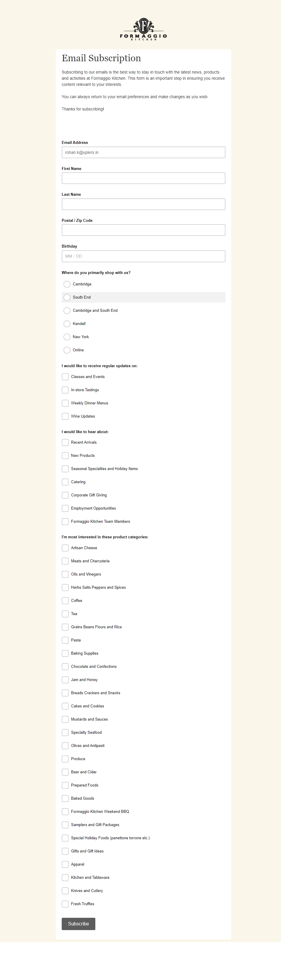
Here, they give the visitor the choice of selecting their topics of interest so that in subsequent times they can send them updates revolving exclusively around the same.
Let Your Value Proposition Take The Spotlight
More than anything, your forms should emphasize the value you’re providing to your visitor in exchange for them entering their information. Now, this need not be a promo code or a discount; a newsletter promising to offer industry insights and all the latest trends and happenings works just fine. If the visitor is unable to get clarity regarding what they will receive post signing up, they will never fill out your form.
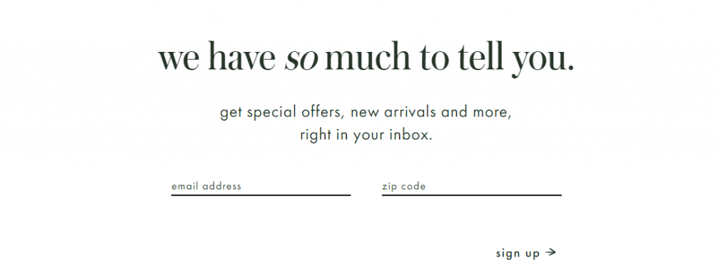
Wondering how a simple and effective email signup form looks like? Take a look at these examples.
Kate Spade:

Monica Vinader:


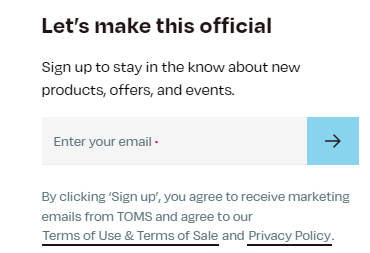
Add an Attractive Headline
How do you ensure that your signup form gets positively noticed by your visitors? Add a catchy headline. Keep the following things in mind while you’re crafting one:
- Keep it brief and super specific.
- Don’t try to make it too clever; if your headline is not easy to understand, visitors will not think twice before overlooking it.
- Create a sense of emergency to spur the user into action.
This signup form by Toms perfectly illustrates how an attractive headline should look like.

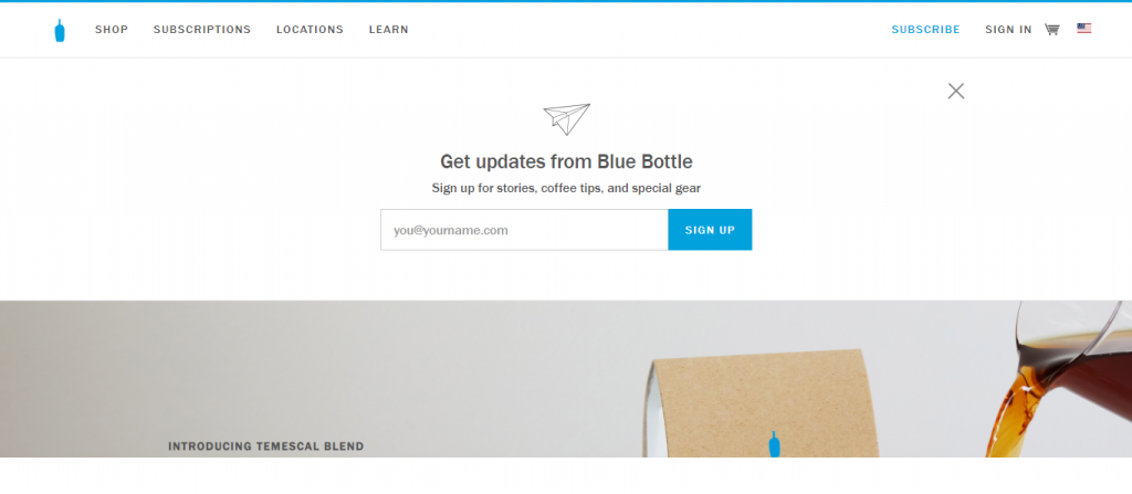
Be Mindful of Your Placement
Although it may appear trivial, the placement of your signup form actually goes a long way towards determining your conversion rates. Typically, brands prefer to keep their sign up form right at the top of their page. That way, they stand the chance of grabbing a visitor’s attention as soon as they land on their website.
MailChimp makes use of this philosophy, take a look.


So does Blue Bottle.

However, there is no hard and fast rule when it comes to placement. You can place it anywhere- at the bottom of the page, within the text, in the sidebar, or even as a pop-up- so long it agrees with your site’s layout. The smart thing to do is to test out all the placements before settling on one. That way, you will be able to figure out what works best for your audience.
Set Clear Expectations
Overpromising and under delivering is a cardinal sin when it comes to email signup forms. Try to be as transparent with your subscribers as possible. It goes a long way towards winning their trust and loyalty. Tell them both the kind of content they’ll be receiving through their emails as well as the frequency.
Just below your headline, elaborate clearly on the value they can expect once they have signed up. It’s best to clear things out at the beginning itself to avoid misunderstandings later on. There’s absolutely no point in onboarding new subscribers on the basis of false pretences. It’s not as if they can be kept in the dark forever; sooner or later, they’ll grow wise to your conduct, and if it doesn’t sit right with them, they will happily contribute to your attrition rate. Moreover, being transparent enables you to comply with GDPR too. Non-compliance can earn you steep fines and penalties or, worse, get you blacklisted.
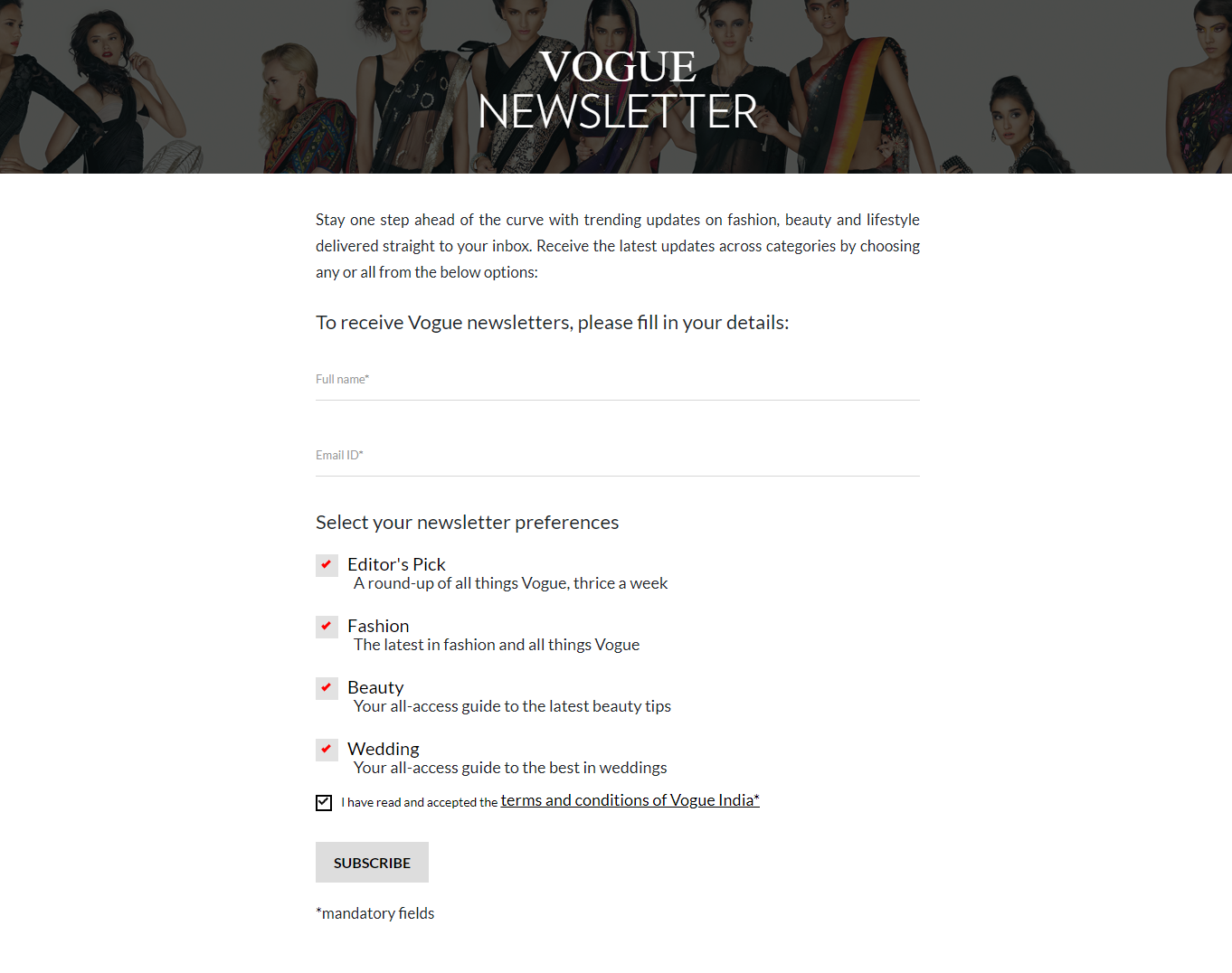
This email signup form by Vogue provides a masterclass on setting expectations.

Don’t be Shy of Giving Incentives
Studies show that approximately 60% of users sign up with the hope of receiving some kind of incentive in return. So, what’s stopping you from providing it? Giving your new subscribers a tangible gift in the form of free content, discounts, ebooks, and printables can help you grow your email list really quickly. Just ensure that your incentive is related to your operations and not a random token.
However, offering the incentive is just the job half done. The other half lies in following up with a meticulous email nurture program so that these new subscribers eventually transform into recurring customers.
Take a look at how Stelton incentivizes their visitors to signup.

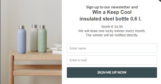
Apart from stating your incentives, you can visually represent it as well, just as Stelton has done over here to further allure your visitors.

Leverage Social Proof
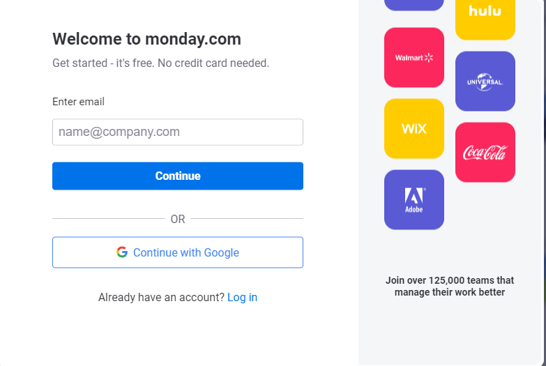
Nothing convinces audiences of your credibility quite as effectively as social proof. It doesn’t matter how lucidly you put forth your salient features; a new subscriber will only vest their unwavering trust in you only after reading the reviews and experiences of other customers. A powerful psychological tool, the mere presence of social proof gives users the sense of joining a community of like-minded people, thereby making them feel surer about their decision to sign up.
For instance, would you think twice before using a platform that’s being vouched for by 125,000 teams? monday.com is sure you wouldn’t. Here’s what their signup form looks like.

Give the Option of Opting Out
Offering your subscribers clarity also involves telling them how they can opt out of your communications should they ever wish to. It is likely that your list comprises contacts hailing from a diverse demographic, and so there’s a good chance that not everyone will resonate equally with your communications. As for the unsatisfied ones, if they don’t have enough clarity regarding opting out or unsubscribing, they’ll mark you as spam or flag you. Ultimately, this will deliver a fatal blow to your campaign’s deliverability. Hence, the best course of action is to shed ample light on the opt-out mechanism in the signup form itself.
Take a look at this example from Allbirds.


Make Sure Your CTA (call-to-action) Game is Top-Notch
The CTA button is arguably the most important component of your email signup form (it is where the magic takes place!), and hence it is essential that you make it as catchy and intriguing as possible. Remember, your CTA will be the difference between a visitor showing interest in your signup form and them bouncing from your site.
Crafting the perfect CTA is a whole science in itself. Below we have listed some tips that will help you master it.
- Shun run-of-the-mill phrases like “Click Now,” “Join Now,” “Free Demo,” and just about anything that is even remotely similar to them. Customers have grown increasingly weary of such phrases, and using them in your signup forms will simply earn you their spite.
- Include power words. Used frequently by copywriters, power words are words that elicit an emotional or psychological response. As a result, they contribute significantly towards boosting your conversion rates. Some common power words are, “Create”, “Explore”, “Learn”, “Find”, “Upgrade”, “Start” and “Try”. The purpose of power words is, in essence, to convert visitors from readers to doers.
- Add a small element of interactivity to your CTA button. Even something as simple as changing the button’s color upon a mouse hover is enough to get the user hooked.
- While not downright necessary, it is advisable to keep the color of the CTA button different from the remaining elements and input fields on your form. This will make it highly prominent. Another technique to enhance its visibility is to make it contrast sharply with the form’s background color.
- Write your CTA copies in the first person. That way they will seem more personal and instantly connect with the reader.
This CTA from Tushy’s signup forms is one of our absolute favorites.

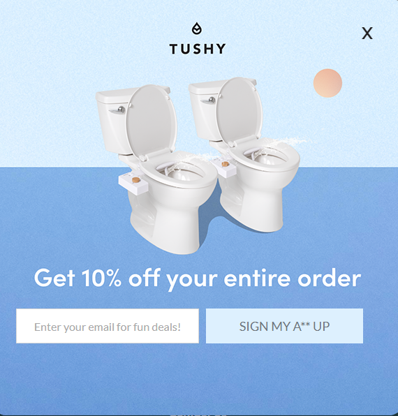
Now, that is rather difficult to ignore, isn’t it?
Don’t Use Too Many Font Types or Colors
It is a good practice to follow a typographic hierarchy in your signup forms. This means arranging the size, layout, and font of different portions of text in a manner such that it gives rise to a hierarchical division. This is necessary to make your form easy to navigate for your readers. That said, using too many font types or colors will only cause visual clutter. Hence, make sure your form uses no more than two fonts or colors.
Write your headline with one font type and all the subsequent elements like the subhead and the description using the other. Similarly, allocate different font colors to your headline and the remaining elements. And while we’re talking about promoting readability, don’t forget to use whitespace generously. A layout where every element has ample breathing space is thoroughly pleasing to the eyes.
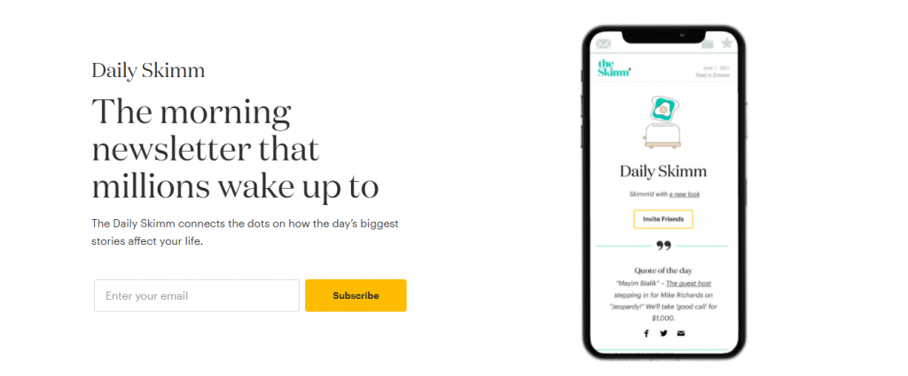
Take a look at how neat Daily Skimm’s email signup form is.

Time Your Pop-Ups Right
If your email signup form is a pop-up box, you have to stay on top of its timing to ensure best results. Put yourself in your visitor’s shoes. If a form were to pop up on your screen the very instance you enter a website, wouldn’t you be annoyed? Hence, optimizing the timing of your pop-ups can have a telling impact on your signup rate. According to a report by Nielsen Norman Group, a visitor makes the decision of staying on or leaving your page within their first 10 seconds of browsing itself. Hence, your pop-up must appear on their screens post this critical window.
Test, Test, Test
We don’t mean to be party poopers, but the truth has to be said out loud- while the act of designing and publishing a signup form is certainly praiseworthy, the real challenge, in many ways, starts after that. It is very unlikely that you would have managed to create the quintessential form in your first try itself. And that’s completely fine. That makes all of us. However, what separates the best from the rest is the discipline and rigor with which they test and optimize their forms. Without testing, you’ll never be able to understand how visitors are responding to your forms. A/B testing lets you pit two different versions of your signup forms with one another and identify the high-performing one. Subject every single aspect of your form- the headline, CTA copy, form placement, CTA color, length of description text- to testing. Every single insight counts.
Email List Building Practices You Should Avoid Like the Plague
Businesses start working on their email lists way before beginning product development; only goes to show how important this activity is. After all, who will brands market their offerings to if they don’t have an audience in the first place?
Below, we have highlighted a few practices that email marketers must steer clear of while growing their lists.
- Buying an email list: This is, hands down, one of the most condemnable practices within the email community. The greed of amassing a large number of contacts within a short span of time is what leads some down this path. Little do they know, however, of the damaging consequences that await them. Lists that are up for sale are populated majorly (if not entirely) with counterfeit and inactive email addresses.
Sending emails to such contacts is equivalent to talking to walls (at least walls have ears, they say). And on the off chance there are some legitimate addresses in there, they’ll spare no moment in marking you as spam. You would do the same if someone sends you emails without your consent, wouldn’t you? But that’s only the least of the troubles buying an email list invite. Hidden among these defunct and fraudulent email addresses are also spam traps. Produced and maintained by the DNSBL (Domain Name System-based blackhole list) and some major ISPs such as Gmail, AOL, and Yahoo, spam traps serve to detect spammers. When a particular sender’s emails reach these addresses, they instantly get flagged and added to a blacklist.
Sure, purchasing a list lets you grow your customer base by a hundredfold, but it doesn’t increase your reach or visibility because almost all the addresses are invalid. Moreover, inorganic surges in your list size draw the suspicion of ESPs (Email Service Providers) and ISPs (Internet Service Providers), ultimately landing you in a blacklist.
- Forgetting to send a welcome email: A lot of businesses lose the plot with their newly acquired customers by failing to send a welcome email (or sequence). An individual signing up for your emails and newsletters is, of course, a big accomplishment, but it’s not the end of the road. In fact, the real challenge lies ahead.
Welcome emails are important for a host of different reasons:
– It is your first point of contact with your customer, your “first impression” that could last really long if you play your cards right.
– It sets the tone for all your future communications. It informs your subscribers about both, the kind of emails they can expect from you and their frequency. As a result, there won’t be any scope of mismanaged expectations. If your subscriber wants to be added to a different list or modify their frequency, they can do so at the very beginning.
– Welcome emails are highly effective. Compared to other marketing emails, they register 86% higher opening rates and 10% higher read rates.
– Approximately 74% of new subscribers expect to receive a welcome email after filling out a signup form.
– They pave the path for long-term brand engagement. A welcome email boosts customer engagement by nearly 33%.
So, what does a winning welcome email look like? Above all, ensure it has a catchy and compelling subject line. If the teaser of the email isn’t on point, you can’t expect it to hold attention, can you? Moreover, it must have a strong value proposition. Either provide your new customers with a “welcome coupon” of sorts or clearly illustrate how your products or services can make their life easier.
- Failing to maintain the hygiene of the list: Letting go is difficult, we understand. But, it is absolutely essential if you want to keep your business’s head high and proud in the long run. Crafting an email campaign involves a lot of hard yards, and if you don’t want that going in vain, you must prioritize the upkeep of your email list.
Every now and then, you should weed out contacts who you feel have become highly unresponsive or altogether inactive. At first, try and understand what could have caused this waning of interest at their end. However, should they continue to remain passive despite your analysis and subsequent corrective measures, take the hint. Remember, keeping such contacts on your list comes at the cost of adding new, more engaged ones. Moreover, if you keep engaging with defunct and bounced emails, it’ll only spell doom for your sender reputation and deliverability.
- Not asking for feedback: At all points of time, it is imperative for you to understand what’s going on in the minds of your customers. And that is only possible when you periodically collect feedback from them. You don’t have to wait for your alarm bells to go berserk to consider soliciting feedback; stay ahead of the curve by gleaning your customers’ insights regularly. Besides rectifying existing loopholes, collecting feedback can help you make better business decisions in the future. It tells your customers that you value their thoughts and opinions, thereby strengthening your relationship.
How Can You Protect Your Site From Spam Signups?
Occasionally, you will find your signup forms being filled out by some spambots. It is important to curb this at the earliest because spam signups can immensely pollute your email list. Given below are a couple of practices that will help you protect your site from such activities.
- Use the “Honeypot” technique. This involves creating an extra input field on your form and hiding it using CSS. This way, your visitors won’t be able to spot it. This additional field is referred to as the “honeypot” field. Keep in mind that while spambots will fill out every field of your form, they can’t tamper with its CSS. Now, when a form is submitted, you simply have to add some JavaScript to check whether the CSS field is filled out or not. If it is empty, it means that your lead is an actual person. However, if it has an entry, the JavaScript will prevent the form from being submitted.
- Call in the services of Google’s reCAPTCHA. It is a free security service offered by Google using which you can distinguish between humans and spambots with the help of a “CAPTCHA” test.

Wrapping It Up
The email pool is chock full of exciting prospects. To attract them to your business, you need an impeccable email signup game. Put the techniques shared above to practice and fill up your pipeline with the choicest of leads!