


Every email element in an email template has a role to play in the overall visual hierarchy.
If you look at the image below, right at the top is the pre-header text in a font color that fades into the background, and a link to view the email in a web browser. This is followed by the brand logo for easy recollection and the Navigation Menu – for anyone interested to check out other products and finally the hero image greeting the subscriber (with a bold headline).

This is great, but programmatically the subscriber first sees the brand logo, while the eye scan pattern moves down towards the navigation menu and finally onto the hero image and then the email copy. The same eye scan path is considered while designing the mobile layout. While all other elements are constantly optimized for mobile layout, navigation menu layout is sometimes overlooked.
So, when such emails are viewed on a mobile device, the navigation menu is either scaled down as shown below:

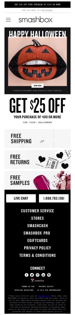
Or each menu element gets stacked vertically, as below:

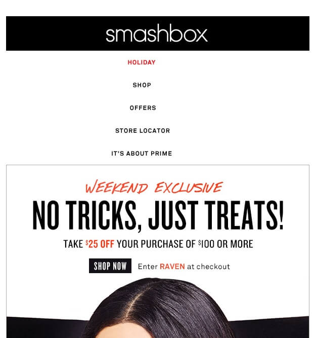
Fig 2. The responsiveness of the email stacks the navigation menu vertically, pushing the content further down.
As you can see, with the navigation menu consuming a major real estate space in the email, the subscriber must scroll down to read the actual email. In this seventh edition of Mailable Microsites, Uplers here showcase how cosmetic brand Smashbox hid its navigation menu behind an interactive Hamburger Menu in Emails to reduce email content length.
Journey From a Responsive Email to Menu Enabled Microsites
2015 – No Implementation of Navigation Menu in Emails
Earlier, emails were mainly opened on desktop devices. In 2009, the need for responsive emails pick up the pace as people started opening emails more frequently in mobile devices. Smashbox’s 2015 email was a beacon stating that their first step into the mobile responsive domain.
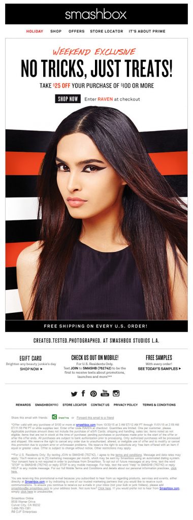

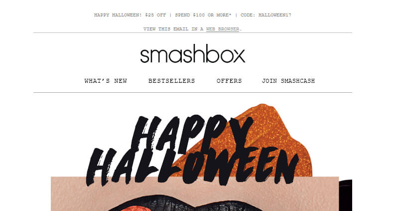
In one look you find that Smashbox has a navigation Menu on the top of their email, where the subscriber is free to click and be redirected to a corresponding page on the website.
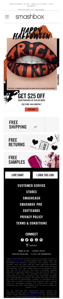
2016 – Menu in Emails
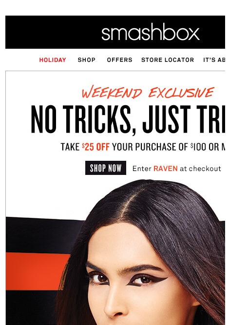
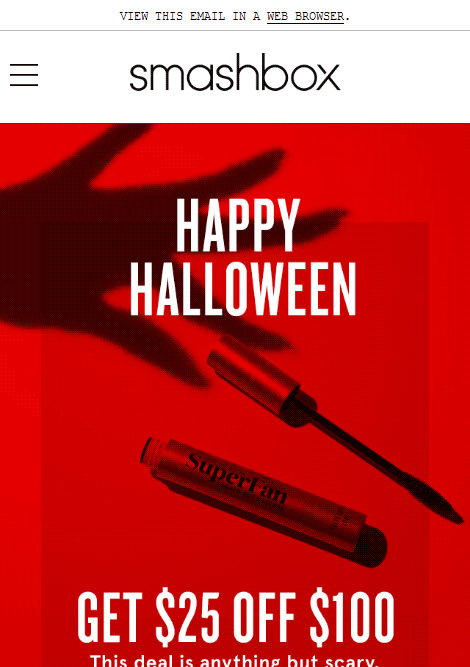
2016 was the year when Smashbox metamorphosed their emails to a minimal and cleaner look. By making use of the Hamburger menu in their emails, the navigation menu was hidden and the user had the freedom to interact with it to be redirected to the required page.

2016 – Menu in Emails

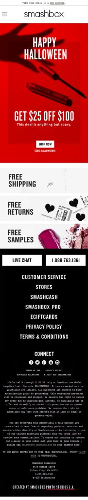
2017 – Menu in Emails

2018 – Menu in Emails
This way, those interested can check out other products via the navigation menu by clicking the menu on the top and rest of the subscribers can move forward with the email.
Advantages of Menu in Emails
- A dropdown Menu optimizes the layout for on-the-go viewers.
- Navigation Menu in email is usually hidden (in plain sight) for mobile layout, nobody is forced to engage with it. This way only those interested shall interact with it.
- The subscriber needs to be driven to the actual email copy. Since the Navigation Menu is hidden, everyone, scanning the email, won’t need to scroll after opening the email to read the email copy.
How Uplers can help
Interactivity in email is achieved using CSS animation and may not be supported in some email clients. After extensive testing, Android and Apple native email clients render Hamburger menu very well and only Windows-based mobile clients are not supporting. Our development team tests all email templates across 40+ email clients before delivery.
Looking to integrate Navigational Menu in your next Email Campaign? Get in touch with our experts.
Check out other Mailable Microsite repository
- Mailable Microsites I – How B&Q clinched it with Carousel in Email
- Mailable Microsites II – How REI ‘Served’ Up Interactivity Using Hamburger Menu
- Mailable Microsites III – How Burberry Impeccably Slid ‘Sliders in Emails’
- Mailable Microsites IV – How Travelocity Started Counting on Countdown in Email
- Mailable Microsites V – How ‘The Home Depot’ Got Their Sales Ticking With Countdowns
- Mailable Microsite VI – How Monks ‘played’ a new tone for Microsoft using Accordion in Emails