


[This post was originally published on 15th June 2016. It has been updated on 29th March 2023.]
In one of our earlier blogs, we talked about how there’s no single “Approved” font out there, the significance of the simple fonts in body text and reserving the fancy fonts to the headings for attaining a sparkling email body copy.
Web typography is improving by leaps and bounds with every passing day and yet at the same time email typography continues to be less than ideal, primarily constrained by email client support. However, email marketers are a tenacious bunch, and despite these limitations, they haven’t allowed their creativity to be compromised. They have persisted with figuring out ways that would allow them to infuse spark and exuberance into their custom email marketing templates, and one tool that has aided them greatly in this endeavor is web safe fonts for email.
Web-Safe Fonts: Richness v/s Compatibility
For the uninitiated, web safe or email safe fonts refer to those that have a high probability of being already installed across a vast array of users’ devices. As a result, they are easily recognized by email clients and browsers.


The graph above shows the 3 choices of desired fonts in your email. @font-face in CSS, calls for the custom font stored on a web hosting site. Both premium and Google fonts can be served using the @font-face rule. As you can observe moving towards right the compatibility increases at cost of richness and vice versa.


Choosing The Right Font Is Very Important.
The ideal method is to use Web safe or Google fonts, considering their aspect ratio (explained below) with email safe fonts and thus allowing maximum email clients to cover richness with compatibility. At the same time, non-supporting email clients would still bring the fallback fonts without breaking the layout or template.
Breaking on layout usually happens when you choose wider or larger fallback fonts.
You can even use a good image text ratio by converting all titles or prominent one liners into images and then using fallback fonts for paragraph fonts. That would allow you to keep your fonts intact for important messages while allowing text render for others.
Criteria For Choosing Appropriate Fallback Fonts
Ever since email marketers have adopted HTML emails, the race to offer personalized content has begun. Email design and aesthetics became a priority. Imagine a scenario wherein your email has an optimum design with beautiful typography, but, due to lack of fallback support, the system font ruins the entire look. Sends a chill down your spine, doesn’t it?
In the 3 seconds that your prospective customer takes to read your email, they may delete or mark it as spam (gasp!). Ideal Characters per Line (CPL) is 75 and ideal email has a 600px width. Based on various factors the CPL changes and along with it the placements of words changes leading to the aforementioned chaos. In order to save yourself, stick to the following pointers while choosing your primary and fall-back fonts. Any reliable agency dabbling in email campaign management services is sure to second these pointers.

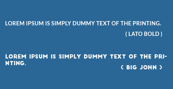
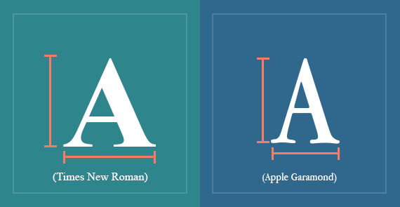
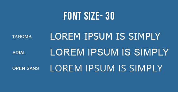
Maintain Aspect Ratio: Each character in your font has 2 values: X-width and Y-height. The values should change proportionally. High width and low height (or vice versa) fonts shall generate low readability. Moreover while choosing fall back font, ensure that x-width is same to the primary font in order to maintain CPL.
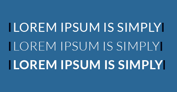
Character Spacing: CPL is also dependent on the space between two characters. Less space will look cramped up and excessive spacing shall generate eye strain to stay on the same sentence.

Line Spacing: It refers to the vertical spacing between characters on two consecutive lines. This is also dependent on the y-height.

Font Widths: Depending on the value of the font weight, the thickness of the font shall change the CPL. Never use condensed font weight.
Serif or Sans-Serif: Generate uniformity by providing serif fallback to primary serif font and vice-versa.


Some Common Email safe and Web safe Fonts?
Email marketers resort to using email safe and web safe fonts for email in their emails because it drastically reduces the likelihood of their email font being altered. So, which fonts are considered both email and web safe? Let’s take a look.
- Arial
- Georgia
- Times New Roman
- Courier New
- Verdana
- Lucida Sans Unicode
- Trebuchet MS
- Tahoma
The ideal course of action, irrespective of whether you are using email friendly fonts or not, is to always test your email, across multiple devices and environments, to ensure your emails are rendering as desired.
Takeaways:
- Choose fonts that work best for your design for all email clients.
- To avoid the ire of spam filters, steer clear of using more than two different fonts in your email. You can always use different sizes of the same font to structure your copy and ensure high readability.
- If you come across an email safe font that is a close match to the font you intend to use, it is advisable to go ahead with the email safe font in favour of your original choice.
- First choose any web safe or Google Fonts and then match up those with appropriate fallback fonts, on the basis of its aspect ratio and character spacing.
- Avoid using Condensed fonts as no fall back fonts have condensed property.
- Myriad pro and Calibri have least support when it comes to rendering the same fonts in Apple Mail.
- @font-face is widely used compared to @import.
Wrapping It Up
Making use of web safe fonts lets you actualize the user experience you envisioned for your subscribers at the outset. We hope the insights shared above will come to your aid when you sit down to design your future campaigns.