


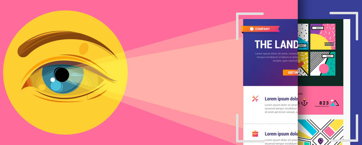
‘Beauty lies in the eyes of the beholder.’
People usually go for the looks before venturing into the purpose. This may be accredited to the low human attention span (~8 seconds) and therefore, most brands adopt eye-catching designs. This way, once you capture the attention of your target audience, they will be curious to gain information.
In the email marketing domain, the subscribers’ attention is caught by a craftily written subject line. The subject line acts as a hook and makes the subscriber inquisitive enough to check out your email copy. Next comes how you present the information in your email template.
By placing information to aid the eye scan pattern, the subscriber can collect the information relevant to them and move forward to the CTA or next email.

On the other hand, a visually appeasing email design (breaking the visual hierarchy) intrigues the subscriber to read further in the email copy.
Let’s see email examples from brands who followed the visual hierarchy and brands who bent the rule to give importance to visual attractiveness and understand the impact of each design.
Adhering to Visual Hierarchy
Residents of English speaking countries follow a ‘F’ pattern while browsing through content,
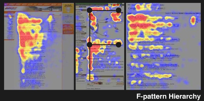

or a ‘Z’ pattern.
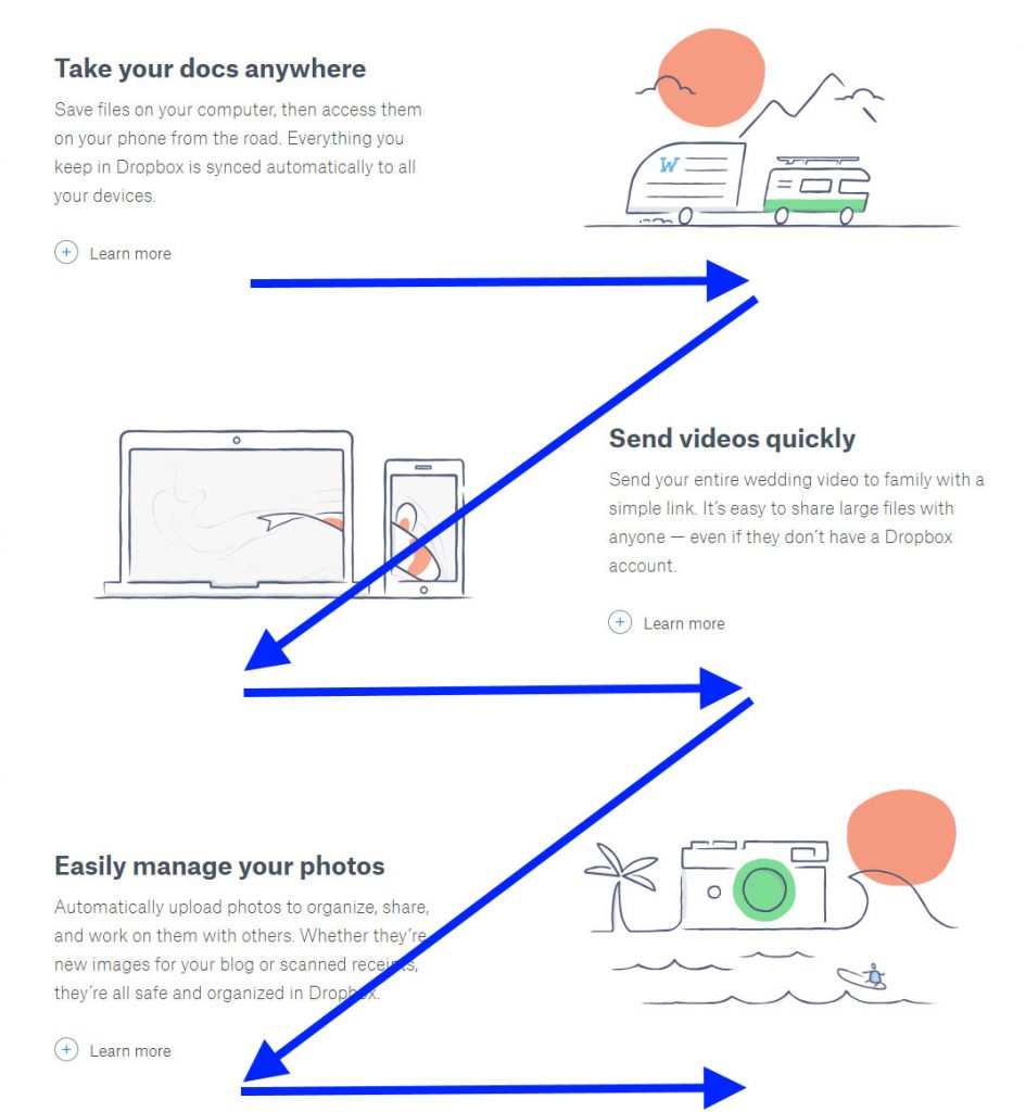

So, email designers design their emails in such a way that the most important content is accommodated in the first fold in a systematic manner. The content flows according to the normal eye scan path.

The following email by connected devices creator brand ‘Withings’ (formally called Nokia Health) follows visual hierarchy. Make an observation of your eye movement throughout the email and compare the results below.
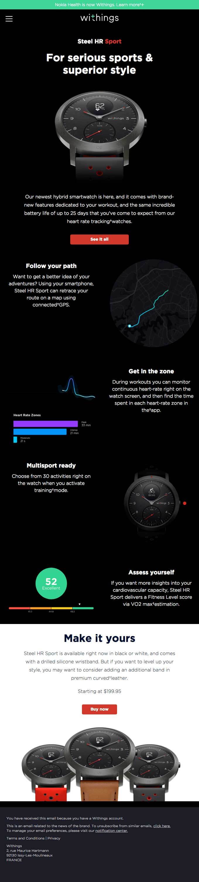

Here is the order of how a general viewer of the email shall see each email element
- Pre-header text in lime green background
- Brand logo
- Product name
- Product tagline
- Product image
- Product description
- Rest of the email copy along with accompanying images
No matter how much you try, every time you see the email, your eye automatically checks the topmost pre-header.

Let’s try another example
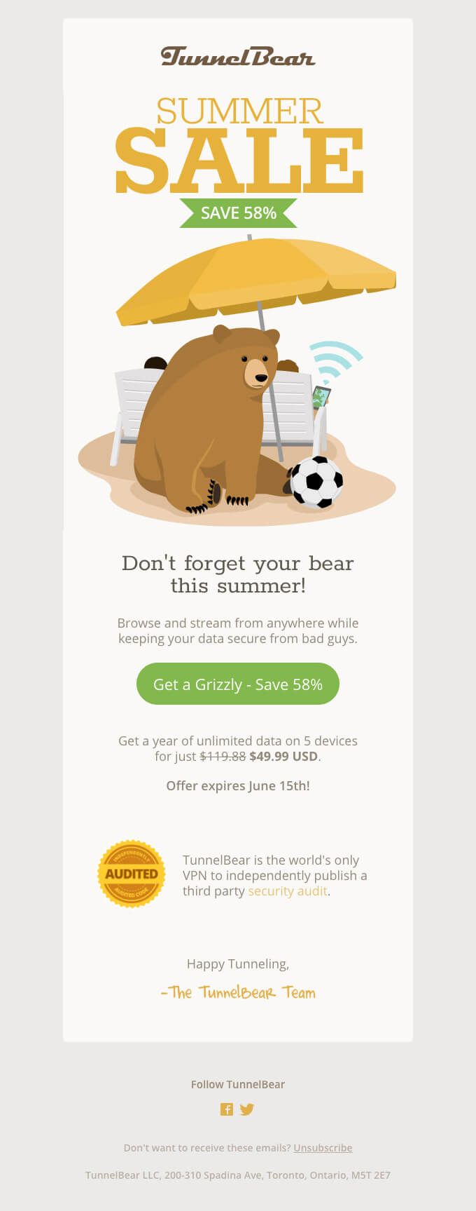

In the above email by VPN provider ‘TunnelBear’, the attention first goes to the brand logo followed by the offer announcement before you see hero image of the brand’s iconic bear sitting under the umbrella.
You will agree that in a layout following visual hierarchy, the time you spent to go through the content of both the emails was less. The design is seamless & distraction-free and the CTA is placed at a point where the subscribers are well-aware of the content, thereby making them more inclined to click-through.
The disadvantage of this email layout is that the design is not distinct enough to be remembered later.
Pros:
- Information is conveyed in a systematic manner.
- The CTA placement encourages maximum clicks.
- Design causes less to no eye fatigue.
Cons:
- There is no distinct design worth remembering.
Treading a path untrodden – Unconventional yet aesthetic design
Switching to the other end of the spectrum, we have brands who bend the rules to create visually attractive email designs. These emails have a distinct design and a copy to complement the imagery.
In the email below by BBC, your attention is immediately directed to the fierce faces of the animals and the (+) sign beside each.
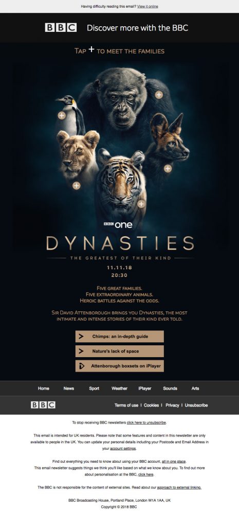

And when you click the (+) sign, an interactive separate pop-up displays extra information. Check out the live email here.
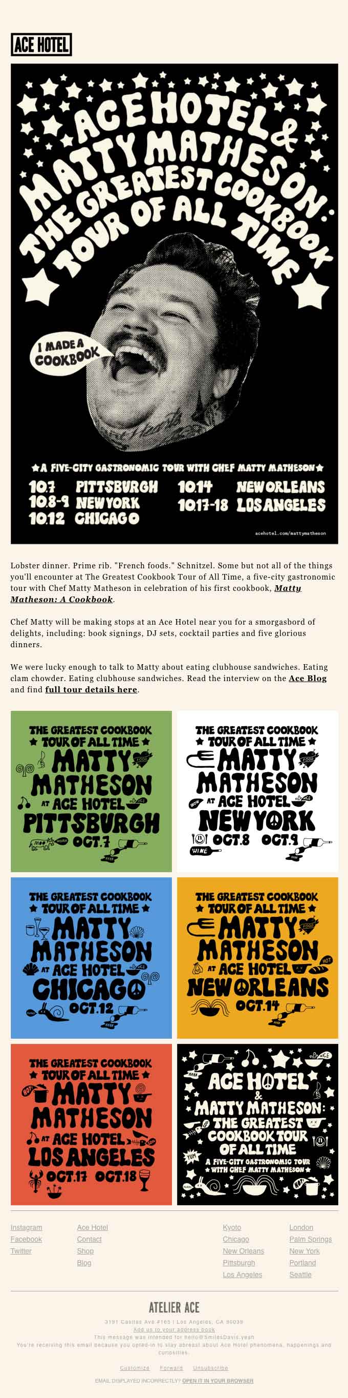
Similarly, in the below email by ‘Ace Hotel’, the eye scan path is frequently disrupted by the email copy placement and no key information pops out while scanning through the email copy.
However, the email design is distinct enough to be remembered later on.

Check out the email below by J.Crew.
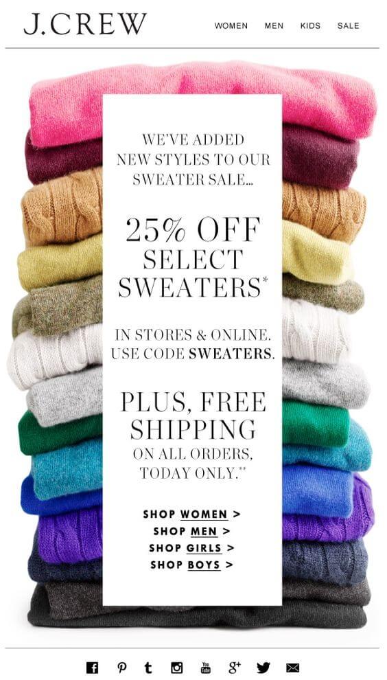

The stack of colorful sweaters in the background capture the subscribers’ attention immediately, before they read the email copy. You may argue that the email copy is following a natural structure, but the attention doesn’t go to it immediately.
In another email by J. Crew, as soon as you open the email you see a giant scoop of ice-cream that goes on and on for couple of scrolls before ending with a CTA button.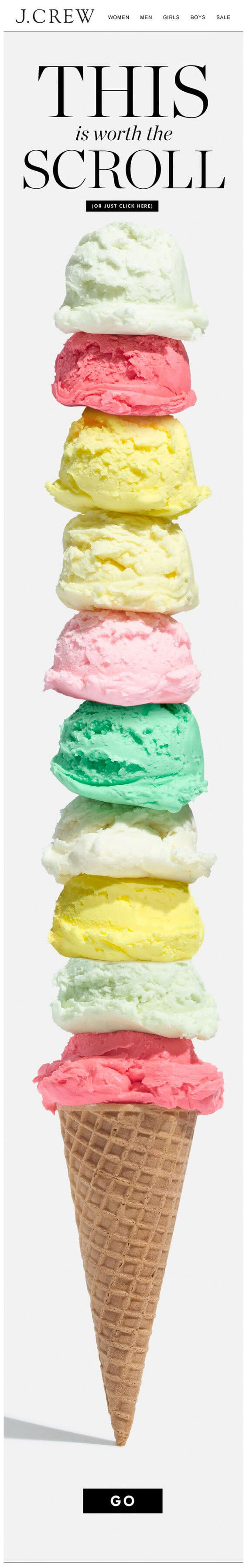

While these emails are distinctive in looks and uphold the eagerness, as stated earlier, there is no key information presented when the subscriber skims through the content. Also, the design is a double-edged sword as the subscriber may get discouraged by the unconventional design and may move to the next email without reading the complete email. Also, such designs may aggravate eye fatigue as the eye scan path is disrupted too often.
Pros:
- The attractive and distinctive design is the biggest advantage.
- It gives a break from boring, similar looking email designs.
Cons:
- Such emails do not give a pleasant read as the elements are too far placed.
- On-the-go subscribers may not be able to skim through email content.
- The subscribers may resist scrolling further.

Wrapping Up
Should you stick to traditional email design based on visual hierarchy or try out a visually aesthetic design? Well, the decision depends on the tone you wish to set in your email as well as what you offer to your subscriber. What matters is that your email should convey exactly what you wish to.
Email Uplers offers free email template audit, where we use our expertise of developing emails for our 6500+ clients worldwide to analyze your template. Additionally, we have a team of template production experts who create stellar email designs as per the client’s requirement.