


Events and conferences are not just an extension of marketing strategies but also a major channel for engaging directly with the audience. As marketers, we know that such engagements not just promote your brand but also build a stronger relationship with the customers and leads as they engage one on one with the brand, virtually or physically.
Marketers are expected to be far-sighted and try to cope up with change, be it amidst a crisis or a last-minute marketing plan modification. Although conferences and physical summits have been replaced temporarily by virtual events and webinars, marketers are expected to generate the same percentage of conversions as before. We can be optimistic about the fact that with the social distancing norms subsiding gradually, it wouldn’t be long before you are expected to restart your marketing strategy for conventional methods of engagement.
In either case, there is only one thing that can assure you reach your goals- A cogent landing page.

Why is a landing page essential for your conference or event?
A landing page is more than essential for an event. It is a channel to inform, engage and invite the right audience. An event landing page comprises of this basic information:
What- The goal of the event
When- The date and time of the event
Where- The location or platform of the event
Apart from this information, Landing pages leverage the details on who will be benefitted by taking part in a particular event or who will be the right prospects for the content delivered in the event. By giving out this information, you attract the right audience. As you now have the attention of your lead, you can ask for their information, increase your database, and know your probable customers.
Another way of making sure your subscriber attends the event is letting them know the speakers, venue, highlights of the event, entry fees, etc. which increases your credibility as an event. We will further discuss how to do this right.
Crafting a landing page that converts not only requires a great team and other resources but with the competition across the industry, it also demands that the marketers stay one step ahead of the game and stand out in terms of design, deliverability, and responsiveness.
For now, let’s take a look at how some brands nailed their event landing pages, and which aspects you can learn from them to incorporate in your next landing page design!
1. AIGA Design Conference


This event landing page example, of the 2020 AIGA Design Conference is an elegant display of design expertise. The copy is kept minimal yet gives out all the details like their upcoming app for the same purpose, what would be the perks of attending the conference, the pictures of the speakers and details of the tickets, and so on.
The highlight of this landing page is the CTA which has a simple text ‘Register today.’ The CTA is distinct and grabs the attention of the reader. It is placed on the right side of the screen, which is also optimized for a mobile viewer, therefore making the design responsive. Another prime CTA is placed at the top of the page, which says ‘Buy Tickets.’
2. Sound On

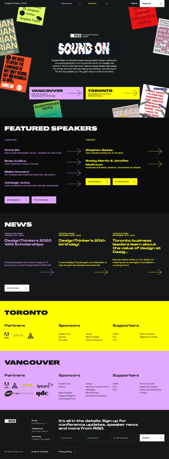
In this event landing page example, Sound On has nailed it despite having multiple points of action. There are two reasons for that. This event is taking place in two different locations and in two different time slots. Instead of creating two different landing pages, they have used two different colors for each location. This will decrease browse-abandonments as all the information for both the locations is available on the same page.
Having a separate page for each location would have increased the number of clicks and time spent on the page but would drain the audience as they search for relevant information.
3. Microsoft’s Business Application Summit


This event landing page example of Microsoft’s summit is brilliant mainly for two reasons. The play of colors and the minimal copy. By giving out the information which will raise the right amount of curiosity, they have made this landing page simple, elegant, and engaging.
Another aspect that has to be appreciated is their effort at constant brand recall, through shapes and colors. The hero artistic image has squares, the CTA is a square-shaped button, so is the video player button – all of these are in the same four colors of Microsoft- red, green, blue, and yellow.
The background color blue and the CTA button color red are colors at the two ends of the color spectrum. Due to the varying wavelengths, they are a perfect contrast and the CTA thus grabs the attention of the viewer. Another conference landing page with a strong conspicuous CTA is Mailcon’s. It is an email marketing conference. You will see that the big red call to action at the top really stands out.
4. Epiccurence
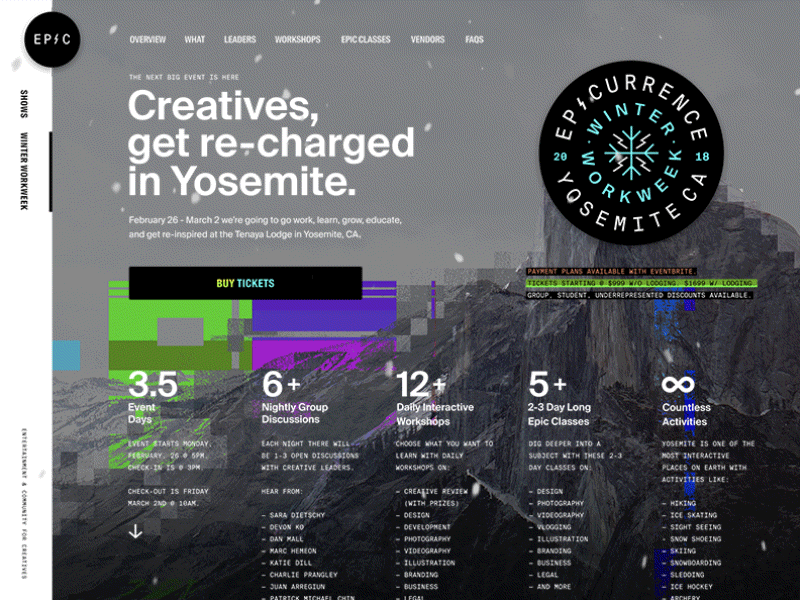
This event landing page for Epicurrence Workweek is a brilliant example of how one can jazz up a boring design into something as engaging as this. They have used a glitch effect which makes the design pop up against the monochrome background. The snow effect GIF is seamlessly embedded and gives the landing page a life.
Apart from the design expertise, they have a text-heavy copy leveraging details of the event. The headline, bold numbers, and subheaders balance the text with distinctive fonts.
The CTA is straightforward and uses a contrast font color against a black background, which makes it impossible to ignore.
5. SXSW Conference


SXSW has used a countdown along with a CTA to create urgency with the ‘fear of missing out’ factor in mind. They have used an image of the previous year’s conference and have justified the goal of the event which is to participate, network, and advance their careers. The top right panel also has a CTA, which asks the visitor to register. They have placed the ‘Browse Tickets’ CTA below the main copy.
The design is minimal yet effective. The copy is concise and action-oriented. The countdown timer is the highlight of this event landing page example.
10 Best Practices for event and conference landing pages
Know Your Audience
It’s only when you know who your audience is that you will be able to attract the right prospects and deliver the right information in the right way. For instance, if you’re organizing a gaming event, a Pac-man inspired landing page would make your event landing page experience interesting.
Highlight your USP for the event
Tell your audience, why they should attend your conference or event. Informing them about the number of people who are going to attend, details about the panel of speakers, and so on will increase the credibility of your event.
Keep the message clear and concise
Make sure the headline of the event landing page is catchy and the CTA grabs the attention of the viewer. The copy should be concise and informative. Keep in mind the tone of your brand and maintain it throughout the extended website experiences.
Use good quality images and videos
Using visual content from the previous year’s event helps the audience anticipate what they are getting into. Using stock images and vectors might make the event look a little less credible. Even if there are no images of previous events, one can use the images of the venue, or the speakers and guests.
Have a Responsive design
It is very important to make sure your event landing page is compatible on all devices. No one would have the patience to zoom in and out to fill up the registration form or buy a ticket.
Keep your form short
The lesser number of clicks on the page, the happier the customer. Although it might mean that you won’t be able to gather much information, you can always gather information when you follow up through your email marketing campaigns.
Use an action-driven CTA
The call to action button is the gateway to a successful conversion. If one crosses this threshold, the rest of the journey is almost secured. Therefore it is very important to make sure that the CTA is action-oriented and impacts the viewer.
Avoid Clutter
Too much information or too many CTAs will overwhelm the audience with choices and details and confuse their course of action. Keep the event landing page clutter-free and concentrate on a single goal.
Track your conversions
There is no point in thinking you can sleep peacefully just because you created a landing page that your boss approved. The success of a landing page for an event or conference lies in the number of people that have registered or bought the tickets. With the help of tools like Google Analytics, you can set appropriate goals and track them.
A/B Test your design
With the constant change in trends, tastes, and preferences, a marketer is pushed to adapt to change. One might lose the right eye to judge amidst all this change. Precisely why one needs to constantly test their landing pages, tweak, and ultimately improve their landing page performance.
Wrap Up
We hope these ideas must have helped you in brushing up your strategy for your event landing page. Be it a virtual event during this lockdown or a conference that you’re planning, post this crisis, always remember that you have only 8 seconds of attention from your audience. Therefore, be sure to incorporate these tips and let us know if you were able to hit the number of attendees you expected.