


Converting mock-ups to fully functional emails can be challenging for the following reasons:
- Design complexity: An email featuring intricate layouts, custom typography, advanced visual effects, etc., isn’t easy to replicate in HTML.
- Client compatibility: Email clients differ widely and wildly in their acceptance levels. Rendering and accessibility are always major hurdles.
- Responsive design: Not all responsive frameworks guarantee a hassle-free adaptation of emails to various devices and screen sizes.
The process used to be more complicated, say, four or five years ago.
However, as experts in this niche, we have witnessed major developments toward simplifying this most essential step in any design project.
We convert 3,000+ PSD files into responsive email templates every month. In this top-level guide, we’ll show you the steps involved. Let’s go!
Requirements for Converting PSD to Email Template
Preparing an exportable PSD file consists of the following steps:
- Setting the template width
- Dividing the PSD into email-specific slices
- Using web-safe fonts
- Optimizing images for the Web
Let’s look at each of these steps in more detail.
1. Width Setting
The recommended width for the traditional email template is 600-800px. Make sure you stick to this range while designing your email in Photoshop.
For the mobile layout, the width should be reduced to approximately 320px.
To avoid clipping or misalignment of email content, it is essential to include padding on both sides.

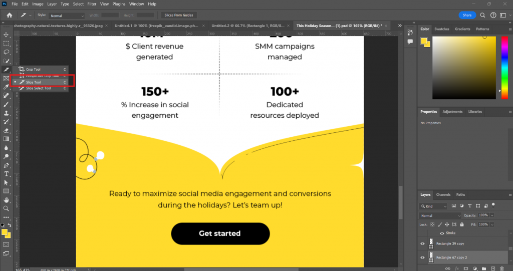
2. Image Slicing
You’ll need to slice up the static PSD image into email header, body, and footer.

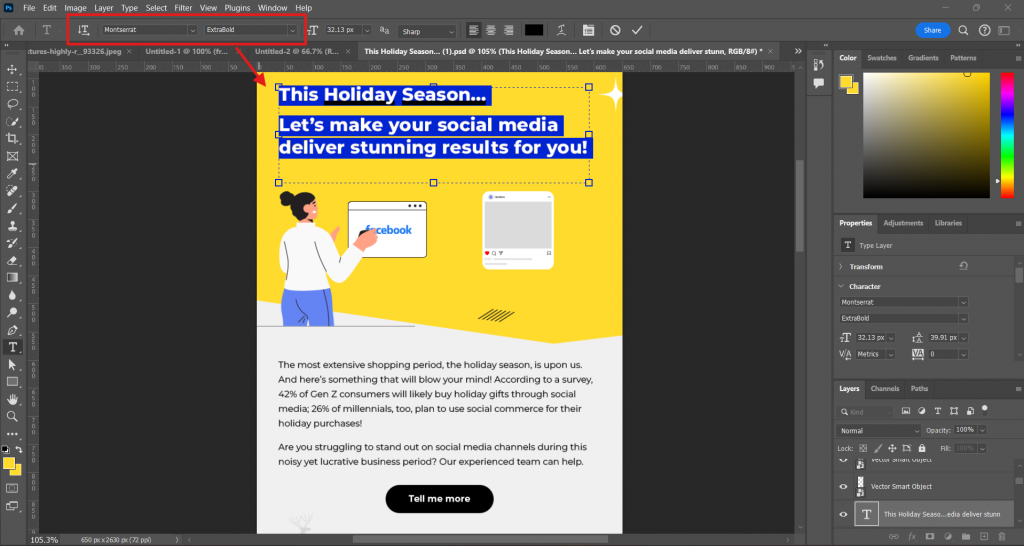
3. Fonts
In view of varying compatibility standards, consider using web-safe fonts for text.

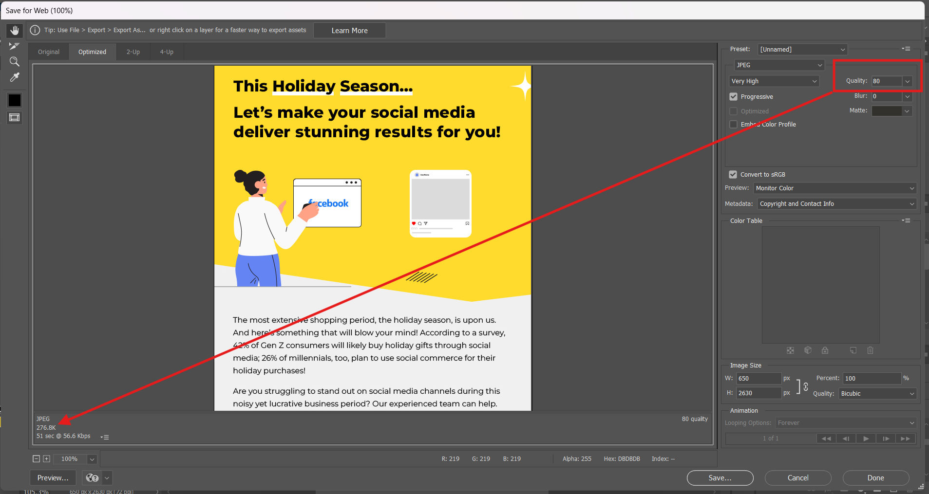
4. Image Optimization
Optimize the images for Web support by compressing them but without sacrificing image quality.
You are now set to convert your PSD to HTML email template.

Steps for Converting PSD to Email Template
The conversion of PSD design to email HTML is a four-step process:
- Exporting your PSD file
- Coding the email structure
- Adding images
- Testing & optimization
Let’s hurry on to the details then.
1. Export the PSD File
Exporting your PSD file to another location is not hard. Simply follow these steps:
- Open your design file in Photoshop
- Go to File
- Select Export
- Click Export Preferences and set your preferences


- From File, go to Export As to export the file
Note that the Export As option allows you to export the file with your preferences.
2. Code the Email
Create the basic HTML structure for your email.
<!DOCTYPE html>
<html lang="en">
<head>
    <meta charset="UTF-8">
    <meta name="viewport" content="width=device-width, initial-scale=1.0">
    <title>Email Template</title>
</head>
<body style="margin: 0; padding: 0; font-family: Arial, sans-serif; background-color: #f4f4f4;">

    <table width="100%" cellpadding="0" cellspacing="0" border="0" style="background-color: #f4f4f4; padding: 20px;">
        <tr>
            <td align="center">

                <table width="600" cellpadding="0" cellspacing="0" border="0" style="background-color: #ffffff; border-radius: 5px; box-shadow: 0 2px 10px rgba(0, 0, 0, 0.1);">
                    <tr>
                        <td style="padding: 20px; text-align: center; border-bottom: 1px solid #dddddd;">
                            <h1 style="color: #333333; margin: 0;">Welcome to Our Newsletter!</h1>
                        </td>
                    </tr>
                    <tr>
                        <td style="padding: 20px;">
                            <p style="color: #555555; line-height: 1.5;">Thank you for subscribing to our newsletter. We are excited to share the latest updates and offers with you!</p>
                        </td>
                    </tr>
                    <tr>
                        <td style="padding: 20px;">
                            <table width="100%" cellpadding="0" cellspacing="0" border="0">
                                <tr>
                                    <td style="padding: 10px; text-align: center;">
                                        <h2 style="color: #333333;">Latest Updates</h2>
                                    </td>
                                </tr>
                                <tr>
                                    <td style="padding: 10px; border: 1px solid #dddddd; text-align: left;">
                                        <h3 style="color: #333333;">Update 1</h3>
                                        <p style="color: #555555;">Details about update 1 go here.</p>
                                    </td>
                                </tr>
                                <tr>
                                    <td style="padding: 10px; border: 1px solid #dddddd; text-align: left;">
                                        <h3 style="color: #333333;">Update 2</h3>
                                        <p style="color: #555555;">Details about update 2 go here.</p>
                                    </td>
                                </tr>
                            </table>
                        </td>
                    </tr>
                    <tr>
                        <td style="padding: 20px; text-align: center; border-top: 1px solid #dddddd;">
                            <p style="color: #555555;">© 2023 Your Company. All rights reserved.</p>
                            <p style="color: #555555;">Follow us on
                                <a href="#" style="color: #1a73e8; text-decoration: none;">Twitter</a>,
                                <a href="#" style="color: #1a73e8; text-decoration: none;">Facebook</a>,
                                <a href="#" style="color: #1a73e8; text-decoration: none;">Instagram</a>
                            </p>
                        </td>
                    </tr>
                </table>

            </td>
        </tr>
    </table>

</body>
</html>
In the above HTML code:
- The outer <table> sets the background color for the email.
- The inner <table> contains the header, body, and footer.
- Inline CSS has been used for styling the elements in the email.
- Social media links are styled for clear visibility.
3. Insert Image Slices
Now, you insert the image slices nto your HTML code. For example, if you need to add your brand logo and hero image, you can do it like this.
<!-- Brand Logo -->
                <tr>
                    <td style="padding: 20px; text-align: center; border-bottom: 1px solid #dddddd;">
                        <img src="https://example.com/brand-logo.jpg" alt="Brand Logo" style="max-width: 100%; height: auto; border-radius: 5px;">
                    </td>
                </tr>
                <!-- Hero Banner -->
                <tr>
                    <td style="padding: 20px; text-align: center;">
                        <img src="https://example.com/hero-banner.jpg" alt="Hero Banner" style="max-width: 100%; height: auto; border-radius: 5px;">
                    </td>
                </tr>
Note the use of absolute URLs for the two image slices.
An absolute URL is a complete web address, containing the protocol, the domain name, and the path to the image.
Absolute URLs ensure that your emails display correctly on email clients.
4. Test Your Email
The last step is the most crucial of all. Test your emails across email clients and devices for accessibility, readability, load time, etc.
Convert PSD to Responsive Email with Email Uplers!
A few things to keep in mind with respect to PSD-to-email conversions:
- Use email-safe fonts sized 12-14pts for better readability.
- Keep the PSD template height within 1800-2000px to avoid clipping in Gmail.
- Ensure the PSD design aligns fully with the brand’s colors and logos.
- Separate sections in the email with spacers for clarity.
- Avoid background images in sections with editable content to simplify coding.
Have a PSD file with you? Send it over to our template production team!