


Update: This post was originally published on Oct 2, 2018. It has been updated on 12th Jan 2022.
Digital marketing has become an essential part of every higher education institution’s marketing strategy. And apart from well-designed websites, email marketing for educational institutions is emerging as one of the most effective ways of promotion for institutions/ universities..
With such great numbers to start with, as an email marketer, it is vital for you to craft great higher education email templates that serve the purpose as well as encourage subscribers to enroll for a course.
Email Uplers has collated some awesome higher education email campaign ideas to help you boost the admission counts.
#1 Arizona State University


Creativity will always help you stand out from the crowd. Look closely at this email by ASU to get an idea of how they have crafted a creative email with the latest email marketing tactics.
What makes this example rank among the best education marketing examples out there is the GIF at the top. Occupying the hero section of the email, it instantly grabs your attention as soon as you open the email. On the other hand, the illustration is cherry on the cake. The social sharing link and the unsubscribe button gets this email a thumbs up!
What could’ve been better:
They could have provided the information in the footer in a better way. Educational emails, in particular, stand to lose a lot if they’re unable to uphold their credibility via their footers. Additionally, they could have upped the visual factor by adding a Cinemagraph. Check out our blog on how you can create an attractive Cinemagraph in emails.


Download A Sample
#2 Udacity

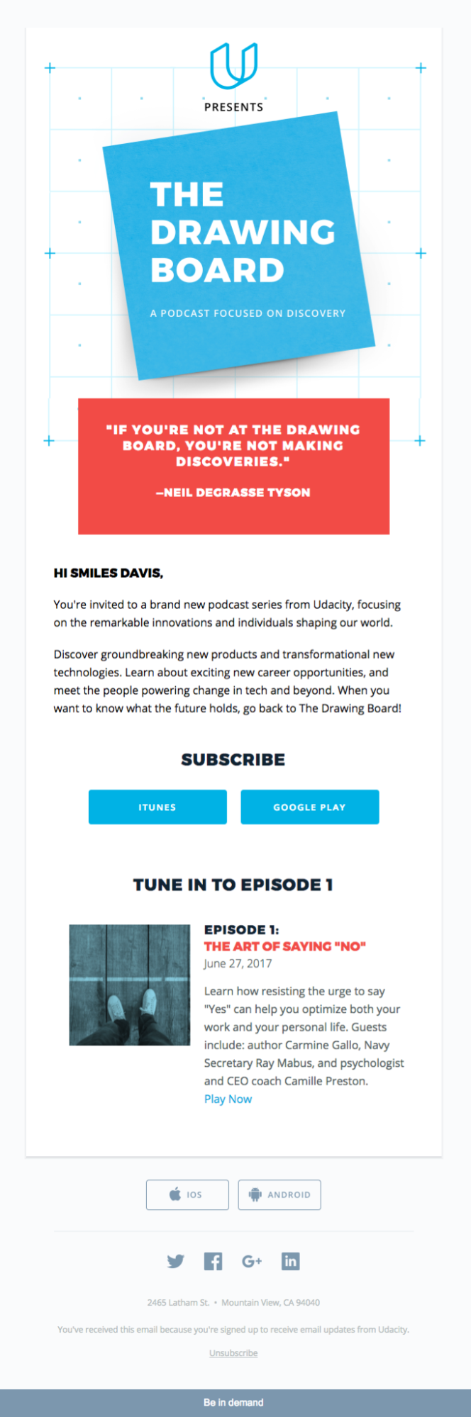
Higher education email marketing campaigns need to be logical, informative, and absolutely to the point, just like this example from Udacity over here. Minimalism coupled with the use of bold typography elevates the visual appeal of this email while the succinct copy effectively draws the reader’s attention towards Udacity’s brand new podcast series. Further, to pique the curiosity of the subscriber, they’ve added a brief descriptive preview of the first episode too.
What could’ve been better:
At first sight, the template appears to be text-intensive and the lack of visual elements can keep the reader from interacting with the email.
#3 Udemy


While looking for pitch-perfect higher education email ideas, we stumbled upon this example from Udemy. If you are looking for some holiday inspirational emails, then this one is the best example.
During holidays, you can promote an exciting limited-time offer and create urgency by adding a countdown timer in your email so that customers get compelled to take immediate action.
Wishing to add a countdown timer to your holiday emails but still in doubt? Check out this fun interactive email element.
The good thing about this email is that they have used a single clear CTA. They have shared the popular courses to prompt the user to take action.
What could’ve been better:
The email looks very cluttered as it has no white space. Also, they have missed out on social media sharing links and an unsubscribe button.
#4 Deakin University

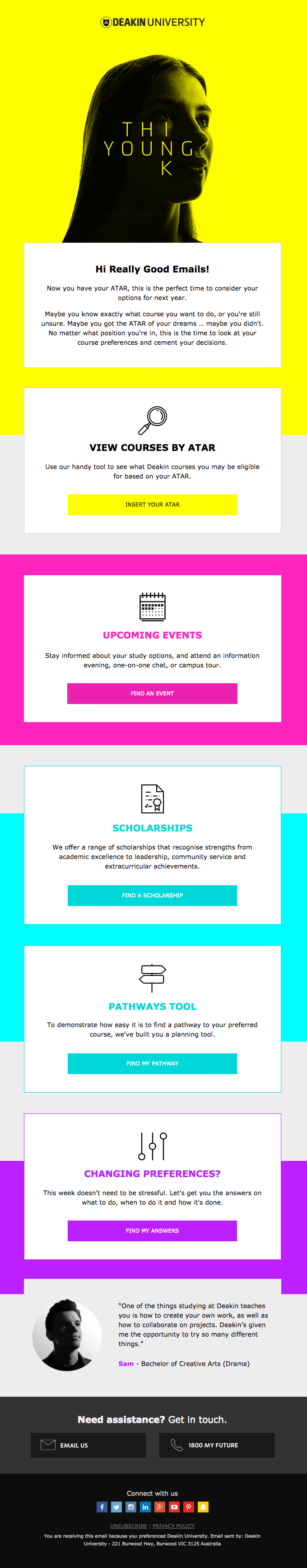
Education email marketing can be tricky, but Deakin University has aced it over here. Often educational emails end up becoming a little monotonous since they pack a lot of information but that’s not the case here at all. The single column layout over here is both vibrant and easy to navigate courtesy of the small rectangles in which the different sections of content are placed.
What could’ve been better:
Though the email follows most of the best practices, it could have further heightened its rank among educational emails by doing a better job with the View Online link, unsubscribe button, and the placement of its social media handles.
#5 Masterclass


This email by MasterClass is a perfect example of minimalistic email with the same CTA placed in both the folds of the email. The header image with the play button is sure to catch the subscriber’s attention.
What could’ve been better:
They could’ve added interactivity to make the email look attractive.
#6 Skillshare

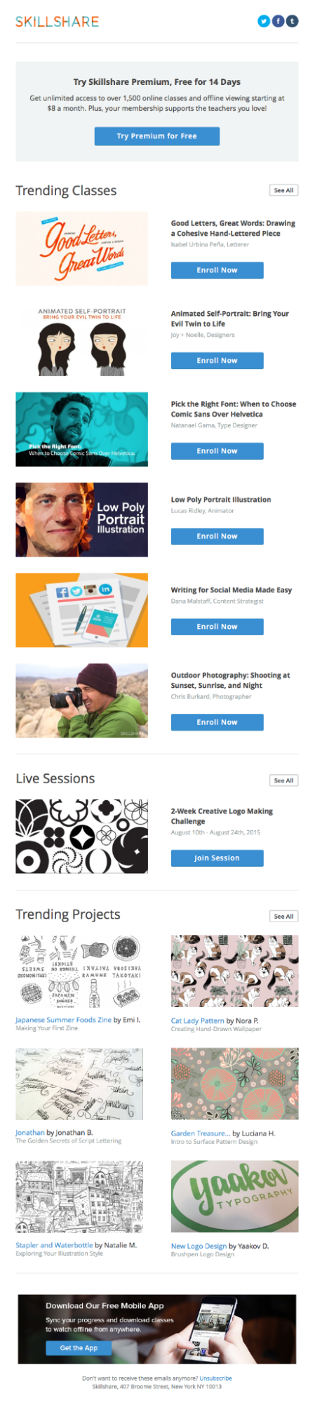
The email has an attention-grabbing headline with relevant copy that works well to engage the reader. The layout is neat and is peppered with enough visual elements to hold the subscriber’s attention. The app download link in the footer encourages the subscriber to install the application and explore other features of the platform.
What could’ve been better:
Adding an interactive hero image would have done wonders for them. Also, they’ve missed a trick here by not including any links to their social media platforms.
Let experts audit your email marketing campaign and help you optimize it.
Wrapping Up:
We hope these educational email examples will help you design your educational email templates as good as these or even better. Be clear about the audience you are targeting and provide information the subscriber is expecting. You can get free education email templates from many platforms but if you want to create a stunning email template for your organization for free, have a design ready, Email Uplers can code your first email template at ZERO cost.