


A well-designed landing page can drastically change the course of your business. Whenever you are creating a landing page, you should always focus on drawing the user’s attention and converting them. Instead of having tidbits of important information inconsistently spread over the landing page, you should be able to convey its purpose and the unique value proposition.
With marketers struggling to adapt their websites to mobile visitors, enticing someone to fill out a form on a small screen while on the go is no simple task. Put that lead generating page on mobile and you’ll see those differences expand and even test the limits of what you thought was possible for mobile.
From designing to deliverability, these tips will guide you towards a better performing mobile landing page.


Layout
1. Design to achieve mobile goals
Desktop visitors usually have more time and a 10 times bigger screen, so they’re able and willing to look around your site in search of what they need. Some of them may even be willing to scroll to the very bottom of your page, even if it’s a long one.
With mobile users, the situation is quite the opposite. People usually use mobile devices when they have only one goal in mind. They’re browsing for it on a much smaller screen and seeing it crowded with useless information is a big turn off. If they sense that the search will take forever, they’ll simply give up.
2. Stay above the fold
On mobile devices, putting all the information you want your users to know will always seem like a lot. There’s no way around it, but you can ask yourself if they really need all the information in the beginning.
You can get out of this situation by utilizing the newspaper concept called ‘above the fold.’ It is quite a simple one – important news needs to appear on the top half of the newspaper, meaning above the point where it was folded. This concept can easily be translated to a mobile landing page, where the fold is the bottom of the page which can’t be seen without scrolling.
A study done by Google on viewability insights revealed that content below the fold had 30 percent drop from the 73 percent viewability of the content above the fold.
This landing page by Hulu is a perfect example of keeping important content above the fold.


In the background of their free trial landing page, the most popular current TV shows are on display, instantly compelling users to sign up to get access. Also, note that the CTA is designed in such a way that it stands out and captures the user’s attention.
Keeping your best content above the fold is key. But that doesn’t mean you can’t have a longer landing page.

3. Use a single column layout
Phone screens are essentially a single vertical column and breaking away from this can be distracting. That said, there are times when you want to jar people’s attention so the occasional section of columns or misaligned content can be more powerful than an otherwise single-column design.
Since that is one of the most important limitations how visitors interact with a post-click landing page, make sure that your leads don’t have to pinch in and out on the screen.

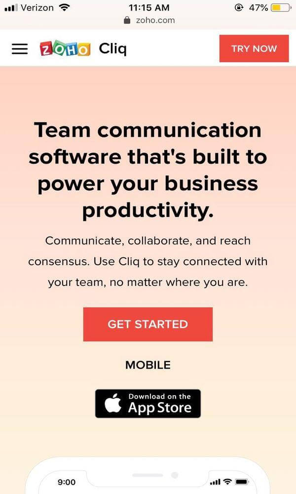
This mobile landing page example from Zoho has a concise headline at the top of the page. It tells you exactly what you need to know and nothing more. And the content below is in an inverted pyramid structure. This will lead the reader directly to the CTA.
4. Optimize for mobile viewing
How many times have you arrived on a landing page that clearly hadn’t been optimized for mobile? It’s one of the biggest blunders a marketer could make.
Take a look at these examples of a landing page before and after optimizing.

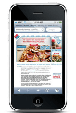

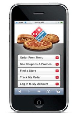
Keep any font on your mobile landing page at least 16 pixels in size to make it readable. This will ensure that the layout is mobile-friendly and could avoid a massive turnoff to a prospect.

5. Design for touch
One of your biggest challenges with mobile post-click landing page design is making sure it’s as easy as possible for visitors to take action. That action could be a form submission or a simple tap on a button. You would expect most people are going to make some adjustments, but that’s not always the case. Adjusting the size of any text element that is hyperlinked is particularly helpful.
6. Implement scrolling cues
If your landing page is longer in size and requires scrolling, then don’t forget to aid your visitors with scroll cues. When there’s nothing on the screen indicating that you need to scroll to see more content below, clicking the back button and leaving your landing page is easier.

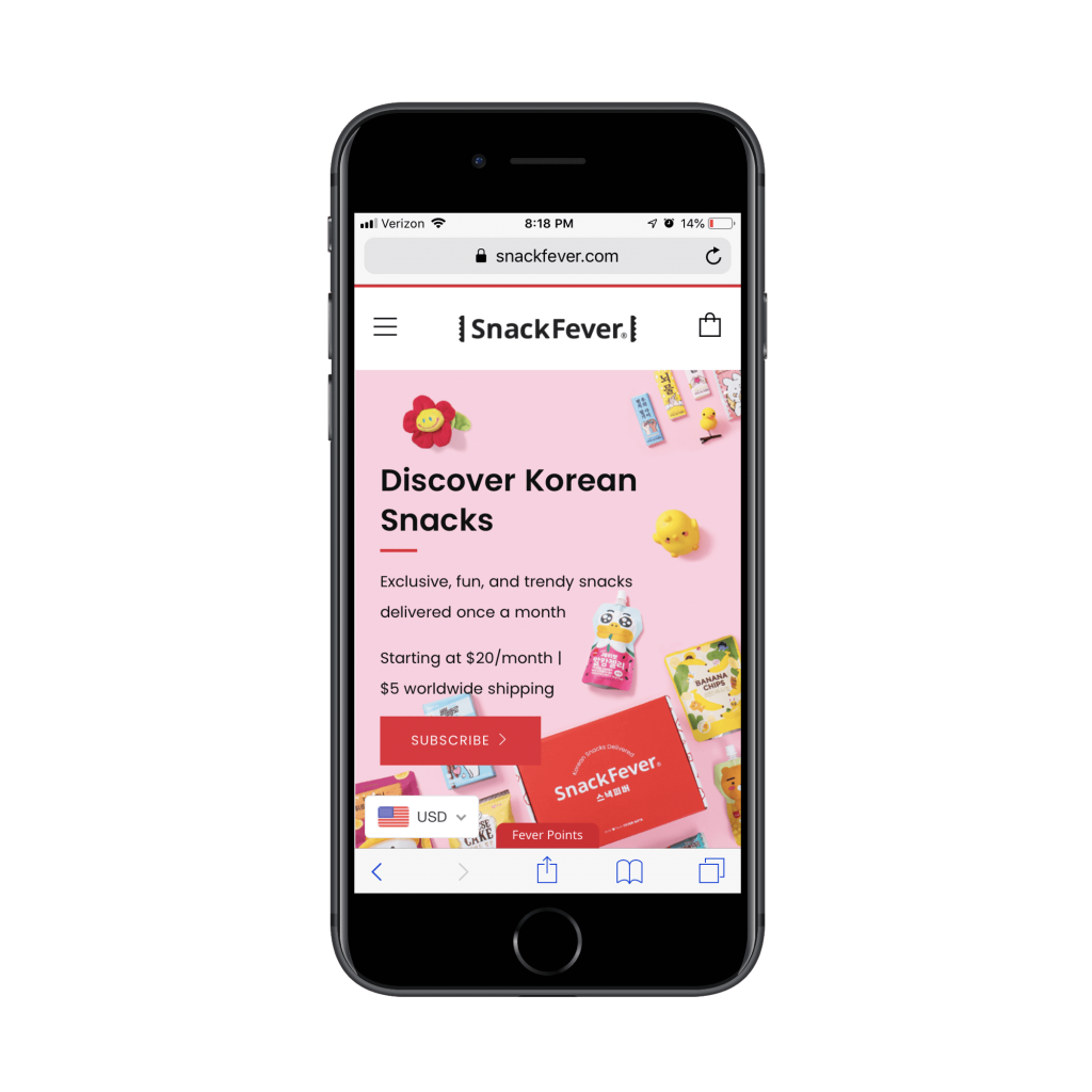
This Snack Fever landing page ends with a CTA on the first page but has a pointer which indicates there is some more content you can view.
Don’t assume that the customer will take your desired action, like scrolling down, automatically. You can hint the user’s eyes for more content by giving a sneak peak of the next section. Or giving a directional arrow to guide them.
Visualization
1. Plan your copy
The ideal length of the copy will depend on what you’re selling and who your audience is, only then you can test to determine the length of the copy that converts best. However, once the content has been condensed into a mobile format, you’ll need to especially consider how much your users will be willing to read and how far they’ll scroll before you lose the opportunity for a conversion.
2. Skip the small talk
Mobile landing page copy plays an important role in lead conversion. The copy should be short yet impactful. It should be immediately obvious what a visitor is supposed to do there.
It’s far better to be clear, direct, and descriptive than to litter your site with vague and meaningless language. Avoid obvious “clickbait” headlines.
3. Use bullet points
Using bullet points on both mobile devices and regular landing pages makes the copy easy to read, communicate marketing messages effectively, and specifically hone in on customer’s wants and needs.

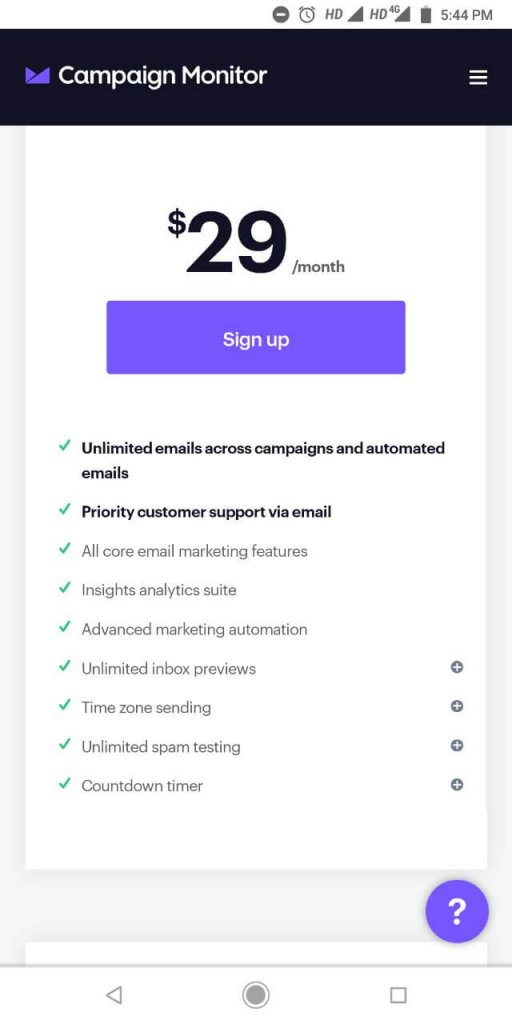
This landing page by Campaign Monitor has included bullet points which creates more white space (as compared to paragraphs), so that the pages look less cluttered. White space is important as it reduces cognitive load and allows visitors to make buying decisions more easily.
4. Go easy on the visuals
It is important to add interactive elements and at the same time you should not overload with excessive visuals. Firstly, using too many images means the loading time of the page is going to be longer. The second reason is, like excessive copy, using too many images can make your landing page feel cluttered and overwhelm shoppers with visual stimuli.

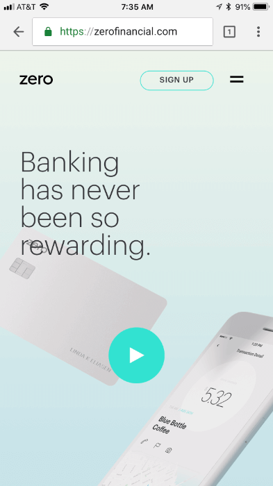
This Landing page by Zero Financial uses video but doesn’t auto play. Call to action is on top of the page. They have used minimal images, yet they convey the message. They have balanced the white space and imagery excellently.
Experience
1. Ditch the navigation
When it comes to landing pages, the navigation menu should only be included when the website is already successfully converting visitors into paying customers. If the landing page is merely there as a bonus element, then it’s not a big deal if visitors want to backtrack to the site.
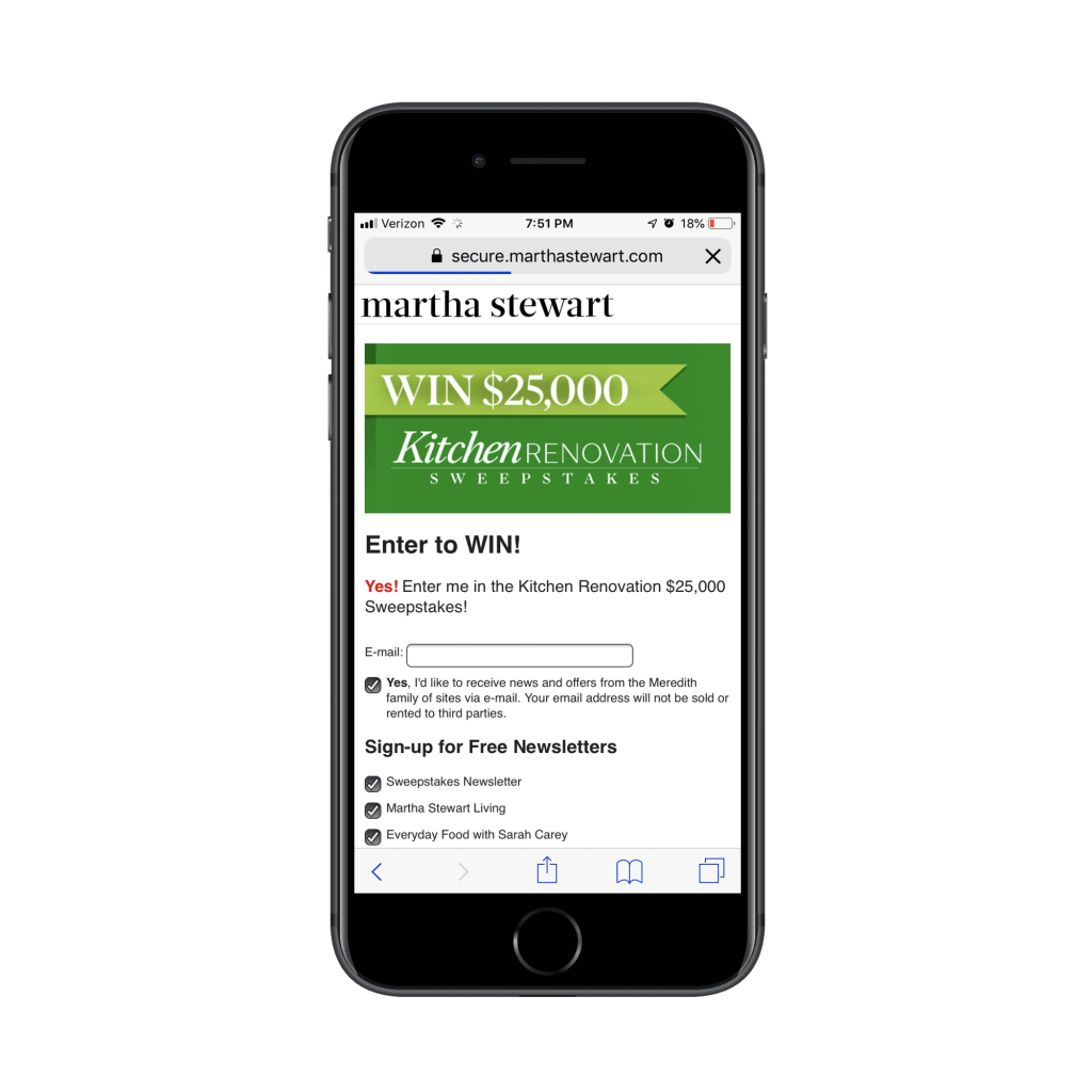
Take, for instance, this sweepstakes giveaway on the Martha Stewart website:

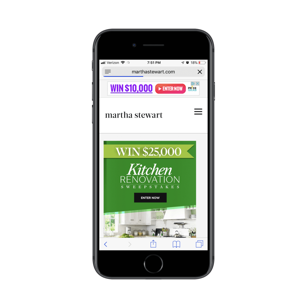
This clickable promotional element takes visitors to the lead capture page where the navigation element has disappeared and only the logo remains:
In general, if you need this lead gen offer to truly be a vehicle to grow your email list, refrain from adding any navigation or competing links.
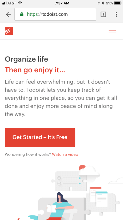
2. Be creative with the CTA
Mobile users are conditioned to scroll, but 80% of a mobile visitor’s attention is still spent at the top of the page, before the first, instinctual scroll. This is where you can use your CTA to increase conversions by wrapping it in the copy. You need to be smarter about the psychology of your conversion
This landing page by Todoist is perfectly optimized and has a CTA along with the supporting phrase.

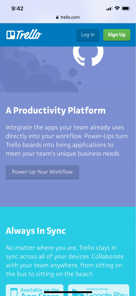
Scrolling down a lengthy landing page means you must scroll all the way back up to find the CTA you saw above the fold. Trello understands the struggle of scrolling back up and uses sticky headers with a static CTA. No matter how far you scroll, Trello’s header with logo and a “Sign Up” CTA will always be at the top allowing the user to convert whenever they feel ready.

3. Contrast CTA button
Never have the CTA as the same color as your rest of the layout. Having a CTA button in a contrasting color will help your mobile landing page visitors follow whatever conversion goal you’ve got planned for them. It’s also easier to link important copy and your CTA together if they’re given a contrasting color.
This CTA on the landing page of Drift is hard to overlook. They have added a supporting statement to the CTA and have a balanced the page with ample amount of white space.


4. Reduce clicks and typing
With touch buttons, conditional logic, and responsive designs, users don’t need to go through the usual pain of clicking and typing their way through your forms, which means you can ask for considerably more information without killing conversion rates. No one wants to fill out a 10-item form that gives you their full life story. The key is to ask yourself: What information do I absolutely need from people?

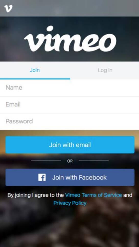
This landing page form by Vimeo give you options to join with email or Facebook. Anyone wanting to save time signing up has an option of choosing from these two options. The form too has only two criteria of information to fill. Once you get them to cross this stage, you can ask for further information later, maybe through a welcome email. Many times, mobile traffic is on the go, so people aren’t coming to your site with a ton of extra time to sit down and fill out a form.
Speed
1. Decrease the loading time
When it comes to mobile Landing pages, speed is everything. The longer your customers have to wait for a page to load, the more likely they are to give up and go elsewhere. There are speed improvement tools available that can increase your page speed by doing a few tweaks to your website.
Always keep in mind that not all your visitors will be accessing your page using the same kind of Internet connection. So, when you design, code, and optimize, make it for the worst connection.
Testing
1. Test your page
With the launch of a page, you can A/B test the placement of website elements using a tool such as Google Analytics’ free Content Experiments. For instance, in the case of pricier products sold to a niche audience, you might want to test if these people will indeed respond to a form they see immediately or if they will need to read through content and view imagery before deciding to convert.
In addition, install a heat mapping tool such as Crazy Egg, to measure clicking and scrolling activity via a tracking script inserted in your website. This data will allow you to look more closely at how people are scrolling and what elements of the page they’re interacting with. In this way, you can determine how far into the content the average user is likely to read, as well as what buttons and form configurations are likely to produce a response.
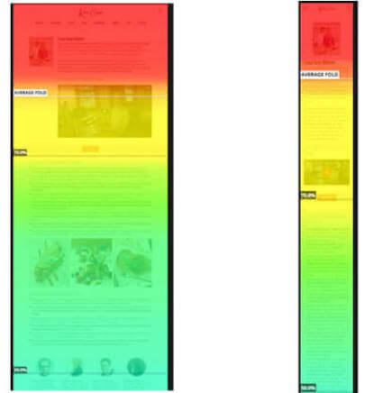
Mobile optimized testing is only suggested to better identify what elements of the website are and aren’t working, test the experience of the website on mobile devices. Be sure to look at heatmaps specific to mobile. While desktop heatmaps might show no issues, mobile might show a different story. Of course, data will vary from website to website, but you might find that a larger percentage of your desktop users scroll through an entire page than mobile users (or vice versa). In the example below, see how users scroll through more of the content on desktop than on mobile. Based on this data, the developer would be wise to take out some of the lengthy content on the mobile version of the page.

Wrap Up
Crafting high converting landing pages on mobile involves working on the psychological and physical friction of the users. Everything revolves around mobile optimization. Only when you know your audience in and out, you can give them an effective landing page with the essential information. Solicit the opinions of multiple users to identify issues and test with analytics data to determine user compatibility. With a clear plan in place for mobile, you’ll be able to convert your leads.