


[This post was originally published on 20th Oct 2021. It has been updated on 28th April 2023.]
First impressions matter!
This is a mantra that turns the wheels of marketing all around the globe. It takes an average person 0.05 seconds to make an impression. Needless to say, the product being marketed needs to make good use of this time period. Email marketers tend to experiment with the subject line and preheader text to boost open rates but once the subscriber opens the email, what they do next relies heavily on the design.

In the above email, even before you read the words in the email, your attention immediately falls on the bright scenery and the blue color standing out against the sea of lavender and mild yellow. Next, you notice the subtle animation of the flowers gently moving on either side of the image, and as you move ahead, while you skim across the text, your eye scan path is diverted towards the bright-colored CTA buttons. This is how important design is to email marketing and more importantly, to highlight the pivotal role that colors play in designing a high engagement email. In this article, we’ll take a look at the various ways in which using colors in email can help you spruce up your email engagement strategy.
Choosing The Perfect Color Scheme
Adding colors to yourengagement emails doesn’t mean slapping any random colors from the visible part of the color spectrum and making it work. Designers make use of different color schemes to make their mobile-responsive email templates stand out. Choosing a color scheme starts with choosing a base color (generally brand color) and the secondary (and tertiary) color is chosen based on the base color. Additionally, you also have to focus on choosing email background colors that contrast appropriately with the foreground elements. The best engagement email examples out there are those who manage to strike perfect harmony with their usage of colors.


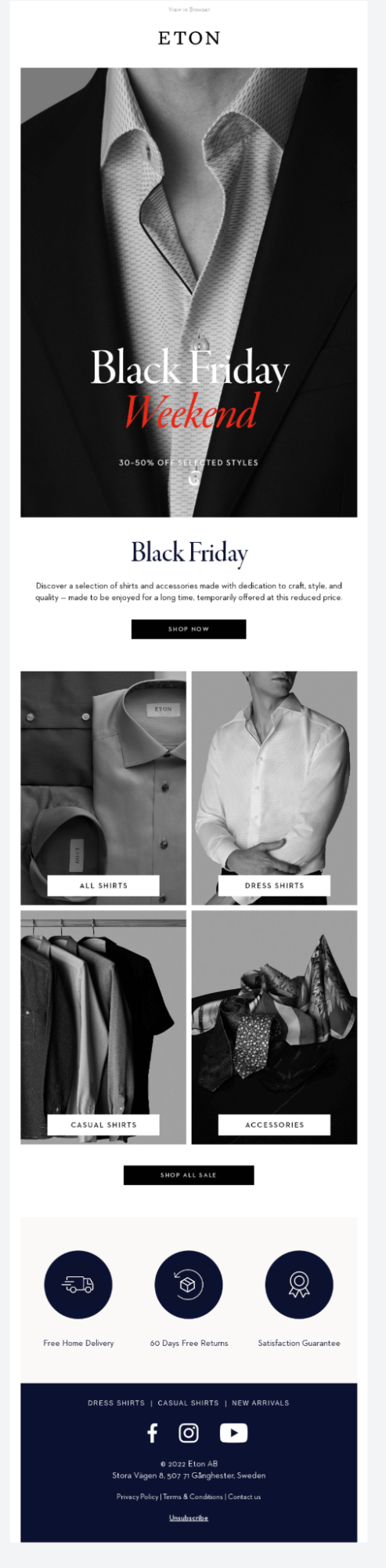
Achromatic Color Scheme: Derived from the Greek word ‘chroma’, achromatic roughly translates into ‘devoid of color’ i.e. Black and White color scheme. In this kind of color scheme, white text is used over a black background to create an artistic effect as well as a clean and professional look. Here’s an example of a Black Friday email from Eton to help you understand this concept better.

Monochromatic Color Schemes: As the word suggests, this color scheme has one main hue and variations of the same. Even though this lacks contrast, the monochromatic color scheme provides a clean and polished image. Monochromatic color schemes are adored by brands because they render their emails with a minimal, elegant, and sophisticated aesthetic. Any agency offering email template design services will concur.


Analogous Color Scheme: In this color scheme, the secondary color is any color that is placed directly next to the base color in the color wheel. Owing to the colors being next to each other, the resultant design ends up having a non-contrasting, softer feel. Many brands make use of this scheme in their re-engagement emails to captivate their audience’s attention.

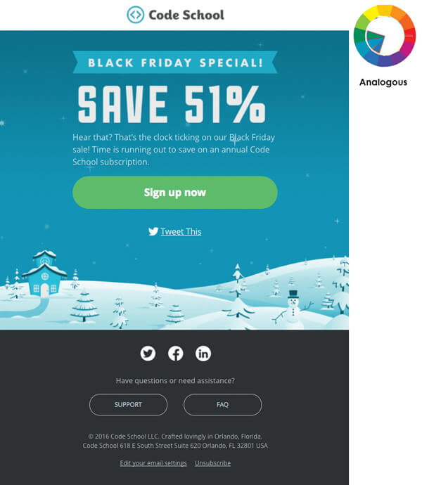
In this email by Code School, the use of green in the CTA button does not make it stand out much but the color still manages to catch the subscribers’ attention.


Similarly, in this re-engagement email by Scratch, the analogous shades blend well to create an overall soothing visual impact. Here, the CTA button stands out rather noticeably as well.
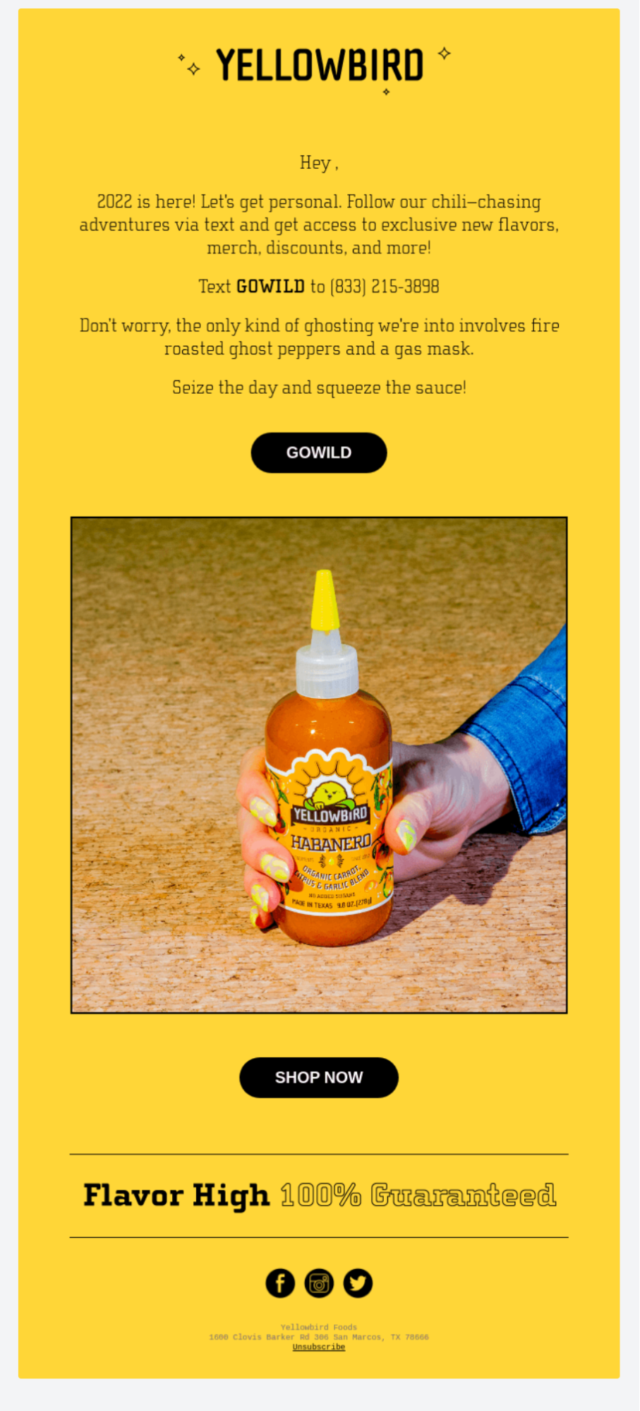
Complementary and Triadic Color Schemes: Using two different colors from opposing sides of a color wheel generates a contrasting effect and such a color scheme is called a complementary color scheme. When you use three colors that are equidistant from each other in the color wheel, it is called a Triadic Color scheme. The best re-engagement emails out there can be observed making frequent use of this color scheme.

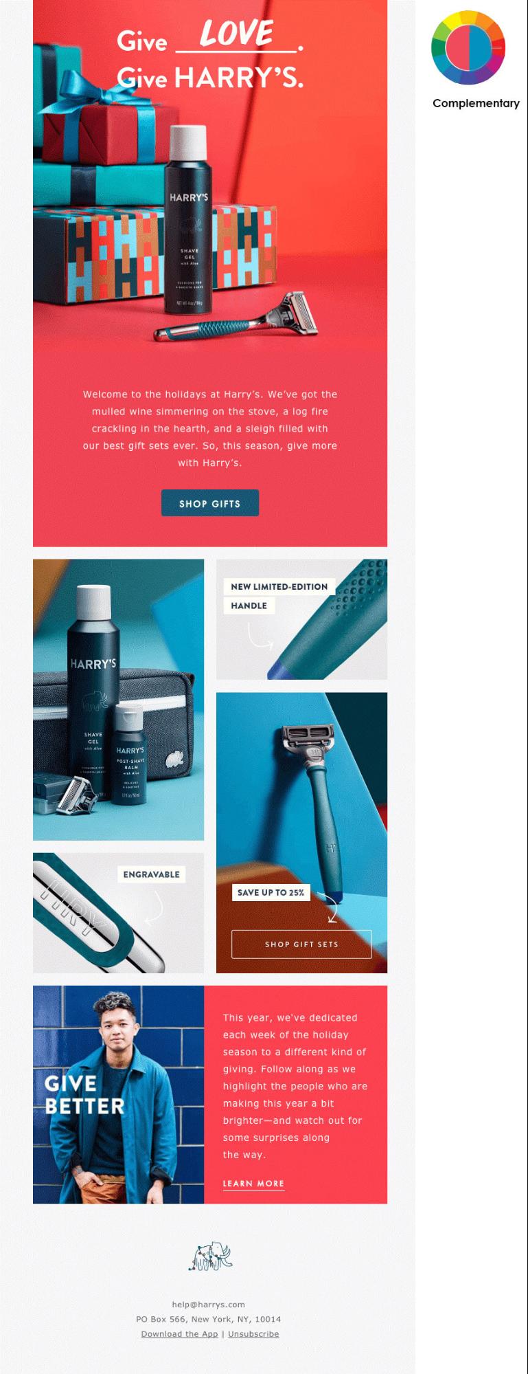
Red and blue colors have been used in the background as well as in the email elements. Although there is a sharp contrast, each section is evident.
The Psychological Effects Of Colors
Emails with attractive color schemes and visually appealing design aesthetics have time and again been observed to drive engagement and lead conversion than the rest. So, there’s definitely no denying that colors play a significant role in influencing our choices.
A popular study titled “Impact of color on marketing” by Emerald Study reported that as many as 90% of instant product-related judgments are based primarily on color associations. Of course, colors definitely impact purchasing decisions, but if you think that’s all they do, then you’re highly mistaken.
They also:
- Boost brand awareness: Using the right colors in your logo and marketing activities can lead to your brand recognition improving by 80%, which is lofty by any standards.
- Elevate product marketing: Your product may present solutions to a thousand different problems and still go unsold if it fails to have magnetic visual appearance. Hence, the product color you finalize could very well be the difference between it being a best-seller or a resounding failure.
- Improve click rates: This is a no-brainer. The more attractive your email CTA is, the greater will be the click rates.
Our brain is hard-wired to respond in very specific ways while viewing certain colors. Therefore, while designing your engagement and emails, it is vital that you factor in the psychological impact that these colors leave on the minds of the readers. Let’s take a look at the various kinds of emotions that different colors evoke in our minds.
Yellow is associated with sunlight and triggers warm, positive, and happy feelings in the minds of your readers. Moreover, yellow and its multiple shades pack strong undertones of optimism and creativity.

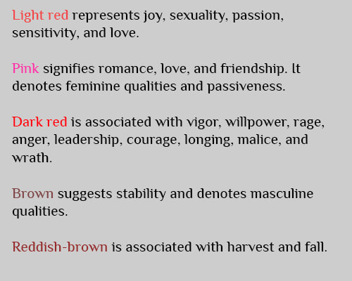
Red is the color of passion and automatically increases the heartbeat. But beware; red also symbolizes danger and crime. So, think twice before you include this color in your emails. Out of all the colors in the spectrum, red is perhaps the trickiest to decode simply because it packs multiple connotations.

Green is the color of the ocean and triggers a feeling of serenity and calmness. The color of Mother Nature, green is best recognized for representing feelings of growth and stability.


Typically associated with royalty, Purple is largely used by brands that wish to accrue a luxurious, elite, and sophisticated aura for themselves. While brighter shades of purple stand for creativity, innovation, and wisdom, lighter shades denote femininity, spirituality, and delicacy.

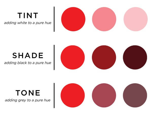
Shades, tints, and tones also contribute to evoking emotions. While red is associated with rage, anger, and blood, pink, which is a tint of red, evokes emotions associated with love and romance.


While the answer to “What are the best colors for email marketing?” is a hugely subjective one, the above listed shades, owing to the immense impact they create, certainly form a substantial chunk of the answer.
Colors And Cultural Association
When sending an email to your global audience, it is important to remember that different colors hold different significance in different cultures. For instance, red is a color for celebrations and good luck in China, whereas in the Celtic community it represents death and the afterlife. Black is associated with funerals, death, and evil in western countries but is a symbol of income, success, and power in Feng Shui philosophy. You can learn more about it here.
Colors And Gender Affiliation
Women, in general, possess one extra photopigment in their eyes and this enables them to distinguish colors in a color spectrum more efficiently than men. Although this doesn’t affect the color of CTA your engagement or re-engagement email should have, it plays a role in what colors attract which gender.
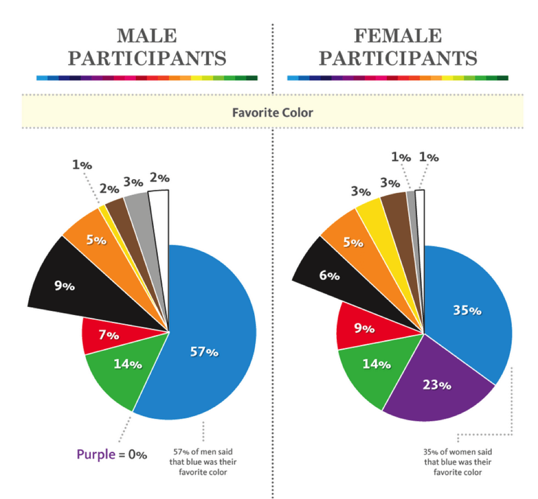
A study by Joe Hallock has cited that the majority of men (57%) and women (35%) picked blue as their favorite color. Additionally, an observation by KissMetrics shows that a huge number of females also like the color purple.

Seasonal Emails And Associated Colors
Each season is associated with dedicated colors. Many email developers include certain colors in their emails based on the ongoing season to amp up their overall email marketing engagement.
Summer: Summer is one of the most awaited seasons for many marketers. With bright sunny colors like yellow, orange, green, and blues up for display, marketers bag on targeting beachwear, holiday packages, summer attires, and more.

Monsoon: This is the season that sparks the love for a good shower. While solid colors like blue, brown, grey, and white dominate the emails during this time, it’s also a great time for bright colors that STAND OUT.

You can read more about the influence of seasons on your email in our blog “Seasonal Email Templates: Add Hues To Your Email Campaign” and how certain holidays have their unique identifiable colors in “Right Colors for your Holiday Emails”.
SPAM Traps And Email Colors
Spam filters by most ISPs hate flashy emails. Bold colors such as red and green, when used to highlight certain email sections, trigger these traps. This is also not a good practice when it comes to accessibility. Especially in your re-engagement emails, try to steer clear of using these colors. You can avoid such pitfalls if you are aware of the Things to look out for in Email Design.
Wrapping Up
In conclusion, colors used in an email are not merely for aesthetic purposes but hold a deeper meaning in themself. In a nutshell, before the email is designed you need to have the following information ready:
- The intention behind creating the email
- Preferred Color Scheme
- Demographic information such as Location, Gender to avoid misunderstanding
- Is it any seasonal or festival-oriented email that has an associated color palette?
We hope the engagement and re-engagement email examples highlighted above have been successful in helping you understand how to use various colors effectively in your email campaigns.
Stay tuned to our blogs for more such email marketing tips.
Monochromatic color schemes are adored by brands because they render their emails with a minimal, elegant, and sophisticated aesthetic.
Monochromatic Color Schemes: As the word suggests, this color scheme has one main hue and variations of the same. Even though this lacks contrast, the monochromatic color scheme provides a clean and polished image.