[This blog was originally posted on April 19, 2017, and has been updated to showcase new examples]
As an email marketer, you need to take care of a lot of things. Apart from writing engaging and relevant content, you also need to add design elements to please the viewer’s eyes. But, the most important thing is to get your email delivered to your subscriber’s inbox- this is the only thing that ensures you rope in respectable open and click-through rates.
Emails should be designed and coded by keeping the concern of email deliverability in mind. Most ISPs look through the keywords that indicate whether the emails are spam or not. And hence, image-heavy emails with low text HTML ratio can raise a red flag for the spam filters.
Although different spam filters have different criteria for a healthy balance of text and graphics, it is recommended that the marketers maintain a proper text-to-image and text to HTML ratio to ensure their emails sail through the spam filters and land in the viewer’s inbox successfully.
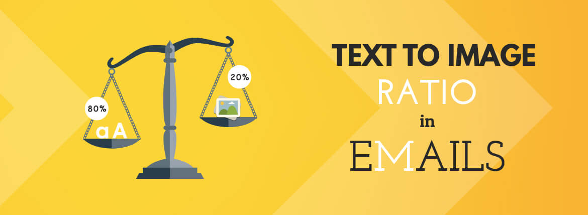
Mailchimp, in their blog, recommends following an 80:20 text to image ratio in emails, i.e., 80% text, and 20% images.
Why Is Maintaining The Image-Text Ratio In Emails Important?
‘Image Only’ Emails Go Into SPAM
Spam filters block image-only emails. Spammers can hide secret links or content in the mail by sending image-heavy emails so that their content is not recognized and read by the spam filters. And so, an email that lacks a healthy balance of text and images is sure to get rejected by the spam filters.
Images Maybe ‘Turned Off’ By Viewers
Some users and email clients generally keep the images turned off at their end. If the image is blocked, the email will appear to be either incomplete or completely blank. Such emails are likely to be ignored, marked as spam, and even unsubscribed.
Images May Take More Time To Load
When there are more images and less text in an email, the images may take more time to load depending on the browser and internet connection of the user and hence may not convey the entire message of the email. Emails with images that take more time to load have lesser click-through rates and conversion rates.
Take a look at this email from Walmart.
All the information about the offers and CTA are contained in the image. And when the images are turned off, the same email appears as below:
Here, the alt tags serve the purpose of conveying the message of the email. But it is essential to maintain a low text HTML ratio so that the message is conveyed in a better way.
How To Make Sure Your Email Gets Delivered?
Email marketers need to bear in mind the following points while planning an email campaign:
- 80% of the email should be text. At the very least, try to include 400 characters of text in your email. This will help you nail your text to HTML ratio.
- Images should cover only 20% of the email and should be given no more than 40 % exposure.
- The images should compulsorily have alternate text (alt tags).
- Avoid the concept of ‘one image will serve the purpose of the email.’ Use multiple images, but at the same time also ensure that the border of one image doesn’t overlap with the other.
- Emails without a balanced text-image ratio won’t allow the users to search for it after a certain period.
- Test your email well and see how it appears in different clients. During these testings, keep a track of the load times. You’d ideally want to settle with those versions that have the lowest loading times.
For more insights on Email Deliverability, refer our Infographic:
Wrapping Up
In your next email campaign, make sure to maintain the 80:20 text-to-image ratio and stop believing in the taboo of “More the images, the better the email will be.” Even better, test your emails with various text-image ratios and find out what works best for your business.
Happy Emailing!
