


Let’s face it: In life as well as in (email) marketing, it’s not always just a reminder.
So often, it’s a high-stakes game. We think of it as cracking a Rubik’s cube that’s in perpetual rotation. Sending a reminder, however gentle, can:
- Annoy the person being reminded because you seem to indicate you don’t trust them, or because you did it much too soon
- Cause you to be resentful so that you give up, discouraged (or even confront the customer by sending off a rude follow-up?!)
- Irritate because it might just be that you’re doing it too often
- Compromise your program because you’re playing into the hands of habitual cart abandoners.
But, not sending a reminder doesn’t help either. Do it, don’t do it — you’re going to face the music, it seems. But not if you do it the way it’s meant to be done.
And that, by way of reminder, is what this blog post is all about.
You’re not the first (nor the last) to be worried about how to send a reminder email. In our experience with over 5,000 global agencies, we have come across many similar queries and requirements. Let’s get started then.
When to Send A Reminder Email
Below are some common instances when you should send a reminder email.
- “Free Trial Ending” Alerts
Free trials are a great way to showcase your platform and features, helping users make informed decisions.
However, customers may forget the trial deadline. A series of well-timed reminder emails can gently prompt them to convert before their trial expires.
- Promoting Ongoing Sales
Sales attract both customers and businesses, boosting visibility and clearing old inventory. Popular periods like Black Friday or Christmas are ideal for such campaigns. To maximize participation, send targeted reminder emails highlighting the sale’s benefits and urgency.
- Encouraging Event Registrations
Events are excellent for building personal connections, establishing thought leadership, and enhancing brand credibility. To increase registrations, follow up an event announcement with reminder emails that highlight rewards like branded merchandise or VIP perks to capture interest and drive attendance.
- Recovering Abandoned Carts
Poor UX or checkout issues may cause customers to abandon carts.
While addressing these helps, sending a strategic abandoned cart email sequence ensures you re-engage customers and recover potential lost sales.
5 Types & Samples of Reminder Emails
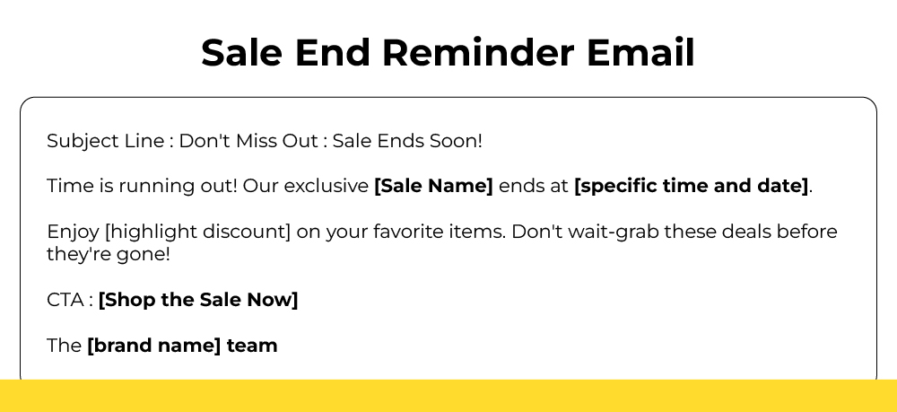
1. Sale End Reminder Email
The ideal sale end reminder email is brief, contains just one call-to-action, and uses bolding to highlight important phrases, dates, discounts, etc.

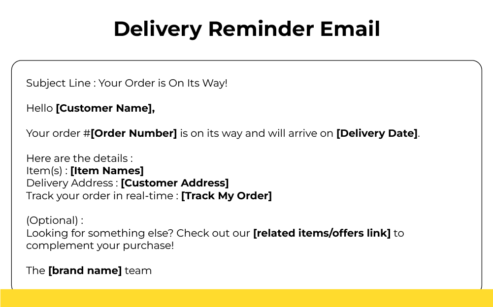
2. Delivery Reminder Email
A successful delivery reminder email is, first of all, precise. Provide the relevant details first, and only then, you may, if you want to, upsell/cross-sell.

3. Payment Reminder Email
When it comes to payment reminders, we recommend using what we call the AMS framework: Action, Method, Support. First, you remind the defaulter that they need to pay. Then, you provide the payment link/options. Finally, you offer to help them if they’re facing any problem making the payment. Check out this template.

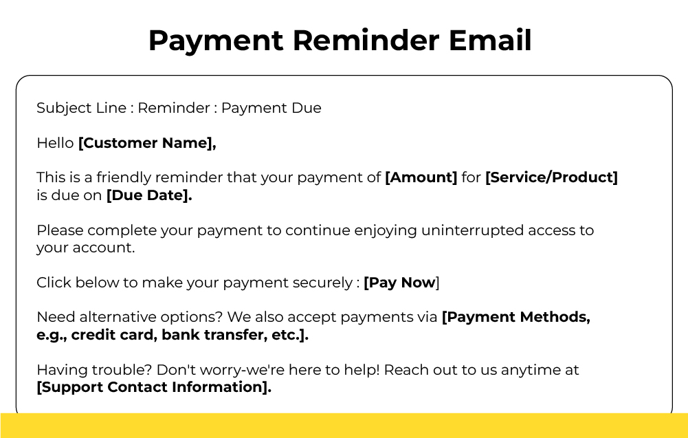
Note that the AMS framework is only for the first payment reminder email.
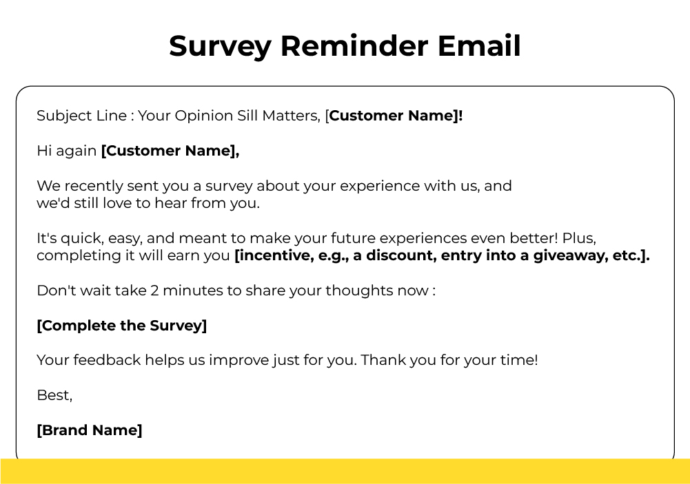
4. Survey Reminder Email
Post-purchase surveys are usually the most common. But the problem is that when prompted to share their feedback, customers often show a lack of interest. A dissatisfied customer is all too ready to attack your company on Facebook rather than communicate their feedback when asked to.
So it’s unlikely that the majority of your customers will complete a survey after the first email. How to write a survey reminder email, then? Try these hacks:
- Personalize the reminder by customer experience as well as name
- Show that the survey is meant for the customer’s benefit, not the brand’s
- Avoid worn-out survey jargon.
- Incentive your survey program.
Check out the following survey reminder template.

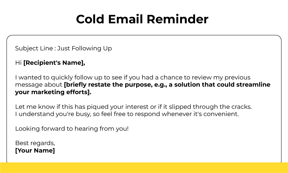
5. Cold Email Reminder
A cold email reminder can be particularly tricky to pull off. Writing a cold email is not an easy thing to do anyway. To follow up, harder.
But here are a few tips that might come in handy:
- Start, not necessarily by acknowledging the recipient’s “busyness,” as it were, but by asking upfront if they missed your email.
- Re-write, this time briefly, the purpose of your email.
- Maintain the tone in your first follow-up. As yet, betray no urgency.
- Be brief; conclude with the “busyness” aspect.
For your help, here’s a template you can use for your maiden follow-up.


8 Examples of Reminder Emails from Top Brands
1. Musicbed
Subject line: Followup RE: unwatermarked music downloads

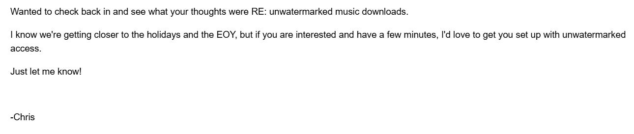
Things we love about Musicbed’s reminder email:
- Brevity, urgency, telegraphic quality
- Use of abbreviations which saves time and space
- Informal, first-name send-off
- Relevant, informative subject line
- Colloquial style of the message
2. Shinesty
Subject line: Your free gifts are in jeopardy.

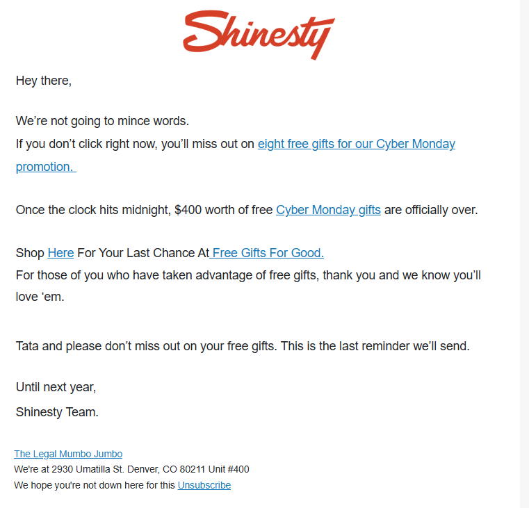
Things we love about Shinesty’s reminder email:
- Superb intro, straight talk
- Useful, relevant links
- Negative words (not and don’t), targeting our loss aversion bias
- Colloquial tone
- Use of brand logo
3. Graza
Subject line: 20.76% off is ending sooooon 🙁

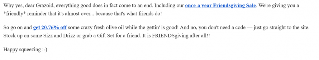
Things we love about Graza’s reminder email:
- Chummy tone, suiting the Friendsgiving vibe
- Jovial send-off
- Use of a few bolded links
- Laser-specific subject line
- Colloquial style
- Products specified
4. Conservation X Labs
Subject line: Join us in one hour for the Beneficial Fire on Film webinar!

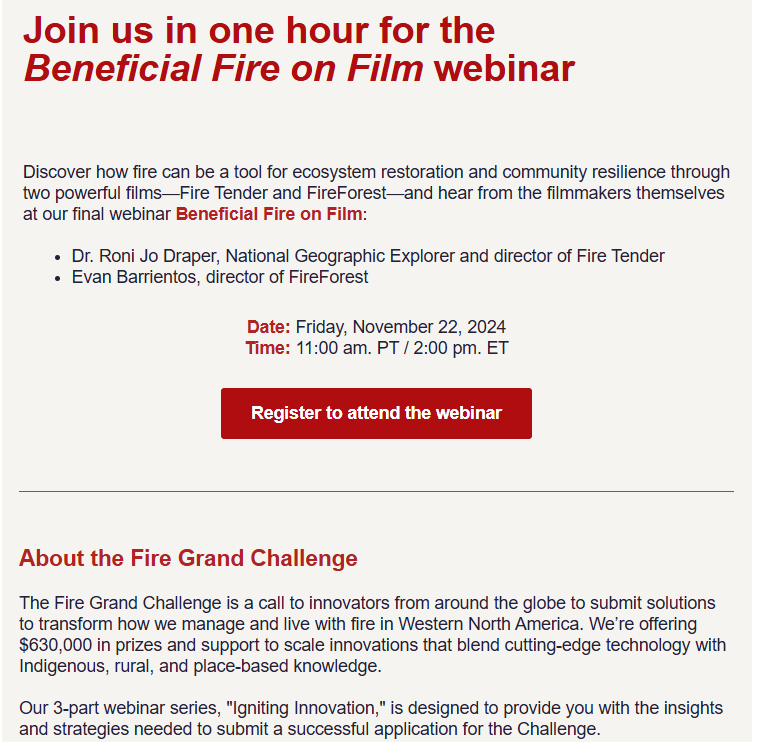
Things we love about Conservation X’s reminder email:
- Real-time subject line
- Solid, prominent CTA button
- Bite-sized text
- Uniform color scheme
- Detailed info
5. The Inside
Subject line: 20% OFF: What’s in Our Carts

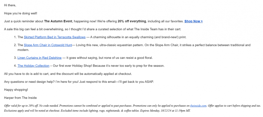
Things we love about The Inside’s reminder email:
- Bolded CTA in the very first line
- Products explained nicely, arranged in bullets, USPs highlighted
- Informative italicized footer
- Helpful tone, assurance of support
6. Sio Beauty
Subject line: Reminder: Get a free ChestLift patch

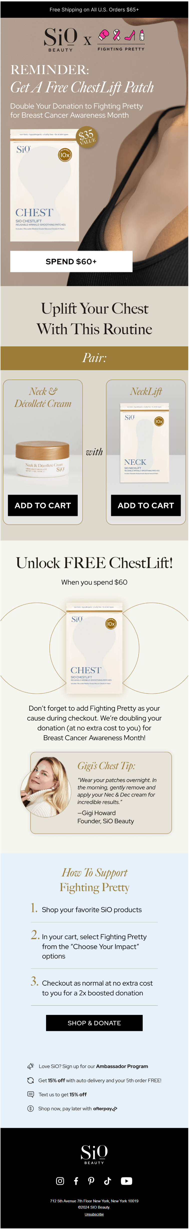
Source: Inbox
Things we love about Sio’s reminder email:
- Urgency-based info hierarchy, above-the-fold reminder
- Prominent CTA buttons
- Tip from the founder & CEO
- Optimized cross-selling
- Prominent Free Shipping offer
7. Air Canada
Subject line: Your Air Canada flight is now boarding

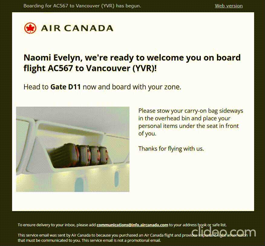
Things we love about Air Canada’s reminder email:
- Timely, effective communication
- Personalized header
- Brilliant use of animated GIF
- Boarding process nicely explained
8. 1906
Subject line: A Thanksgiving Tail from Duke 🐾

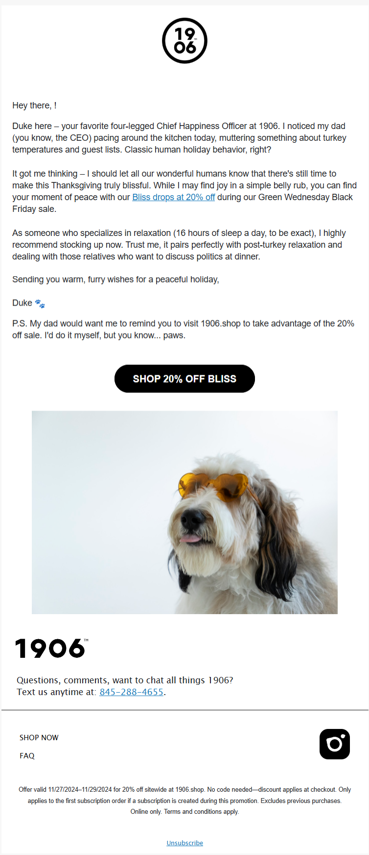
Source: Inbox
Things we love about 1906’s reminder email:
EVERYTHING!


5 Best Practices for Sending Reminder Emails
1. Nail the Subject Line
To create effective reminder emails, start with a friendly, compelling, and clear subject line. Your subject line should explain why the recipient is receiving the email and encourage them to take the desired action. If your subject line doesn’t grab attention, the email may not even be opened.
Here are some key tips to craft engaging subject lines:
- Keep it concise: Aim for 30-40 characters to ensure readability across all devices, especially mobile. Avoid overly trimmed or lengthy subject lines.
- Personalize it: Address recipients by name or tailor the message based on their activity, such as past purchases or abandoned carts. For example, “Hurry Up! Last Chance To Get Product XYZ At 50% Off” is more effective than a generic “Sale! Big Discounts On Your Favorites.”
- Add urgency: Highlight deadlines, limited stock, or time-sensitive offers to prompt immediate action.
- Use emojis sparingly: Enhance appeal with appropriate emojis, like an hourglass for deadline reminders, while maintaining a professional tone.
- A/B test: Experiment with different versions of subject lines to identify what resonates best with your audience. Data-driven insights outperform guesswork.
By following these practices, you’ll craft subject lines that boost email opens and drive user action.
2. Get Your Greeting Right
A greeting is an essential part of a polite reminder email, but finding the right one can be tricky. Here are some tips to guide you:
Match your brand tone: If your brand communication is casual and witty, use greetings like “Hi” or “Hey there,” followed by the recipient’s first name. For formal communication, “Hello” and the recipient’s first name work well..
Be cautious with titles: Formal greetings may include titles (Mr., Ms., Mrs.) with the recipient’s full name. However, as these titles are not gender-neutral, avoid using them unless you’re certain of the recipient’s preference. Instead, stick to a polite “Hello” followed by the full name.
Reconsider “Dear”: While “Dear” may feel outdated, you can continue using it if it aligns with your brand’s communication style.
3. Get Your Timing Right
Businesses often wonder: How long should we wait before sending an abandoned cart email? The answer isn’t one-size-fits-all, as what works for one brand may not work for another.
Experts generally suggest sending the first email within a couple of hours after abandonment to avoid the customer forgetting their cart. If it doesn’t yield results, wait 12–15 hours before sending the second email. For the third reminder, wait at least 24 hours.
While this approach works for many brands, it’s not a universal rule. Test different timings to find what resonates best with your audience.
Tailor your email sequence to customer behavior. For example, offer first-time visitors a “new user” discount to encourage them to return. For returning customers, incentives like loyalty points or exclusive rewards may work better.
Also, consider the contents of the abandoned cart. High-value items may require a different approach than lower-priced ones. Similarly, cart size matters—a customer abandoning a cart with ten items likely has different reasons than someone leaving behind just one or two. Adjust your strategy accordingly for better results.
4. Try to Be Brief
Brevity is key to effective reminder emails. The best ones are concise, providing necessary context right away without unnecessary preamble. Reminder emails are meant to prompt action—your subscribers already know what to do; they just need a gentle nudge. Avoid repeating information from previous emails.
Make sure to include all essential details, such as dates, times, venues, incentives, and customer support links, to ensure the recipient has everything they need to act.
5. Make the CTA Prominent
In a reminder email designed to drive action, the CTA (Call-to-Action) button must stand out. It should be the most prominent feature of the email. Place it above the fold and ensure it contrasts sharply with the background for maximum visibility.
While secondary CTAs can be included, prioritize making the primary CTA highly noticeable. Use action verbs and power words to evoke an emotional response, and consider adding an interactive element to make it more engaging.
6. Be Patient
Avoid spamming your contacts; the success of a reminder email sequence lies in its timing. Allow sufficient gaps between reminders. If a contact remains unresponsive, investigate why. If your analysis suggests they should be removed, do so. A smaller, engaged list will always yield better results than a large, inactive one.
Wrap-up!
Sending reminder emails is not rocket science; but it’s still science. We hope the best practices and tips shared above have inspired you to create your own reminder email campaigns. Go ahead and start crafting—guide your customers exactly where you want them!
Need more help with reminder emails? Learn how to craft a payment reminder email.