[This post was originally published on 7th June 2022. It has been updated on 5th Aug 2024.]
Are your emails optimized for touch-only interactions?
Increasingly, emails are being opened on mobile and wearables. The screen size is shrinking. As a result, you want your subscribers to view the most critical piece of information in your emails as soon as they open them.
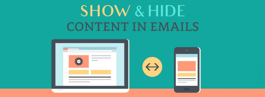
Which means you need to hide the less relevant information for when your emails are opened on mobile devices and wearables.
Otherwise, the gap between your opens and conversions will widen, eventually causing your open rates to plateau too as subscribers lose interest in opening your emails.
In this post, we’ll show you how to hide irrelevant content in emails viewed on mobile devices. Let’s begin.
How to Hide Email Content in Outlook?
Using display:none
Implementing Accordions
Real-world Application: By Client Type
By Device Type
Advantages of Hiding Email Content
How to Hide Email Content in Outlook?
The CSS rule display:none works with Outlook 2007/10/13, but if there is a table within the element you want to hide, the table’s contents will still be visible.
To hide content in Outlook, use the mso-hide:all tag. This will ensure that any content within the div remains hidden when viewed in Outlook.
Using display:none
The news of Gmail supporting ‘display:none’ brought joy to email developers everywhere.
Previously, email developers had to use ‘display!important’ or set height=0 to hide elements without Gmail’s inliner removing the code.
Now, with Gmail supporting ‘display:none’ and promising future support for media queries, content blocks can be hidden using ‘display:none’ with the appropriate media queries for screen width. Consider the following code snippet for an example.
Implementing Accordions
The CSS rule display:none works with Outlook 2007/10/13 unless there is a table within the element you want to hide. In that case the table’s contents will be visible even though everything else is hidden. So to hide any content in
By using the Accordion effect in your email, the content is organized into segments that subscribers can tap to expand and read further.
This doesn’t actually hide the content but arranges it into sections, allowing subscribers to easily read the parts they’re interested in while skipping the rest.
“Responsive design will take on entirely new dimensions because of the rise of wearables and voice-based interfaces.”
Chad S. White, Email Marketing Rules
Real-world Application: By Client Type
By implementing Accordion effect in your email, the email content gets neatly arranged into segments which the We tested integrated forms in emails. These forms are compatible with Apple Mail, Gmail Desktop, Yahoo Desktop, AOL, and Outlook on Mac. Subscribers using these email clients saw the following email.
And subscribers using non-supporting email clients received the following message instead of the form.
By Device Type
One of the critical questions to answer is: Which content should you show/hide on mobile emails? Here are a few examples for your help.
| For Desktop-only | For Mobile-only |
| Ebook downloads Long-form videos Tutorials White papers Multiple columns Complex design | App downloads Prominent CTAs Video embeds with static first frame QR code/barcode Time-sensitive deals Location-based offers |
Advantages of Hiding Email Content
- Imagine a scenario where you need to promote your mobile application to your subscribers. Depending on the device they are using to view the email, the content varies. Desktop users will see content highlighting the app’s features. Mobile users will see a CTA to download the app from the respective app store.
- Outlook doesn’t render GIFs and only shows the first frame as a fallback. This can convey the wrong message. By using mso-hide:all, you can hide the GIF for Outlook and show a fallback image instead.
- Interactive elements are not supported by some email clients. To prevent those clients from displaying a broken layout, you can hide the content for such email clients.
- Reducing/hiding content, visual or textual, also increases loading speed on mobile devices with slower connections, leading to improved customer experience.
“Load time is a much bigger deal than image blocking nowadays”
Kristina Huffman, Experience Designer at Salesforce
Wrapping Up!
Creating responsive emails is not easy. The complexity of email rendering arises from the need to ensure that your email remains functional and visually consistent as it passes through various ESPs, email clients, operating systems, web browsers, and a multitude of devices and screen sizes.
The increasing popularity of wearables presents a significant challenge to responsive design. For now, adhering to coding best practices remains our most reliable approach.
For more information, head over to our in-depth guide to email client hacks.
