


Last year, Kathyrn Cullen, NRF Vice President of Industry and Consumer Insights, remarked that the “big picture” was that Halloween’s popularity was greater than ever before. No wonder that in 2024, U.S. consumers are expected to spend more on Halloween than last year, notwithstanding the recession and related financial concerns.
But here’s the interesting bit: The projected expenditure on email marketing in 2024, totaling $12.33 billion, is comparable to the Halloween spending figures from last year, which amounted to $12.2 billion.
Need ideas for your Halloween email campaign in 2024? That’s what this post is about.
Tight deadlines, creative blocks, substandard handoffs — well, so much of holiday email marketing can be just that. Plus, the market doesn’t wait for anyone. After all, Halloween is when the holiday shopping takes off for real.
But don’t let your creative juices dry up just yet. Coming up with ideas is hard, but seasonality is also the best opportunity for a brand to shine.
Catch up on these ten cool Halloween email inspirations to get a head start over your competitors this year.
1. Spirit Halloween

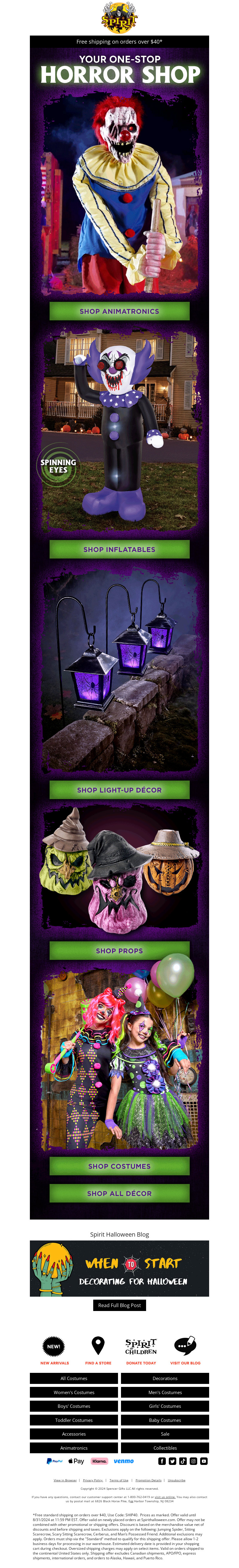
Spirit Halloween is a widely popular Halloween costume store. And their Halloween email is not just funny-spooky, but strategic aesthetically.
In an email so full of rich images, the CTA button has a uniform color — a critical design trick, one that checks the template, preventing it from bleeding into color clutter. The single-column layout helps as well. These are ways of lending balance to visual indulgence.
Read More: Our in-house experts share Holiday Email Design Trends
Pro Tip: If you are a Halloween-centric brand, make sure your emails help the sales team. Add destination links at the end and provide payment options. Just like Spirit Halloween has done in their Halloween template.
2. Uncommon Goods


Image source: Inbox
Uncommon Goods’s Halloween email lets products do the talking.
Importantly, the single-column layout breaks in between the product grids prevents a monotonous viewing. Yes, the email is not Halloween-themed. But the products more than compensate for the lack of a theme. Besides, not every brand needs to have a dedicated theme in their seasonal emails.
In fact, it can at times do more harm than good. It certainly would in the case of Uncommon Goods. The white background was essential for showcasing the products nicely and clearly. Fancy aesthetics, not for all!
Read More: How to Increase Email Newsletter Subscribers in Holiday Season?
Pro Tip: Avoid feeling obligated to go out on a limb. Design in accordance with the nature of your business, brand identity, and your customers.
“This is the core of the Contextual Design philosophy – understand users in order to find out their fundamental intents, desires, and drivers.”
– Karen Holtzblatt and Hugh R. Beyer
3. Decor Steals

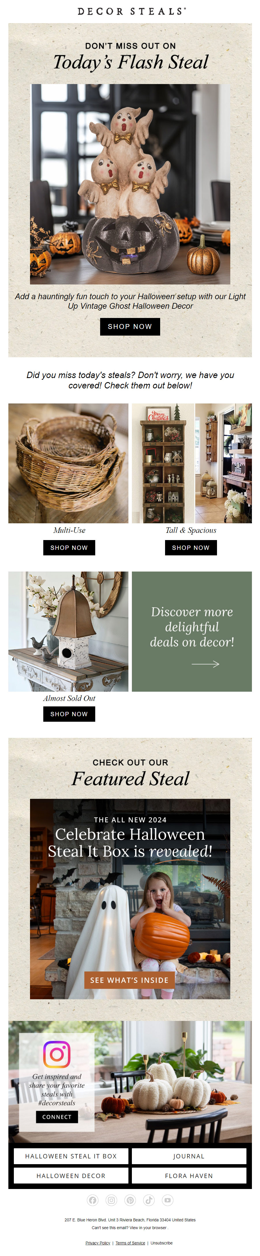
Image source: Inbox
The best thing about this Halloween email from Decor Steals is their use of a product image in the hero banner. It looks more authentic than featuring a dedicated hero image designed in-house. (You heard us!)
The layout of this email is nice and practical: each content block, a specific exploratory recess. Easy on the eye, which encourages focused scrolling. More importantly, Decor Steals have optimized the CTA copy for this campaign. Instead of STEAL IT, their trademark CTA strip, it’s SHOP NOW.
Read More: 13 Tricks for High-Converting Holiday Landing Pages
Also, Decor Steals uses an emoji in their Halloween email subject line. Not a bad idea.

Pro Tip: For time-sensitive Halloween campaigns, prefer quick, top-of-mind viewing experience to aesthetic foreplay. Also, feel free to add emojis in the subject line; but just to be safe, let the emojis be such that neither Light nor Dark Mode viewing affects their visibility.
4. Nuts.com

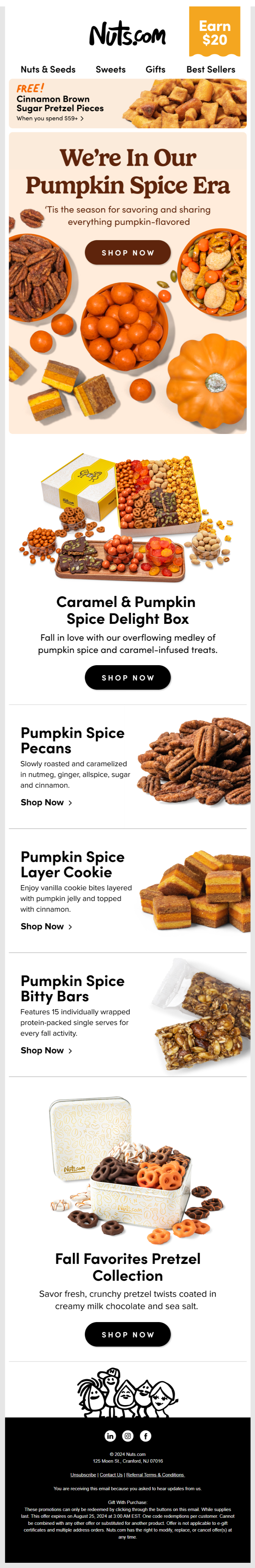
Image source: Inbox
This is for the food brands out there: Leverage the color orange for all your pumpkin products. Whether or not you mention Halloween in your email, take advantage of the season. The above email from Nuts.com can be seen as a pre-Halloween email — a vital limb of Halloween campaigns.
Pumpkin spice alone is a $500 million industry. Early rollouts are almost an annual tradition among retailers.
If you’re debuting pumpkin spice, leverage email to the hilt. Like Nuts.com, utilize the hero space. Supplement it with bold typography in the headline. Dedicate the footer space to explain the terms and conditions of your offer. Remember, limited availability is one of the driving factors in the popularity of pumpkin spice in fall.
Importantly, prioritize single-column layouts for time-sensitive emails. This is to help those who’ll be viewing your email on mobile devices and, when it comes to mobile, the simpler the layout, the better.
Read More: Top 100 Holiday Email Subject Lines To Boost Open Rate
Pro Tip: To maximize viewer attention, consider featuring additional products (not too many!) subtly during first-time or early rollouts when subscriber engagement is high. Placing these products at the beginning and end of your template may provide the best opportunity for exposure.
5. Mailmodo


Image source: Inbox
It’s Halloween for the B2Bs as well; and Mailmodo’s Halloween newsletter is not just great, but accurate.
Now accuracy is a mathematical, not an aesthetic, concept. But this email is accurate aesthetically. You only need to read it to believe it.
In terms of design, since the typical newsletter is mostly textual, make sure to leverage white space between blocks of text. In addition, if you want a white background, like Mailmodo, you should be strategic about CTA color and placement, because the white will by default accentuate the CTA. Ergo, regardless of the number of CTAs, they shouldn’t seem to appear too often.
Read More: Christmas Gift in your Inbox: A Ready-to-Send Email Template
Pro Tip: Invest in the heading of your Halloween newsletter. Use emojis and stock photos to bring out the Halloween spirit.
6. Terrain


Image source: Inbox
Usually, the font is a problematic aspect in email templates, especially if it isn’t a part of HTML. But if it is, you may go to town with it. Take a cue from Terrain’s Halloween email. Yes, we’re talking about the hero space. The season’s ripe for experimenting with such customized/decorated fonts.
Significantly, the email takes full advantage of minimal text by featuring full-bleed product images. It’s also a good idea to go for button-less CTAs. It gives you the freedom to be creative with your CTA copy.
Pro Tip: Prevent potentially monotonous viewing by alternating the framing techniques. Just like Terrain does it in their Halloween email.
7. Lush

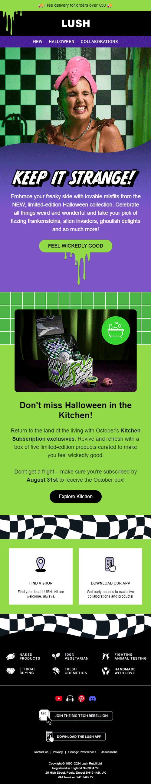
Lush’s bleeding CTA is the high point of this email.
People love a decent blood splatter effect, so don’t hesitate to use it in your Halloween email. But don’t overdo it, no matter how appropriate. Lush, for instance, limits it to just two times. Also, speaking of overdoing things, if you want to use GIFs in your Halloween email, let it be just one GIF per scroll for the benefit of photosensitive readers who are prone to epileptic seizures.
Generally speaking, it’s considered best practice to use thematic effects for above-the-fold viewing, not the rest of the email in order to prevent fatigue.
Our suggestion? Design a schematic template first and arrange the flow of effects in the order of decreasing importance.
Pro Tip: Resist tinkering with typography in a feature-rich Halloween email.

8. ASOS

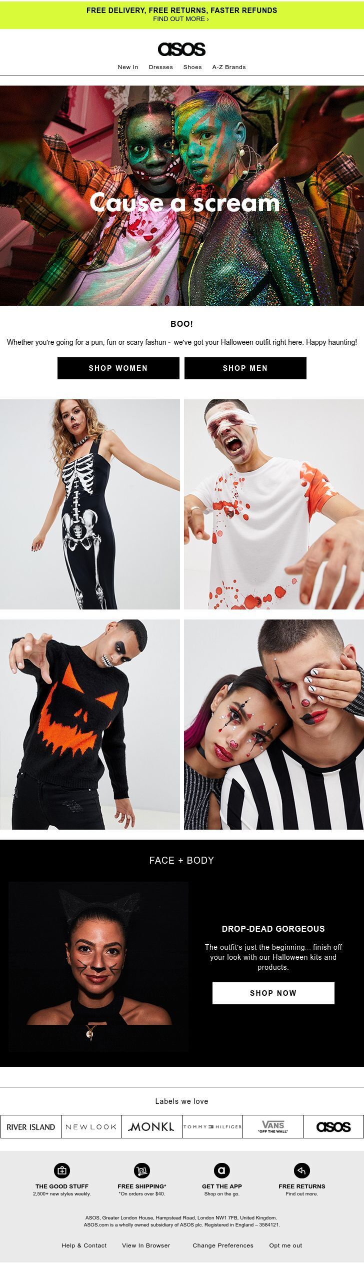
ASOS’s Hallowen email is fun, scary, and colorful. The gothic/death metal aesthetics captures the Halloween spirit remarkably well.
We also love the hero image with its flashy, almost kitschy appeal to the senses. The boldness quotient goes wonderfully with the heading, too. (Note the absence of the exclamation point, emphasizing the naturalness of the occasion, which is complimented by the po-faced expression of the actors.)
Speaking of gothic and death metal, feel free to borrow from these genres, considering their appeal to Gen Z. Here’s a list of design elements you can use in your Halloween email templates, hot from the coven: 😈
- Symbolism: Inverted crosses, runes, pentagrams
- Typography: Dark, ornate fonts, at times difficult to read, such as Fraktur (avoid this font for important announcements though!)
- Color: Predominantly black, purple, red, and gray
- Mythology: Nordic images, Celtic druids, underworld themes, etc.
Pro Tip: Good emails needn’t come at the expense of great photography.
9. Clear

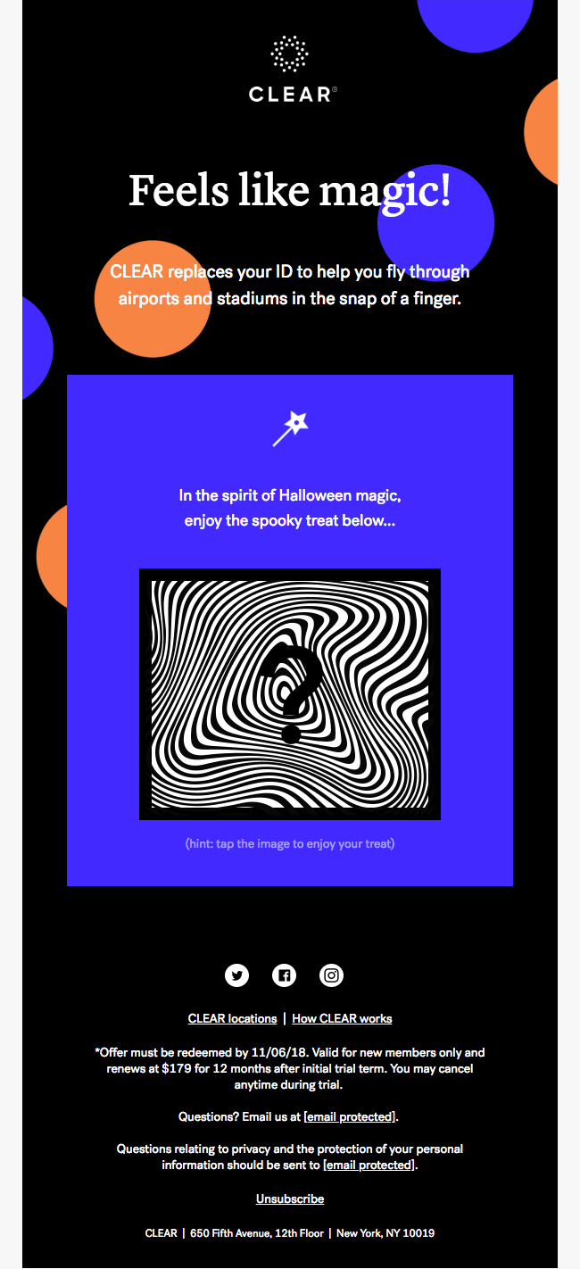
Clear’s interactive Halloween email is simple yet not vanilla, and soothing to look at, thanks to the use of dark colors. The blue-black pairing looks great.
The tap-to-reveal feature almost never fails. It’s attractive, it’s easy. Additionally, in this email, the positioning and use of a contrasting color immediately capture the reader’s attention toward the surprise.
Clear’s tap target features a big question mark, heightening curiosity. Note the area of the tap target as well. This is in accordance with Fitts’ Law, which states that the time required for a user to interact with a target is inversely proportional to the size of the target. In less complex terms, the bigger the target area, the quicker the interaction.
Pay attention how the moiré pattern behind the question mark is unsettling to the eyes, increasing the sense of urgency to tap.
Pro Tip: If you intend the final template to feature no dividers between content blocks, use negative space carefully. Once again, it’s much better to work on a schematic template initially than to count on your imagination.
“Interactivity is not simply the behaviour necessary to implement a certain functionality, but an important quality of a digital product.”
– Dag Svanaes, author of Understanding Interactivity
10. Hershey

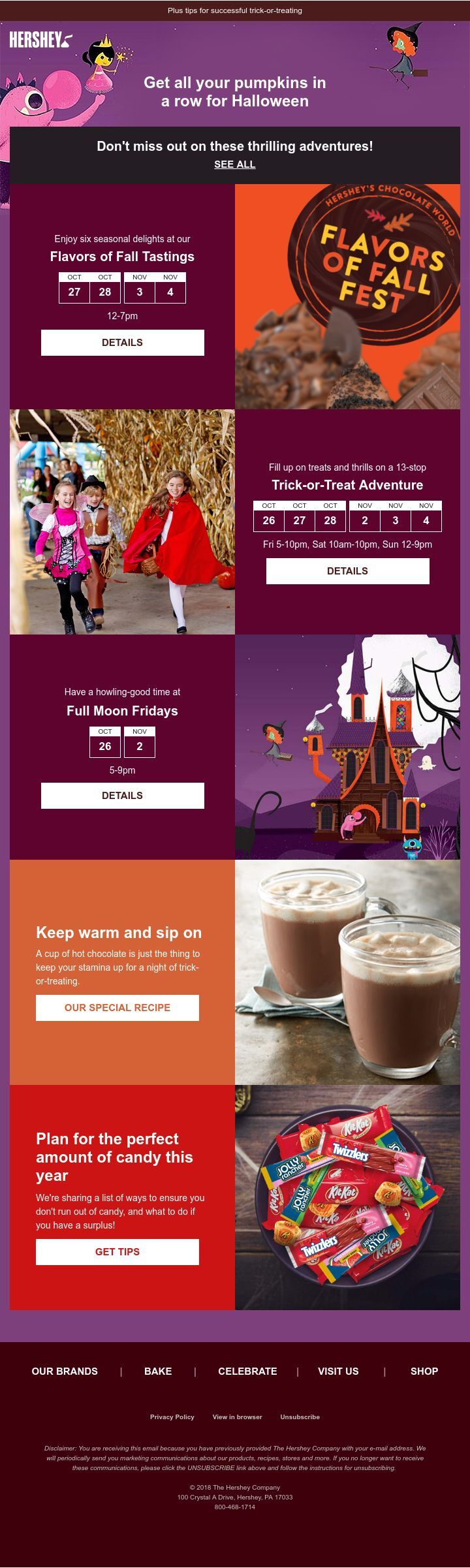
Our last Halloween email example is from Hershey.
The color scheme is confined to the brand palette. Different shades of a uniform color scheme throughout the email keep the complex layout and rich information from appearing cluttered. The layout is a variegated S-curve, with image and text alternating at the end points.
This Halloween email has a unique festive appeal which none of the emails on our list has. Seasonality is one thing, but festive is something else. Thanks to the kid-friendly vibe of the email, it creates a festive atmosphere, an outgoing mood. We love how the email does not feature specialized blocks for products and resources. It’s all mixed up quite nicely together.
In fact, because of the rich use of tiles, a calendar invite seems to sit comfortably on top of a blog post. The arrangement doesn’t look odd.
Pro Tip: If you need your email to be info-rich, maximize the use of blocks to separate different types of information.
Well, That’s Us! What about You?
Need help with holiday email templates?
Get in touch with our email template production team. Share your project brief, brand assets, and content, and our team will apply best practices in email design to create a visually appealing and responsive email template:
We will go from concept to the final template within 2 days. We will also conduct an audit of the current email campaign templates to ensure branding consistency. Our 24×5 support will be available, and we will provide code-commented mobile-responsive email templates along with a test report to ensure maximum compatibility.
Meanwhile, feel free to catch up on these Fall email inspirations!