
Fly high with conversion
focused landing pages
Uplers show you how
Before you jump start, understand the need of a high performing landing page – Why do you need a great landing page at the first place?
- Easily capture & convert leads
- Showcase specific offer to a prospect
- Link similar offers and other services or products
- Collect data and information about your prospects
- Sharable landing pages provide fuel to other marketing channels
Kudos! Now that you know the importance of a landing page, what’s next?
“CONVERT”Best Practices
just like the AERONAUTICAL SCIENCE
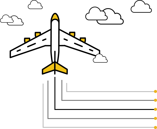
You can’t fly without understanding the dynamics of aeronautics. And, you can’t design a cool landing page
without knowing these “CONVERT” best practices.
-
Call to action
Any good landing page has a compelling and visually distinctive CTA.
-
Offer relevancy
A CTA has no meaning without right offer. Provide offer that your visitors can’t refuse.
-
No
pop-upsLet visitors focus on the primary offer. Don’t divert them through pop-ups, but an exit overlay is good way to retain them.
-
Visual elements
Make your landing pages visual to engage the audience and let them consume information quickly.
-
Effective Copy
Witty & emotional copy can do wonders for you. Generate curiosity, but explicitly talk about what’s the offer about.
-
Responsive Design
Most visitors are “on the go”. That said; turn your landing page responsive & don’t miss out on the mobile visitors.
-
Trust Orientation
Landing page is a first point of contact. Make it credible and trustworthy with testimonials, social proof, and more.
handy things to consider for
high performing landing page
- Load speed time
- Split testing
- Conversion tracking
- Referrals
- Engagement per audience group
- Cross-browser compatibility
- W3C Validated
- Resistance free CTA
- Unique Value Proposition
- Goal of the landing page
- Form validations and minimizing the number of fields
- Above the fold vs. Below the fold content
- Use directional cues to draw attention to the form
- Don’t crowd forms. Use Whitespace
- Use oversized buttons
- Do usability, functional, and other testing on the landing page
- Care about SEO keywords while writing these landing pages
- Don’t exaggerate
- Experiment media types like video, images, screencast, etc.
- Be consistent, but create different landing pages for different audience
 So, you have learnt flying, but does that make you the best captain? May be
not! Upnext is what makes you the best captain aka. Landing page maestro.

Landing Page Design
Trends Update your
b r a i n’ s control room
Just like a good captain that updates ATC about traffic and the last minute situation, you should update
yourself about latest in vogue, talking about landing page design trends.

Design with innovation
Designing with innovation is the new. Some brands don’t let the landing page feel like a real runway for visitors. They kill the monotony avoiding standard navigation and menus in landing page design.

Ghost Buttons
Unlike the set trend of placing vibrant contrast CTA color, ghost buttons are very subtle. They are covered with a little border, give smoky white feeling, and hold the content smoothly. These buttons work well if you have two competing CTAs (try/buy) combined with terminal positioning to create implicit design hierarchy. This is the new fad and you can only test to see their effectiveness.

Suggestive power of the eye
Some brands also use suggestive power of eye and use images pointing directly at the CTA. This helps motivate users look at the CTA.

Interactive reporting
Many landing pages that are built to share information, generate immediate reports based on the data filled by the prospect. These are interactive graphs or reports generating more engagement as visitors can play around them.

Less is more approach
While we talk about making landing pages visual, most designers take the route cautiously. They now don’t place many images on the page, especially if that is compromising the load speed. More designers use a good mix of content + graphics, so that the conversions don’t get affected.
CC rule – Curious Copywriting
Many modern designers use CC trend and instigate curiosity in the minds of the visitors. By not mentioning anything explicit, some designers use (What is it? What result it fetches if I engage?) rule, which center curious copywriting. With headline that isn’t clear, you surely generate more clicks. As a drawback, it might also increase the bounce rate.

Two-step signup forms
As capturing the information is one of the main ideas behind creating landing pages, designing intelligent forms is critical. Subtle two step opt-in forms are quite in vogue. With such forms, there is a button or link which when clicked pops up a new form or redirects to a new page.

Flat illustrations
Not only landing pages, but also the operating system and interface design of renowned brands like; Apple focuses on falling flat. ;) With flat design, most landing pages follow clean & open space, crisp edges, bright colors, and two-dimensional/flat illustrations.

Full screen Videos
Full screen contextual videos can increase conversions up to 86%. Contextual videos help set the mood for the conversion. Prospects are triggered emotionally with the subtle imagery and are persuaded to click the CTA button.
The floating KISS
Some brands love lengthy landing pages with detailed notes about their services and products including contextual imagery. Floating navigation bars are great to use if the landing page is lengthy.
Takeaway
- Landing pages should differentiate
- Consider the mobile first approach
- Make the forms interactive and intuitive
- Go with the flat designs
- Use white space and go minimalistic
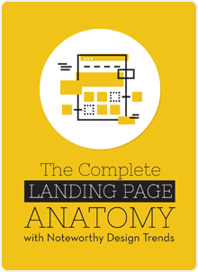
Want to dive deeper into the Landing Page concept? Here’s an EBOOK
that throws light on the basic elements that make up a landing page.

Uplers design and code flawless emails, newsletter templates, landing pages, and digital assets such as banners. In
addition, we also offer email automation and campaign management services. To know more, email us at
email@uplers.com or visit email.uplers.com.
