Why make emails accessible?
Email is one of the most important forms of communication to many of us. Email is fast, efficient, and creates a record of the communication. Like documents, accessible emails ensure that all the users can read them and engage with them easily. This is important because an email recipient can be a person with a disability who uses assistive technology such as a screen reader, which reads information such as text or image descriptions provided through alternative text (Alt Text) aloud on the screen.
Here, we mention what aspects you should keep in mind while creating an accessible email and how we build our email to be accessible.
Appropriate Font Style and Size
For accessible email, just like accessible Word documents, Sans Serif fonts such as Arial, Helvetica or Verdana work best. Use 12 points or larger.
- San-serif fonts are more legible and will benefit more users from the outset, especially those with low vision. In general, Sans Serif fonts display better on computers and mobile devices.
- Avoid using script base fonts as these may be difficult to read and cause eye strain.
- Try to use large font sizes. Avoid font sizes smaller than 9pt as they are difficult to read.
- Avoid italics and underlining text other than hyperlinks.
Appropriate Use of Colour
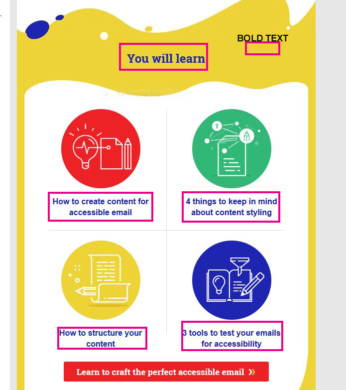
When using colour, you must make sure that any information conveyed with colour, is also conveyed in black and white. For example, if you're using colour to identify key words in a document, make sure that you also make them stand out in another way (for example, by putting them in bold).
Backgrounds
While it gives the option of changing the color or even placing a picture behind text (e.g. stationary), it is recommended to keep the background white. Any shading in the background can make email difficult to read.
If a background color is included, please ensure that the contrast with the accompanying text is appropriate.
Colour Contrast
You must provide high colour contrast to the text in your document. A good example of high colour contrast is black and white; while an example of poor colour contrast is light yellow and white.
The same colour Contrast is used in full email text and background colour.
Set and Style Alt Text
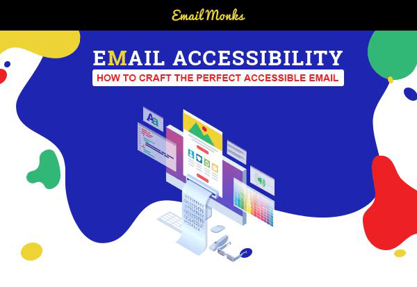
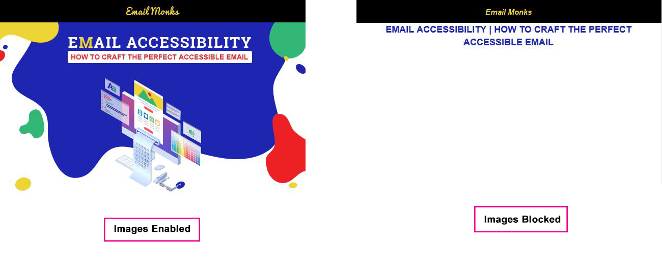
The typical image-based email has a lot of information that can't be parsed by a machine. What's more is that a lot of email clients disable images by default, too.
The first is to rely less on images and more on HTML to convey your message. Pull copy out of your images and put it into your email as real, live text.
The second is to rely on alternative text for images. By adding the alt attribute, we can describe the content of images for screen readers so that users get some context and a better understanding of the email.
Accessible Tables?
One of the main reasons that web developers hate building emails is that we're still stuck using tables for layout in email.
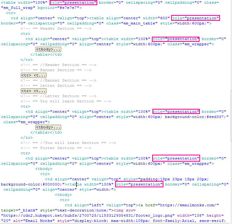
However, since we're using tables purely for structural purposes, we need screen readers to ignore those tables. This is where ARIA roles can help us out. By applying the role="presentation" attribute to a table, we can instruct the screen reader to skip over those elements and move straight into the content.
Use Semantic Code
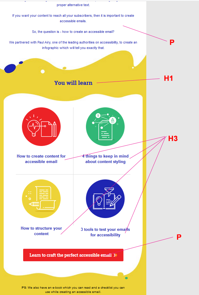
Using semantic code is a basic fix that developers can apply to code, although most people overlook it. It's important to use header (<h1>) and paragraph (<p>) tags, so screen readers can easily digest your content. These tags allow the screen reader to differentiate between headings and paragraphs, which creates a more pleasant reading experience and allows the user to better navigate through your emails.
Accessibility Testing
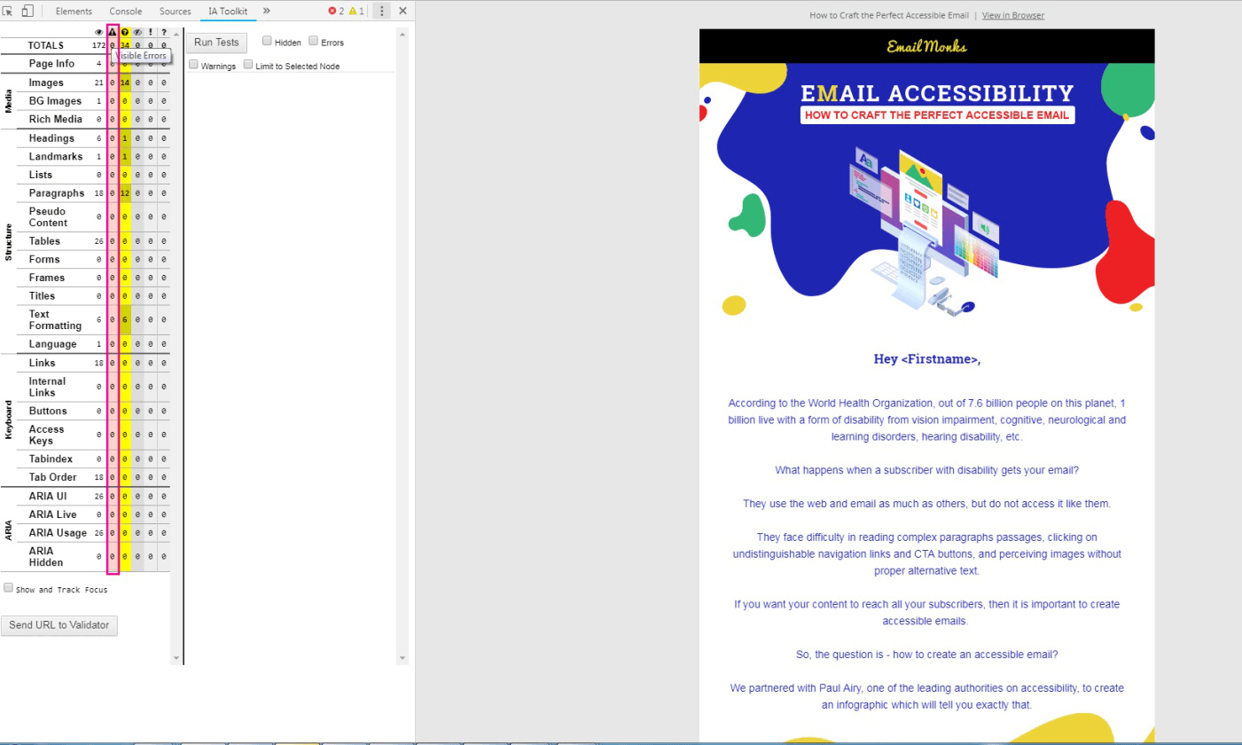
There are a total of 2 tools we need to check.
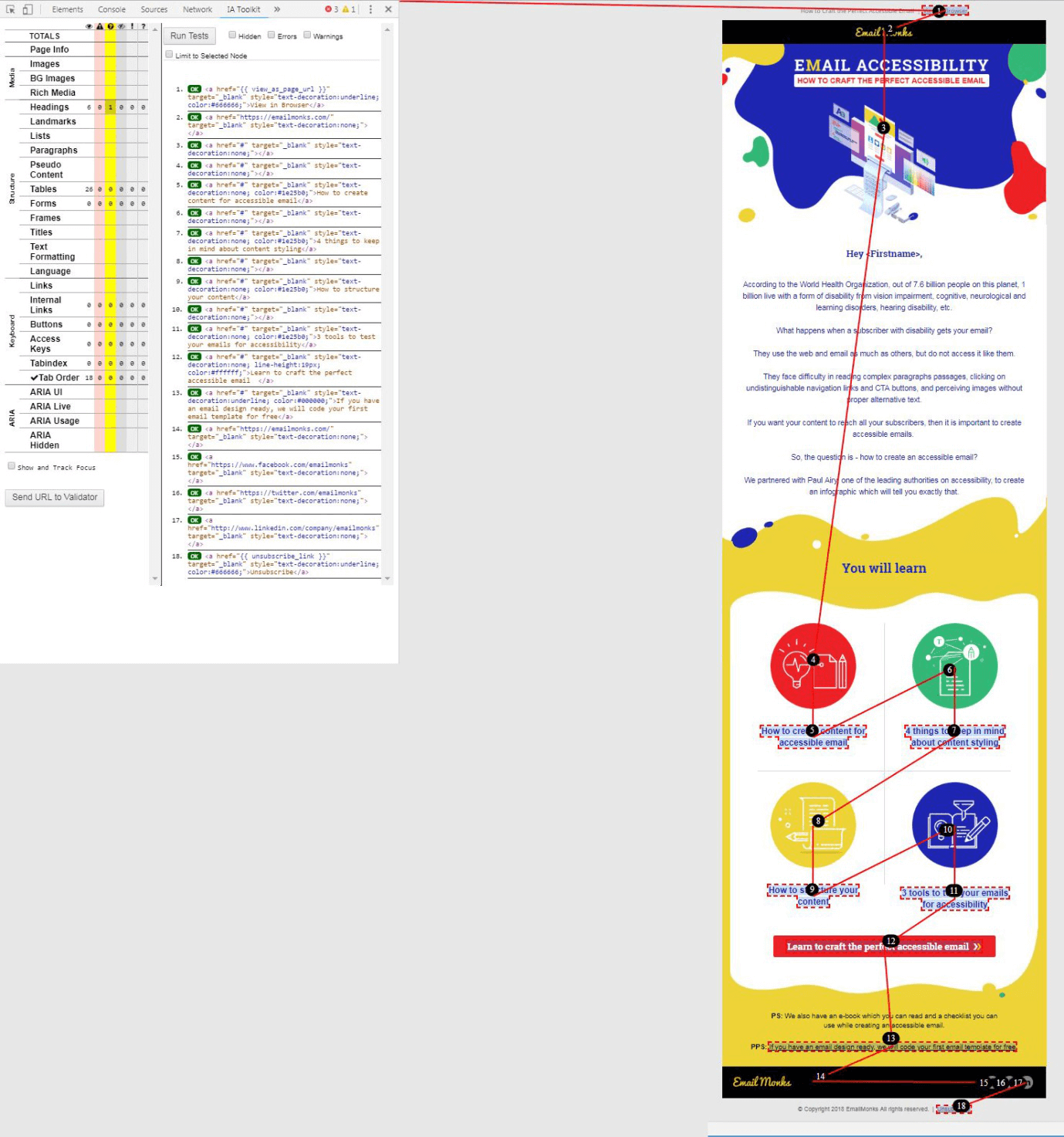
- IA Toolkit
There are 0 Visible Errors in all tabs.
Headings:
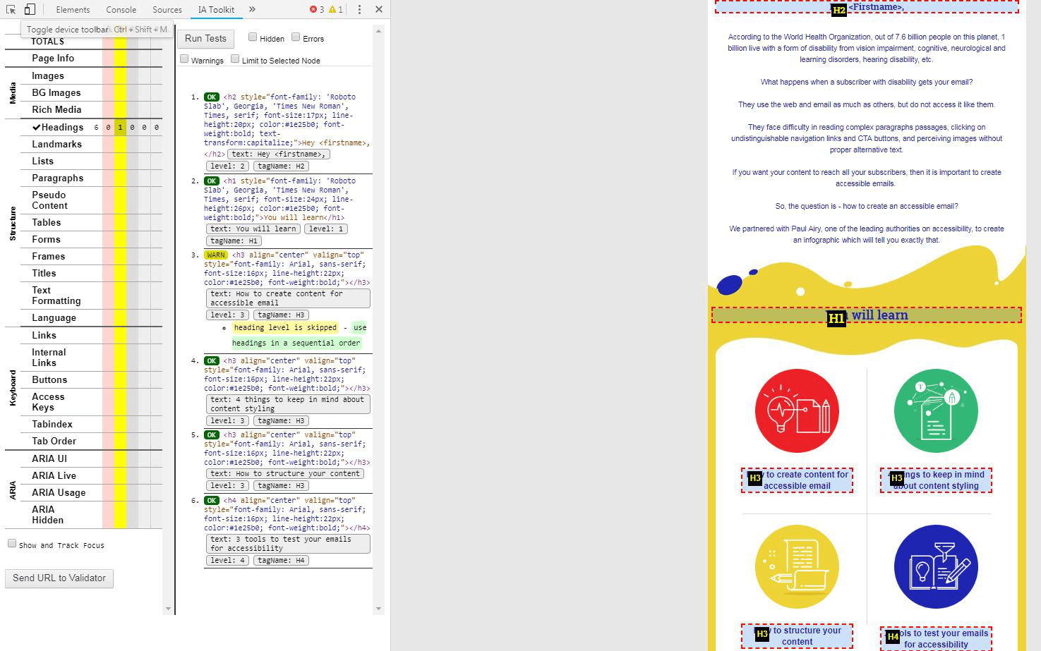
Navigating through the <h1> and <h2> elements allows the user to understand the overall purpose of an email and how its content is structured. The <h3> through <h6> elements provide a quick understanding of the details in each section.
Tab Order:
Users who are navigating by keyboard (eg. using the tab key) expect to move sequentially from left to right and top to bottom through the focusable elements on the page.
Keyboard accessibility is one of the most important aspects of Email accessibility as it affects many individuals with disabilities.
2. Wave Tool
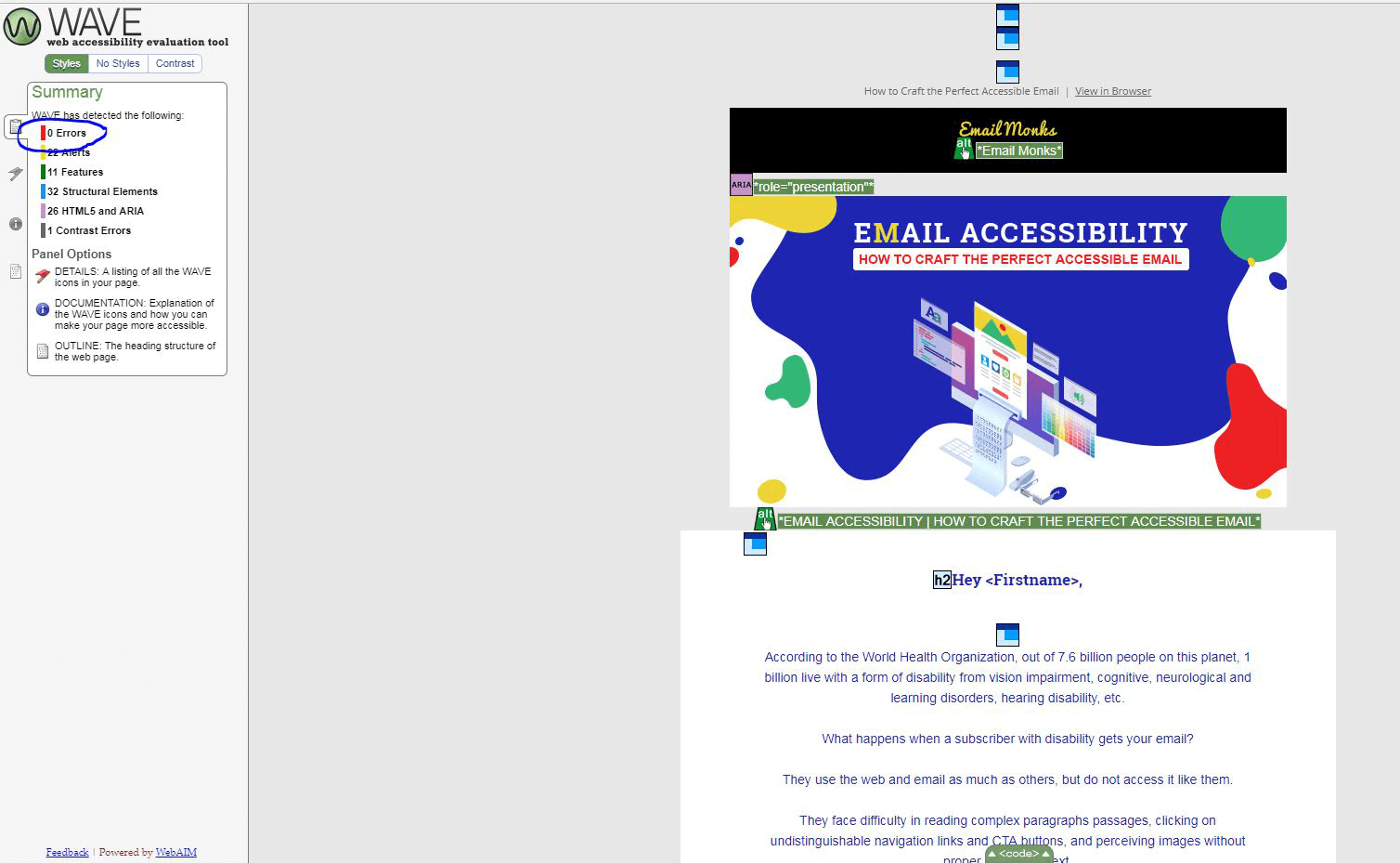
Use the WAVE toolbar to view the Outline of the page to visually see the heading structure.
There are 0 Errors.
