11 Email Design Trends
that will reign supreme in 2021A lot has happened and unexpectedly changed over the past year. No wonder brands have been playing it safe with tried and tested email designs. Will the trend change in 2021 or will brands continue to make the most of the old favorites like minimalism, pastels and static images?
We think it will be a superb medley. While simple design elements will rule the email roost with a twist, of course, emotional designs or designs that have a calming effect will gain greater importance.
And of course, creative minds will never cease to surprise us with a pinch of newness in email design every year. So, wait for it!
Here are some promising trends we foresee for 2021.
01 Bid on
Bold Typography
Bold Typography
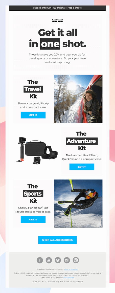
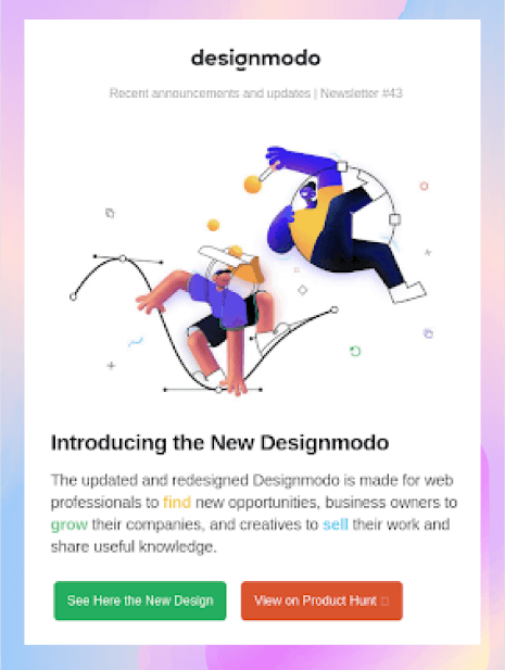
An image is the HERO? in emails (usually). However, email designs are evolving, and it is inspiring to see innovative copywriting highlighted in BOLD TYPOGRAPHY promoted as the HERO lately.
Bold Typography originated in the 19th century and interestingly enough, there were no matching bold weights. People just used a generic bold like Clarendon or slab-serif.
The present-day BOLD TYPEFACE imparts a remarkable impact to the message you want to convey. They make the emails more appealing with custom fonts and typography. See this example!
How easy it is to skim through such emails that are composed of neatly placed text in BOLD to draw the reader’s attention!
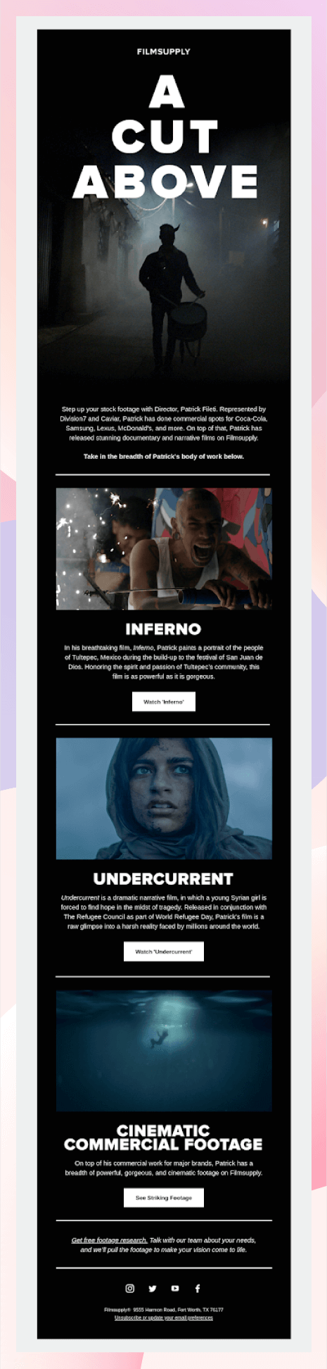
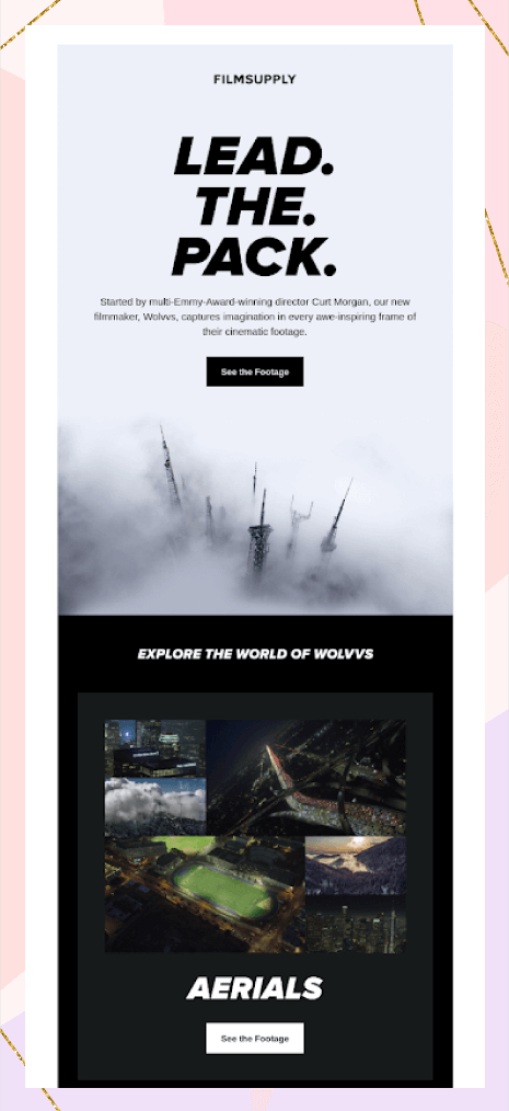
Another great example is by FILMSUPPLY:
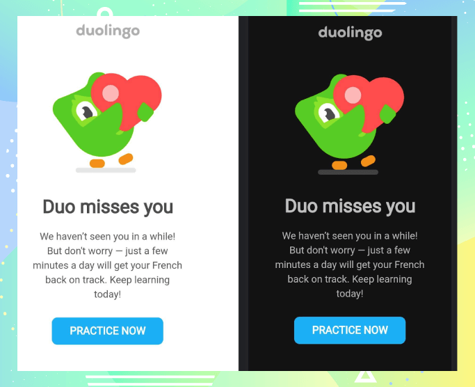
Embrace the Dawn of Dark Mode02
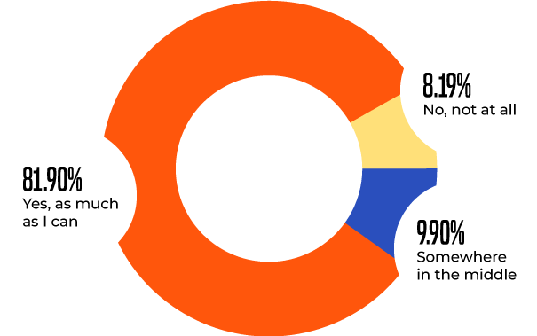
Everyone’s talking about this! Dark Mode is the latest fad for marketing professionals across the globe. With increasing exposure to devices leading to eye strain, Dark Mode comes to the rescue.
Google introduced Dark Mode on 24th September 2019. According to Android Authority, 91.8% of people use some form of dark mode in their emails.
Do you use dark mode on your phone?
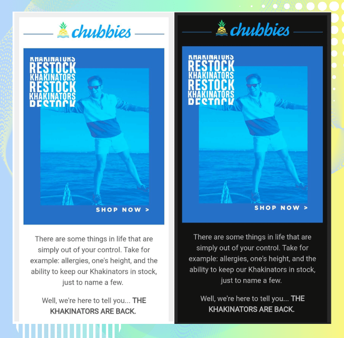
It represents a reversed color scheme wherein light-colored typography, iconography, and UI are placed in a dark background. Email developers will have to design emails considering Dark Mode compatibility and adjust the coding accordingly. The simplest example is to have a white border on your text so that it does not disappear/become challenging to read in the Dark Mode.
Take a look at these email images to get an idea of how dark mode works.
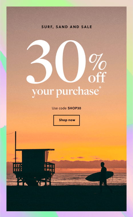
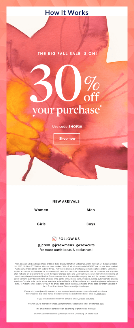
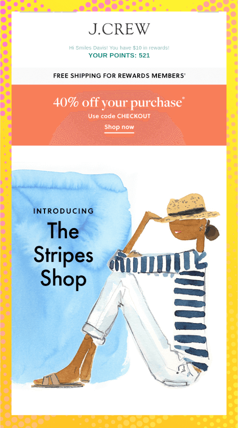
03 Upgrade your email designs with Gradients
Are you wondering how to create unique backgrounds that can make your email stand out in 2021? Designing with gradients is the best way to go about it. They not only grab eyeballs but also keep the subscribers interested. The gradually fading effect imparts a captivating feel to the email.
INTERESTING INFO: Some people believe that the psychedelic culture of the 1960s is accountable for the origin of gradients. Its re-entry in email design reflects a strong feeling of nostalgia and vintage effect.
J. Crew has nailed this trend in their emails.
In addition, you can also have gradients in the CTA like Instagram has done using their brand colors.
If you want to up the game even further, you can even have animated gradients in the backdrop of the email copy and visu als to make the emails even more aesthetic.
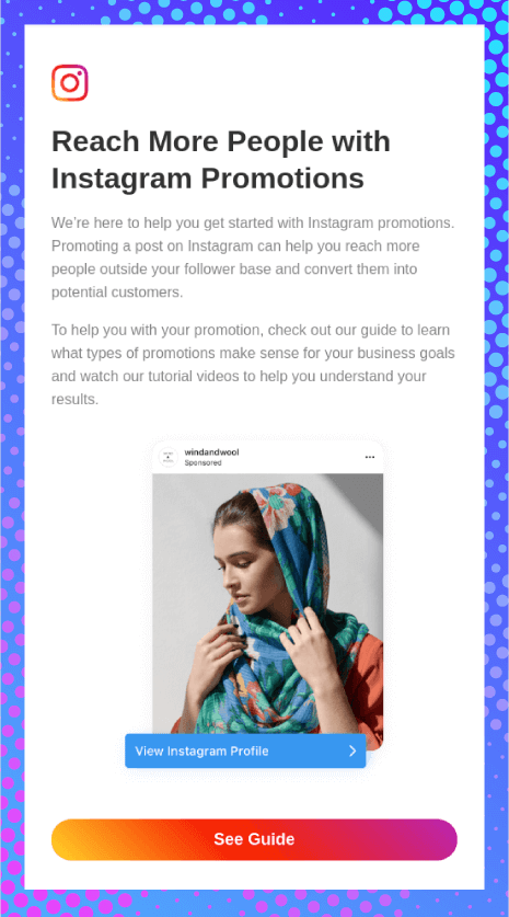
In addition, you can also have gradients in the CTA like Instagram has done using their brand colors.
If you want to up the game even further, you can even have animated gradients in the backdrop of the email copy and visu als to make the emails even more aesthetic.
Let your emails emote with Emotional Design04
When it comes to emails, usability and functionality are not enough. You must instill the right emotion with your design.
Typically, these are the 9 emotions you can trigger for maximum conversions through emails:
- Belonging
- Greed
- Guilt
- Trust
- Curiosity
- Fear (of missing out)
- Hope or Optimism
- Love/Lust
- Vanity
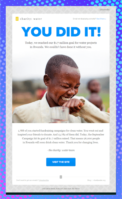
You can evoke the right emotion by the proper use of colors and imagery. While blue reflects serenity and peace, red stands for excitement, passion, and urgency. Orange signifies creativity, energy, and freshness. Yellow, on the other hand, can be used to draw attention without giving any alarming signal.
The same principles apply to images. So, if you are promoting a discount offer, you can use images that reflect excitement. On the other hand, if you are thanking your subscriber for making a purchase or a contribution to a cause, you can use images that portray gratitude.
Take a look at this email by Charity: Water. The blue color used in the email looks calm and soothing, and the image reflects a sense of optimism and hope.
Here’s another example by Postable that reflects consideration for their subscribers.

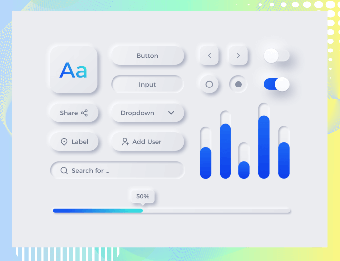
05 Bring freshness in emails with Neumorphism
Also known as neo-skeuomorphism, neumorphism uses subtle effects for the objects without over-representing them.
It creates a new form that looks like a clay render of analog elements from the old world. Tools like Adobe XD, Figma, Sketch, and Adobe Photoshop can be used to design such emails.
Take a look at this image to understand what neumorphism looks like.
Such elements deliver a unique experience to the subscriber and help to bring attention to the hierarchy of the email content. You can experiment with different types of shadows and the colors of the buttons. See what brings the best results according to your industry and business model.
Test Textured illustrations for 2D Images06
If you are still using ordinary stock images or vectors in your campaigns, let 2021 be the year of revamping the visual marketing strategy for your email designs.
Using textured illustrations to embellish your 2D images is a good idea to start with. Adding texture and shading to images and illustrations will take the look and feel of your email’s look and feel to the next level by representing the items more tactically. You can experiment with various color contrasts, gradients, tints, and patterns to give more depth to your emails.
Take a look at these examples to see how textures take the visual appeal to the next level.
07 Add a new dimension to your emails with 3-Dimensional Images
One step ahead of textured illustrations — we have 3D images.
3D images were first used in computers in the 1970s, and slowly, it entered the world of email design after establishing its foothold in web designing.
It can be somewhat tough to create a 3D image for an email, but it can make your email come to life by making the design P.O.P.
Here are a couple of examples to kindle your 3D? imagination.
Here are a couple of examples to kindle your “3D�? imagination.
Phase in
Phantasmagoric Collage08
Phantasmagoric Collage

The newest thing in 2021 will be the use of phantasmagoric collage in email designs. Such a collage includes bits and pieces from different images placed on a single image.
It will not only impart a surreal feel to the email but also stir the subscriber’s interest. Just make sure you use this element judiciously so that it does not overwhelm the readers.
Take a look at the phantasmagoria used by FILMSUPPLY in their email designs.
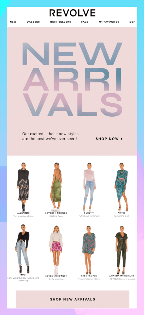
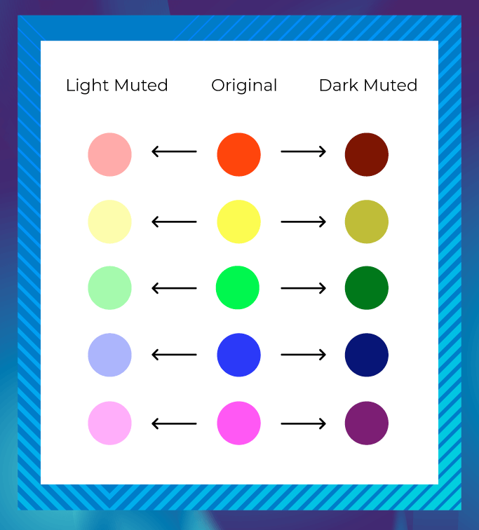
09 Give voice to your email with Muted Colors
Bright and bold colors are no longer the subscriber’s favorite. People have now shifted to muted color palettes that are desaturated by adding some white, black, or other complementary colors.
Muted colors got immense popularity in 2020, and they are extensively used by health and wellness brands to portray safety.
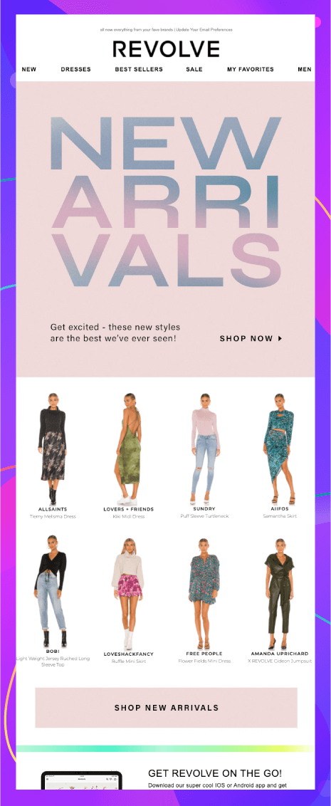
Take a look at Revolve’s email; they have used muted colors (or pastel as they call it) in their hero image.
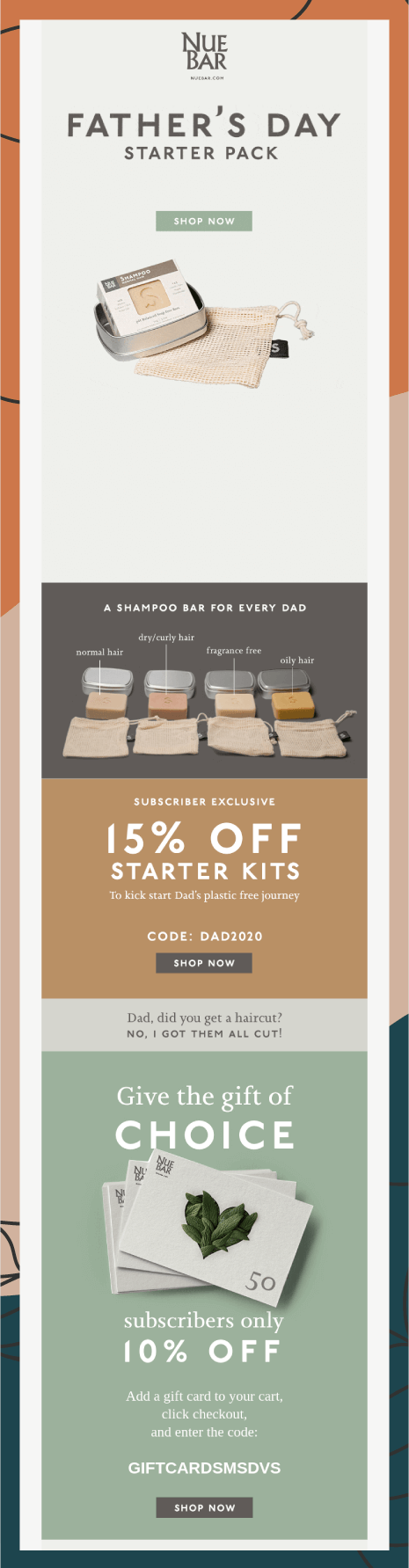
And also, check this email by NueBar
Take a look at Revolve’s email; they have used muted colors (or pastel as they call it) in their hero image.
And also, check this email by NeuBar
Try out the marvel of Monochrome Layout10
Many people misinterpret monochrome email designs as the usage of black or white. The truth is you can try out the monochrome email design with any color of your choice.
Get inspired by these examples that have aced it with a monochrome and minimalistic approach.
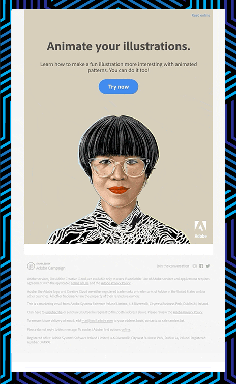
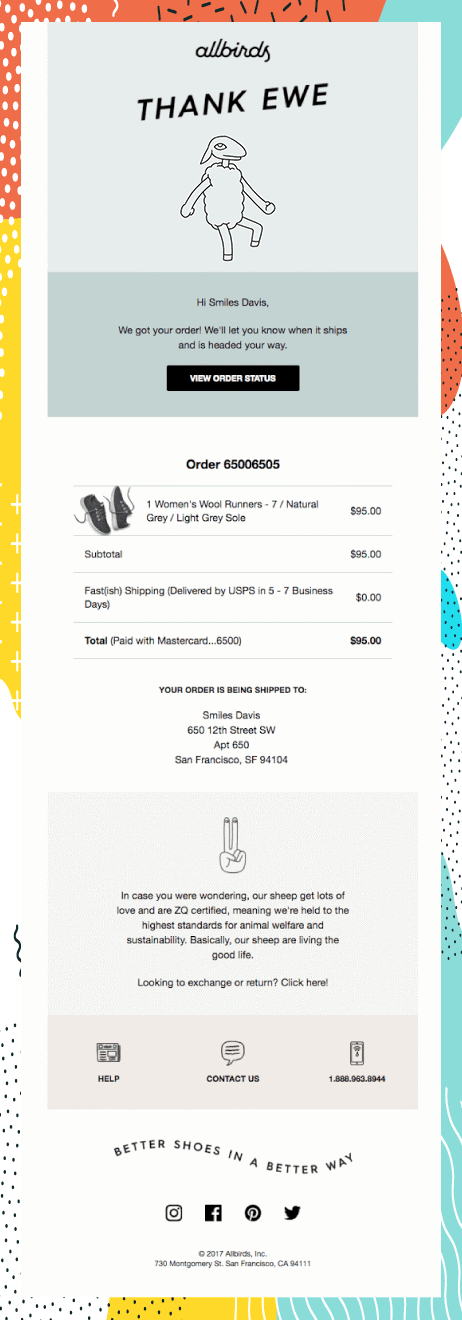
11 Spruce up your emails with Illustrated Animations
Trends are often a combination of two or more elements. One such trend is illustrated animation, where you combine the power of illustrations and GIFs. It will not only add visual oomph to your emails but also encourage more people to convert.
Allbirds has a cute animation in their transactional email to inspire you.
Take a look at how Adobe has created this animation in their illustration:

 +1 213 674 6665
 email@uplers.com

