Email enthusiasts constantly strive to impart a different kind of experience to their readers and this is reflected in the way email design trends continue to change every year. The future of email design is technologically advanced and excitingly interactive. The best email designs in 2020 will be a perfect combination of impeccable visual appeal and impressive use of technology.
We have collated the best of these worlds to present the top email design trends that you can look forward to in 2020.


Design for Dark Mode
Dark mode changes the color palette of the email interface so that the content presents high contrast on a dark background and light foreground. This helps to eliminate blue light and make the email more accessible. This setting changes the light colors into darker colors and vice versa without notifying you about it. People who have light sensitivity or night shifts at work would find it quite easy to read in dark mode.
Here’s an example from Email on Acid.
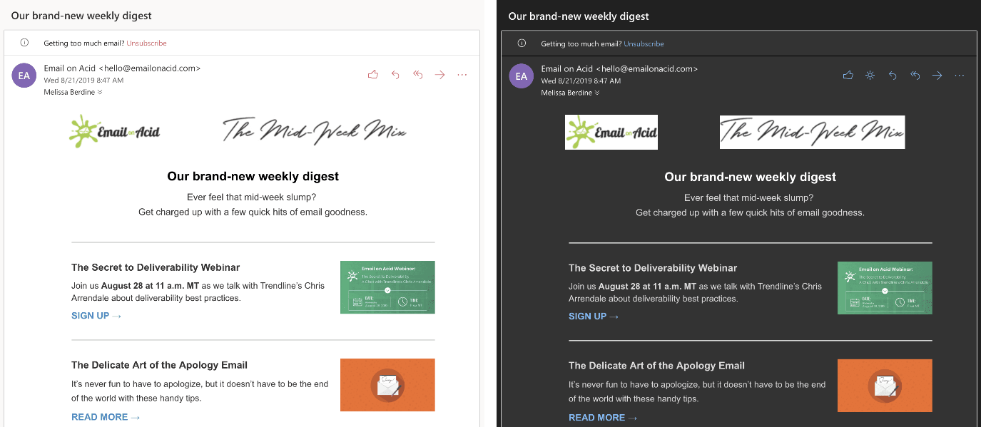

All the major email clients are likely to adapt to this trend just like Apple Mail and Outlook. It is one of the best practices for accessibility wherein the email layout, colors, font type, and placement of the design elements are chosen in such a way that all subscribers can easily access it.

GO 3D
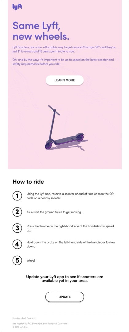
Visuals will be incredibly useful to email marketers in the days to come. Using 3D images will help you create better emails that would lead to enhanced subscriber engagement. It will not only convey the message more effectively but also facilitate the decision-making process by building confidence in the subscriber’s mind.
Lyft has gone a step ahead and created a 3D GIF that is sure to grab the subscriber’s attention and bring conversions.


Advance to APNG
animations and
seamless designs
GIFs will continue to be a rage amongst the marketers and subscribers alike, but in the coming year, animations will go a step further with high resolution APNG images. APNG will get more popular because of its unparalleled clarity and support by major email clients.
The awesome email that you see here has a graceful black bird created as an APNG. It has a better effect than conventionally designed GIF.


This email is seamless because it occupies the entire screen and leaves no scope for distraction. Breaking the visual boundaries will certainly be in trend in the years to come.


Adopt AMP
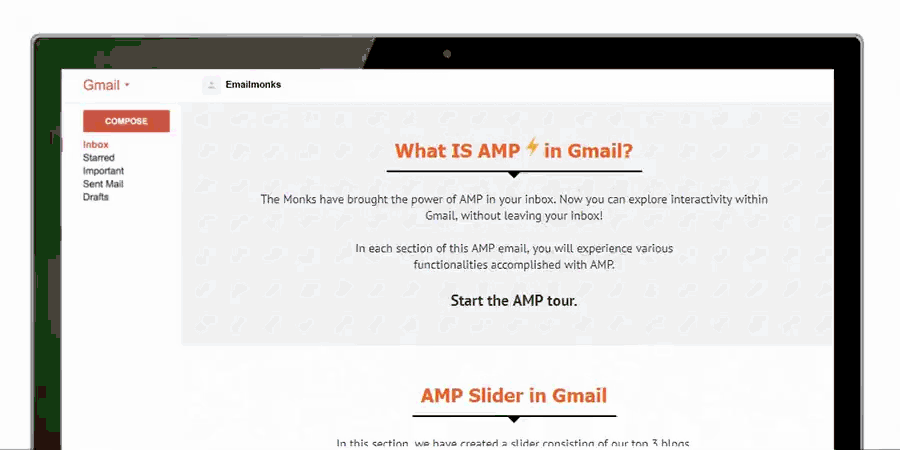
Imagine being able to respond to a survey or complete the checkout process from the email itself, without being redirected to the landing page. Sounds like a dream, right? The good news is we have made this dream a reality with AMP in email. Brands like Booking.com, Doodle, Pinterest, and Aweber have already started sending out such emails and this technology is expected to be embraced by many other companies too in the near future.
Uplers developed a unique AMP email to demonstrate all the interactive elements like slider and accordion. It also allowed the user to subscribe and fill the form from the email itself. All these features were incorporated with the help of AMP. Needless to say, our subscribers loved this email and brought us a lot of appreciation for the efforts.

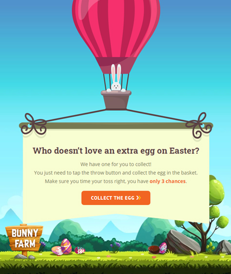
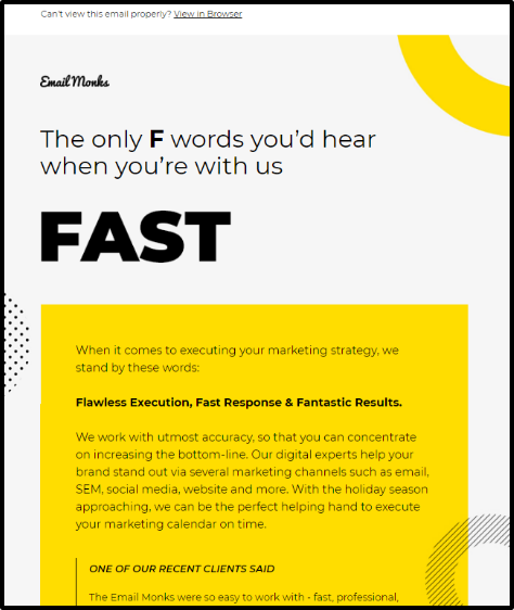
Incorporate
Interactivity and
Gamification
Interactive elements can be used in such a way that they do not need any involvement of the subscriber. It will not only make the email more delightful but also enhance the performance and reduce the unsubscribe rate. Take a look at the interactive email by EmailMonks.
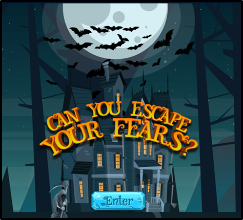
Gamification is another form of interactivity that has entered the world of emails. Play a game in the inbox and get incentives in the form of discounts or freebies – that’s the whole idea of gamification in emails. EmailMonks designed a spook-tacular game for Halloween 2019. The subscriber was supposed to spot five items to escape from the ghost. It perfectly blended with the Halloween vibes and imparted an enjoyable experience to the email recipient.


Curb the
columns
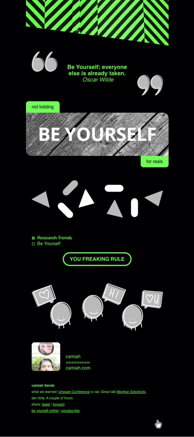
Email header, hero image, product image, product description, offer details, and email footer – Often, you come across similar looking emails with the mundane layout. In the years to come, marketers will think beyond the conventional column layout and innovate their designs by introducing broken grids.
camiah.com has designed a unique email that breaks the rule of using a column layout and does a great job.


Play with typography
Web fonts can add to the rendering difficulties of emails, but according to a recent research, more than 80% of recipients can view web fonts in their email clients. Marketers are choosing to try different fonts to add visual oomph to their email. Also, more and more email marketers are choosing to send emails with bold typography without imagery.

Minify
email design
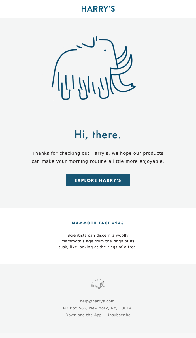
The trend of minimal email designs with illustrations, ample white space, and monochromatic effect will get more evolved in 2020. It will not only make the emails easy to read but also highlight the purpose of sending the email without overwhelming the reader with unnecessary clutter.
Harry’s sends a minimalistic email with plenty of negative space and a cute illustration.


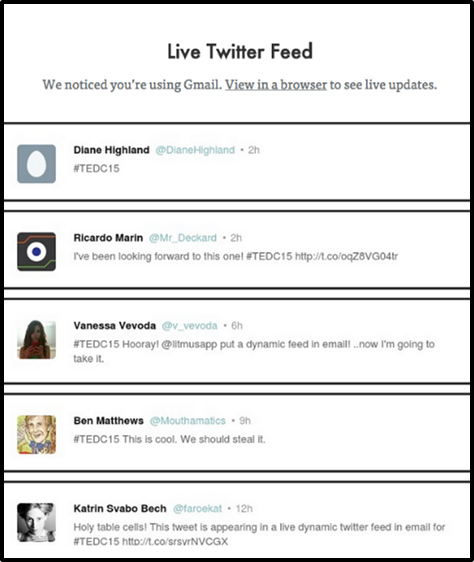
Personalize with
Dynamic Content
While personalizing the emails with the first name is one of the best practices, it will go a step ahead with dynamic content that changes in the real time. Whether it is live social media feed from Instagram and Twitter or countdown timer, it will help the subscriber to stay up to date regardless of the time the email is opened.
Litmus tried live Twitter feed in their email back in 2015 and this trend will pick up pace in the time to come.
Wrapping Up
Aren’t these super diverse design trends truly impressive? Well, you will get to see all of such mesmerizing emails in the coming year.
So, are you ready to join the furore of awesome designs?
What are your predictions for 2020? Do let us know in the comments below.