If your goal is to have a strong relationship with customers and form engaged communities around your brand, leverage email! With email you can identify and communicate with customers more easily than ever. But customers can simply cut off direct communication by unsubscribing from your emails.
Why? Usually because of a disappointing experience.
Knowing how customers are responding to your emails helps you plan your campaigns better and improve the results.
One of the email metrics that gives you direct feedback on how your customers are engaging with email content is Click Through Rate (CTR). By analyzing CTRs you can figure out what does and what doesn’t work for them. This insight on which links in your emails are getting clicked is one of the key indicators of your email campaign’s success.
Are you not getting enough clicks from your emails? Do you want your campaigns to deliver better results? Try these 10 efficient tactics to enhance your email CTRs and increase engagement.
1. Personalize your message
Send emails that individual customers will truly love. The best way to make subscribers click is to deliver personalized and relevant content in each email message.
The data you’ve collected about your subscribers during sign-up allows you to segment your email list and tailor the email content. If you segment your list, you can deliver clear value that the individual customer sees right away. Your emails will not annoy anyone and your customers will be genuinely interested in what you have to offer or say. Your chance of getting these clicks will be higher.
Relevant email makes customers act, however, remember that personalization should always feel natural and not forced. Put yourself in your customer’s shoes and make them the focal point of your message.
Source: https://reallygoodemails.com/
2. Include just one CTA
Do not overload your customers with too much information if you want more clicks. We know a big pain point for marketers is lack of time. Our customers have the same struggle. According to Microsoft, the average human attention span is 8 seconds – it’s even less than a goldfish!
That’s why it’s crucial that you give your customers a clear path to follow towards conversion. Otherwise, you might lose them along the way.
Why does it work?
- Less is more. If subscribers receive a clear hint on what to do, they are more likely to do it.
- People who are faced with having to choose one option out of many, often begin to consider, re-think, and leave without making a decision.
Ideally, one email should have just one CTA.
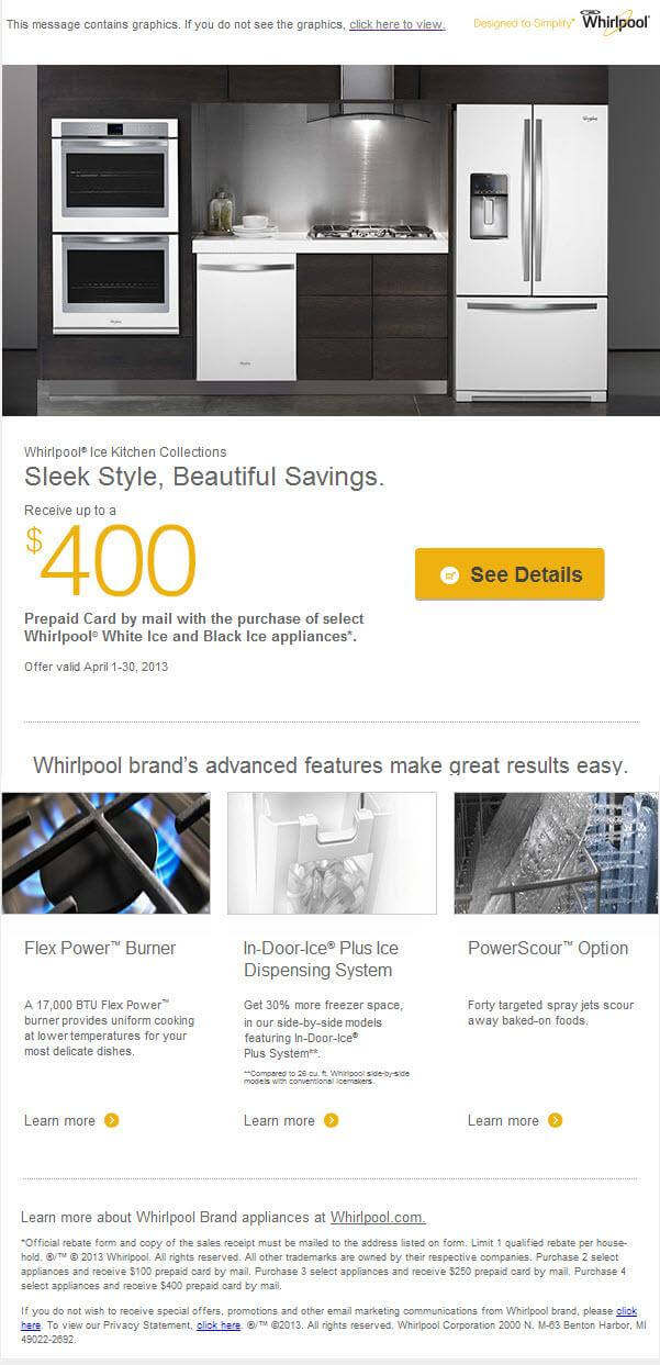
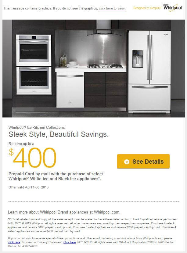
Check how Whirlpool improved their campaign results by reducing their number of CTAs from 4 to 1.
Before:
After:
3. Align your CTA to the goal of the email
One email, one CTA, one goal. Why? There is a thin red line between having a lot to choose from to find the right product and feeling simply overwhelmed with too much choice. According to studies, choice can no longer be used to justify a marketing strategy. Too much choice introduces an adverse effect of feeling dissatisfied.
Think of simplicity when you design each and every email- starting from the subject line, through the design, up to the compelling CTA. If the goal of your email is to make someone download an ebook, say it clearly on your CTA button:
“Click here to download your eBook”
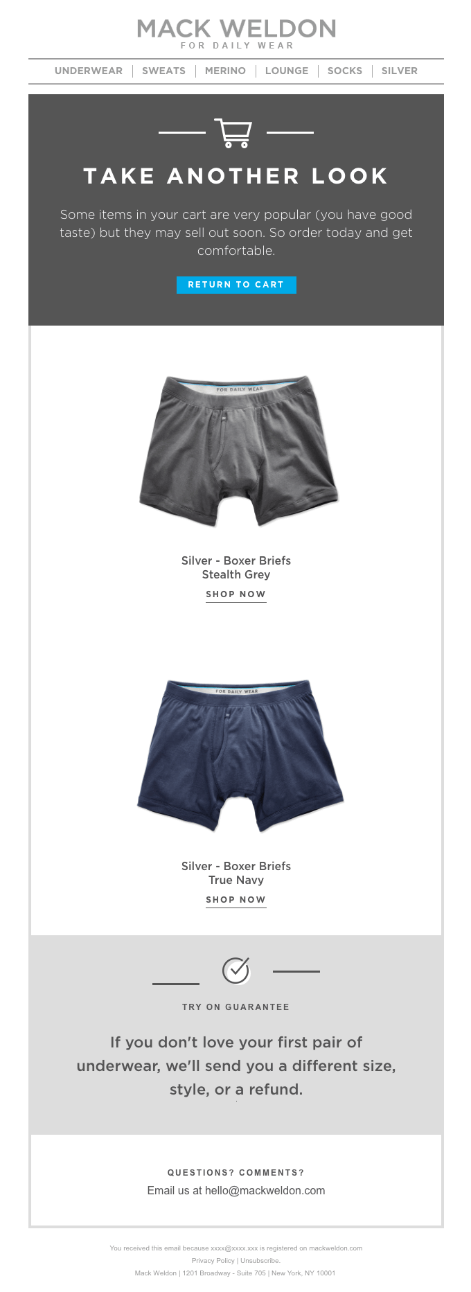
If you’re sending a weekly newsletter with a variety of different products, remember to use the same form and copy for the CTA under every single product. For example: “Shop now”, like Fab does below. And last but definitely not the least – a clear CTA should lead to a page that fulfills the promise you made in your email message.
Source: https://reallygoodemails.com/
4. Use buttons
Buttons are what make people click, and that’s how conversions happen. This is the most noticeable and prominent form of CTA and can deliver much higher conversion than a simple text CTA.
When customers open your email, the CTA button has to instantly stand out. Make it appear clickable. Customers are accustomed to the online experience and they will know what to do when they see a button.
How to decide on the colour of a CTA button?
Use contrasting colors and surround the button with enough white space to make it pop even more.
Where to place CTA button?
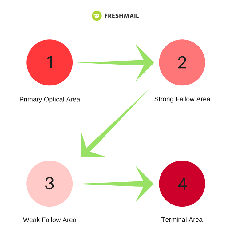
When you place your CTA in the area where subscribers look last, you’ll get them to click your call to actions more often. There are a few important focal areas, one of them is the terminal area and is usually on the right of the screen.
How to design your CTA button?
Use HTML to design CTA buttons. You will avoid the risk of customers not seeing your CTA if email images don’t load properly. Moreover, most email clients don’t display images in email by default, so even if they are blocked, your CTA will be visible.
5. Use images and ALTs
HubSpot conducted a survey in which they asked more than a thousand respondents whether they preferred email coded in HTML (mostly graphics) or plain text emails. Almost two-third of them chose HTML email templates.
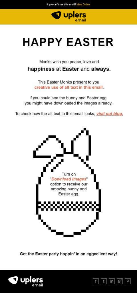
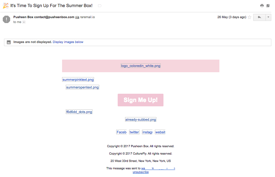
Graphics help you convey your message better and hold customer’s attention in their busy inboxes. Unfortunately, images are blocked by default in most email clients. Even the most compelling email can just end up being deleted because it’s unreadable.
To make sure that your message is clear, use ALTs to describe each graphic element. ALTs are the texts that are visible to the recipient if the email program does not automatically download graphics in the email. Their role is to convince the recipient to download images manually to increase the efficiency of the whole design.
6. Use actionable language
Choose your words carefully when designing content for your email. First of all, make sure your message conveys the value of your offer and communicates why subscribers should be interested in your message.
Secondly, put the focus on your subscriber. Use second person language because pronouns like “you,” “your,” and “yours”, direct subscribers to take action. Also use verbs – these are action words that come extremely helpful in subtle persuasion.
Do you want your subscribers to click on your CTA button? Simply say:
Click here to buy or Click here to learn more.
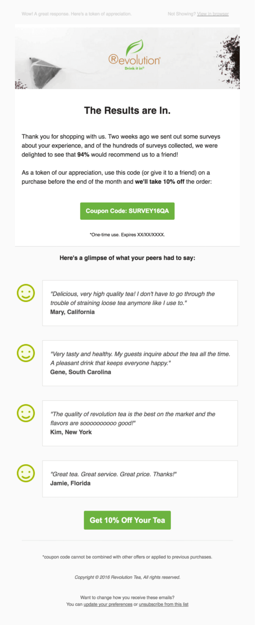
7. Leverage social proof
Our behaviour is often affected by the actions of others. If we don’t know how to act in a given circumstance, we often choose to follow what others do. This is called “social proof” and was described by Robert Cialdini in his book “Influence”. Social proof is nothing new and has been used as a powerful tool in marketing long before the Internet began.
How can you use this in your email to get more clicks? Support your offer with the opinions of others:
- Customer testimonials
- Positive social media comments and reactions
- Product reviews
- Awards and press mentions
Let “the crowd” help you sell your offer by showing how your product helped their business succeed or how it made them happy.
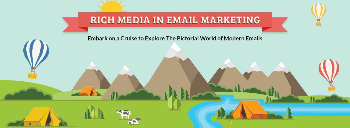
8. Use rich media
Rich Media, such as video, audio and animation in emails gives you a subtle visual experience that sometimes words can’t. Email marketing needs to be engaging, and rich media elements can evoke emotions to draw great engagement.
Find out how you can effectively engage your subscribers using rich media in email.
9. Send mobile-friendly emails
Responsive newsletters are no longer optional, they are a must. 54% of email messages are being opened on mobile devices. As more websites cater to mobile, this number will continue to increase.
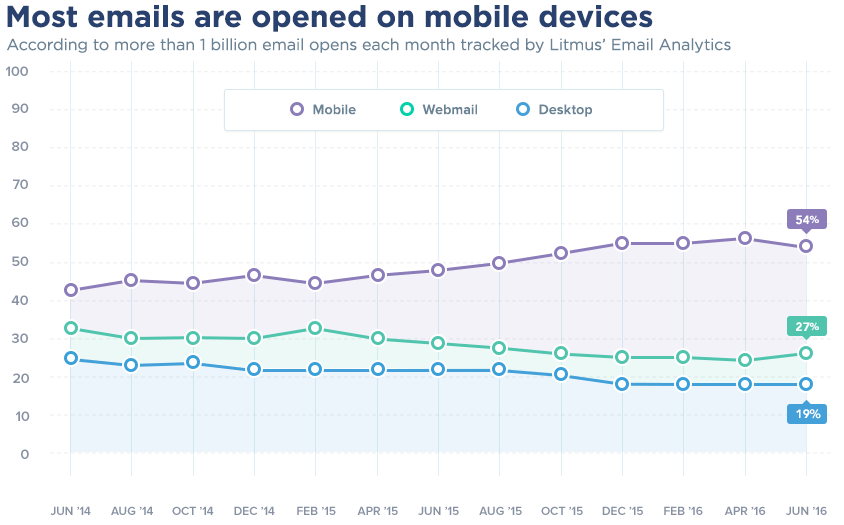 Source: https://www.emailmonday.com/mobile-email-usage-statistics
Plenty of your customers might already be reading your emails on mobile. And if their experience is bad, you are missing on a big bite of the potential conversion cake.
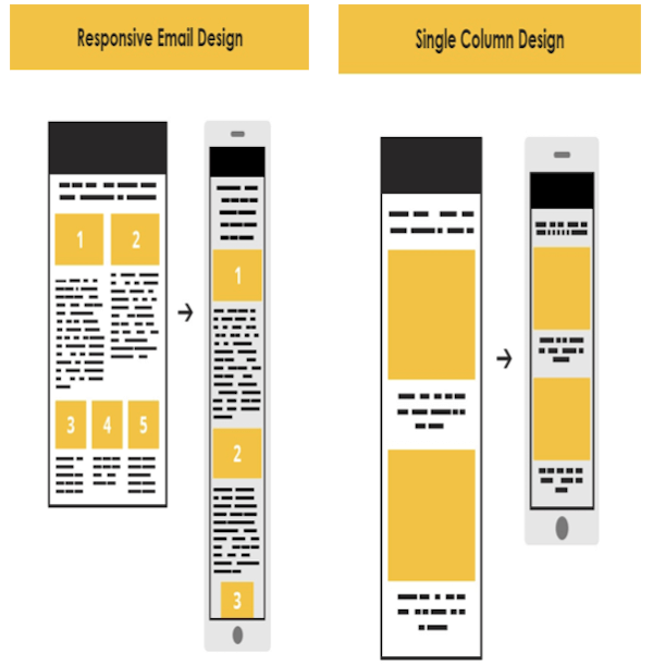
To achieve good click through rates from the mobile channel, you have to design email with the mobile user in mind. The top area of your message, the place above the fold plays a crucial role in conversion of any campaign, especially for mobile. Make sure to place your CTA there.
Tips for mobile-friendly email design:
- Choose fonts that aren’t too small and difficult to read
- Use a single-column layout
- Logo, link, image, CTA – set them above the fold
- Human fingers need a certain amount of space to click on a small screen; your buttons should be at least 44px wide.
10. Send more emails
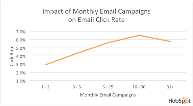
Sounds silly? Not at all. According to Hubspot, companies that send 16 – 30 campaigns a month, see a click rate more than 2X greater than the click rate of companies that send 2 or fewer campaigns a month.
There is no such thing like too many emails if instead of email blast, you send targeted and relevant campaigns that present value to customers.
Ready to try these tactics for yourself?
Test them out with your subscribers and tell us in the comments section what really helps to increase your click-through rates.
About Author:
Maria is a Head of Content at FreshMail. She is responsible for creating effective content marketing which aims to engage relevant audience, using content to drive profitable behaviors.
Being passionate about digital marketing and new technologies she feels strongly that Email is King and has definitely not left the building yet 🙂 You can find her on Twitter.






Guest Writer
Latest posts by Guest Writer (see all)
Uplers in conversation with Andrea Kayal from Signpost
Mailchimp’s DIY Email Template Editor – An Important Review