A well-designed landing page is one of the important junctions on the way to achieving higher conversion rates. However, more than 20% of businesses do not have any strategy to test their landing page.
The sole purpose of a landing page is lead generation. It helps subscribers to get detailed information about a specific offer, product, or service in which they are interested, and encourages them to convert. An average landing page has the conversion rate of 2.35% whereas the top 25% have 5.31% or higher conversion rate.
It is no rocket science to build a well-designed website or email landing page that brings you awesome results. The successful and high converting landing pages follow some common traits that lead to high conversions and greater ROI.
Uplers are here to help you with the most important landing page elements. Let us go through each element one by one.
Read More: Make Your Email Alive with Interactive Elements
1. An impressive Headline
A headline has to be the center of attraction of your page. It should serve the following purposes:
- Appeal to the visitors
- Convey the crux of your product or service
Attention spans of your subscribers are very short and you have just 0-8 seconds to win their hearts with your headline. Make sure, thus, that your email or website landing page has a catchy headline to uplift your brand.
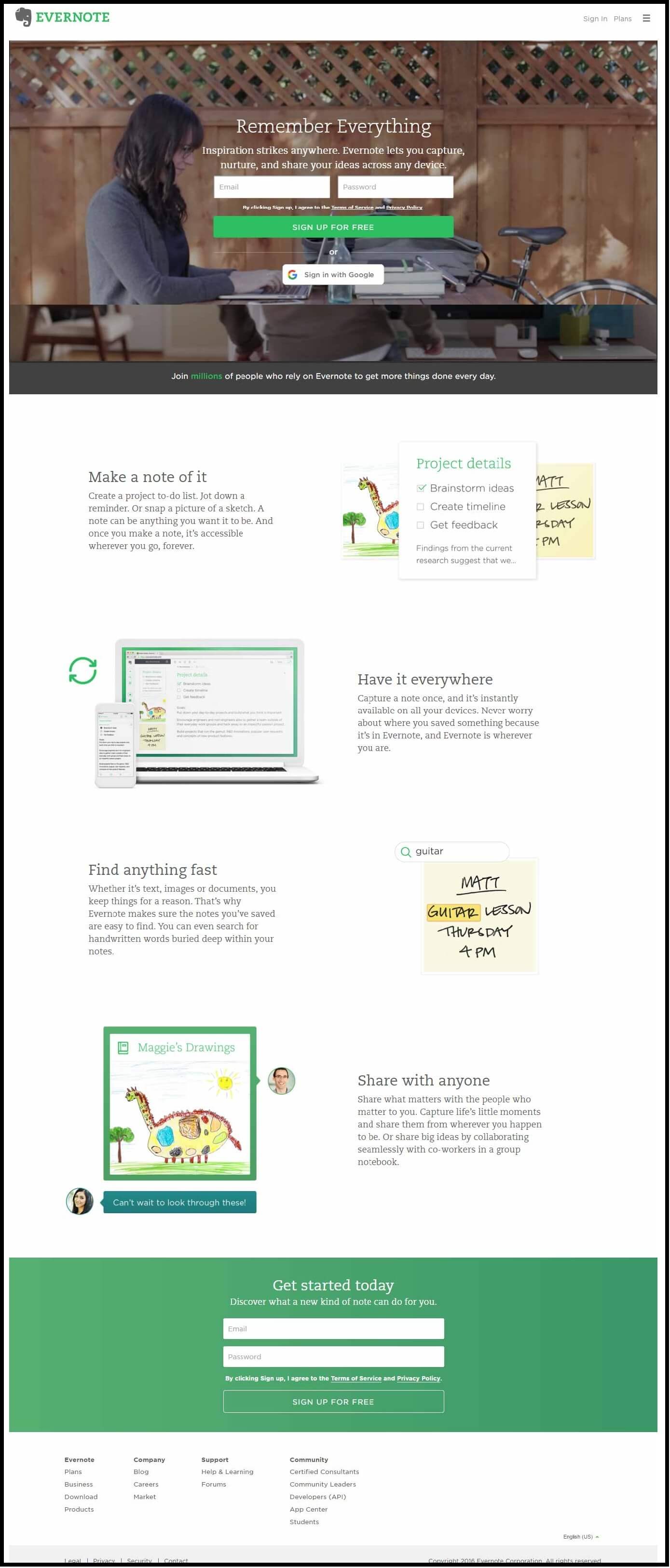
Evernote surely follows the best practices for web landing page. It has the perfect headline according to the service it offers that manages to capture the visitor’s attention, succeeds in getting them glued to the page and ultimately getting converted. Also, notice the way they have used white space with minimum use of colors. It enhances user experience and makes the elements stand out by increasing readability. Your subscribers are more likely to remember such prominently placed content. They have presented what they offer in a step-by-step structure that can be easily grasped by the subscribers.
2. Sub-headline that compels
Sub-headline, in a highly converting landing page, usually is placed below the main headline. It should elaborate on the lines of the headline and give detailed information to the visitors. Make sure that your subheadline entices your visitors to stay on the website landing page.
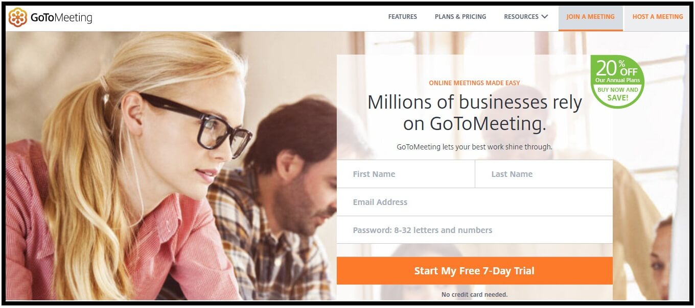
Whenever the subscribers read the line – “GoToMeeting lets your best work shine through” followed by the headline, they build a sense of trust for the company. The green-colored badge with the words “20% OFF” and “SAVE” over the top forms an important element of a website landing page, enticing the subscriber to fill the form and try out their service which is exactly the purpose of the landing page.
3. Pictures that “talk” more than words
Pictures are an important landing page component as they can convey a lot more than plain text. If your pictures are relevant and strategically placed, you can easily draw attention of the visitors. If you deal with the sales of products, it is advisable to have the product image on the sales landing page. Service-based companies can have service related interesting images that aim at solving problems for customers.
It is very important to have high resolution custom images. Stock photographs or poor quality images do not work well anywhere and landing page is no exception. Besides pictures, gifs and animations on the campaign landing page have also helped in enhancing conversion rates.
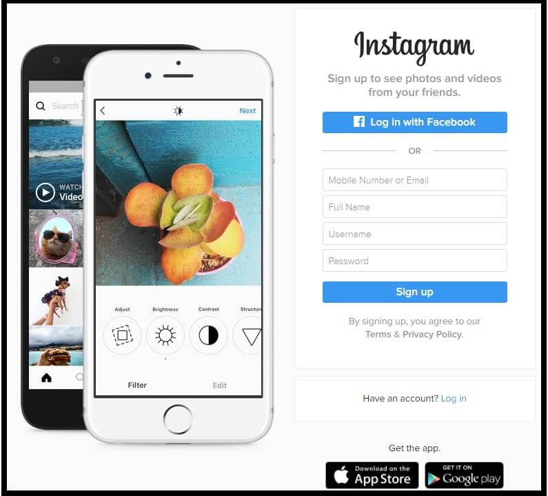
Instagram follows the vertical split idea that works really well for landing pages. The slideshow to the left beautifully explain the entire “Instagram experience”. No wonder, it is expected to reach USD 5.8 billion in 2020.
The brain can easily process information presented in this way as it reduces the cognitive load. Moreover, there is no navigation bar at the top distracting the users to click to any external links. The latest trend is to place the navigation links at the bottom of the landing page.
4. Get the concept clear with a concise explanation
A clear explanation is one of the most important elements of landing pages that convert. Unless you tell your visitors how it works, you will not be able to sustain their attention. Do not twist the language or add heavy words unnecessarily. What wins for an explanation is the mention of benefits rather than features. Visitors have greater liking towards content that explains how the product can help rather than technical stuff.

Intuit Quickbooks has cleverly included a 30 second video along with the headline and followed it up with concise explanations further empowered with the “Learn More” button. The explanation is neither too vague nor too lengthy. It is just perfect for the visitors to take the action they desire.
5. Pain of losing
It is human psychology that we always want to get away from pain. As a marketer, your laser focus should be on how your product or service can solve your subscriber’s problems and relieve him of the concerned pain. If the subscriber can identify you as the painkiller, you have hit the bull’s eye. Consequently, you will have more conversions.
Let the theory of loss aversion work in your favor and help you drive greater business growth. Testimonials conveying real human emotions can be a wonderful way to touch the pain points of the subscribers and suggest your product or service as a remedy. Sounds convincing, right?
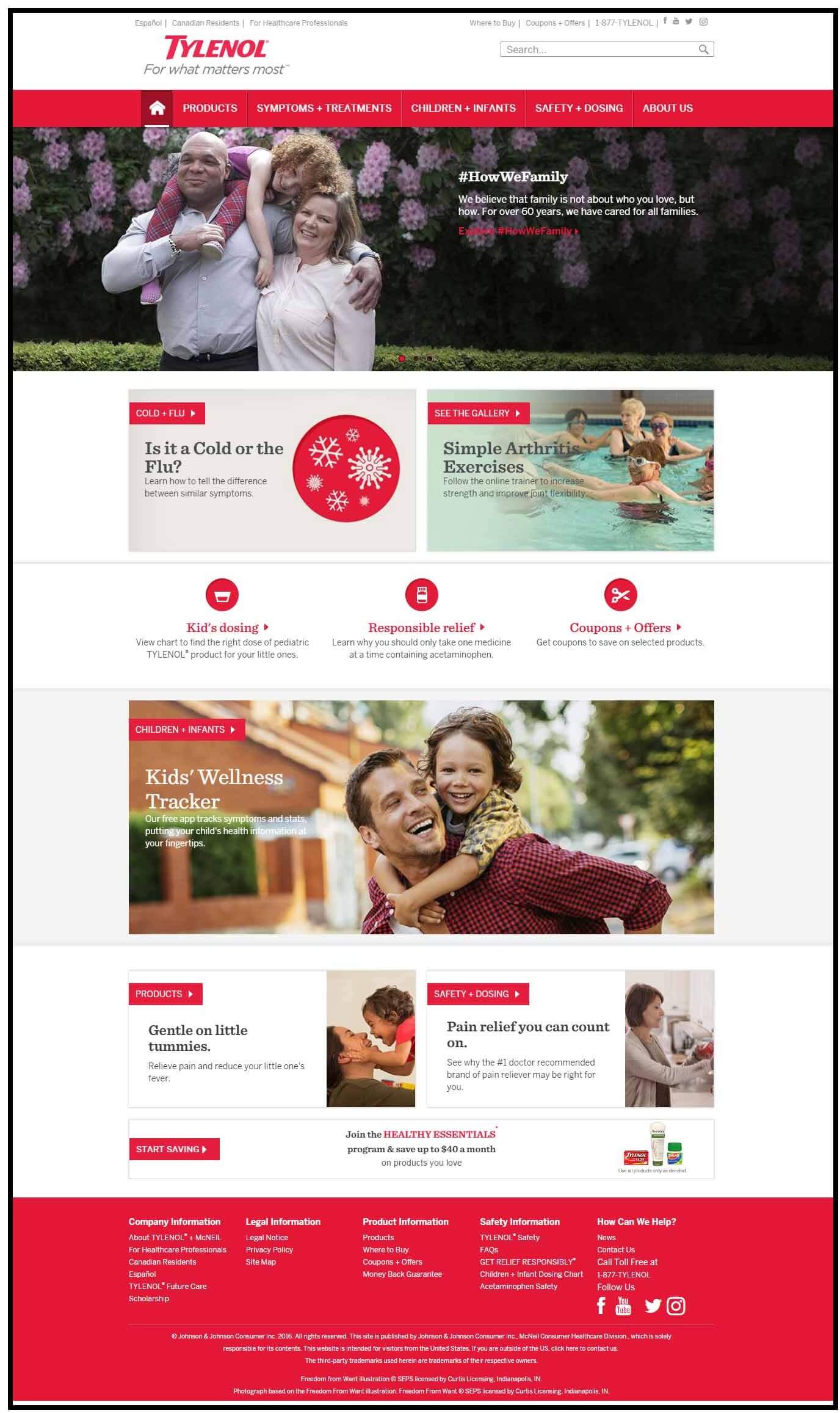
Tylenol is a pain reliever and their lead generation landing page is truly a winner. The happy family in the picture triggers the thought of losing such precious moments due to bad health. As you read through the page, that thought becomes even stronger with similar pictures depicting joyful faces. An individual is compelled to try out the medicine whenever he is unwell and that’s VICTORY for the page.
6. Joy of gaining
Besides evading pain, your subscribers also wish to experience happiness of gaining something. Your lead generation landing page elements should be placed such that you can represent your product or service as a well-wisher for your subscribers and something that would bring them joy.
Say for example, you are dealing with a shock-absorber footwear specially designed for senile individuals. It is not just footwear for them. It would ease their life, make walking a breeze for them and improve their standard of living.
What it implies is – you need to use language that touches the subscriber emotionally. Most of the times, conversions happen through an emotional connect of landing page elements.

The joy of gaining is depicted in the banner itself with the statement – “Let me help you reach your business goals”. It is an absolute winner because the eyes of the guy direct your sight to the same line, alluring you to read the copy.
7. Testimonials that build trust
Testimonials or user reviews are the most effective in building trust. Your target audience loves to know how your product or service helped other people. Make sure you include pictures of real people along with their testimonials.
Flowery words like “amazing”, “awesome” and other adjectives should be used at the bare-minimum. Instead, try using facts supported by figures and screenshots. Customer feedback posted on Twitter and other social networks can also be highlighted on the email capture landing page.
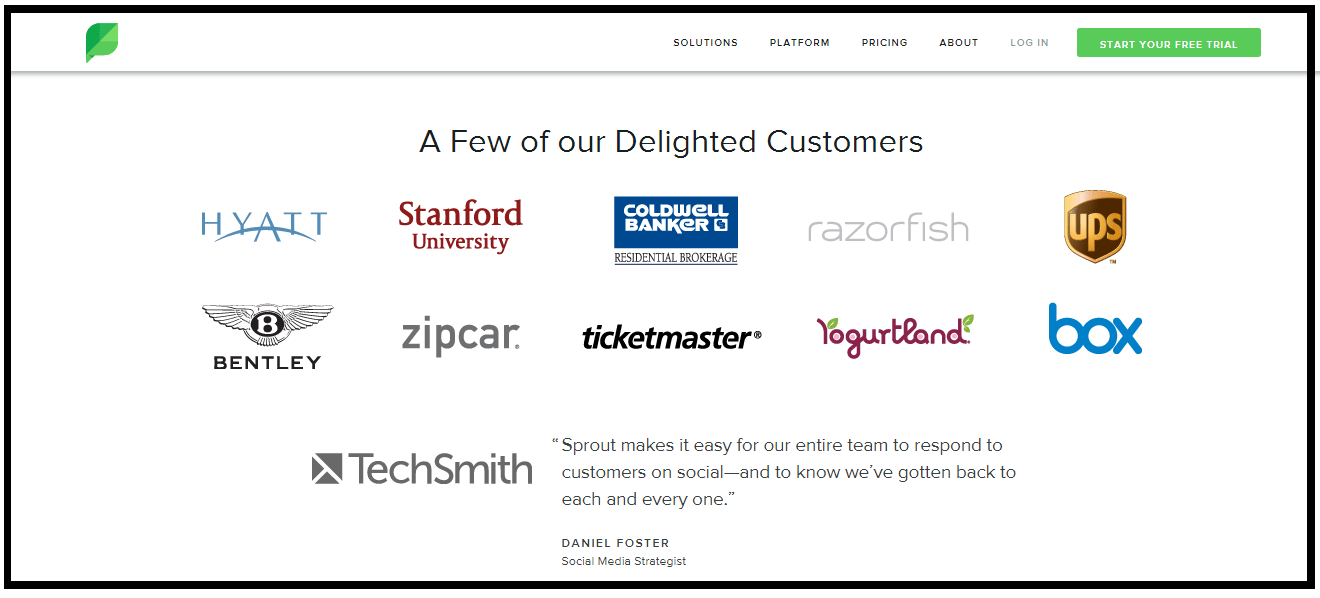
Sproutsocial has displayed the list of some of their delighted customers like Hyatt, Stanford University and zipcar, along with a wonderful review by TechSmith that helps in building brand reputation and assuring the subscribers that they can trust the company.
8. Guarantee that assures
Subscribers have an obvious inclination towards guarantees. Offering a money-back guarantee or a return policy can immensely enhance the conversion rates, mainly because it assures the buyer about the product or service.
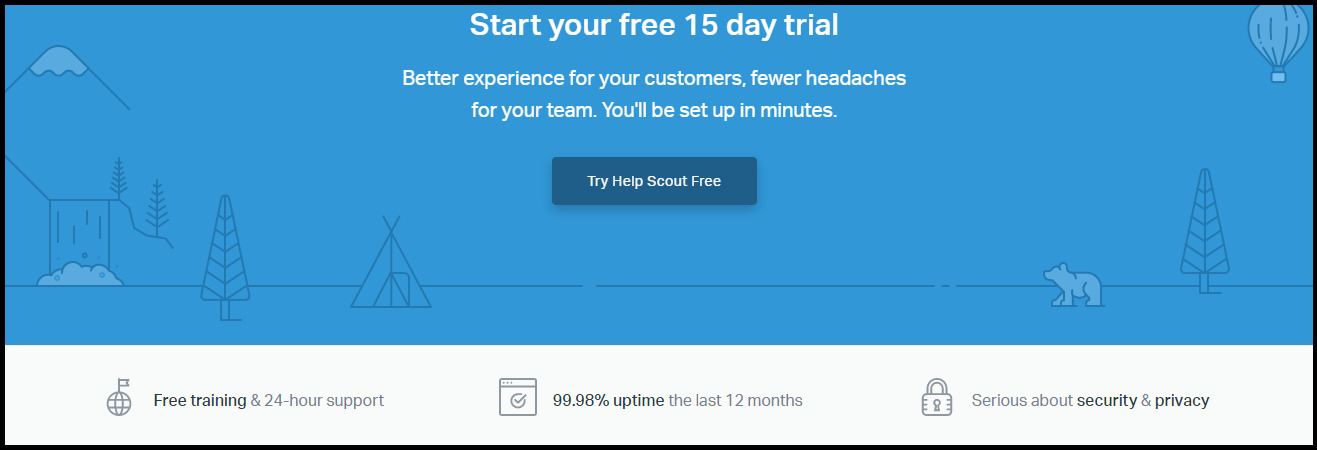
HelpScout offers free training and support for 24 hours and 99.98% uptime the last year. It also assures the customers about a secure experience with no privacy issues. Such statements inspire the subscribers to take up the trial, which is the main objective of the landing page.
9. Call to Action
Have your guarantee and call to action placed close to each other. Your call to action should be clearly visible with an engaging content supporting it. The color of your CTA button also influences your buyer’s decision. It is advisable to use contrasting colors to highlight the CTA. Study has shown that more than 90% of the visitors who check out your headline also go through the CTA copy.
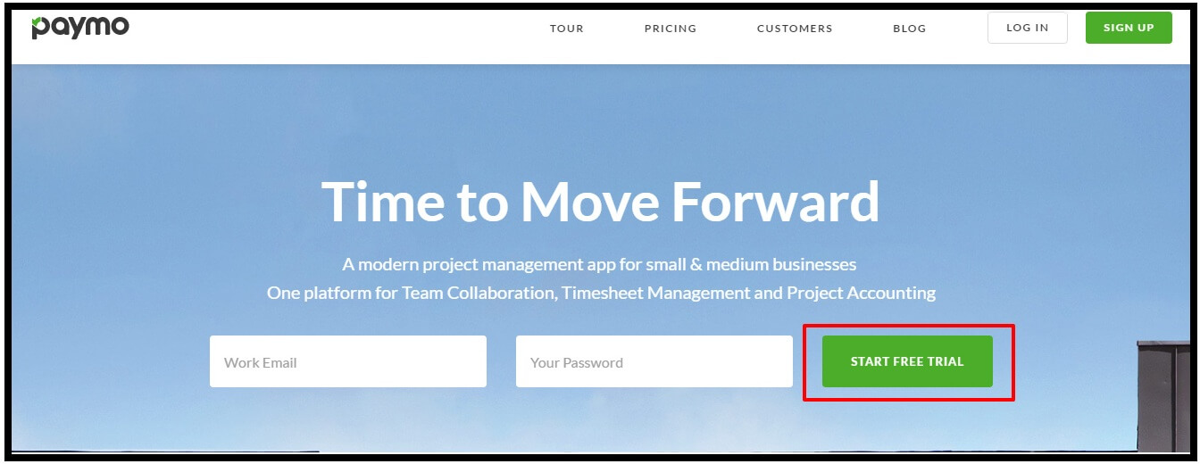
The green CTA in the sky blue background works really well for paymo as it stands out and grabs the attention of the visitors, ultimately making them click and act.
10. Contact Information
Do not miss out on contact information to show your reliability. A physical address, an email address, phone number and a contact number should be included as the main methods of contact. If you can offer a physical address and a phone number, it instills trust in the minds of your subscribers towards your company. You can even have live chat popup on the landing page to assist the visitors with their queries.
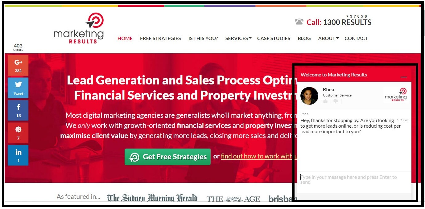
Marketingresults.com.au has brilliantly used live chat popup to give the subscribers a feeling of talking to an actual person rather than a nameless and faceless “customer support executive”. This goes a long way in helping the subscriber recognize the brand.
11. Logical Flow
Logical flow is a must for every responsive landing page. This implies that each element of your landing page should make sense independently as well as be related to each other. They should be in sync with the subscriber’s thinking. You can have a short-form landing page or a long-form landing page according to the information you wish to convey. Don’t hesitate to use the long-form landing page if your product or service demands so. It can fetch you equally good results. If you think multiple CTAs can benefit your business, you can have a long-form email marketing landing page with strategically placed copy and CTA buttons.

The self-explanatory tagline followed by an accurate explanation of “Shopify experience” makes the landing page template a star. The clarification of free trial version for 14 days without any requirement of credit card, below the CTA in green further enhances the user experience by offering them an assurance. As the subscriber scrolls through the page, the value proposition through engaging content, easy to read points and the dynamic counter entices the subscriber to try out Shopify. The CTA is again strategically placed before the testimonials, followed by free resources. The design is flowing so logically that the subscriber cannot simply bounce back from the page empty-handed despite the lengthy script.
Wrapping Up
Landing pages help you form the first impression and you need to make sure that your subscribers fall in love with you at the first sight. Convey your unique value proposition in a short and crisp copy with an out of the box offer that makes you stand out from your competitors. The ultimate thought behind a landing page is to make a difference and leave an impact on the minds of your subscribers. What is your take on landing page components? Do share with us.




Kevin George
Latest posts by Kevin George (see all)
Jailbreak your Master Template: How to make various Types of Emails
Email Marketing for Startup - Tips to Skyrocket Brand Visibility