Emails are the way of life. An average email user receives an average of 73 emails every day. And most importantly, there are efforts of multiple people behind each email such as:
- An email marketer, strategically using clever subject line and optimum send time for improving open rates.
- An email designer, expressing creativity with beautiful email designs that convey information in an orderly fashion to improve click rates and user experience.
- An email developer, coding the email and including any interactivity to improve user interactions and testing the rendering for ensuring good user experience.
Since emails are so important for an email marketer, Uplers have compiled 20 Pro Email Design Tips to help you make the most of your emails. Let’s take a look:
Type of email
Tip #1:The first step in creating an email is understanding the type of email you are designing.
- Welcome emails: First interaction with your subscribers and so needs to have minimal text and relevant images orienting the subscriber about your brand.
- Getting started / Feature emails: This kind of emails is image heavy and can also have an embedded video in it.
- Newsletter emails: These emails provide a summary of updates that your subscriber is keen to learn about and hence shall be text heavy with occasional images.
- Promotional emails: Such emails are focused more on the announcements and promotion of a sale and will have attractive images and lesser text.
- Transactional emails: These emails are triggered by a purchase-based user behavior and can be 20% promotional. Such emails will have images of the product(s) and the text related to it.
Structure of email
Once the type of email is finalized we move forward to the structure of the email.
Tip #2: 600px email width is a thing of the past. With more and more devices featuring screen resolutions greater than 800px, it is time to create emails that make use of the extra screen space. Since webmails have a display pane which prevents the email from occupying the entire screen width, restrict your email content within 800px width and fill the remaining space with a background color or image.
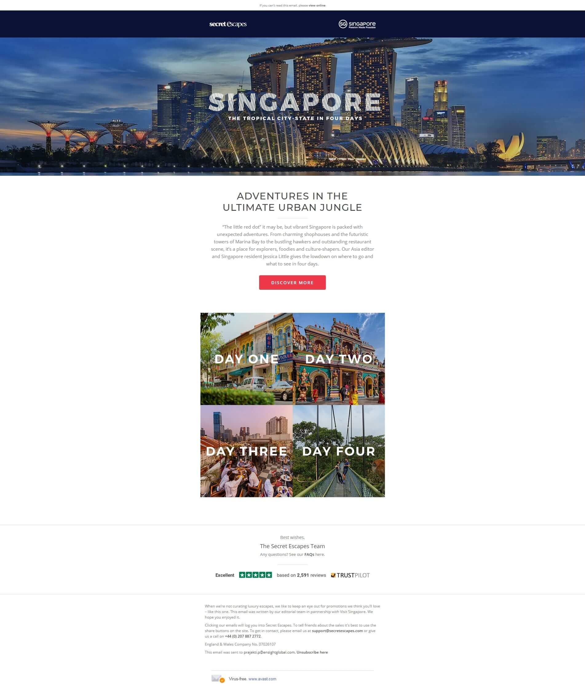
In the above email by Secret Escapes, the hero image covers the entire width of the email and the rest of the email copy is accommodated within a column of shorter width.
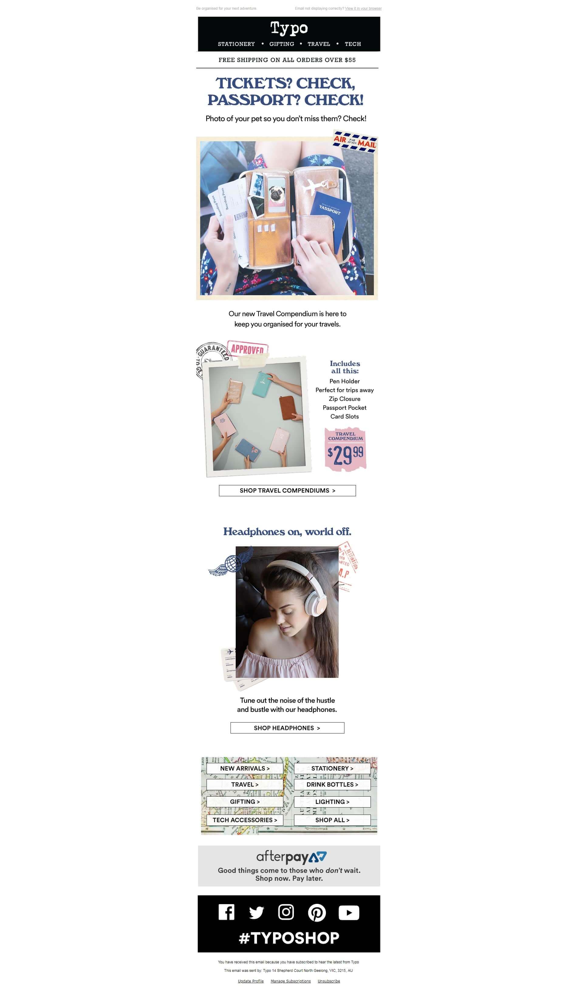
Tip #3: Have consistent branding assets. Create a separate template containing header and footer of your emails which can be used again and again. This way you don’t have to expend time on creating a new header and footer for every email that you create.
 |
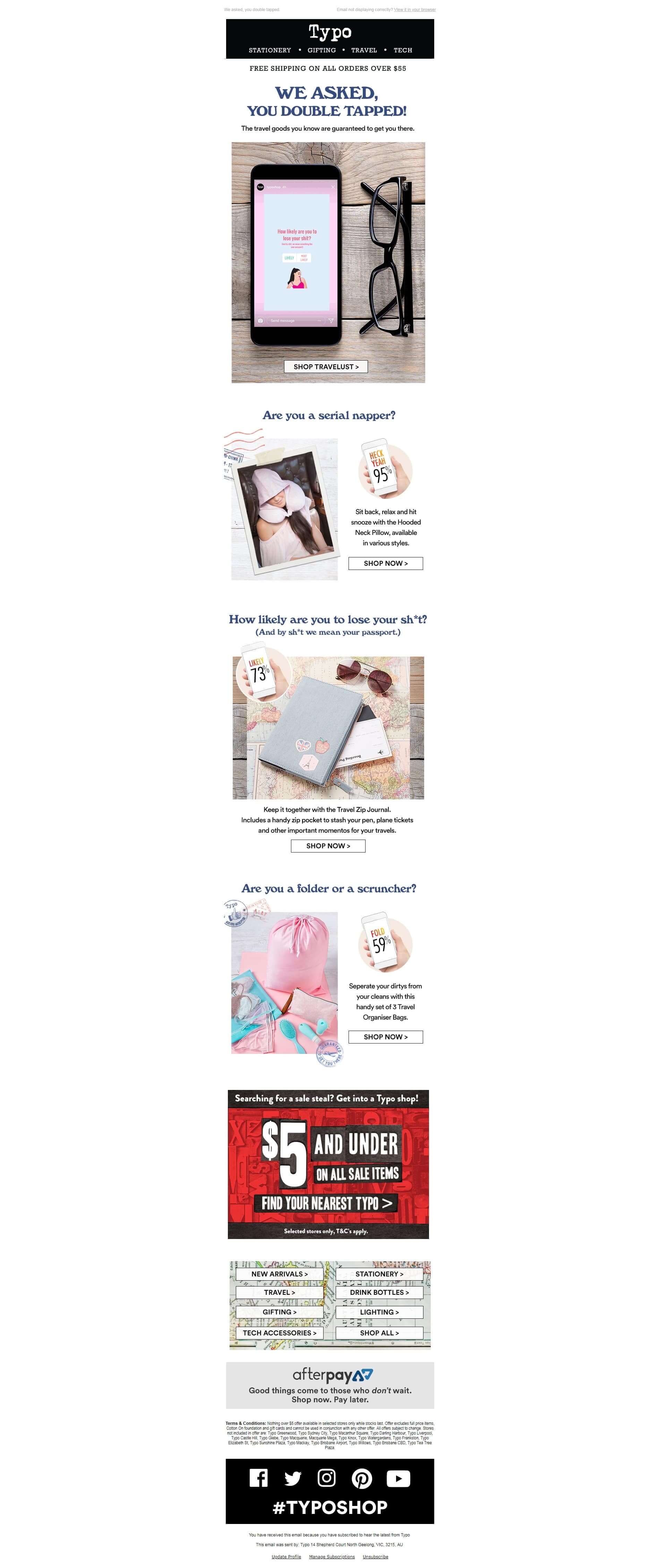 |
As you can see in both the above examples, the header and footer section is the same and can be replicated for more emails.
Tip #4: Stick to a one-column layout. Creating responsive emails is mandatory, and this will reduce the headache involved in arranging email elements for mobile layout.
Tip #5: Since most email developers code their emails using <table> to maximize compatibility, it is a good practice to design your emails in a grid to better understand the placement of different email elements.
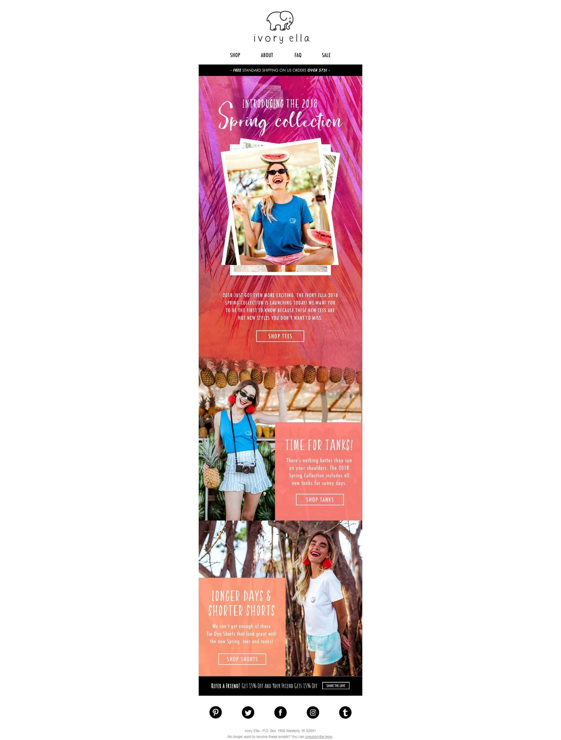
As you can see in the above email, it has been designed in a grid style so that the elements can be arranged.
Email content
Tip #6: Maintain a visual hierarchy. None of your subscribers is going to read your email from start till the end; keep your email design easy to scan. Cater the most important information in the first fold itself but don’t clutter it. Use text formatting to highlight crucial information and it is the bare minimum to make your email accessible.
Tip #7: The images of your email need to be dependent on your text and not the other way around. Most email clients tend to disable images by default and the email copy needs to be persuasive enough for subscribers to enable images for getting more information.
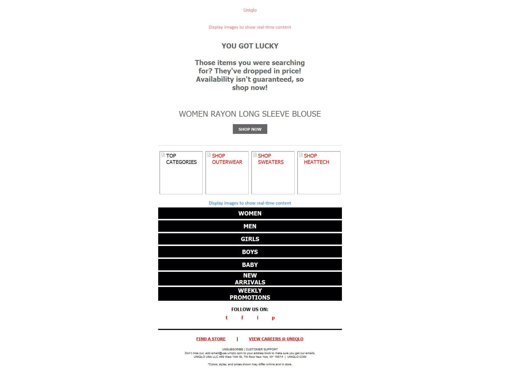
In the above example, Uniqlo manages to convey the message using alt text when images are disabled by default.
Tip #8: In connection with the previous tip, NEVER create an email that is just a single image. While brands manage to pull off a single image email, it is not an ethical step, as ISPs consider an email that doesn’t have an 80:20 text to image ratio as a potential SPAM email. Read further about design tips to avoid SPAM traps.
Tip #9: Experiment with fonts. Each typeface triggers an emotion subconsciously and so experiment with two email-safe fonts.
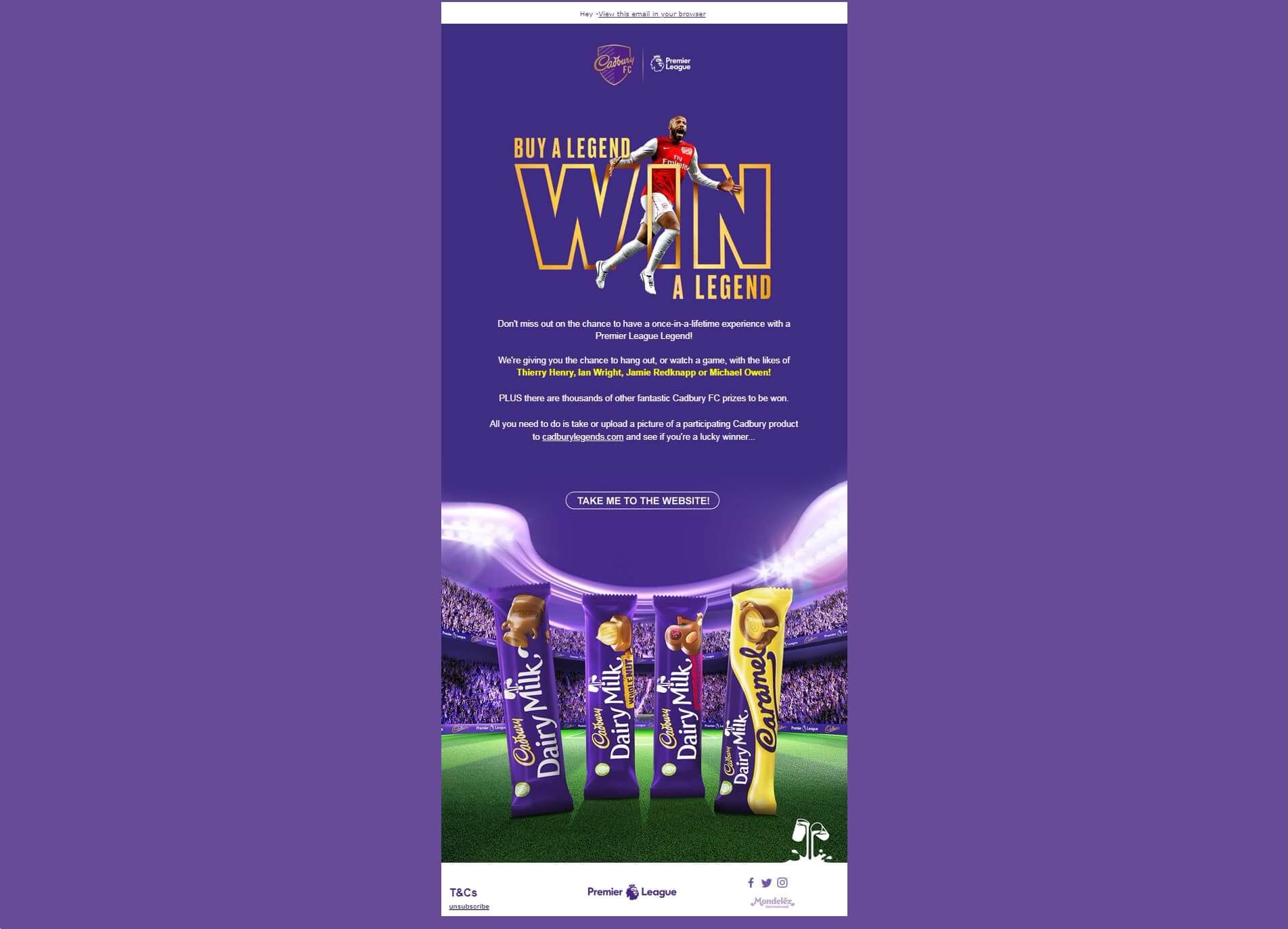
Tip #10: In case you must use custom fonts, stick to those fonts which have reliable fallback fonts and use stylized fonts as an image.
Tip #11: Ensure that your CTA button is prominent. This could be done by using contrasting colors or by playing with the placement of the CTA button.
Tip #12: Depending on the type of email and the industry, don’t hesitate to repeat your CTA button more than once. Some subscribers are paranoid to click the CTA button placed in the first fold without going through the entirety of your email and the repeated CTA buttons can be helpful in converting such subscribers.
Tip #13: Except for languages that are read right to left, most subscribers tend to follow an F-shaped pattern while reading/scanning. Keep this in mind while placing email contents.
Tip #14: Use bulletproof buttons. Never use an image for bullets and instead rely on HTML for the bullet to look the same across all the email clients.
Visual Content
Tip #15: The first frame of your animated GIF should never be blank. Outlook and Lotus Notes are notorious for showing only the first frame of your GIF and so design the first frame as if it was the only frame to load.
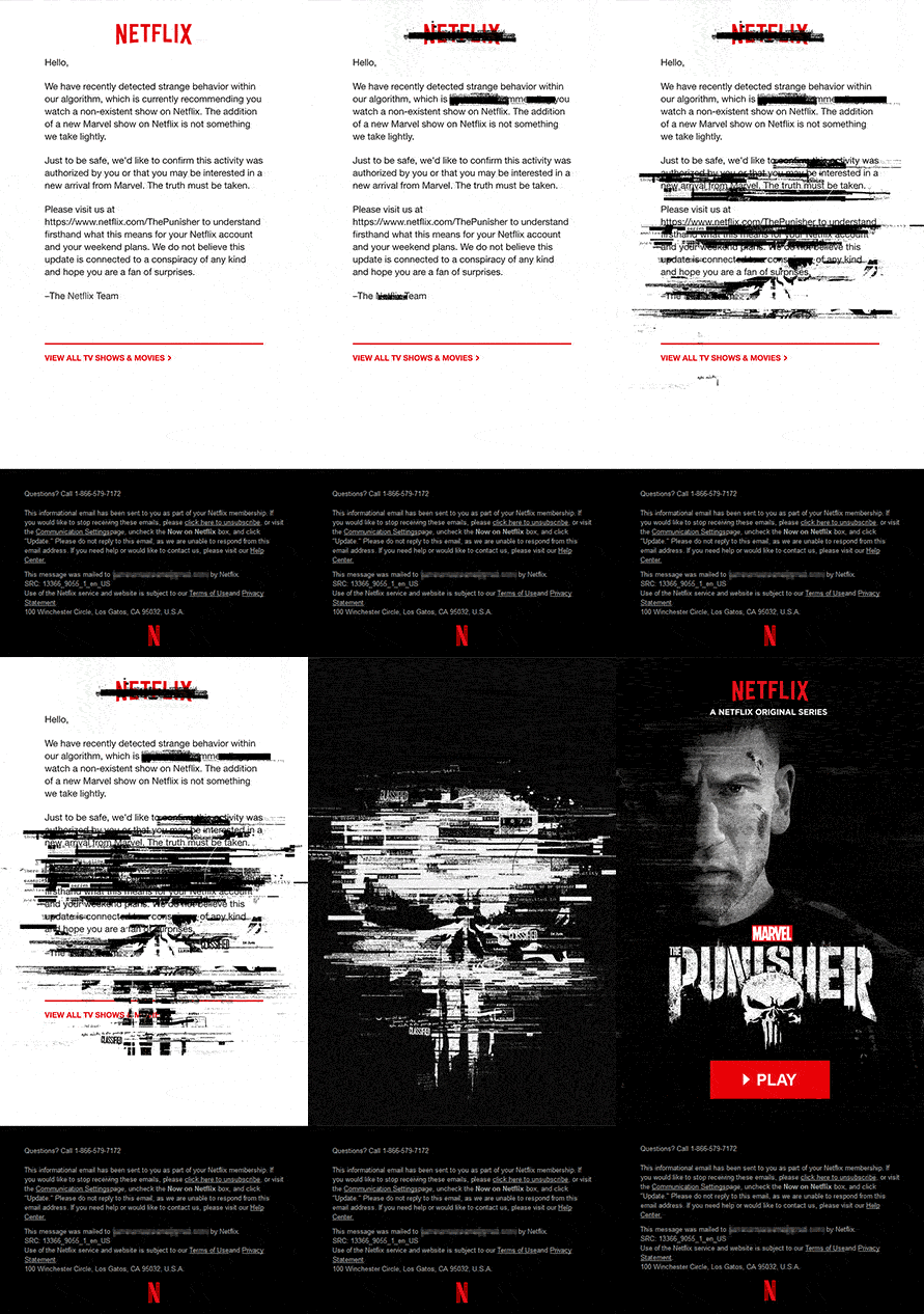
This email by Netflix conveys information in the first frame which is followed by the animation.
Tip #16: Even though images are dynamically fetched to lower the size of the email, avoid using heavy GIFs which will increase the loading time of your emails and in turn discourage your subscriber.
Tip #17: Embedded videos are currently supported in most of the email clients, but the animated GIF placed in the fallback needs to convey that on clicking it the subscriber will be able to see the video in their browser.
Tip #18: Always have a ‘view online’ link and a visible unsubscribe link. Even if you are creating a plain looking email, a view online can be the savior for those with sketchy internet connections. A visible unsubscription is now important since CAN-SPAM act and GDPR guidelines impose hefty fines for not having it.
Advance email design tips
Tip #19: Plan your layout. When including any dynamic content in your email, you need to make sure that your content accommodates in the space provided. If the content is longer, it might overlap and if the content is short, then there shall be a disturbing amount of unnecessary whitespace.
Tip #20: Understand what kind of interactivity can further enhance the user experience and move forward with it only after you are clear with the functioning. A plain looking email is much better than a glitchy email. Additionally, certain interactive elements need to have a separate mobile email layout, so be prepared for the additional work.
Wrapping Up
Even though these email design tips might sound basic, ignoring any one of them can make your email one step shorter than perfection. As stated at the beginning of this article, you can refer to Steps to creating a design PSD and Steps to create a modular email template to further hone your email skills.



Kevin George
Latest posts by Kevin George (see all)
How MarketingSherpa Keeps Up Its Email Engagement & Re-engages Inactive Subscribers
Image Caching in Web Email Clients – Alarm for your Email Metrics?