Except for cold outreach, nearly all brand emails are predominantly visual, incorporating elements such as images, videos, and animated GIFs. In fact, more than 50% of marketers concur on the importance of visual content to their marketing strategy. Next to video, image is the most popular content asset, leveraged by 47% of marketers.
However, these statistics didn’t appear out of nowhere. The value of visual content in emails is directly related and solely attributable to accessibility.
So the question is: Are your visually rich emails accessible? Do you ensure that each time you send out an email, your subscribers can see and understand your visual content? Our development team is foremost concerned about this.
Alt text is key to email accessibility. In this blog post, you’ll learn what alt text is, why it is critical to email marketing, how to write it, and also catch a few good alt text examples.
- What Is Alt Text in Emails?
- What Is the Purpose of Alt Text in Emails?
- How to Code Alt Text in Emails?
- Good Alt Text Examples & Best Practices
What Is Alt Text in Emails?
Alt text, short for alternative text, is an HTML attribute that provides a precise textual description of an image. If subscribers cannot view an image in your email, they can still read the description and understand what the undisplayed image is about.
Here’s an example of how alt text makes images in email accessible to subscribers.
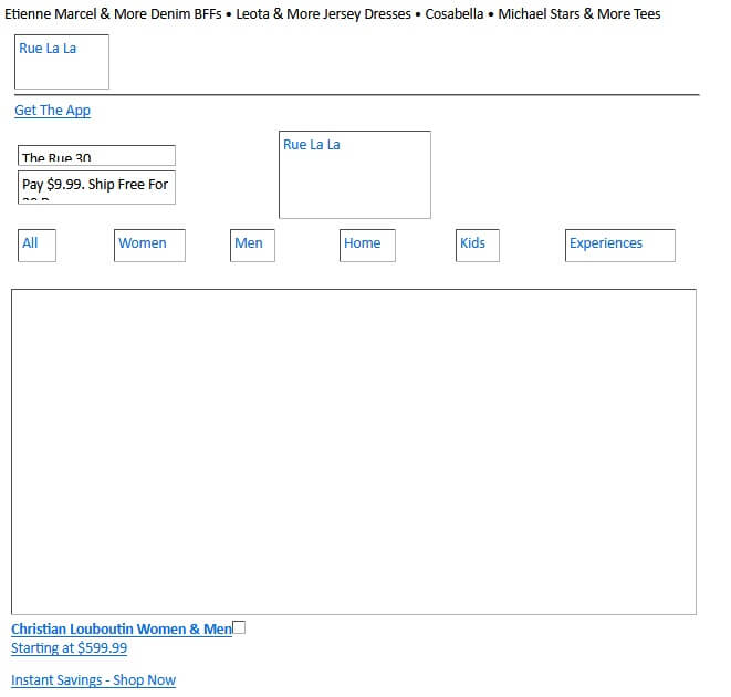
In the above example, the brand logo, featured image, navigation bar, etc. are not displayed. But thanks to alt text, the viewer can understand the images. Of course, it impacts the viewing experience, but that’s the purpose of fallbacks when the priorities change. The focus now is on accessibility, not experience.
Note that image alt text and image captions are totally different. All images have alt text, but not all images have captions. Alt text is a fallback, an “alternative,” unlike captions, which may take the form of description, commentary, contextual remarks, etc.
What Is the Purpose of Alt Text in Emails?
The purpose of alt text in emails is to make visual content accessible.
“From websites to apps to emails, adopting an inclusive, ‘accessibility-first mindset’ for all sorts of digital design is the right thing to do. As a bonus, email accessibility makes it easier for all subscribers to see, understand, and engage with your messages. The point is – better accessibility leads to better email marketing performance,” says Megan Boshuyzen, Senior Email Developer at Mailgun.
But the question is: Why might images be inaccessible in the first place? Three primary reasons:
- Certain email clients, such as Outlook do not allow image downloading
- Many subscribers/recipients manually block images to save network data
- Slow internet delays image loading, especially if the file size is too large
However, there are other reasons that may affect email accessibility, such as spam filters and visually challenged subscribers.
The latter is one of the main reasons for using alt text in emails. According to the World Health Organization, approximately 2.2 billion people are visually impaired.
If your email list contains visually impaired subscribers, alt text is indispensable to your strategy. These subscribers use screen readers to navigate digital content, including emails. Feel free to learn how to optimize your emails for screen readers.
However, avoid being lopsided in your approach to alt text strategy. Alt text is just as important for regular subscribers. Be sure to use image alt text in every email you send. “In other words, alt text helps ensure your visual content is accessible to all users, regardless of their visual ability,” states Braden Becker, SEO Lead at Faire.
Read more: 10 Best Practices for Using Alt Text in Emails
How to Code Alt Text in Emails?
Include the “alt” attribute within the <img> tag, as shown below.

In the above snippet, “Description of the image” contains the alternative text displayed if the image fails to load or the recipient uses a screen reader.
But here’s another way to code email alt text.

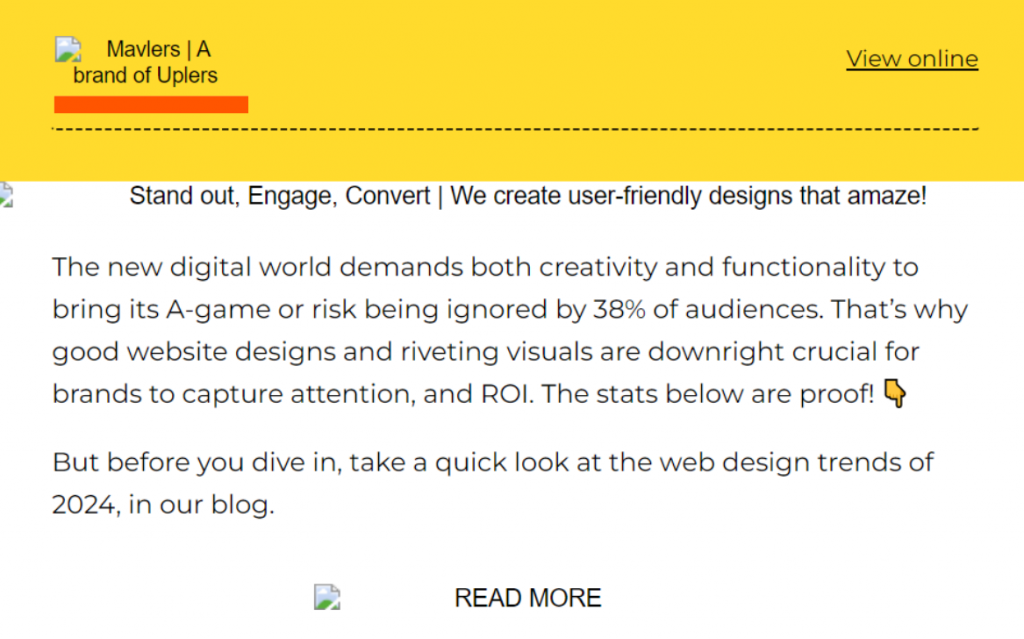
In this code snippet, the alt text is included within the image’s style attribute. You can style the alt text using CSS properties like color, font size, and font weight.
Note that not all email clients support styled alt text. You can customize the styling on iPhone, Gmail, Yahoo! Mail, Apple Mail, Thunderbird, and Outlook.
The point of using styled alt text is to make it more visually appealing. Or at least to display the text in non-HTML form. For instance, here’s an example of a non-styled alt text for the undisplayed brand logo. As you can see, it’s displayed in HTML format.
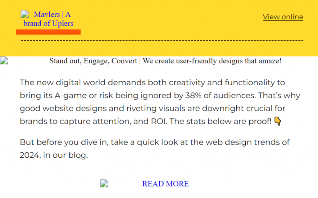
Now, look at the same alt text styled.
Good Alt Text Examples & Best Practices
1. Keep Your Alt Text Brief but Accurate
Your email alt text should be short and simple. Try to avoid going over 100 characters. The following email from Mojo uses “Mojo Logo” as the alt text for the brand logo.
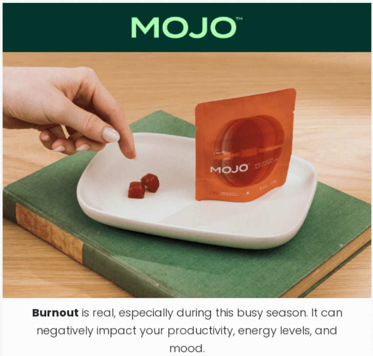

Note how the alt text does not include “Image of” or “Picture of.” You want to make it as crisp as possible while also accurately describing the image.
For more complex images that may require longer descriptions, it’s best to explain them in the body copy to keep the alt text brief.
2. Use Null Alt Text for Decorative Images
Decorative images are those that do not serve any particular purpose. You can think of non-brand-specific hero banners and stock images.
For such images, use empty or null alt text. The alt attribute will be present but contain no text. When a screen reader encounters the text-less attribute, it will skip over the image. In the absence of the empty alt attribute, the screen reader may read the file name of the decorative image, distracting the reader.
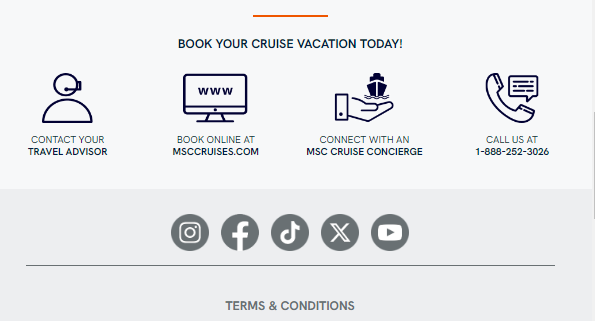
In this email from MSC Cruises, the first icon in the footer has a null alt text attribute.

3. Use Relevant Keywords in Your Alt Text
Determine whether your images can benefit from the inclusion of campaign-specific keywords in the alt text. For instance, if an image is relevant to your call to action, you can add relevant keywords in the alt text to improve scannability for visually-impaired users.
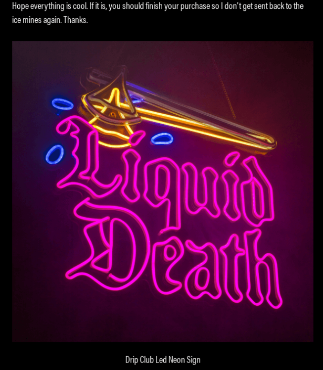
This cart abandonment email from Liquid Death uses the keyword “abandoned” in the alt text to the product image.

4. Keep Image Text and Alt Text the Same
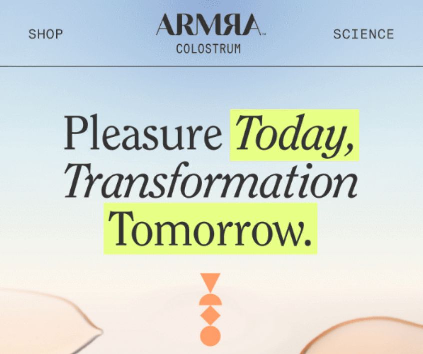
The Web Content Accessibility Guidelines or WCAG does not allow images of text. However, many emails do use images of text for aesthetic purposes. In such cases, use the same text in your alt text.
This email from ARMRA incorporates the heading verbatim into the alt text.

Read more: Sending Image-heavy Emails the Right Way
Build Accessible Emails with Email Uplers!
Collaborate with us to hire remote email template developers capable of building a robust email template architecture for your business. Our pre-vetted experts specialize in creating customized, pixel-perfect, responsive HTML email templates. Monthly packages start at $1750 per resource, with proficiency in all DIY and enterprise-level ESPs. Get in touch with our dedicated HTML email developers today!


Susmit Panda
Latest posts by Susmit Panda (see all)
Is it a good idea to allow your customers to opt-out of Holiday emails?
Top 9 Back-to-School Email Marketing Examples