Imagine having a great product or service but still not getting any conversions!
The culprit could be a bad landing page.
Simply put, a landing page is a webpage that a user first arrives on their way to an important action you want them to take on your website. It can either be part of your main website, or a standalone page that is particularly designed to drive traffic from an online marketing campaign.
Landing page for startups can be compared to a first date that can either make the prospects feel like they have found the one or leave them unamused. If your landing page is compelling enough, it can have several benefits.
Advantages of a Landing Page
- You can grow your email list.
- It is cost-effective to develop a landing page.
- With the help of a landing page, you can build your online presence faster.
- Landing pages can help you determine whether your product would resonate with the target audience or not.
- You can request user feedback through landing pages.
To make sure that your landing page reaps all these benefits, start with the three basic questions.
What is the value proposition?
As soon as a visitor comes to your landing page, they should come to know the offerings of your company. Make sure your value proposition grabs the visitor’s attention and piques their curiosity making them want to learn more.
For example: Uplers offers flawless email templates at the fastest turnaround time. This means that the service is designed for direct brands or agencies who are looking forward to getting an email designed and coded in the shortest time possible.
Who is your target audience?
Obviously, your product would not appeal everyone under the sky. That’s why you have to ascertain your target audience and the background of your potential customers. Consider the age, gender, geographical location, key motivators of buying, hobbies, interests, and values of your prospects.
Create user personas to understand the potential buyers and build an effective marketing strategy.
What does your market look like?
In addition to the buyer personas, you should know the size of the market that you are targeting, the market wealth, and the competition. Monitor the competitors and their websites to get an idea about how they are marketing their products or services.
Elements for an Impressive Landing Page
You have the fleeting attention of your website visitors for hardly a split second. Luckily, you can work on certain elements that can make your landing page more attractive and prompt the users to take the next action.
1. Make it visual
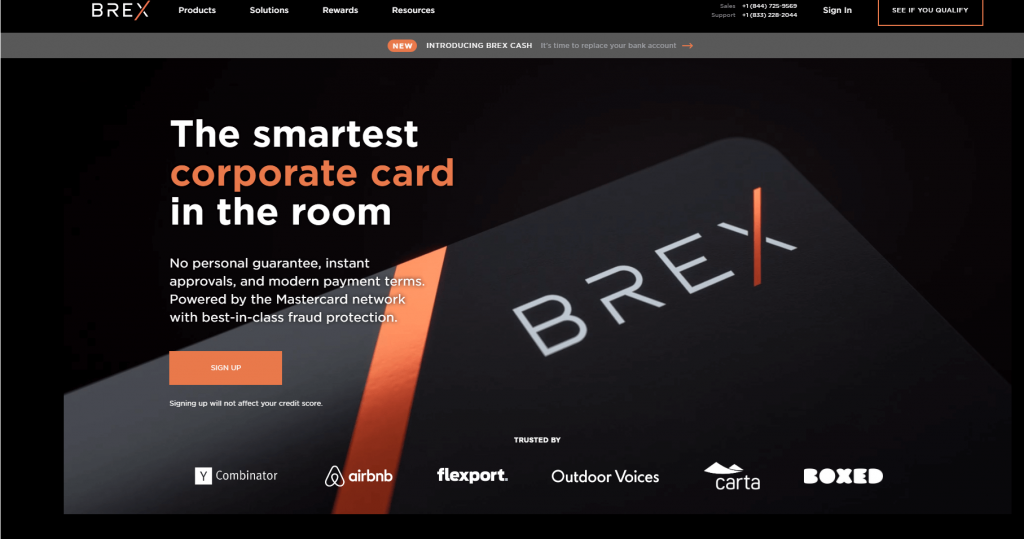
Your prospects are inundated with content, which makes it imperative to impart a visual experience and prevents the visitor from leaving your page. You can add an animation, a background autoplay video or a photograph to the landing page to make your visitors interested in what you have to offer.
Brex has created a beautiful landing page with animated images running in the background. No wonder, it got listed as the top 10 startups in 2019.

2. Include a clear message
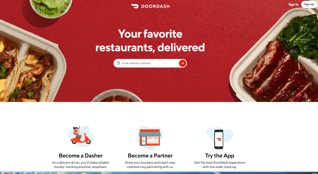
Visuals are, of course, important to convey how your product or services work, but copy is equally important. Have a suitable copy to go with the visuals and make sure it answers the who, what, how, and why of your offerings.
It is often observed that marketers create a common landing page for every campaign. That is not a right practice. You should design unique landing pages for each marketing campaign so that it imparts a consistent marketing experience to the prospects. By having consistent messaging, you can build trust with your customers and prevent any confusion.
Take a look at the landing page by DoorDash and its clear messaging.

3. Add an emotional appeal to the landing page copy
Tapping on the human emotions goes a long way in driving conversions. According to HubSpot, people count on emotions instead of information to make brand decisions. The emotional response to ads leaves a deeper impact on the person’s desire to make the purchase, rather than the ad copy.
Therefore, you should use it to the advantage of your startup business. Harness the power of human emotions by using the right emotional appeal that suits your target audience.
4. Keep your landing page copy brief
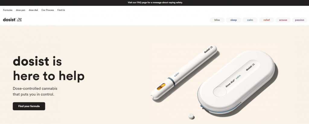
A wall of text is the last thing a prospect would want to read on your landing page. Your startup landing page should talk about your selling points briefly. As you are a startup, it is possible that your visitors do not know who you are. Therefore, you should not inundate them with technical stuff or else they will bounce.
See the brief copy by Dosist, a startup dealing with dose-controlled cannabis.

5. Include customer testimonials on the landing pages
Testimonials from customers and names of companies who have worked with the brand are most important trust-building elements on a landing page. However, if you do not have too many testimonials, you can run a social media campaign to get people to talk about your brand. It might involve an investment in a prize so that you can get maximum people to participate, but it will work wonders to yield conversions from your startup landing page.
6. Have a “How It Works” section
After the headline and hero image, you should include the “How it works” section in the landing page. It is recommended that the copy lies below the fold and is as brief as possible with relevant visual images. Most of the visitors are not aware of your brand and its products if you are a startup, so this section becomes particularly important.
7. Entice the prospects with an attractive incentive
A free giveaway or discount deal could get your visitors interested in your products and encourage them to complete the purchase. For instance, you can offer a free discount coupon in exchange for their email address and other contact details. Just make sure you do not have too many fields on the landing page form. Ask for minimum information from the visitor.
8. Use the principle of tunnel vision
To keep the prospect hooked to your landing page, you must keep it free from any distractions. Avoid having any unnecessary CTAs or navigation bar that would divide the attention of the visitor. Stick to a single goal through your landing page so that the visitor knows which action he or she has to take.
9. Test your landing page
Whether it is the color combinations, copy, CTA text, or CTA copy, you should test your landing pages for all these elements. Carry out A/B testing to figure out what resonates the most with your target audience. Also, test it for flawless rendering across all devices and browsers.
10. Follow the trend of personalized videos
Brands are using personalized videos to woo more customers. Startups can also join the league and add a human touch with tailormade videos for individuals or segments. It will not only add a personality to your brand but also connect with the visitors on a personal level.
Wrapping up
It is certainly not a cakewalk to market your startup but following these tips will surely boost the conversions for your new business.
Do you have any other ideas for a startup landing page?
Let us know in the comments below.


Kevin George
Latest posts by Kevin George (see all)
Email Marketing Trends 2020 to Supercharge Your Business
Deciphering the Essentials of Security in Email Marketing