In our blog post on how to create professional email templates, we pointed out that email is not a vanity channel. It is ultimately about sales.
No take backs! But the question is: What drives sales? What is it that makes the subscriber convert willy-nilly?
Now, that’s a strong statement. Potentially offensive? After all, you can no longer “force” people to buy from you and not from your competitor.
You can’t. And you shouldn’t. But there’s a bigger, more powerful force, something ineffable, perhaps even vague that can. And that is experience.
It’s complex, it’s mysterious, but it’s real, in fact hyper-real, and the 21st century is an experience economy. As a business, you no longer want to sell products/services, but positive memorable experiences to your audience.
It is important to appreciate that in the digital economy, any memorable experience is the sum of user experience or UX and customer experience or CX. You should distinguish between the two but you can’t separate them. Note that customer experience is beyond the scope of the present article. We’ll only be talking about user experience in respect to email marketing.
So, how do you design memorable emails for a brand? Keep on reading!
- What Is Email UX?
- Clean Design
- Minimal Content
- A Well-organized Structure
- Clear Message
- 7 Tips to Improve Email UX
- The Last Word on Email UX
What Is Email UX?
UX, or user experience, describes the overall experience a user has when interacting with a company, product, or service. Specifically, email UX focuses on the experience a subscriber or customer has when engaging with emails. The term ‘user experience’ was coined by Don Norman, a distinguished psychologist and usability expert, to encompass all aspects that affect a user’s interaction with a product or service.
“No product is an island. It is a cohesive, integrated set of experiences.”
– Don Norman
Coming to email, user experience consists of the following components:
1. Clean Design
Clean email design refers to the presence of discernible order in an email.
Human beings are characterized by the inherent need for order in any experience, visual or no. So, if a viewer can’t immediately find any order in your email, they’ll either stop looking or impose a makeshift order on the design. In either case, you’re turning the recipient off. Because the viewer shouldn’t be required to make sense of your email. Clean design is therefore a necessity, and in email, it depends on the following elements:
- Proper layout: Usually, this involves a grid-based layout in emails, where each unit corresponds to the next.
- Good typography: The fewer the kind of typefaces, the cleaner your email. In fact, the best emails don’t use more than two font types.
- Restricted color palette: Again, the fewer the colors, the cleaner the email. Resist springboarding off aesthetics only; focus on usability.
Those are just the first principles of user-focused email design.
Below is an email that has a proper layout, a restricted palette, and just two typefaces, one in the primary headline and one in the rest of the body copy. We designed this email on Emarsys for our client, Learn with Homer.
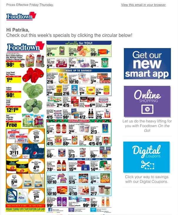
Compare the above email with this one from Foodtown. (In all probability, Foodtown’s email is way more memorable than ours; hence our emphasis on positive memorable experiences in the intro. 😊)
2. Minimal Content
Minimalism, in relation to both image and text, is a critical development in modern UX design. Simplistically, it’s the idea of “less is more.” In email, which, in the absence of AMP technology, acts as a means not an end, the concept of minimalism can be variously applied and interpreted:
- Bold, contrasting colors; for example, a ghost button alongside its solid counterpart, or a colorless content block immediately below a richly-colored hero banner, or even plain text followed by images.
- Sans serif typography, which is widely held to be the best for online readability. Two different fonts may elicit different responses; and research has also shown how font size affects the readability of serif and sans serif typefaces.
- Less text, more images, or vice-versa, thanks to the predominance of white space in such cases. For example, e-commerce emails tend to feature more images with fewer than 100 or so characters.
- Minimal-reinforcing layouts such as S-curves and single columns.
Significantly, minimal design is directly related to responsive design. Since the former is based in the one-dimensional framework, it eliminates the need to adjust the perspective or depth of elements as they scale variously on different devices.
“Much of the appeal of flat design is found in the implementation. It enables the UI designer to think of their designs as a functional tool.”
– Interaction Design Foundation
3. A Well-organized Structure
In the first section of email UX, we touched on how layout contributes to order. But the layout is just one part of the design structure. Here are the rest of the elements that reinforce the structure of an email:
- Size: Larger elements are more noticeable than smaller ones.
- Color: Bright colors are more attention-grabbing than muted colors.
- Contrast: Deep contrasts are more noticeable than light contrasts.
- Repetition: Styles repeating imply related content.
- Proximity: Close-spaced elements imply they’re related.
- Pattern-match: Natural reading paths, such as F-shaped and Z-shaped patterns, to lead the user through an email.
- Pattern-break: To draw the user’s focus to something important.
- Negative space: To make a specific element stand out.
The above elements lead to a strong visual hierarchy, which is the basis of a well-organized structure of an email.
Now, why do these elements contribute to visual hierarchy? The answer is: Gestalt principles. Most of these elements are part of Gestalt principles, which also include concepts like pragnanz, emergence, invariance, and so on. The goal of applying Gestalt principles to UX design in email is to enable the viewer to understand your email at a glance. Because that’s how human beings make sense of everything — at a glance.
Let’s take a look at an example.
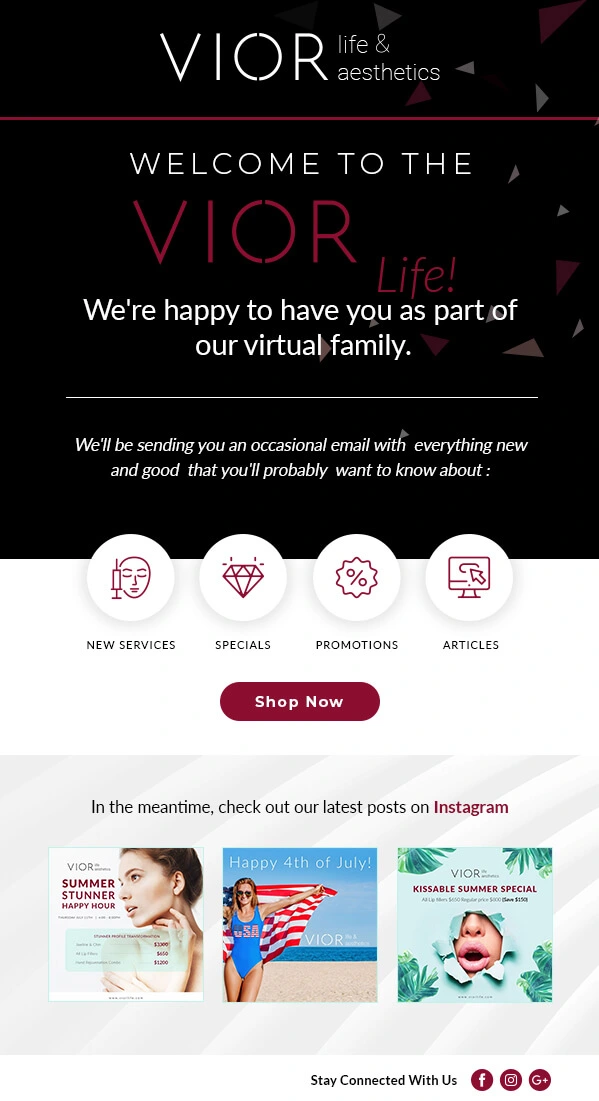
In the following email which we designed for Vior as part of an Adobe campaign, you can perceive the Gestalt rule of symmetry. According to this principle, human beings tend to group symmetrical, rather than asymmetrical, elements/shapes. In this email, notice how the destination links are symmetrically lined up, implying their relatedness.
4. Clear Message
The final aspect of email UX is communicating the purpose/message of an email clearly and quickly.
Clarity and conciseness lead to credibility, which leads to trust. UX is based on credibility and trustworthiness. Your product or service may not be good, but the way you communicate with your audience can result in a positive user experience. That’s where UX is different from CX. Notably, a study conducted by credibility experts in Stanford University determined the relationship between visual appeal and credibility.
In email design, the following factors determine credibility:
- How well you know your target recipients/subscribers and their needs
- How you can meet those needs
- How your design “speaks” to your audience or subscribers, and
- How your design serves, instead of sells to, the subscriber
The first two factors relate to the email designer and the last two concern the reaction of the subscriber to the design. Let’s unpick them. Note that in either case, it’s a gamble since building credibility is not an exact science.
The Designer’s Gamble
Your goal as an email designer is to repeat what the user already knows and remembers well; the latter part is crucial because it’s a very thin line between knowing something and remembering something. Failure to appreciate this is what leads brands to blow up their triggered campaigns.
For example, the maiden cart/browse abandonment, all else being equal, shouldn’t trigger an email.
But so often it does. There can be various reasons why someone abandoned a process; perhaps they never felt up to it to start with, leading them to quit after the first scroll. Maybe they were merely curious to see the page.
Now, as a designer, you can create the perfect abandonment email, with a product from the category most viewed during a session displayed prominently in the hero space of your email, but it may not lead to a sale since the user might not actually remember seeing it, even if they did.
What you just did was serve up an irrelevant experience. It showed in how you designed your email: Ignoring where the user’s interest actually lay, you pushed something random in their face; and you used the hero space, the most important piece of screen real estate, to do it.
Instead of this, you could have, since it was the first such behavior on the user’s part, designed an email with an uniform focus on all the products in the explored category, along with nicely spaced-out text explaining the delivery process, associated costs, and customer support options.
Now, it’s critical to understand why you did not choose to do it this way:
- You might be too inspired to prioritize functionality over aesthetics
- You acted selfishly, either to scratch the creator’s itch or shove the one product to make bank
- You intentionally misled the viewer through your design. Yes, that’s possible. Here’s how Amazon allegedly used “dark design” patterns to influence customer choices.
Well, that’s not a gamble worth taking. Instead, hedge your bets by being, according to Ken Thompson, able, benevolent, and honest as a designer:
- Ability: You show your ability to the user through your design skills
- Benevolence: What you’re offering should be useful and interesting to the user
- Honesty: Your design should be based in integrity and fairness
“Some people think design means how it looks. But of course, if you dig deeper, it’s really how it works.”
– Steve Jobs
The User’s Gamble
It’s a gamble on the user’s part as well. The internet is not a safe space after all. So, like many other things in life, navigating the web is an act of faith, which naturally involves significant uncertainty. Your goal as a designer is to reduce uncertainty. It’s no different in the case of emails.
So, the first step to reducing uncertainty is to know the user. And how do you know the user? By investing in user scenarios and personas. Here are the steps to creating a user scenario, as recommended by 18F:
- Select a pool of user groups or personas, and determine potential critical scenarios for the user.
- Create a list of motivations, interests, desires, goals, and behaviors for each user.
- Build a practical, detailed narrative or story which contains information related to the user, their motivations, the context of interaction, their goals, and how they set out to achieve them.
- Share the user scenarios with the user groups for their validation, feedback, and fine-tuning.
- Analyze your email according to these scenarios and identify areas you can work on to improve user experience.
Here’s an example of an email user scenario:
Samson receives a promotional email from a clothing brand which features a list of new arrivals in the sustainable activewear section. Samson clicks the CTA button and is redirected to the sustainable category page. After browsing through the products, he adds a moisture-wicking T-shirt and a pair of joggers to his cart. Samson then proceeds to checkout, enters his address, and completes the transaction using his preferred payment mode. Immediately, Samson receives an order confirmation email.
Now, that’s a pretty straightforward user journey. In reality, the journey a user takes can be complex. In such cases, a positive UX will depend on the extent to which your email design is intuitive.
In fact, it’s reasonable to assume that in-mail experiences can suddenly turn sour, leading subscribers to quit continuing with your message.
Hoa Loranger, VP at Nielsen Norman group, sheds light on how negativity bias in UX can affect your business. The negativity bias defines the tendency of human beings to pay more attention to negative experiences than positive or neutral experiences. So, even if an email followed all the standard principles of UX design, a stray CTA button or a View Online link appearing at the bottom rather than on the top, can prejudice the viewer against your brand.
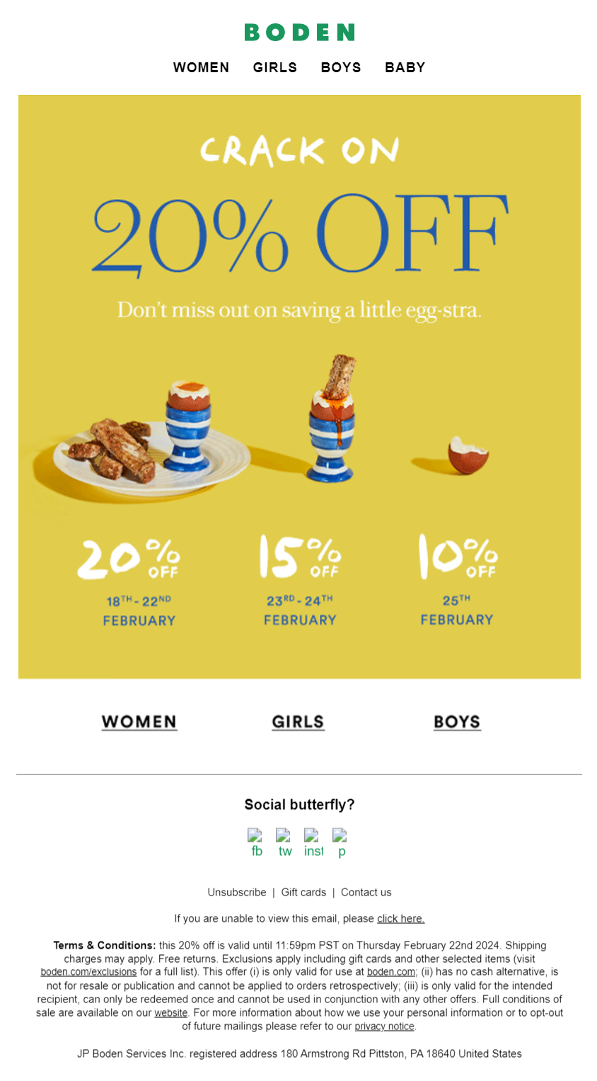
For instance, this email from Boden excels in layout, contrast, and spaced-out nav bars, only to falter in the social sharing block, where the social media icons are replaced by alt text. The typical viewer will lend more weight to just this one wrinkle in an otherwise well-designed email.

Image source: Inbox
It’s not just a psychological quirk though; such slips imply indifference on the sender’s part, which is unpardonable in the online world. In Boden’s case, the alt-text gaffe sends out a wrong message, albeit unintentionally, potentially forcing the viewer to not just squint but swear.
7 Tips to Improve Email UX
But first, why should you even consider improving UX, generally speaking? Because:
- If a website takes longer than 3 seconds to load, 2 out 5 people will leave the site. (Source: Toptal)
- 32% of customers would leave their favorite brand after just one bad experience. (Source: PWC)
- 91% of users who’ve had a bad experience don’t complain about it, but choose to leave without bothering to give feedback. (Source: Think Jar Collective)
- 13% of users will tell about a bad experience to at least 15 people. (Source: Think Jar Collective)
- A seamless UX design could raise conversion rates by up to 400%. (Source: Forrester Research)
- For every dollar invested in UX design, the ROI can be as high as $100. (Source: Forrester Research)
Get it now? Here are seven actionable tips to improve email UX and boost conversions.
1. Research & Discovery
1.1 User Research & Competitor Analysis
1.2 Define Goals:
– Increasing click-through rates
– Boosting sales
– Driving website/landing page traffic
2. Persona Development
2.1. Create User Personas
2.2. Define Your Target Audience
3. Content Strategy
3.1. Personalize content
3.2. Display tailored products or offers based on previous purchases or browsing behavior.
4. Design
4.1. Create responsive designs
4.2. Choose scannable layouts:
– Grid-based design
– Single-column design
– Z-pattern design
– Interactive design
4.3. Choose colors that support email accessibility
4.4. Use fewer and smaller images
4.5. Opt for legible/readable typography
4.6. Create a visual hierarchy
4.7. Design for accessibility:
– Clear, straightforward language
– Honoring modern accessibility standards
4.8. Add menus and anchor links
4.9. Use a clear call-to-action
4.10. Add a descriptive and prominent CTA button
4.11. Create a meaningful footer
4.12. Add unsubscribe button
5. Testing
5.1. Data-driven A/B testing:
– Which subject line strikes the strongest chord with your audience
– Which call-to-action button drives the highest clicks and conversions
– Which content type (videos or images) elicits the best response from your audience
– When your audience is most likely to interact with your emails
6. General Tips
6.1. Draft attention-grabbing email subject lines
6.2. Optimize preheader text
6.3. Avoid slow-loading emails or images
6.4. Avoid spam triggers
7. Documentation
7.1. Document campaign-specific learnings
7.2. Record key findings related to UX
7.3. Prepare a report outlining the effective strategies and pinpointing areas for improvement to guide future email campaign efforts.
“Don’t be arrogant and assume that your new design idea is so brilliant that it can overrule decades of user habituation.”
– Jakob Nielsen on UX Tigers
The Last Word on Email UX
It can sometimes be frustrating to have to hear that you should design for usability, not just aesthetics.
Any designer is basically an artist; utility is often the last thing that an artist wants to commit to. Hence the need for marrying your aesthetics to a robust, almost charmed, understanding of marketing. And marketing is all about how you can be useful to your audience in your own way.
To that end, here are 10 best practices for designing useful emails:
- Design your email in such a way that the recipient can immediately see what actions they may be able to take and how. You want to make it ridiculously easy for the user to interact with your email.
- Make your email consistent not just with your brand, but with user expectations as well.
- Make your emails equally accessible on all devices and to all people in different contexts.
- Design your emails with an emphasis on downward movement in order to encourage the recipient to keep on reading.
- Break text up into smaller chunks, preferably in the form of bullets. In the case of paragraphs, avoid justified text. Optimize email copy for right-to-left scripts as well, if you have a global audience.
- Place CTA buttons or any critical piece of information outside banner graphics so that they’re visible even if the image does not load.
- Use email-safe fonts such as Times New Roman, Verdana, Arial, and Georgia. Typography should not come at the expense of readability.
- Leverage white space to the max to let your email breathe and be easy on the eye.
- Use the triadic color scheme to make your email visually appealing, aesthetically sensible, and harmonious.
- Test your design before sending out the email.
The above 10 best practices can be summed up in Peter Morville’s highly celebrated framework of a good UX design: Your email should be useful, usable, desirable, findable, accessible, credible, and valuable.
Design for People, Design with Us!
Need help with designing user-focused email templates?
Get in touch with our email template production team. Please provide us with your project brief, brand assets, and content, and we’ll craft an engaging, responsive email template using industry-leading design practices. From initial concept to final template, we’ll deliver within 2 days. Additionally, we’ll audit your existing email campaigns to ensure cohesive branding.
Sounds like all talk, no walk? Get an inside look at the email design and development process at Email Uplers.


Ria Pattani
Ria Pattani is a Senior UI/UX Designer with over four years of experience specializing in design, research, and communication. Currently working at Mavlers, she brings a deep understanding of user-centred design principles and effective visual communication strategies. With a Master’s in Communication Design, Ria excels in creating engaging user experiences that seamlessly blend aesthetics and functionality. Her approach focuses on bridging the gap between user needs and business goals through thoughtful research and creative solutions.
UTSAV KHAMBHATI
Utsav is a UX/UI and Graphics Design Manager passionate about crafting exceptional user experiences. Combining design expertise with leadership skills, Utsav delivers impactful solutions that resonate with users and drive business success.
Susmit Panda
A realist at heart and an idealist at head, Susmit is a content writer at Email Uplers. He has been in the digital marketing industry for half a decade. When not writing, he can be seen squinting at his Kindle, awestruck.
How to Create A Responsive Email Template – The Only Guide You’ll Ever Need
How Our Experts Solved The Issue of Truncated Padding in Outlook